What’s the best approach in icon design: minimalism or details?
Building a global visual language that unites us.
What’s the best approach in icon design: minimalism or details?
We caught up with Alex Clem, Digital Marketing Associate at Disability:IN, to learn more about her career path, creative process, and approach to designing for accessibility and disability inclusion.
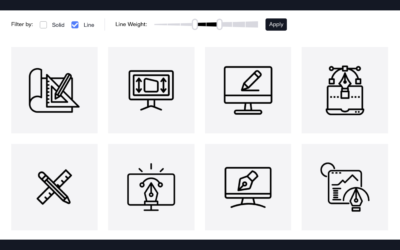
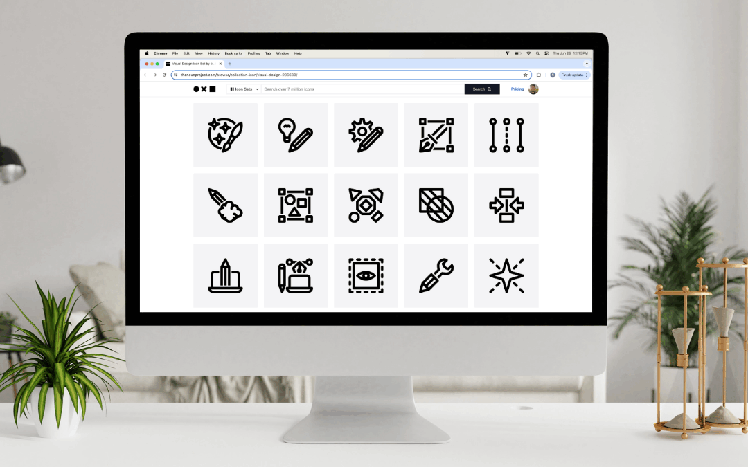
We’ve listened to your feedback— Now, we’re making it easier than ever to search icons with new Style and Line Weight filters.

This interview is part of a series celebrating the work of Black and African creators from around the world, in partnership with Black Women Photographers.

This interview is part of a series celebrating the work of Black and African creators from around the world, in partnership with Black Women Photographers.

Explore how top brands are leveraging Noun Project’s Icon API to create more thoughtful, inclusive user experiences.

This interview is part of a series celebrating the work of Black and African creators from around the world, in partnership with Black Women Photographers.

We asked 20 of today’s top designers and illustrators what advice they’d give to fellow creatives just starting out. Here’s what they said.
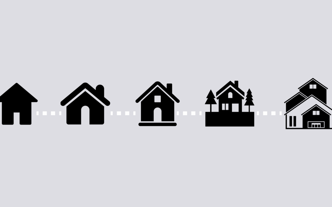
If you’re contributing multiple icons to Noun Project around a certain topic or theme, here are the top design considerations to help you create a cohesive and unified set.

Learn how the principles of grouping and proximity can help make your graphic design compositions more scannable and clear.

Get a head start on planning your marketing and promotion activities throughout 2025 with our free content calendar. Whether you're a marketer, social media manager, or small business owner, you can view some of the holidays, milestone events, month-long themes and...

Planning a stock photo shoot can be an exciting and creative endeavor. In this article, we'll walk you through how to create the perfect photo shoot, from concept to completion. Use these free photo shoot production document templates, including a sample deck, budget,...
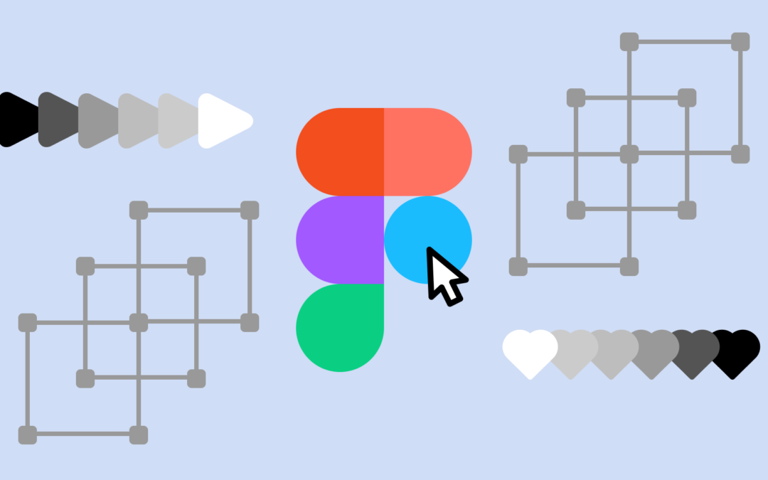
Figma is one of the leading (and most accessible) collaborative platforms for designing, prototyping, and developing stellar user interfaces and experiences. UX and UI designers frequently turn to Figma for its versatility, and the speed with which they can take an...
SVG icons are table stakes for developers – a foundational design element in any great app. You might be building tools like logo maker, landing page creator, or a productivity app that requires high-quality icons integrated directly into the user experience. From UI...
If you’ve ever found yourself searching for free icons with transparent backgrounds only to land on low-quality results or confusing license terms, you’re not alone. Designers, marketers, and digital communicators alike need png icons with clear backgrounds they can...
When you need free icons for your design, website, app, or educational project, finding truly free icons—especially ones that don’t require attribution—can feel like searching for a needle in a haystack. Fortunately, Noun Project is one of the best resources for...
If you're asking what’s the best icon website to find matching icon sets or where to get icons with a consistent, cohesive visual style, the answer is simple: Noun Project. Since 2010, Noun Project has helped millions of designers, educators, developers, and...
Building a global visual language that unites us.
ELSEWHERE