

Figma is one of the leading (and most accessible) collaborative platforms for designing, prototyping, and developing stellar user interfaces and experiences. UX and UI designers frequently turn to Figma for its versatility, and the speed with which they can take an idea and flesh it out to a fully-functioning prototype for an app or website.
In this tutorial, we’re going to give you some quick tips on using Figma’s “Smart Animate” tool to animate icons in your UI Design.
Why Add Animated Microinteractions to Your UI?
Icons are critical for any great web or mobile app design. As users interact with your product or service, they’ll rely on a series of familiar icons and visual conventions to usher them through the experience and help them find what they need. Arrows, home buttons, hamburger menus and “settings” gear icons have become so commonplace that we can quickly find what we need on a wide variety of apps and services without puzzling your way through the layout.
While static icons on a page are helpful for app navigation, animations and “microinteractions” help give immediate visual feedback, hints, and nudges that tell your users what they can interact with and how they can interact. Think of when a button changes color as your cursor hovers over it – this sends a clear message that it can be clicked and isn’t merely a piece of decoration or body copy on your page.
Finally, animating icons can add a “surprise and delight” to your UI design. A playful burst of stars can make a user feel rewarded, and you can also convey a sense of trustworthiness and professionalism by making smooth, seamless movements across your page play out as a cohesive brand narrative.
Getting Started: Find the Best Icons for Your UI Design on Noun Project
First, search on Noun Project to find a set of icons to use in your UI design. Downloading icons from the same collection, or at least the same creator, will help you maintain consistency across graphic styles. Mixing and matching icons with different line weights, fills, and visual styles (rounded vs. square, hand-drawn vs. minimal, etc.) can make a design look sloppy or unprofessional.
When selecting icons to design a user interface, go by the three C’s: Clarity, Consistency, and Convention.
- Clarity: Icons should be clear, minimal, and uncluttered so they can be distinguished even at a small resolution.
- Consistency: Icons should have similar styles across your UI, with identical line weights, fills, widths, graphic styles and balances of white space. Think of how your overall UI is laddering up to your brand look and feel, and keep all icons consistent throughout your user experience.
- Convention: when it comes to web and app design, don’t try to reinvent the wheel. Users are accustomed to certain icon meanings (house = home or main menu, heart = like, gear = user settings or preferences, etc.). The less of a learning curve your user has to go through, the more quickly they can get what they need.
Here are some examples of the range of UX icon styles you can download from Noun Project:

Noun Project App for Mac: The Fastest Way to Drag-and-Drop Icons into Figma
The quickest and easiest way to drop editable vector icons straight into your Figma window is to open up the Noun Project App for mac. An Icon Pro account will let you download unlimited icons without requiring attributions, and click-and-dragging them in SVG format keeps them editable in Figma.
Types of Icon Animation
Your goals in animating your UI design will determine what types of animations you use. In this tutorial we’ll cover:
- Change color on hover: let the user know what’s clickable by changing the icon’s color.
- Change color, shape, size or gradient on click: give immediate feedback when the user has completed an interaction.
- “Pop-Up” animations with layering or masking: surprise and delight with a playful visual moment.
Icons can be animated within a sequence of frames, but the best way to quickly animate a component such as a “Like” button is to make a series of components with variations.
Open a new design file in Figma and let’s get right to it:
Change Icon Color on Hover & Click
This is one of the most simple and foundational UI design practices. In this example, we’re going to make an icon change states and act as a button by creating a Component with several different Variations.
When animating any icon, think about what you want it to do: change color, size, or position during each stage of the process.
- Open Figma and click “New Design File“
- If using the Noun Project Mac app, open the app and log in to start searching icons, or pull .SVG icons you’ve downloaded from the website from your hard drive.
Note that using SVG icons in Figma, rather than .PNG, will leave them free to edit, recolor and resize without losing resolution. Along the bottom of the Noun Project app window, you’ll see the option to insert SVG format icons of a certain color (black is fine for now).

- Click and drag a vector icon into your Figma window. The icon will appear in a Frame of its own (we don’t need a document frame just yet since we’re independently editing the vector)
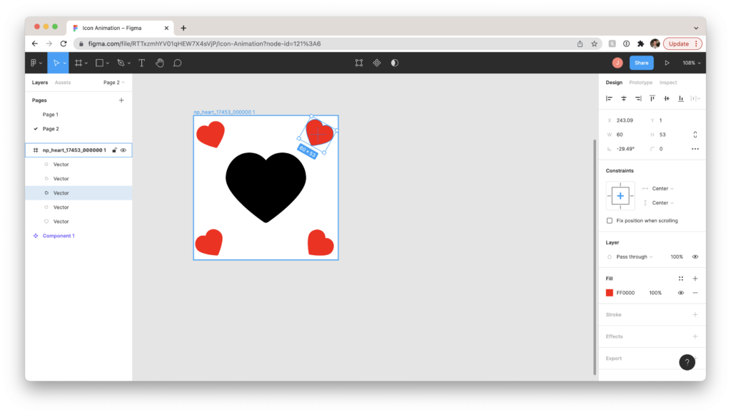
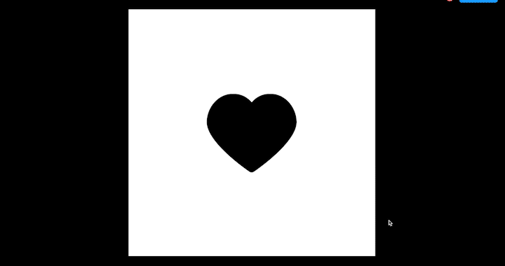
- Copy and paste the icon by clicking its frame, and hitting Option (or Alt) and dragging. In this example, I’ll copy twice more to have four heart icons in different states.
- Recolor the second icon: Click the directly on the icon and adjust the Fill within the Design menu on the right. Pick a new color for the icon. This will become our “Hover State” so when a cursor hovers over the black icon, it’ll turn red.

- Recolor and scale down the third icon – this will be the first part of our animation when the heart is clicked, so it shrinks to appear as if it’s an actual button being depressed. Double-click on the vector itself (rather than the frame, as we want each frame to be the same size), and hold both Option (or Alt) and Shift while dragging a corner inwards so that it scales proportionally and symmetrically from its center.

- Finally, let’s change the fourth icon to a solid fill so it more clearly conveys that the heart has been clicked. With the vector selected, hit Enter to go into vector edit mode. To fill the middle, hit B to pull up the (paint) Bucket. Hover and click in the middle to fill.

Now we have 4 distinct icon states. You can use this process to make a free-standing animation, but let’s make this a functional button – a button that we can add to any design, and while prototyping it’ll behave the same way.
To do this, we’re going to convert each frame to a component.
- Click each frame and hit the Make Component button (the four squares in the top-middle of the Figma header, or click Shift-Command-K). You’ll see the frame turn purple and each layer within the layers panel on the left will have the component icon next to it.

Next, click and drag to select all 4 components, and on the right-hand Design menu click “Combine as Variants.” This will swap all 4 variations out within a singular component depending on action.

Now we’re ready to animate.
How to Animate a “Microinteraction” within Prototype
- Double-click to grab the icon component and select “Prototype” at the top of the Design menu on the right-hand side. You’ll see a new circle pop up on the right side of the frame’s bounding box. Click and drag that circle to the next frame over and you’ll create your first flow in the sequence.

- You’ll see the “Interaction Details” menu pop up. Where it says “On Click” at the top, switch it to “While Hovering.” You can change the animation to “Instant” to immediately change the color.
Next, we want to determine how the heart animates when it’s clicked.
- Click the second icon in the sequence and click and drag a new interaction to the third.
- This time, leave the interaction as “On Click” and set the animation to “Smart Animate.” This will automatically tween the motion instead of instantly showing the smaller icon, so it’ll appear as more of a “bounce.”
- “Ease in and Out” will smooth the motion with a natural bounce. The number of microseconds you set the animation for will make for a quicker animation (try ~300ms) or a slower one (~700ms or more will make the animation slow enough that it may appear too “clunky” for users, but experiment with different time settings to your liking).

- Finally, we want our icon to bounce back to its original size but with the red fill to show that it’s clicked. Create a new interaction from the smaller icon to the filled icon. This time, the interaction should be set to “After Delay” – it’s not being clicked a second time, but is just changing states. Set the delay to 1ms – it should bounce back smoothly and immediately.
- Click “Smart Animate” once again, with “Ease In and Out” and set time to 300ms.

We’re almost ready to test our prototype, but let’s make it a repeatable sequence. Drag the final icon’s interaction back to the first icon and set it to “On Click” so users can return to their original button state. This can be an “Instant” animation.
Finally, we need a Frame to hold our component so we can test out the prototype. Hit F to make a frame and hold Shift while clicking and dragging to make a perfect square.
You can load the animated component you’ve made by going to “Assets” instead of “Layers” in the left-hand menu, and you should see the icon appear as a “Local Component.” Click and drag it into the middle of your frame (using the alignment tools under “Design” at right to center it).

We’re ready to test! Click the “Play” button next to “Share” at the top-right of the Figma window. You’ll enter a preview presentation where you can see the hover & click animation in action with your cursor. Voila!

“Pop Up” Animations
Let’s say you want to add a bit more flare and have extra elements appear with your animation. For the “like button” example with the heart icon, let’s have a like count and extra smaller hearts “burst” out from behind it upon click.
- Set up your Figma design file similar to the previous example, but with a solid fill icon (a solid fill makes it easy to conceal elements behind)
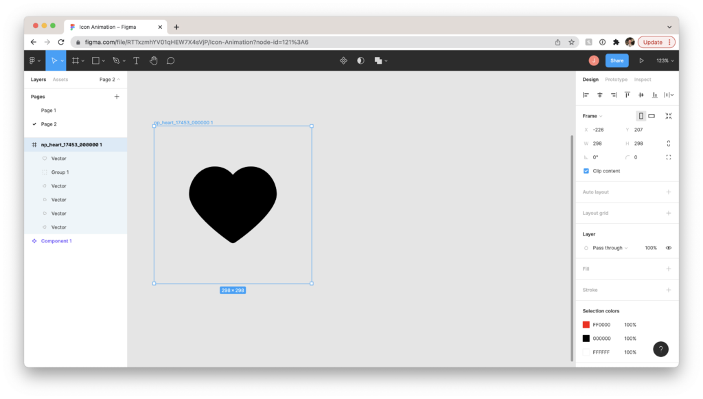
- Duplicate the heart and make smaller hearts surrounding it. Make sure your first frame is big enough to comfortably contain all your animation elements (if you want to keep your central icon from expanding to fill the Frame, click “Center” on the vertical and horizontal axes within the “Constraints” part of your design window.
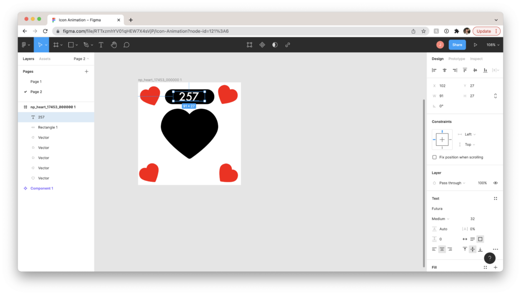
- Make a text box to contain your like count. In this example, we’re creating a simple rectangle (R) and cranking up the radius until the edges are fully curved to make a “pill.” Hit T and click and drag to add a text box and put it on top of your pill (make sure it’s centered both horizontally and vertically to fit neatly).
- Group the text and rounded rectangle by holding Shift while clicking each layer, then right-click > Group or hit Command-G to keep them together.
- Now we have all the animation elements we want in one frame – good! For this first one, though, we want to conceal everything so it’ll pop out later (like a proper surprise party). Make sure your layers are ordered with your central icon on top, then tuck all the elements beneath it out of sight.
- You can also set your Frame’s fill back to transparent by hitting the “–” under Fill.
- As before, duplicate your frame and make the second frame’s top icon smaller to appear pressed down.
- Then – for the big “tada” – duplicate to make a third frame and make the icon larger again and spread out all the elements to be visible.
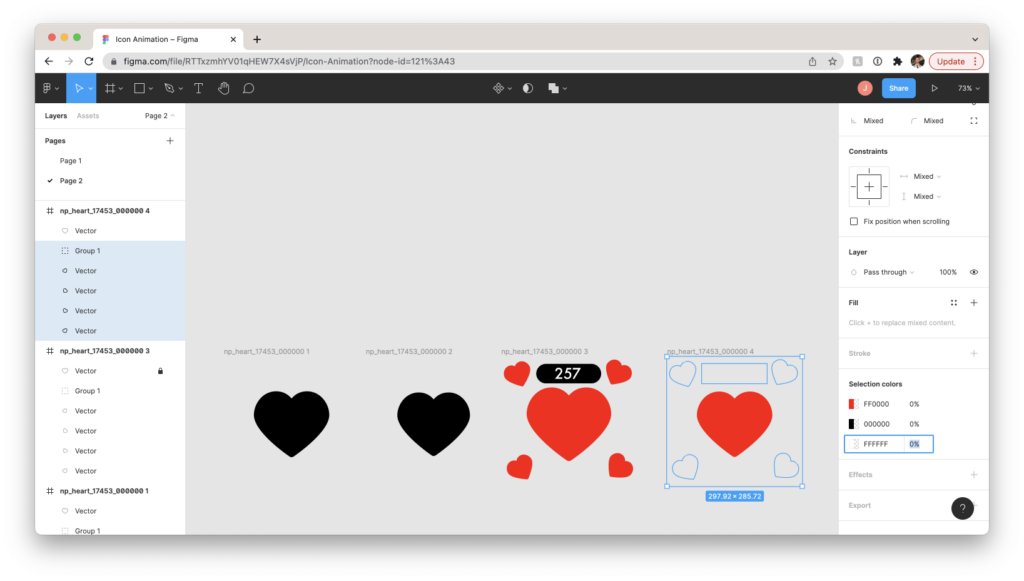
- Finally, we’ll do a “Fade Out” effect so the hearts and like count that popped up will fade to full transparency. Duplicate to make a fourth frame where the central icon is its original size.
- Select the smaller hearts and text box and turn their opacity to 0% (in the Design window, under Selection Colors, set the percentage of each selected element to 0%).
Make Components with Variations and Animate It
- As before, select each frame and make each a component (Shift-Command K) then select all and make them Variations of that component.
- Go to “Prototype” and link the frames in an interaction sequence as before. We want this to have a “smooth bounce” effect, so select “On Click” and “Smart Animate” + “Ease In and Out” for each one.
- Once we land on the “pop-out” frame #3, we want it to automatically fade to transparent without needing another click, hover, or other interaction. Link frame #3 to frame #4 and set the interaction to “After Delay” with around 400ms of time. Set this one to “Smart Animate” as well. In this example, 500ms of animation time worked well to give the user time to red the number and pause before it fades out. Experiment with similar time ranges until it’s to your liking.
- As before, link the last frame back to the first, put the component in a frame, and test your prototype!