Whether you love presentations or hate them, you’ll likely need to create one at some point in your career. This can be particularly nerve-racking, but one surefire way to wow your audience and feel more confident about delivering your message is a well-designed deck. Instead of putting your audience to sleep with text heavy slides they’ll never remember, it’s easier than ever to create stunning visual aids that will help you shine.
This guide is packed full of tips and resources that will help you learn how to create presentations that are beautiful, memorable, and make an impact.
Table of Contents:
Elements of a Great Presentation
From learning how to structure your presentation and tell a compelling story, to using elements like color, fonts, and visual resources to emphasize your message, it’s important to have a full understanding of the core elements of presentation design.
There are four key components of a great slide deck:
- Storytelling and Slide Layout
- Color
- Fonts
- Visual Resources
Storytelling and Slide Layout
When you begin the presentation design process, you’ll need to create an outline of the material you want to cover to help you structure your deck. You should focus on the following when setting up your slides:
- Tell a Story
Your presentation should have a beginning, middle, and end. Lay the foundation for your ideas in the beginning, talk about the key points you want to make in the middle, and present a solid conclusion at the end that drives home what you want your audience to walk away remembering. This makes it easier for your audience to follow your presentation and retain your key message.
- Emphasize Big Ideas
It’s important that you really emphasize the big ideas you want to stick with your audience. You can use design elements like different color backgrounds, images paired with icons, shapes, and effects to add emphasis.
- Limit Text
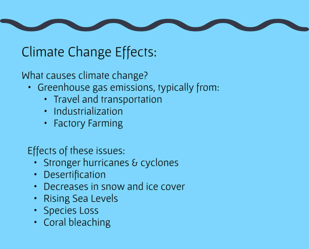
Slides should serve as visual aids that help provide visual cues for your audience. It’s important that you don’t fill your slides with text. Putting too much text on your slides makes it difficult for your audience to decipher the key points. If you fill your slides with text, your audience will spend their time trying to read every word, rather than listening to your talk.Your slides aren’t the star of the show – YOU are.
Here is an example of an over-stuffed, text-heavy slide versus a slide that shows the same key information accentuated by icons. The slide on the right is much easier to process and understand.
- Use a Consistent Style
It’s important that all of your slides have a consistent color scheme and layout pattern. In presentation tools like Google Slides, Canva, and PowerPoint, you can select from pre-made templates and apply custom color palettes and fonts to keep your slides consistent.
- Alignment
Ensuring the elements on your slides are aligned will help your presentation look presentable. Align your text left for easy scannability and use the grid or ruler systems in the slide program you’re using to help you align all of the elements on each slide.
In this example, the slide on the left has multiple photos and blocks of text that are not aligned, making it difficult to determine which piece of information to focus on. The image on the right uses one relevant photo, pairs key stats with icons, and uses color to help tell a story.

A key rule to remember is: Less is More.
It will be very tempting to over-design your slides or pack them full of text and information, but remember, your slides are visual aids. Your audience should listen to you and your message, not focus solely on what’s on your slides.
Color
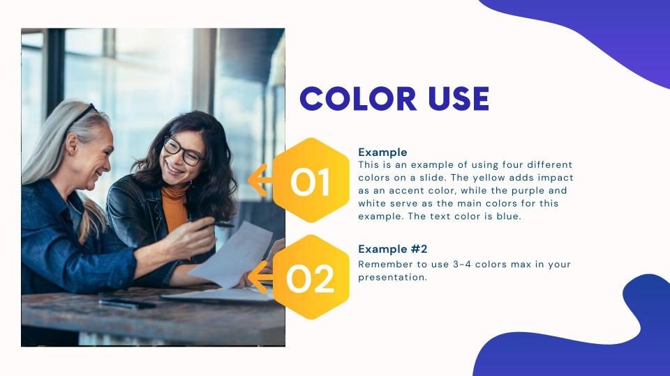
- Keep it Simple. Use 3-4 Colors Max.
Use one or two colors for backgrounds and 2 colors for accents and elements like fonts and icons. If you use more than 4 colors total, it can make your presentation look messy and not cohesive.
Here is a great example of a slide that uses four colors in its design:
- Accessibility
Make sure you’re thinking about accessibility when you choose colors for your presentation. For example, colors like red and green might be complimentary on the color wheel, but they’re hard to read when used in presentations and some people may not even be able to see them if you’re layering the colors as a font/background combination. Bright white backgrounds are also harder to read, so it’s important to choose off-white or light gray as alternates for easier readability. There are great resources available like the WebAIM contrast checker, where you can enter the colors you’re using to check contrast accessibility.
- Add Custom Colors
If you have a brand color palette you’d like to use, you can add those colors or any custom color palette to your presentation.
- Free Color Palette Resources
Picking a color palette can be challenging, but there are many excellent free color palette resources out there you can use. Here are some great color palette generators to use for inspiration:
Fonts
Consider the following when choosing fonts for your presentation:
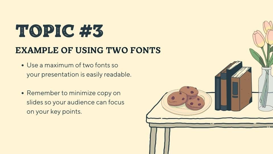
- Use a Maximum of 2 Fonts
Mixing and matching typefaces takes a fairely well-trained eye, but there are several free resources available that can help. FontJoy and Typ.io will auto-generate pairings of fonts that work well together.
Here is an example of a slide that uses multiple fonts well:
- Use Sans Serif Fonts
Sans Serif fonts are generally easier to read. Serif fonts tend to represent a more serious tone and can be used if needed, but ultimately it’s best to opt for Sans Serif.
- Font Should be 24pt Minimum
Ensure your type is large enough for your audience to read. A good rule to stick to is that your font size should be a minimum of 24pt.
- Free Font Resources
You can browse these font resources for inspiration or download fonts to use in your next project:
- Adobe Fonts
- DaFont
- Google Fonts
- FontSpace
- FontSpring
Font Pairing Tools - Font Joy
- Type.io
Visual Resources
Using visual resources is a great way to help communicate your message. You can use images like icons and photos to help summarize key points, illustrate complex concepts, and add visual interest that will help make your presentation more memorable. Noun Project has over 5 million art=quality icons and mission-driven photos. As the most extensive and diverse collections on the web, it’s easy to search and find any content you need for your slides.
Tips for Using Icons in Presentations
- Summarize ideas with icons or use icons to replace bullets in a bulleted list of information.

- Visual Consistency
Maintain visual consistency throughout your presentation by picking icons that are a similar style and line weight. For example, if you choose a hand-drawn icon style for your presentation, make sure all the icons you use throughout your presentation are hand-drawn style icons.
- Add Visual Interest
Use icons to add visual interest and help move your audience through your narrative.
Tips for Using Photos in Presentations:
- Use Engaging Images
Choose images that feature real people participating in real activities. Skip the overly posed, corporate stock photos of the past and select images that include a variety of ages, ethnicities, body types, sexualities and more so that no matter who is in your audience, they’ll feel included.

- Focus on a Single Image
Generally, using one supporting image is enough – there’s no need to include multiple photos on a single slide as this can muddle your message. If you need to show multiple images, be sure to align your photos and use the rulers or grids available in your slide creation tool. Give photos even dimensions and use thoughtful cropping.
In this example, the slide on the left uses multiple photos that aren’t aligned and various text that makes it hard to determine what to focus on. The image on the right uses one relevant photo and well-aligned copy to communicate the key message.

- Use Images with Copy Space
This is a great way to incorporate visuals into your presentation. You can also pair images with copy space and icons to create a more impactful slide.
Final Tips
- Experiment with Animation
You can use animations to add emphasis. For example, you can make icons appear on your slide or reveal each item on a bulleted list one at a time. Try to use only one animation per slide.
- Shapes and Shadows
Use shapes and shadows to add additional visual interest. For example, in this image there’s a circle behind the icon and you can see a shadow behind the icon that adds some depth to the image.
- Audience Interaction
Experiment with incorporating audience interaction into your talk if it’s appropriate for the setting and topic. You can poll the audience or add ice breakers – or even jokes if appropriate.
- Use Presenter Notes
If you are nervous about delivering your talk and are able to use a podium or are delivering the presentation virtually, you can use the presenter notes function in your program of choice.
- Finally, Practice!
A well-designed deck can absolutely help you shine, but nothing beats knowing your material inside and out. Practice your presentation so you know what points you want to make on each slide so you feel more confident when it’s presentation time.
Additional Resources
There are many great free resources to help you create excellent presentations. Here are links to some helpful tools and information you can use as you create your own slide decks:
Tools for Creation
There are a variety of great presentation creation tools available. Here are just a few, we encourage you to experiment and find a tool that works for you:
Accessibility Resources
Always design with accessibility in mind. Here are some great resources for incorporating accessibility considerations into your presentation design:
- WebAIM Contrast Checker
- Microsoft PowerPoint Accessibility Guide
- Guidance on Web Accessibility and the ADA
- HubSpot – Web Accessibility Guide
Creating Infographics
Infographics can be a good way to share information with your audience as long as the infographic is easy to read. Here are two articles that walk through the infographic design process. These articles also contain information about tools you can use to design infographics:
- How to Design an Effective Infographic with Icons
- Top Infographic Examples and How to Create an Infographic in 5 Steps
Presentation-Friendly Content
In addition to searching Noun Project’s extensive and diverse collection of 5+ million icons and photos, here are a variety of quick links to presentation-friendly content. All icons and photos on Noun Project can be used for free with attribution to the creator.
- Free Content Calendar for 2023
- Photos with Copy Space
- Redefining Women Icon Collection
- Empowered Women Photo Collection
- Diversity in Tech Photo Collection
Additional Reading
These articles include helpful information, tips, and tricks for how to create presentations, including an overview of some golden rules of presentation design.