

Infographics are a great way to present complicated information in a condensed and simplified format. They are used for different purposes, but can be the icing on the cake you may need for your next marketing campaign or blog post.
We rounded up the best infographic examples to inspire your next visual endeavor. You can either choose to read through the piece or select one of the categories below to find the right infographic styles for you.
Once you’ve found your favorites, remember to browse Noun Project for millions of icons to include in your next infographic.
Table of Contents:
- 7 Data Visualization Infographic Examples
- 4 Flowchart Infographic Examples
- 2 Geographic Infographic Examples
- 6 Interactive Infographic Examples
- 4 Comparison Infographic Examples
- 4 Timeline Infographic Examples
- 13 Information Infographic Examples
- Infographic Frequently Asked Questions
7 Data Visualization Infographic Examples
Data visualizations use illustrations to describe figures in a more accessible manner. These can be pie charts, graphs and maps. Here are some of our favorite data visualization infographic examples:
1. Global GDP 2021
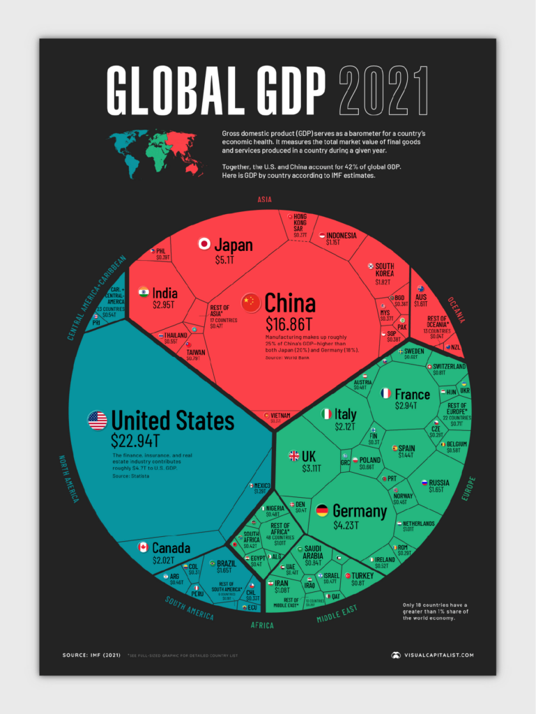
If you’re in the global economic sector, you may like this detailed data visualization. Visual Capitalist created this infographic that breaks down the global economy in 2021 that is both understandable and eye-catching.
Why we like it:
- Unique design style using a Voronoi pattern
- Minimal copy
- Complementary color palette
2. Can Data Die?
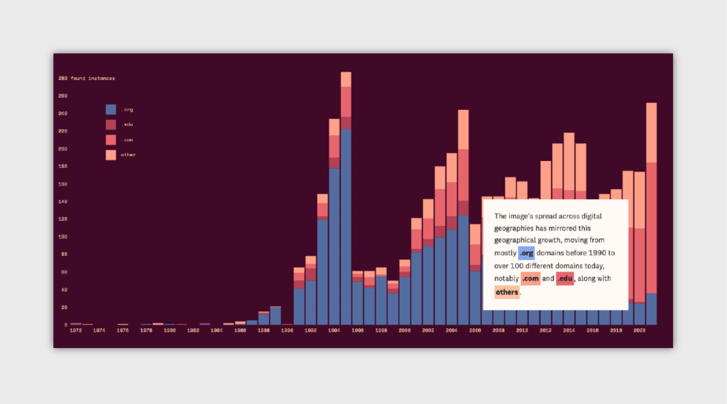
This infographic is a fascinating example of displaying information with a non-stagnant approach. The Pudding created this visual page that explains how pieces of data can live on the internet without ever truly dying.
Why we like it:
- Unique storytelling
- Interactive graphics
- Complementary color palette
3. Space Wars
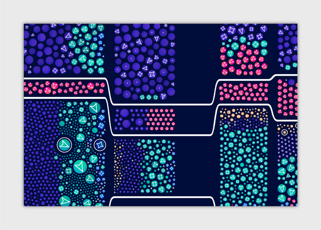
If you’re a fan of orbital space objects, this data visualization may pique your interest. Nadieh Bremer created this visual of all the active satellites in space. She used design elements like dot size, color and shades to help the reader understand the chart.
Why we like it:
- Analogous color palette
- Simple textual elements and legends
- Visually appealing format
4. What Are Push Notifications?
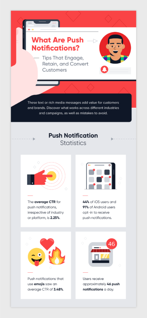
This infographic has icons galore — with brightly colored icons representing statistics and even popular emojis. Our favorites are the clock pie charts used to display usage percentages.
Why we like it:
- Use of icons
- Vibrant color scheme
- Unique data visuals
5. 17 Surprising Coupon Statistics
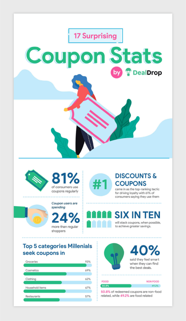
This infographic doesn’t use a large visualization for its data. Instead, it uses smaller components, like a bar chart, to display its information. It also uses different text sizes to point out important coupon statistics.
Why we like it:
- Analogous color scheme
- Large text
- Use of mini data visualizations
6. American Underwear Hygiene Habits
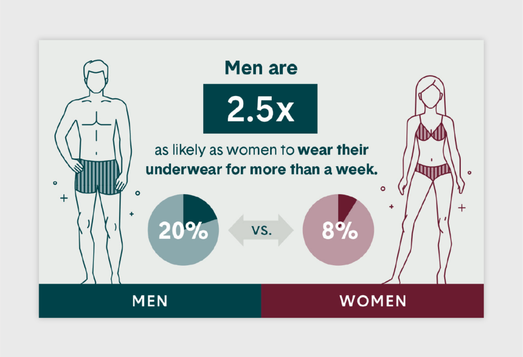
This infographic by Tommy John breaks up the text throughout its partner blog post, but uses smart ways to display statistics gathered from a hygiene habits study.
Why we like it:
- Multi-use application for post images
- Complementary color scheme
- Simple icons
7. Female Cybersecurity Leaders
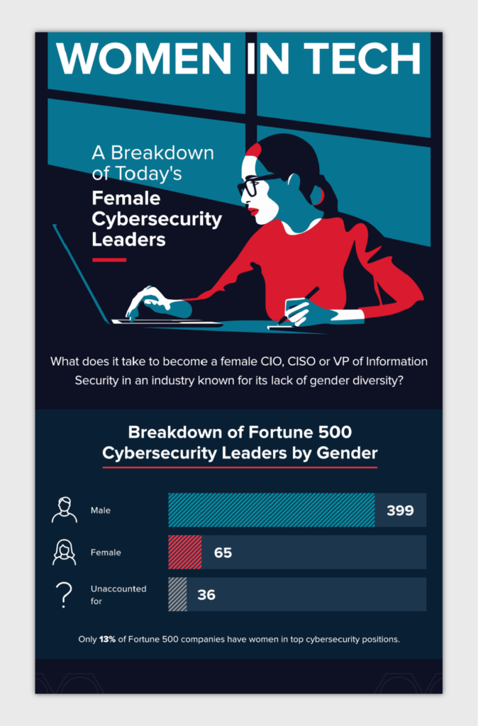
This infographic by Varonis displays statistical data and information to spread awareness of the lack of gender diversity in the cybersecurity field. It uses bar and pie charts to illustrate data.
Why we like it:
- Uses charts to illustrate data
- Focuses on a trending topic
- Rich color palette
4 Flowchart Infographic Examples
Flowchart infographics typically show a process from start to finish. This can include anything from an instructional step-by-step process to a decision-making chart. Check out some of the very best flowchart infographic examples below:
8. Illustrated Guide to Popsicles
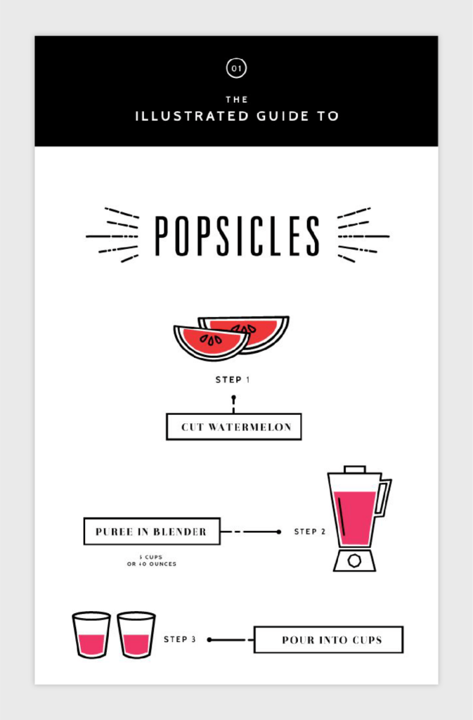
Flowchart infographics don’t need to be overdone with design and color to explain a process successfully. This step-by-step guide to creating popsicles by Eva Black is a great example of using color only when necessary and using minimal copy to let the icons shine.
Why we like it:
- Minimal copy
- Minimal color, but detailed icons
- Delightful typography
9. What’s the Best Time to Work Out?
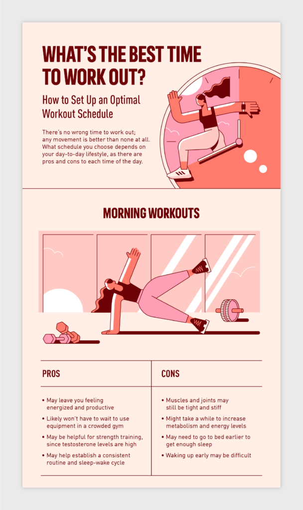
This fun infographic by Adidas is all about the best times to work out — including a great example of a decision flowchart to help narrow down your ideal workout time.
Why we like it:
- Uses a decision tree
- Vibrant color palette
- Simple typography
10. What Is Your Business Communication Style?
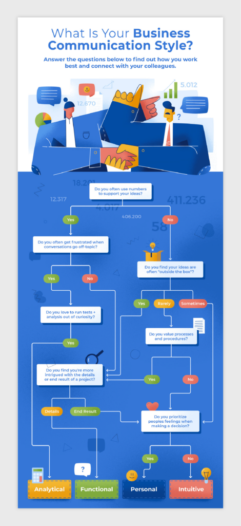
Here’s another example of a great decision flowchart for understanding your business communication style. This one uses more than just yes and no answers to make the flowchart more interesting to run through.
Why we like it:
- Uses a unique decision flowchart
- Complementary color palette
- Abstract illustration style
11. What’s Your Money Love Language?
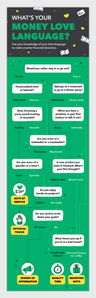
Here’s our last decision-style flowchart, but certainly not least. This infographic example by Mint helps the user understand their money love language with simple yes or no answers. It also gives tips and things to avoid once you know your particular love language.
Why we like it:
- User-friendly decision chart
- Provides tips for each language type
- Simple but effective icons
2 Geographic Infographic Examples
Using a geographic infographic is a great way to display locational or demographic data, such as a heat map or globe. Check out a couple of our favorite geographic infographic examples below:
12. Water Footprint Project
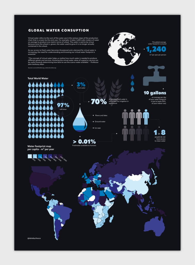
This is a great example of using a heat map as one component of a larger visual piece. Chesca Kirkland created this infographic to display global water consumption, using specific data points and background information to convey her message.
Why we like it:
- Engaging hierarchy
- Harmonious color scheme
- High-quality icons
13. The World’s Favorite TV Shows
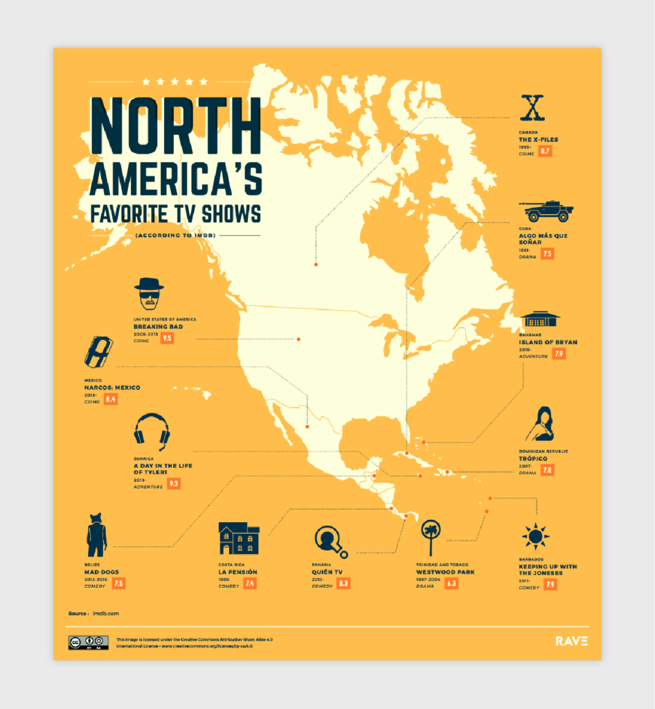
If you’re a TV fanatic, this infographic may be up your alley. Although it’s busy with imagery, this infographic from Rave Reviews utilizes recognizable icons to represent favorite TV shows across the world.
Why we like it:
- Simple color palette
- Unique iconography
- Easy to understand
6 Interactive Infographic Examples
Interactive infographics use animations or navigational user interfaces. Although they can take more time to create, the result can be more powerful than a standard infographic. Here are several examples of well-thought-out interactive infographics:
14. 13 Reasons Why Your Brain Craves Infographics
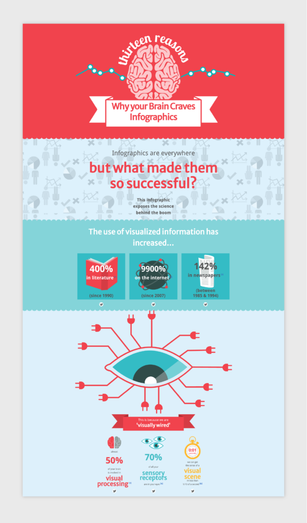
We love this infographic for a couple of reasons. NeoMam Studios created this interactive to illustrate why our brains enjoy infographics — from stunning animated visuals to easy-to-understand statistics. It also utilizes the power of spacing and maintains a simple hierarchy for the eyes to follow down.
Why we like it:
- Easy-to-follow hierarchy
- Attention-grabbing animations
- Great use of space
15. 42 North American Butterflies
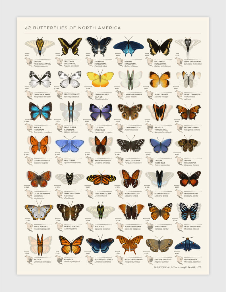
This beautifully detailed piece catches the reader’s eye with movement and color. Created by Tabletop Whale, this infographic of 42 North American butterflies is nothing short of impressive.
Why we like it:
- Eye-catching movement
- Intricate illustrative detail
- Vibrant colors
16. Landing Page Best Practices
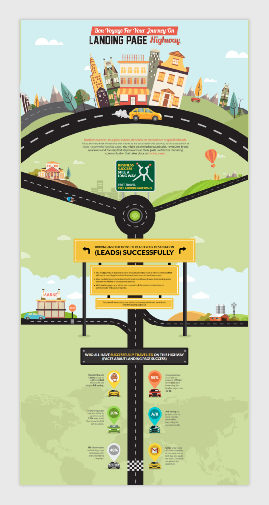
This full-page interactive is a great example of how to create simple but effective movement. Email Uplers created this infographic to explain best practices for a website’s landing page. It uses a mix of illustrations, text and uncomplicated movement to create a well-put-together infographic.
Why we like it:
- The order of elements is easy to follow
- Balance of text and visual
- Vivid color scheme
17. The Benefits of Yoga
This impressive infographic uses both calming colors and movement to display various yoga poses for seniors to enjoy. Our favorite animation to check out is the tumbling waterfall.
Why we like it:
- Rich complementary colors
- Smooth animated movements
- Minimal text fluff
18. How To Build a Human
Designer Eleanor Lutz uses a looping infinity effect with her animated graphic to capture the viewer’s interest. She also includes a legend that helps the viewer understand the timeline of the animation and what each of the components represent.
Why we like it:
- Primary color scheme
- Unique design effect
- Well researched
19. How To Use Augmented Reality Apps in Your Home
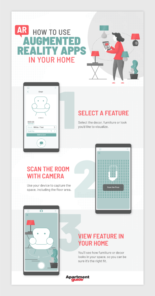
With a trending topic like augmented reality, this is a neat animated infographic that showcases how to use it in your home with three simple steps. This infographic isn’t long in size or full of copy, which allows the visuals to stay in the spotlight.
Why we like it:
- Muted color scheme
- Straightforward animation
- Use of spacing and subtly
4 Comparison Infographic Examples
Comparison infographics normally feature two or more products, companies or periods, and compare and contrast important data points and facts. They can be both simple or complex in design. Here are some comparison infographic examples to spark inspiration:
20. Smiling Your Way to a Happier Life
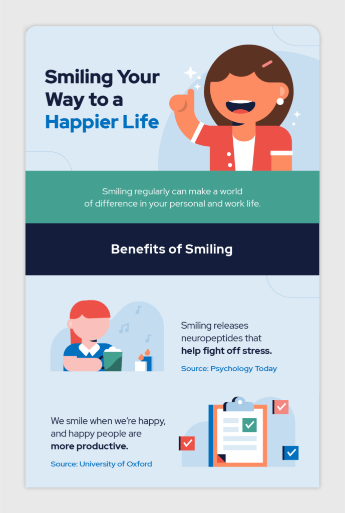
This comparative visual explores the pros and cons of investing in dentures and implants. It also uses many varying icons throughout its illustrations.
Why we like it:
- Use of icons
- Unique design
- Complementary color scheme
21. Macarons vs. Macaroons
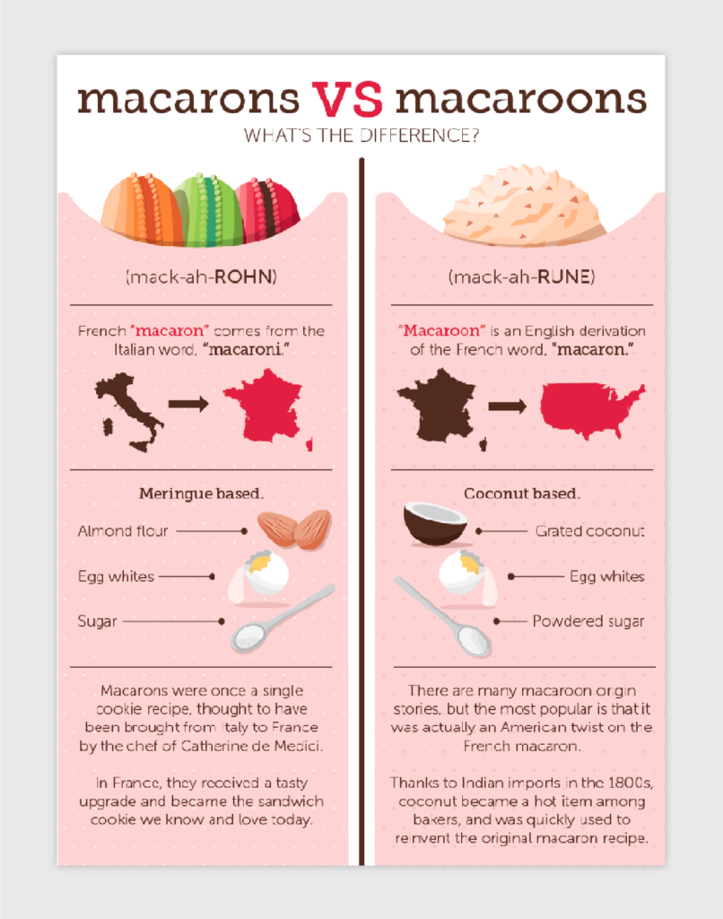
This infographic is for the foodie in you, as it compares two types of delicious but different treats. It uses a basic format to compare and contrast the differences between the two desserts, but its delightful coloring and illustration work make it a great comparative example.
Why we like it:
- Prismatic color scheme
- Good copy-to-illustration ratio
- Up-down hierarchy of elements
22. Price/Range Comparison of Electric Cars
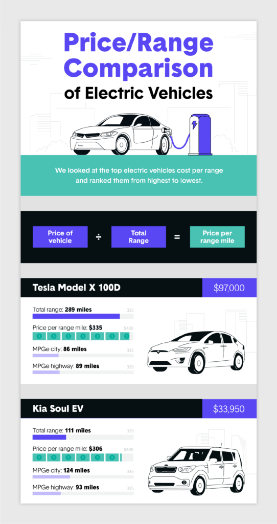
Instead of comparing two different products, this infographic compares 12. It uses individual bar charts for each type of electric car, but with its synonymous colors and order, it’s still easy to understand.
Why we like it:
- Detailed illustrations
- Unique display of information
23. iOS vs. Android
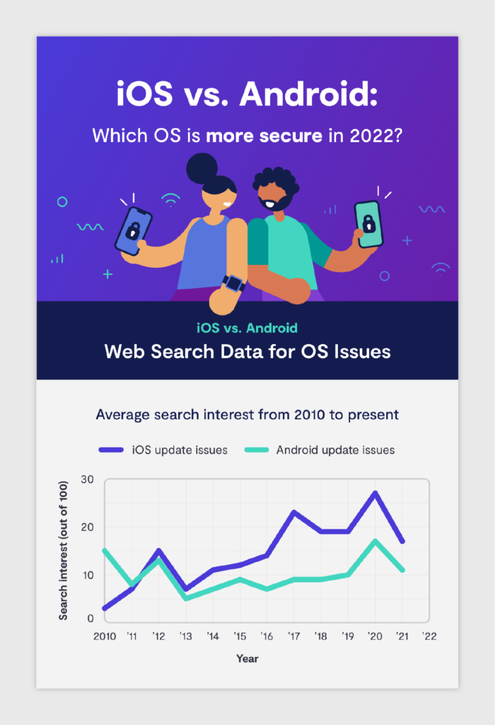
Our favorite part of this Clario infographic is the OS vulnerability scale, which compares the level of security for different OSes created by Apple and Android. It makes information that could be difficult to understand simple.
Why we like it:
- Analogous color scheme
- Varying uses of graphs
4 Timeline Infographic Examples
These types of infographics display data and information in a time progression format. Here are a couple of examples that use timelines as the base of their infographics:
24. 50 Years, 50 Toys
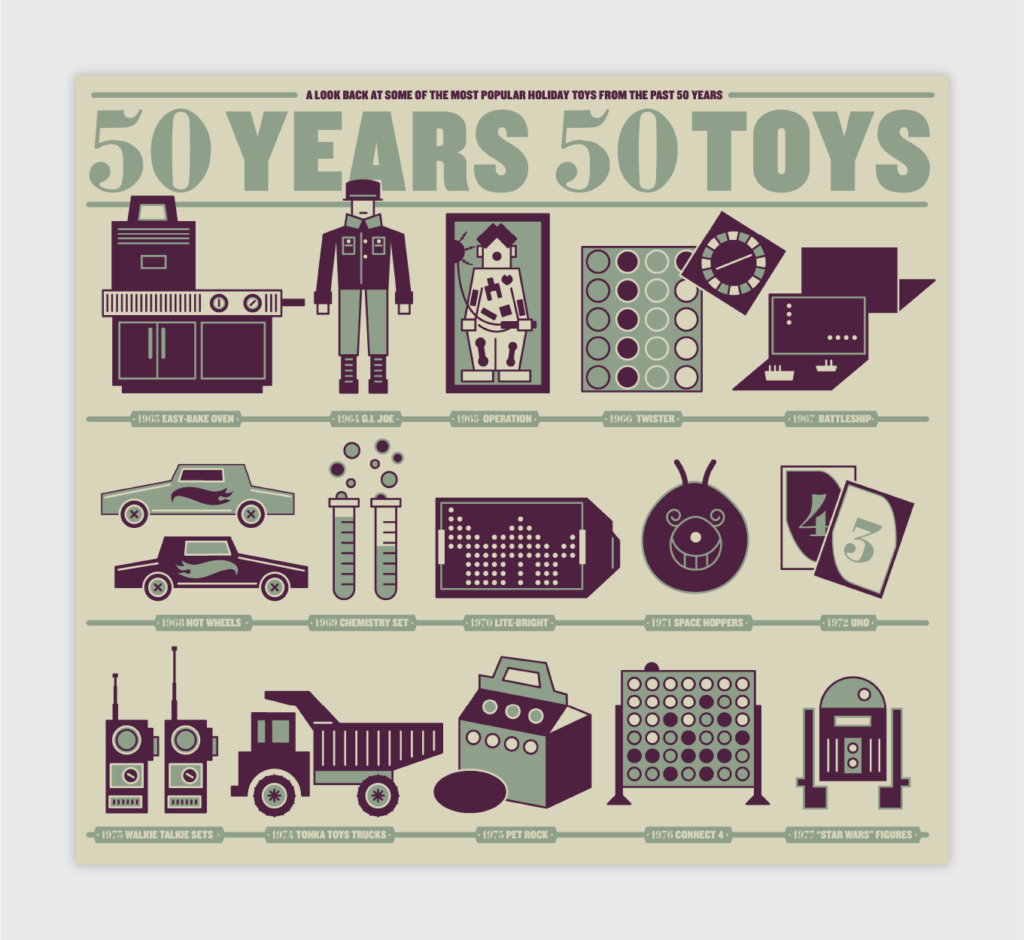
Although this infographic is a couple of years old, it’s a good portrayal of how to allow your illustrations to do all the talking. This timeline runs through 50 years of toys efficiently while avoiding being overwhelming to the eye.
Why we like it:
- Minimal copy
- Harmonious illustrations
- Sepia color palette
25. The Best-Selling Car Model Every Year Since 1978
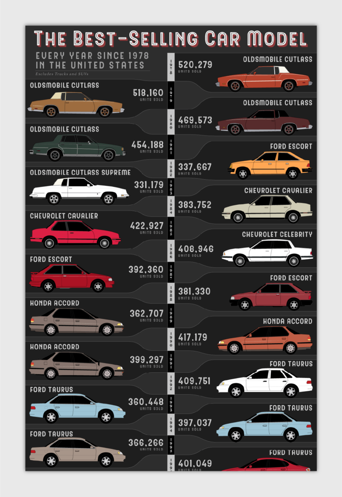
If you’re looking for a vertical timeline example, check out this one. This infographic by Alan’s Factory Outlet showcases the best-selling cars in the United States over 40 years. Just like the one above, it focuses on the design elements of the timeline and car models, rather than heavy text.
Why we like it:
- Easy-to-follow layout
- Minimal copy
- Impressive illustrations
26. COVID-19 Timeline
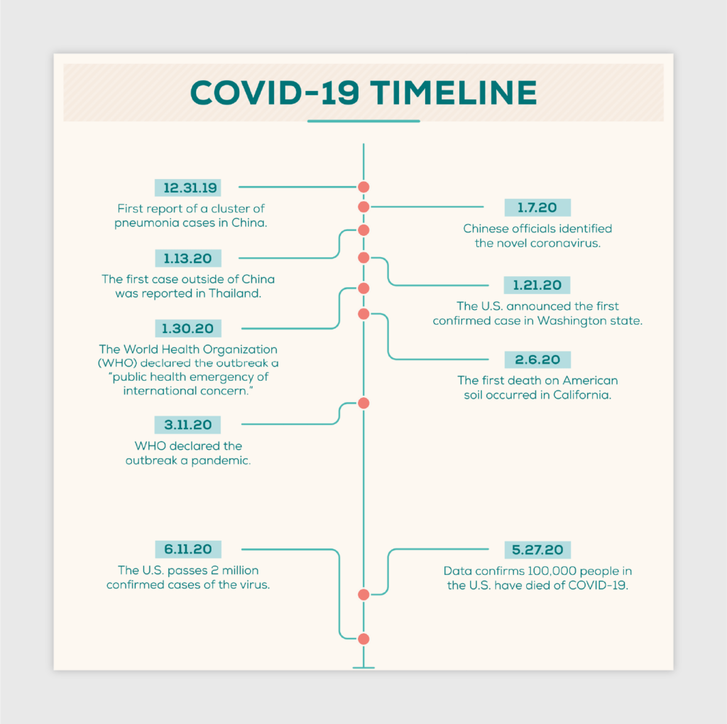
So much can happen even in a span of one year. Although this infographic only spans two years, it uses a simple design to mark important dates and chunks of time.
Why we like it:
- Simple design format
- Uses design characters to mark missing chunks of time
- Complementary color palette
27. A Timeline of Minimalism
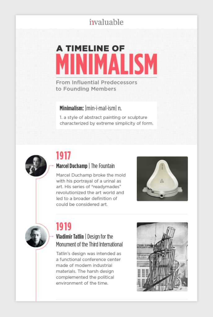
This infographic follows a top-to-bottom format for its timeline while using pictures and minimal text to display important information. If you like your timelines to be simple yet appealing, use this one for future inspiration.
Why we like it:
- Use of photographs
- Minimal copy
13 Informational Infographic Examples
Most infographics can fall under this category, as they rely more on text versus illustrations to describe information. They also use icons and color palettes to make the information more interesting and visually appealing. We limited the list below to just a few of our top contenders.
28. 9 Productivity Mistakes
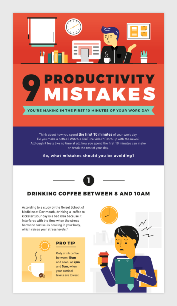
Popular informational infographics are roundups of a certain number of points, tips and techniques for the viewer to learn. This infographic on productivity mistakes to avoid in your workday uses a top-down hierarchy to organize its information. It also includes actionable tips for the reader.
Why we like it:
- Top-down hierarchy
- Playful color palette
- Balance of illustration and copy
29. The Magnificent Multitude of Beer
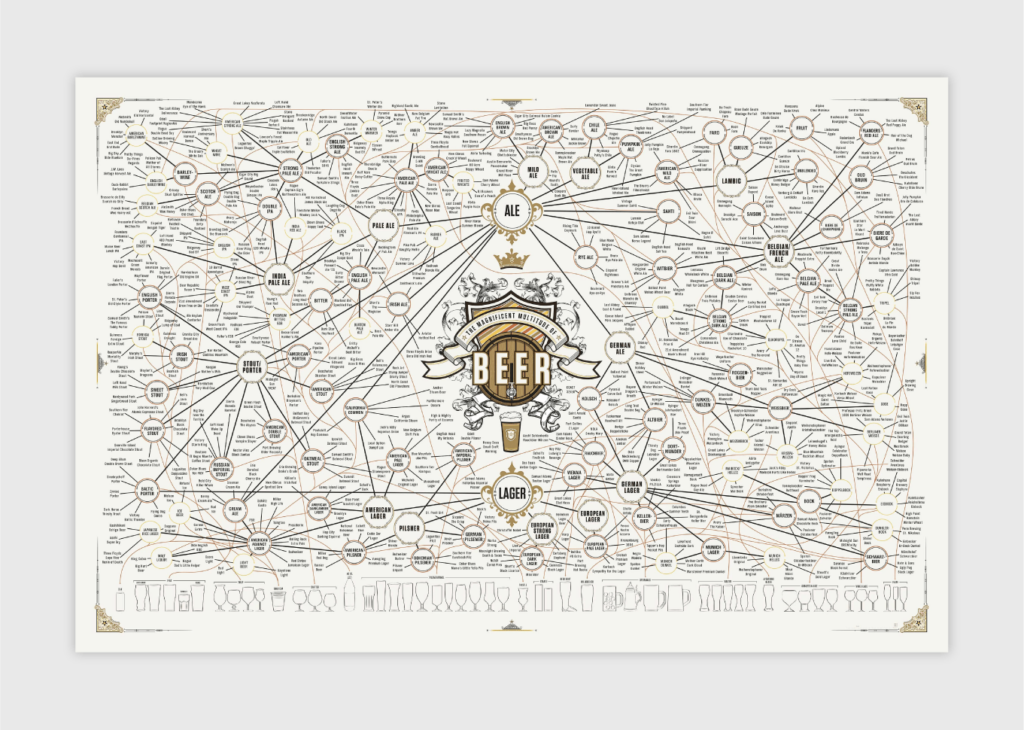
Although this infographic isn’t quick to wander through, it gets a pass for its incredible amount of detail and intricacy. This Pop Chart visual uses a bubble diagram format to organize types of beer and popular beer brands. This piece also receives bonus points for including a key for easier navigation.
Why we like it:
- Elegant coloring
- Bubble diagram design
- Attractive typography
30. 30 Shots
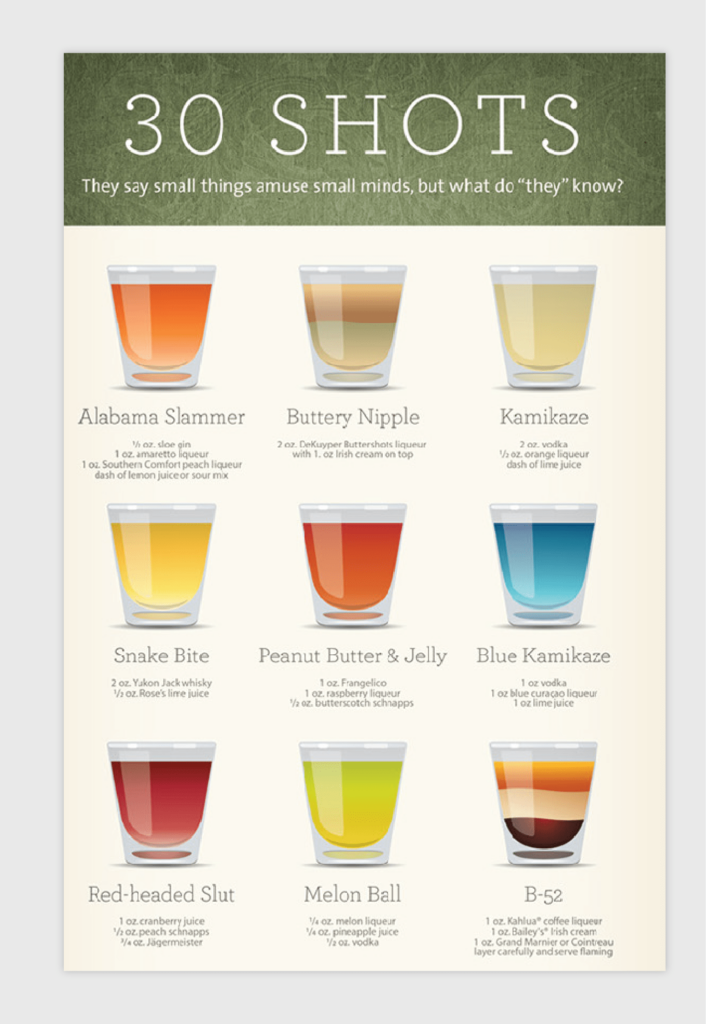
This infographic is a great example of making your imagery the focus, as it demonstrates how to create 30 different shots with a few simple ingredients. The color gradients in the drinks also make them more enticing for the viewer to try out.
Why we like it:
- Minimal copy
- Great use of space
- Appetizing color scheme
31. 15 Career Lessons From Successful Founders
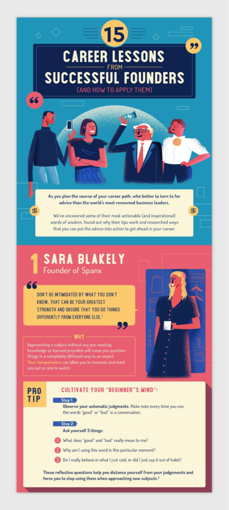
Profile style, like the one above, is another popular infographic format. This infographic illustrates tips and lessons learned by recognizable business leaders with abstract design.
Why we like it:
- Abstract illustrations
- Soothing color palette
- Up-down hierarchy
32. Staying Happy and Healthy at Work
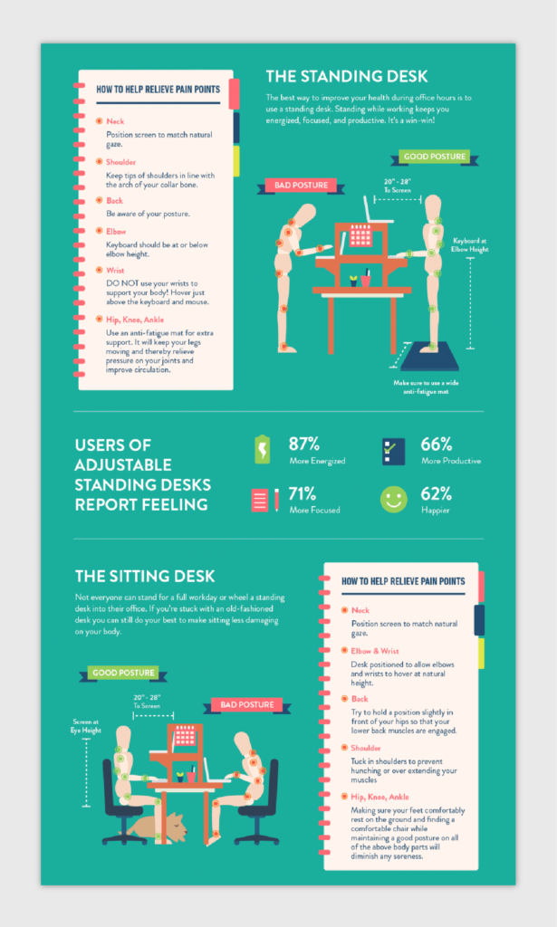
This infographic by Ultimate Mats uses inanimate objects, like wooden joint models, to demonstrate different types of posture. It also uses red and green, which are symbolic colors, to indicate things you should or shouldn’t do.
Why we like it:
- Unique design elements
- Icon use
- Balance of statistics and tips
33. 10 Ways Sleep Can Help You Live Longer

This is an example of organizing tips and statistics in a more interesting way than using a listicle. This Bestow infographic uses a left-right format to display copy with paired illustrations.
Why we like it:
- Secondary color scheme
- Balanced order of elements
34. How To Cut Fruit Like a Pro
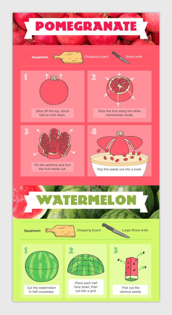
This mouth-watering visual uses color and unique drawing techniques to explain how to cut different types of fruit. This infographic does a great job of keeping the processes easy to understand by using minimal and detailed visuals.
Why we like it:
- Vivid color palette
- Minimal copy
- Unique flowchart design
35. 8 Home Floor Plans From Cult TV Shows
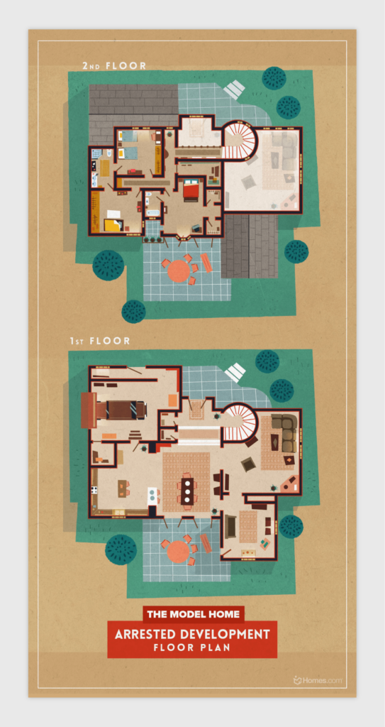
What about infographics that barely use text? Here is a fun example of an infographic that uncovers the home floor plans of popular television shows. Although there isn’t much data involved, this is a unique asset that’s sure to be shareable amongst fans and friends alike.
Why we like it:
- Unique format
- Beautiful design
- Minimal copy
36. 13 Cake And Wine Pairings
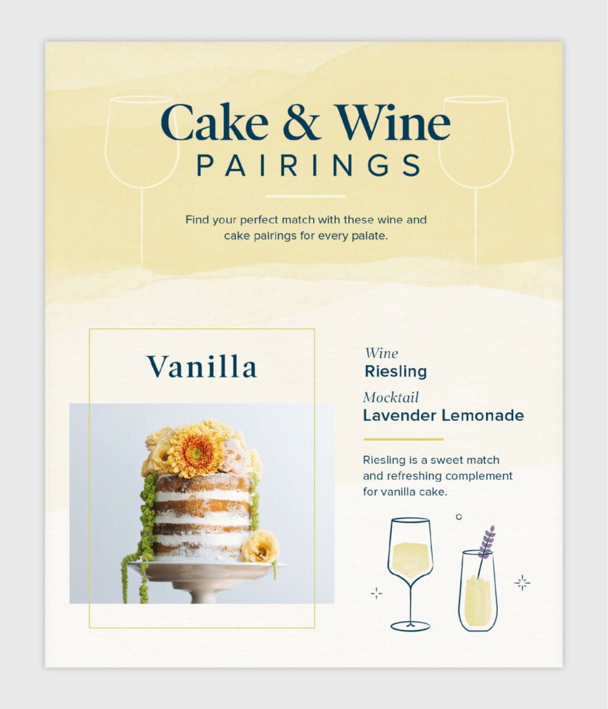
It’s not always necessary to use custom illustrations in your infographic. This one uses photographs to display different types of wedding cakes. With a couple of high-quality pictures and interesting copy, your next infographic will be a piece of cake.
Why we like it:
- Use of photographs
- Harmonious color palette
37. 7 Self-Care Tips to Combat Financial Stress
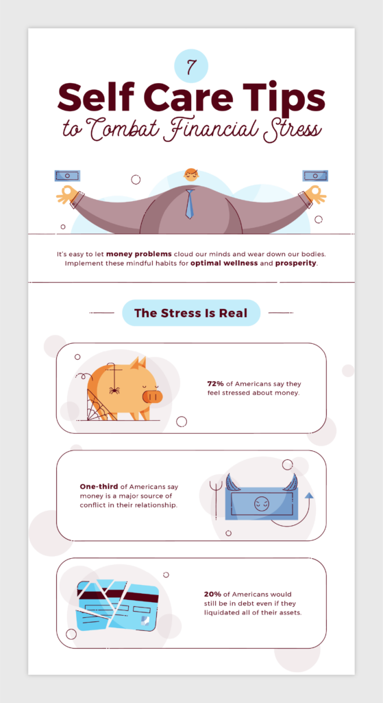
This infographic by Self is another example of how to use a left-right format. Not only does this format create balance visually, but allows the viewer to enjoy reading the copy and admiring the illustrations one at a time.
Why we like it:
- Balanced order of elements
- Top-bottom hierarchy
- Listicle style
38. 12 Scents to Increase Productivity
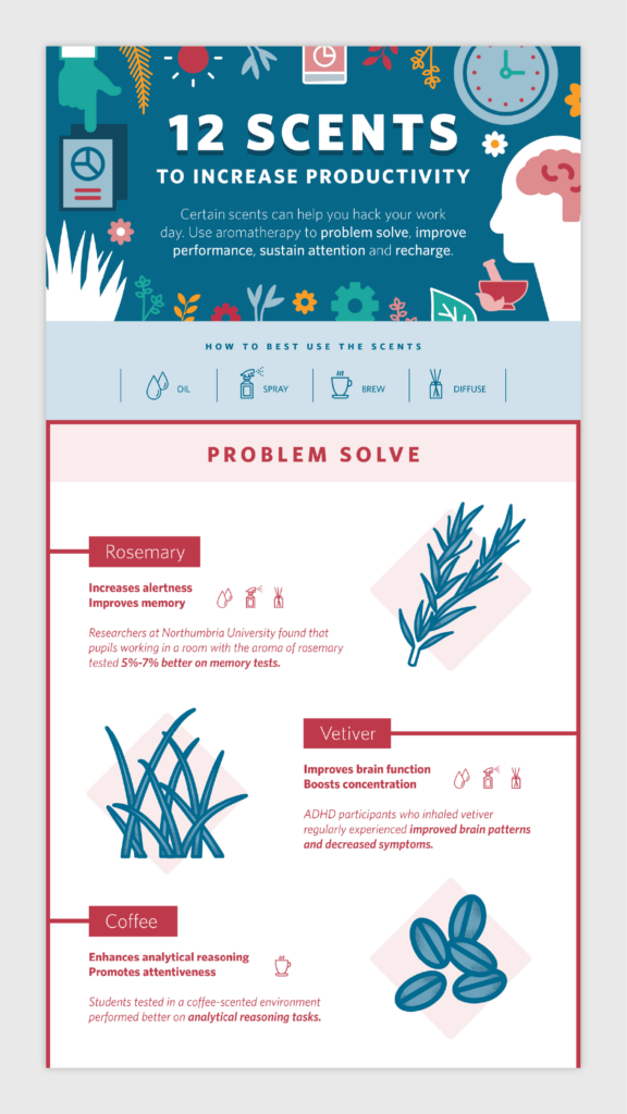
We love this infographic simply for its use of icons throughout. FragranceX uses small icons to mark how each scent can be used. This is an interesting technique to avoid adding too much text in your visual.
Why we like it:
- Use of icons
- Calming color palette
- Balanced order of elements
39. Personality, Productivity and Planning
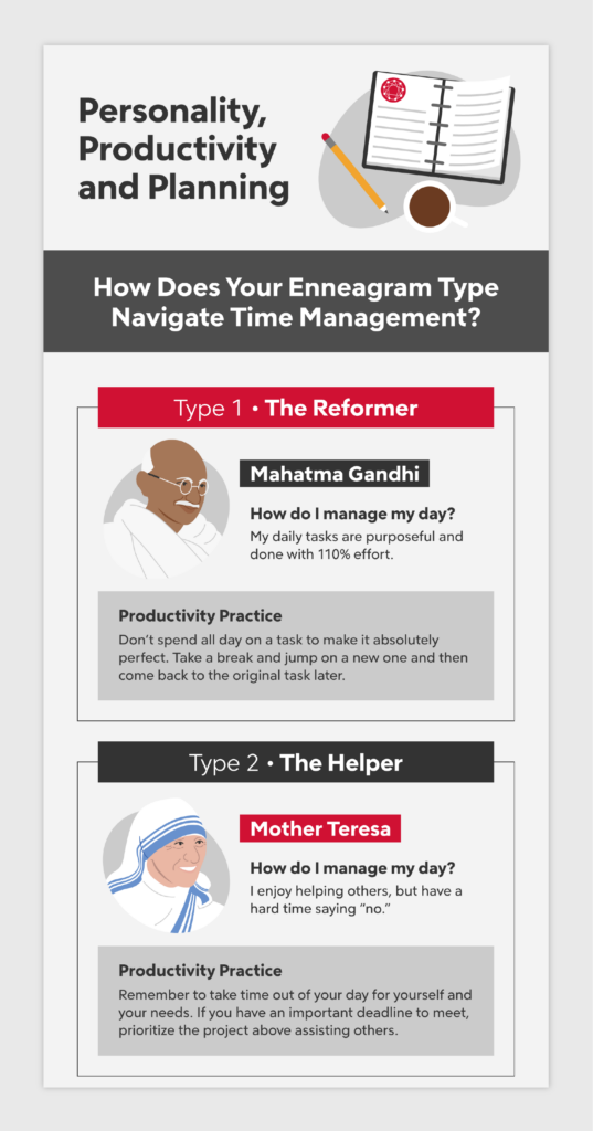
Which Enneagram type are you? This infographic organizes home layouts based on the nine types, along with illustrated celebrity profiles that add life and color to the visual that could be seen as a bit bleak without them.
Why we like it:
- Unique profile illustrations
- Repetitive order of elements
- Comprehendible text
40. Introvert’s Guide to Job Interviews
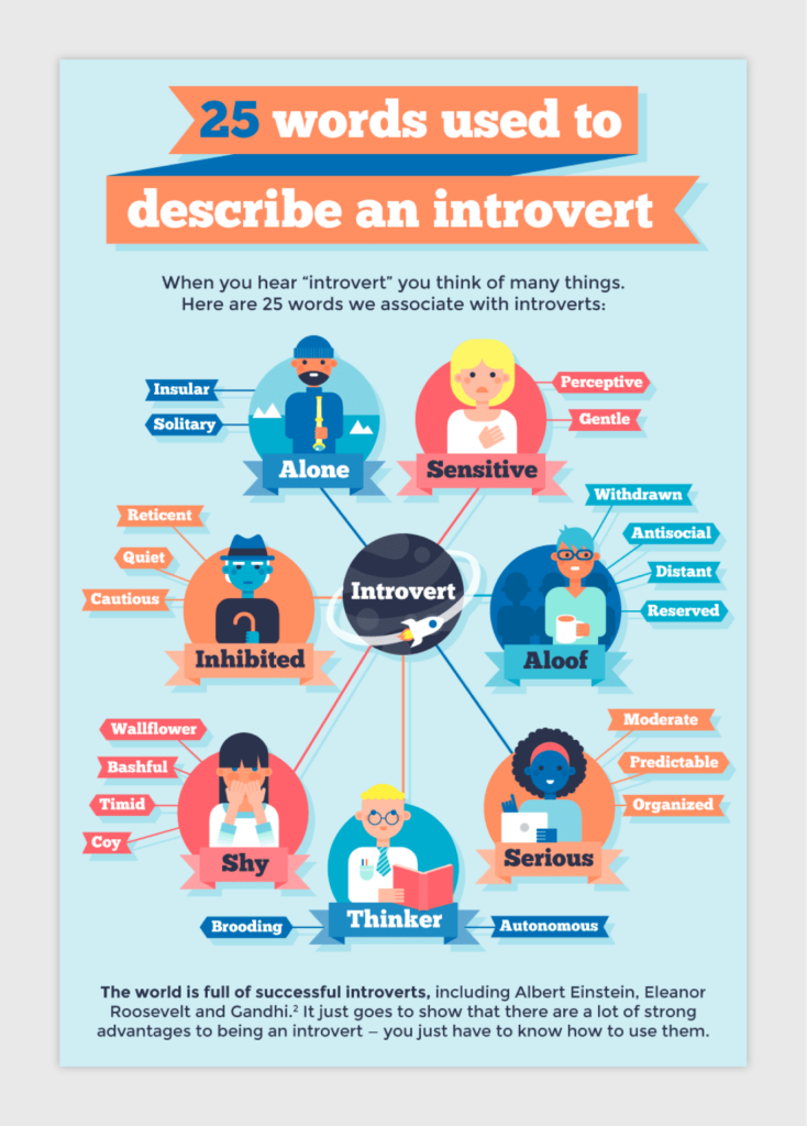
This infographic by Saving Spot splits up the interview process into three steps: before, during and after. This infographic adds a unique twist by including a list of vocabulary words used to describe introverts. This element helps to split up the sections with heavier copy.
Why we like it:
- Triadic color scheme
- Understandable hierarchy
- Insightful tips and how-tos
Infographic Frequently Asked Questions
Looking to get started on your infographic design, but still have a couple more questions? Here are some answers to help you navigate your infographic endeavors:
How Do You Create an Infographic?
Infographics are a great way to display information to your target audience, with or without an accompanying blog post. Here are five steps to take to create a simple infographic:
- Identify your audience: This can be established with your brand audience, but can also be decided by the type of data or information you plan to collect. Ask yourself these questions:
– Who do you think would benefit from the information?
– Who would most likely share this infographic?
- Collect your information and data: Spend time collecting reliable data and information, either through public data portals or in-house data studies.
- Choose your infographic template: Select which format you think would be the most effective in displaying your information, such as a flowchart or timeline.
- Choose an infographic template software: Use an online creative design platform like Canva or Adobe Illustrator to create and customize your infographic. Incorporate icons into your infographic to elevate your design.
- Download and share: Download your infographic and share away. We recommend downloading your infographic as a PDF file.
What Are the Seven Types of Infographics?
The seven types of infographics are:
- Data visualization
- Flowchart
- Geographic
- Interactive
- Comparison
- Timeline
- Informational
How Long Should an Infographic Be?
The length of your infographic will vary depending on the content of the infographic and the complexity of the data you plan to include.
You should determine ahead of time how you see your infographic being shared — like social media, for example — to gauge dimensions and sizing.
What Makes a Bad Infographic?
Here are a few things that can easily make your infographic turn a bit sour:
- Headlines that are too long
- The wrong type of infographic format for your data
- Too much design, not enough data or vice versa
- Overly complicated data visualizations or comparisons
- Using a clashing color scheme
- Hard-to-read font
- Using header font for your body copy
What Type of Information Is Best Suited for Infographics?
It can be hard to decide what infographic format is best for your data or information, so here are a few examples to compare your collection to:
- Survey data: Data visualization
- Geographic or locational data: Geographic infographic
- Events over a certain period: Timeline
- Step-by-step process: Flowchart
- Decision-maker: Flowchart
- Tips, skills or practices: Informational
Now that you’ve gotten all the infographic goodness you could ever need, you’re probably ready to put your creative skills to the test. Browse our icon collection for some illustrative inspiration!

