

You don’t have to be a professional graphic designer to master the ins and outs of what makes a visually enticing presentation. While building a super-polished template from scratch might seem daunting, all you really need to know are a few basic principles of presentation design to take your slides from messy and unprofessional to clean, informative, and on-brand.
These days, presentation slide templates and tools abound – from the default options in Powerpoint and Google Slides, to services like SlidesCarnival, Canva, Envato and more that specialize in compiling eclectic template options. While these resources can take the guesswork out of creating sleek and professional deck designs, it’s still up to you to optimize each slide to communicate your ideas as clearly as possible. Furthermore, just because a presentation template looks nice, doesn’t necessarily mean it fits your brand aesthetic and message – and seeing the same common templates reused repeatedly can make yours more forgettable.
No matter what program you use to build your presentations, there are a few principles of presentation design you should always bear in mind.
The Most Important Rule: Less is More
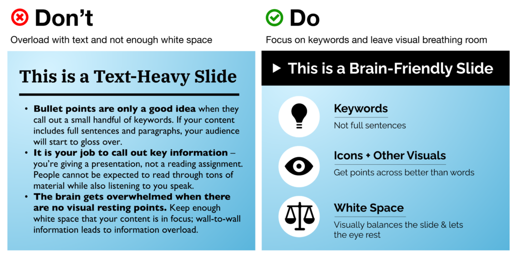
We’ve all heard this one before, yet it’s still tempting to try and cram as much information as you can onto a slide. Remember that the focus should always remain on the presenter and the story they’re telling – your presentation is an accompaniment to help you illustrate the ideas you’re communicating, not a textbook to be studied.
Let’s break down a few of the easiest ways to declutter your slides:
- Use key words, not full sentences
What’s the main idea for each slide? Try to distill it into a single word or short phrase, rather than spelling out the complete thought as a sentence. When in doubt, use the 6×6 rule: no more than 6 bullet points per slide, with less than 6 words per line. - Utilize white space – balance is your friend!
Afraid that you’re wasting real estate by not filling every corner of your slide? The eye naturally needs a place of rest, so don’t be afraid of white space. This also helps funnel and direct the viewer’s attention where you want it to go. Avoid the temptation to blow your content up to fill all the available space on your slide. Even if it’s still just a couple sentences of information, this can make it look overwhelming.
- Break up your ideas if needed
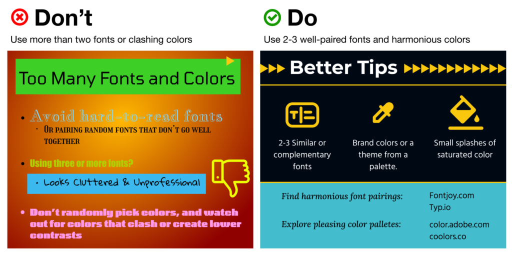
Don’t be shy about spreading out information between multiple slides, and pace yourself! A “title slide” to introduce a new topic can provide a nice (and necessary) breather that balances out the pace of your presentation, preventing audience exhaustion. - Use fewer fonts (aim for 2 or maybe 3 max)
Mixing and matching typefaces takes a fairly well-trained eye, but there are a couple of handy resources on the web to help: FontJoy and Typ.io will both auto-generate a pairing of fonts that go well together visually. Other rules of thumb: keep body copy typefaces simple and sans-serif (using too much of a display typeface hurts legibility), use caps lock only for emphasis and visual contrast, and understand how typefaces can help convey brand sentiments.
- Choose colors and fonts wisely
You may be designing a presentation for work, in which case you likely have a couple established brand colors to use throughout your presentation.
If you’re making up a color scheme from scratch, bear in mind:
(A) Don’t use too many colors. Using too many different colors will make the presentation look messy, busy, or incoherent – so focus on one or two key, recurring colors that’ll lend a sense of cohesion throughout all your slides.
(B) Try to get one or two vibrant, saturated colors to energize your presentation with a more youthful energy – muted and neutral tones run the risk of boring your audience or looking overly corporate.
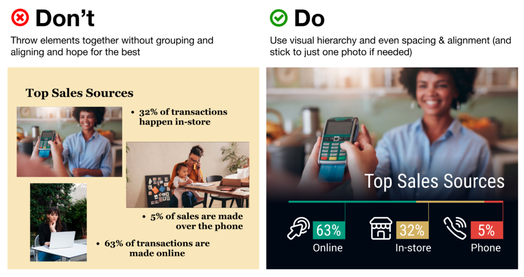
Use Visual Hierarchy
Create a clear delineation between the most and the least important information. This can be done in a few ways:
- Contrast
Don’t let your text or other elements disappear in a monochromatic fog; up the contrast to make things pop off the page. - Background vs. Foreground images
If you want to overlay text on top of an image, make sure to use photos with copy space and more subtle, uncluttered background elements. Can’t find enough white space in the pic to give your text breathing room? Consider adding a photo filter, color block, or even a gentle and more subtle gradient block to put beneath your text. - Size
Use 30+ pt. text sizes to keep your copy legible even from a distance – and keep it bolder for titles, headings, and key words. Be sure that the size you use for headings is at least 50% larger than the size you’re using for body text to better call out your main ideas. - Alignment
One of the single biggest threats to legibility – and your professional credibility – is a “scattershot” slide with text and images thrown together with no rhyme or reason. Instead of combining alignments (center-aligned with left-aligned headers or body copy, for example), stick with left-alignment for quick scanning.
Your best bet? Use a grid system instead of plopping elements on the page and hoping for the best. Align similar elements along vertical and horizontal lines to give each slide a sense of rhythm and repetition. Tidy groupings of similar items (e.g. having all your headings, descriptions, pictures and icons along the same lines) bolsters scannability.
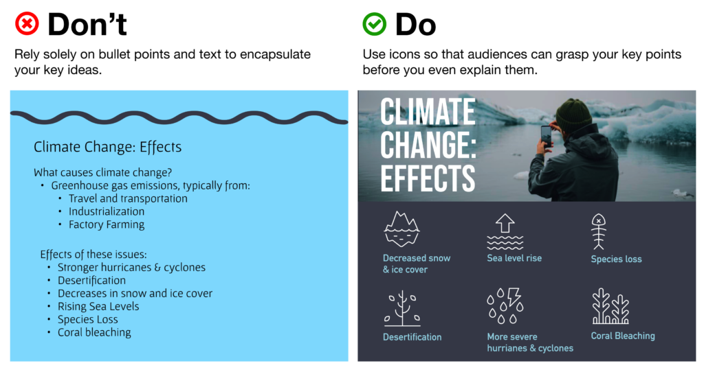
Use Icons to Get Your Message Across Faster (and More Beautifully)
Icons are a critical component of presentation design, as they help your audience digest the ideas you’re covering quicker than words alone. In fact, studies have shown that audiences will remember an image paired with a verbal cue 55% better than a verbal cue alone – a phenomenon known as the Picture Superiority Effect (and a critical component of Dual Coding Theory).
Some may even argue that icons can (and should!) take the place of bullet points.
It’s especially critical to bring in visual aids like icons when you’re covering topics that are more abstract or technologically complex – consider how much words on a page can fall flat and fail to “click” in your audience’s minds, vs. bringing in a quick and concise visual that will help people place the key ideas in a clear, real-world context.
Visual cues like this “deliver the punchline” for your viewers before you even need to – so your ideas can not only jump off the page, but stay in your audience’s memories for longer.
Nonetheless, you’ll need to make sure you’re using your icons as effectively as possible.
Using Noun Project Icons in Your Presentations
- Search Icons
Get all the icons you could ever need from Noun Project. Our collection is literally millions of icons deep – and each one can be customized, colored, and downloaded as a PNG or SVG. - Use Apps & Plugins
Instantly insert icons without leaving your workflow – Noun Project has apps and plugins for Google Slides, Powerpoint, Adobe Products and more. (Plus, Noun Project apps now support SVG icons – so you can use and customize vectors directly inside apps like Powerpoint). - Go Pro for Royalty-Free Downloads
Customize and insert unlimited icons royalty-free with an Icon Pro account. When you go Pro, you can instantly recolor and click-and-drag icons straight from the Noun Project window without needing to worry about attributions.
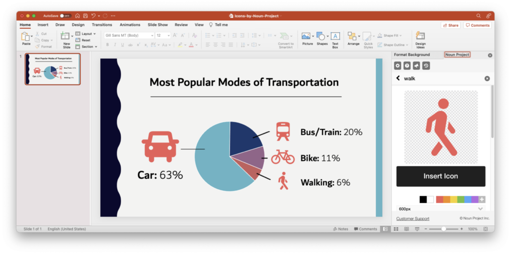
Tip: Icons are essential to help an important point “click” in people’s brains more quickly. The Noun Project Add-On for Powerpoint lets you instantly search, recolor, click and drag icons instantly all without having to leave your window (and a Icon Pro account lets you insert unlimited icons).
Use Icons to Make Your (Bullet) Point
- Condense & Summarize Your Big Ideas with Icons
Use icons as a direct translation of your information – or an obvious metaphor that won’t leave people guessing. Noun Project offers a dazzling range of icons, from the extremely literal (bar graphs, money, medical icons and more) to more broad and abstract concepts (gerrymandering, sanctuary city defunding, you name it)….
But with any icon you need, choose one that doesn’t need too much deciphering, or provide an explanatory caption where necessary. As with all things design, go by the famous maxim “Don’t Make Me Think.”
- Aim for Visual Consistency
Icons come in numerous styles: thin line icons, thick “glyph”-style icons, sharp, rounded, pixel-perfect or hand-drawn. Pick a style that suits your brand and message, then stick with it. Selecting icons from the same collection, or the same creator, will help maintain visual consistency – whereas a mixing and matching of styles will appear messier and less professional.
Tip: Try to select icons from the same collection so that they have a consistent visual style. (Basic Interface icon collection by Caesar Rizky Kurniawan).
- Use Icons to Accentuate Your Theme
Icons don’t need to be used merely to reinforce your statistics – they can usher people through your narrative and play off your visual theme as well. Think about the stylistic possibilities of your overall presentation – e.g., bringing in a nostalgic ‘80s theme with 8-bit pixel icons or discussing holistic health with naturalistic, ecological icon collections.

Tip: Browse the latest topical icon collections on Noun Project.
Use Photos to Suit the Mood
Icons aren’t the only must-have in packing a visual punch. While we’ve already written dedicated articles about the best ways to use stock photos in Powerpoint or even in social media campaigns, here are a few quick rules of thumb:
- Use photos that are natural, authentic, diverse, and inclusive
Ditch the overly-posed and unnatural corporate stock photoshoots of bygone eras. It’s important to make sure your photos feature a variety of ages, ethnicities, body types, sexualities and more so that no matter who your audience, they’ll feel included (Hint: check out photo collections like Diversity in Tech and Empowered Women on Noun Project).

Tip: Search for diverse stock photos that don’t feel too “stock-y.” Relaxed poses and natural lighting and textures will look more suitable than the overly staged corporate photo shoots of yore. Explore the Diversity in Tech or Empowered Women collections on Noun Project for inspiration.
- Focus on single background images – not a whole album.
Usually one supporting image is enough – there’s no need to include multiple images on a single slide as this muddles your message. If, perhaps, you want to show multiple photos to recap an event or show steps in a process, be sure to align your photos, use a grid system, or give each one even dimensions through thoughtful cropping. - Visually unify your photos using color overlays
Apps like Powerpoint will typically let you adjust brightness and hue or overlay a color so that multiple disparate photos can appear unified – and reinforce your brand.

Tip: While a full-color photo may be eye-catching, consider using a color overlay (at right) with your brand or theme colors to give a stronger air of sophistication and cohesion to disparate photos. (In Powerpoint, with an image selected, go to Picture Format > Color > More Variations to set your own color).
Get Started on Your Next Presentation Design With Noun Project.
Explore icon and photo collections, and unlock unlimited royalty-free icon downloads with Icon Pro.
Ready to try out different types of presentation design apps? If you’re looking for friendly, web-based alternatives to the classic Powerpoint, try out free options like Google Slides or even Canva.
Hungry for more design tips? View more on our blog at blog.thenounproject.com.