

Web-based graphic design tool Canva has become the go-to platform for designers of all experience levels for its ease of use and low barrier to entry. Teachers, students, marketers, designers, brand managers and more use Canva to swiftly create graphics, branded collateral, and other types of visuals from scratch or using thousands of templates.
Best of all, Canva comes with a robust library of stock photos, illustrations, and simple vector icons that you can instantly drag and drop to convey your ideas more quickly.
New to Canva? We’ve put together this guide to how you can make the most of the platform and use it for a variety of purposes and projects.
Why Use Canva?
When it comes to free graphic design software, Canva stands out for its user-friendly interface and powerful features that make it accessible to beginners and pros alike. With thousands of templates at your fingertips, Canva enables you to design on a lean budget. Among its best features:
- User-friendly interface: Canva’s intuitive, drag-and-drop interface and focused set of tools ensures that beginners can start designing like pros in less time.
- Thousands of templates: You can kick off your new project with a stylish template for nearly any kind of graphic – such as social media posts, greeting cards, presentations, posters, and more.
- Free for all: Get started with thousands of free templates and elements, or upgrade to Premium for a wider selection of specialized graphics.
- Noun Project icons at your fingertips: Canva has included a curated selection of Noun Project icons in their elements library, so you can search the world’s most diverse and extensive icon collection right inside their “elements” tab – or search and start with your favorite icons from our Noun Project Canva page.
How to Get Started with Canva
Head to canva.com and sign up with your email address, Google, or Facebook account.
Canva is committed to providing all the tools you need to design for free. Their free tier gives you access to over 250,000 templates for different types of designs, over a million free photos and graphics, and 5 GB of cloud storage.
If you want more out of your experience, Pro versions give you access to even more premium content including stock photos, videos, audio and graphics, more designer templates, brand kits, folder organization, 1 TB of storage, and more. Multiple people on a team can also enjoy these features with a “Canva for teams” upgrade.
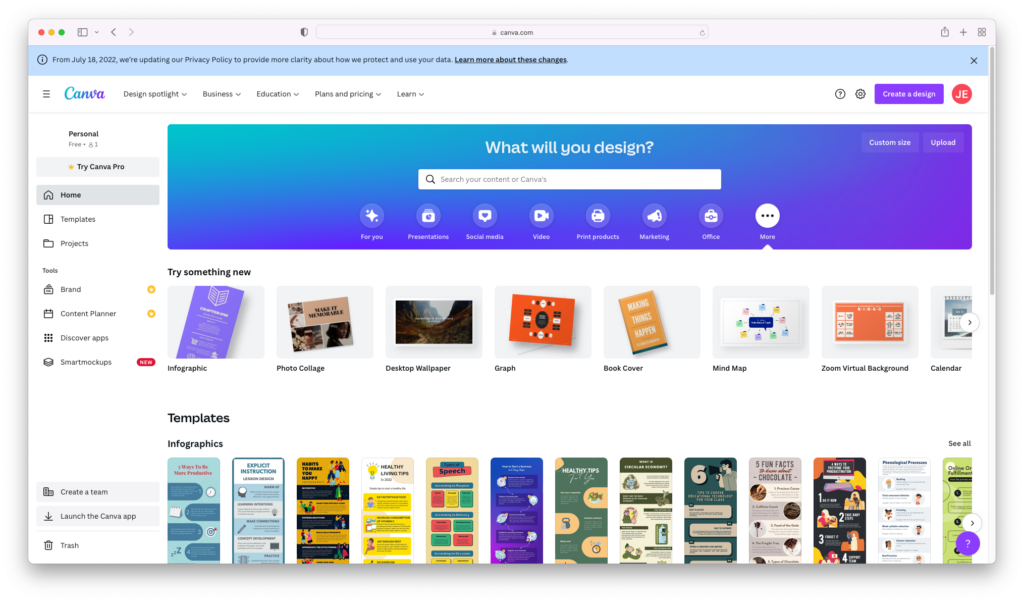
Once you’re logged in, you’ll see multiple options for types of templates to start from.
Any template or element you see that has a small “crown” icon over it is a premium asset that requires an upgrade.
Popular Types of Graphics and Templates
Intimidated by the blank page? The easiest way to dive in is to use a preexisting template. Fortunately, Canva has thousands of templates for any design project you need to tackle:
- Social media graphics: From Instagram story templates to Facebook cover picture designs, Canva simplifies the creation of eye-catching social media visuals.
- Presentations: PowerPoint alternatives like Canva’s presentation templates allow you to craft a variety of slides tied together with a cohesive theme.
- Marketing materials: Design flyers, brochures, and business cards effortlessly to promote your brand or service.
- Invitations and cards: Craft stunning print or digital cards or invitations for weddings, parties, and corporate events
- Infographics: Transform your data and key facts into a compelling but digestible narrative.
- Educational materials: With Canva For Education, qualified educators can enjoy a free subscription to access thousands of learning templates, lesson plans, and more.
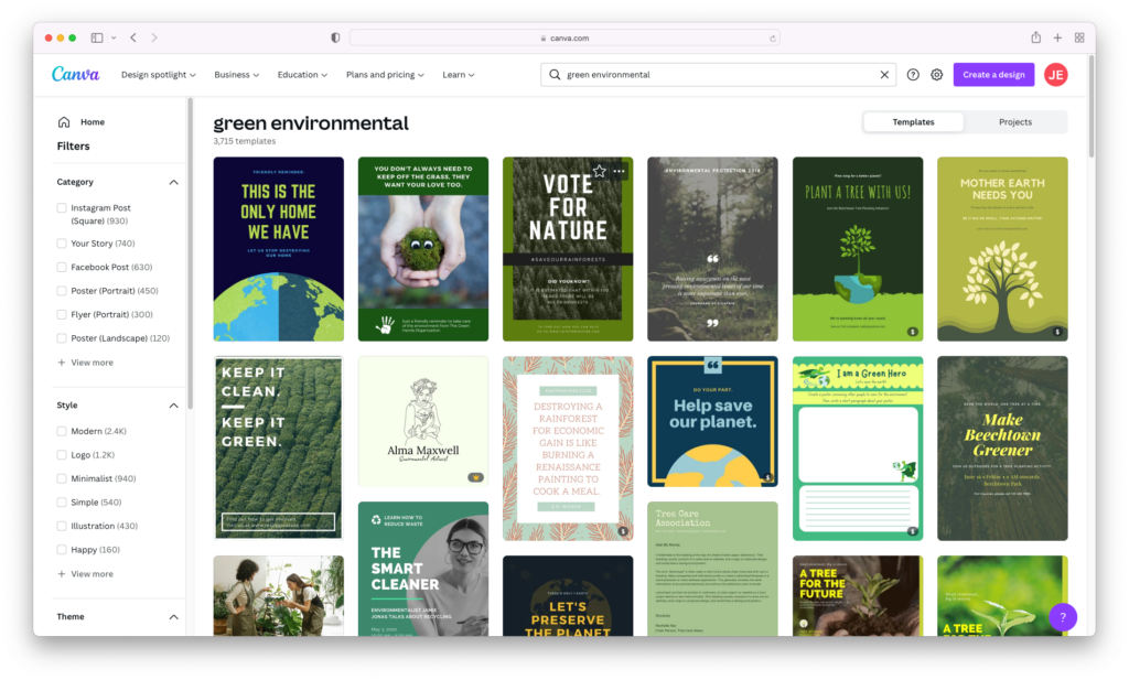
You can browse their template library for whatever type of project you’re working on – and conduct a search for specific things like “Instagram Reels” or “logo design.”
Just make sure you design with intention and don’t just grab the first flashy template you see – who is your target audience? Are you designing social graphics for a certain kind of brand, making a business presentation, or decorating a kindergarten classroom? Refine your search with keywords like “education” or “classroom poster,” or aesthetic descriptors like “neon,” “minimalist,” or “floral.”
Remix a Canva Template to Make It Your Own
Choose a template and select “Edit Design” to enter the editor. You can customize each element in your design by clicking it – and do things like edit the copy, select different fonts, colors, resize, rearrange, and insert new elements to use. Want to dig in further? Take a look at more of Canva’s design capabilities below.
Designing from Scratch
If you don’t find a template that looks suitable, you can easily begin combining your own elements, shapes, and colors. If starting from scratch, think about your design as typically having 4 main elements:
- Background color and overall color scheme
- Elements like icons, shapes, and illustrations
- Text and font choice
- Other imagery (like photos, animations and videos)
Let’s look at each one within Canva.
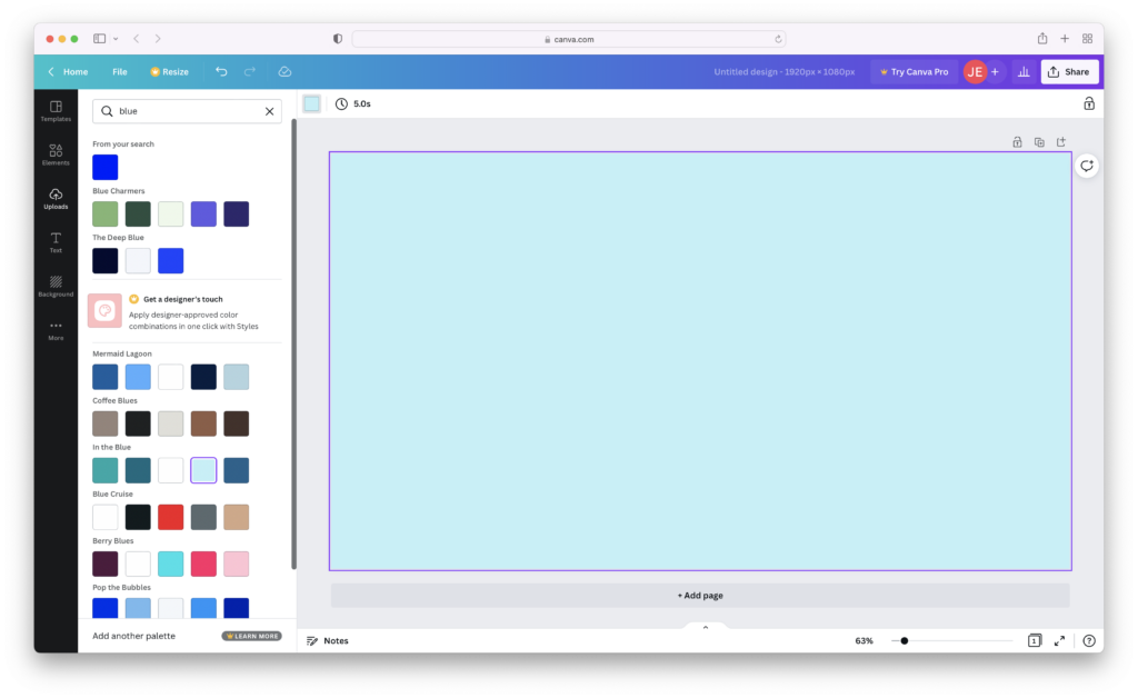
Color
To set a background color, select the blank Canvas (the outline will turn purple when selected) and find the color picker in the upper-left corner. You can select one of the colors in the drop-down menu as a basis to create your piece, or input a HEX value of your favorite color. If you’d like to explore some of Canva’s recommended palettes, simply type in a color in the window’s search bar and you’ll see related palettes that work more harmoniously. This will give a more coherent and aesthetically pleasing look to your composition – and it’s recommended that you use no more than 3 colors to avoid a messy and cluttered design.
Inserting Icons and Other Elements
This is where you can quickly and easily add visual assets to your composition without having to draw them from scratch.
Clicking on “Elements” in the left-hand sidebar will pull up a search that covers just about any kind of visual you can hope to find, from flat icons to animated gifs, colored symbols, photos, videos, and more. You can narrow down your search (say, to just “Graphics” to search icons instead of photos) to filter only those elements – again, bearing in mind that any element with a small gold crown next to it is a premium element that requires an upgrade.
A curated selection of Noun Project icons are available to instantly insert from the Elements pane – just search, click, and arrange on your canvas!
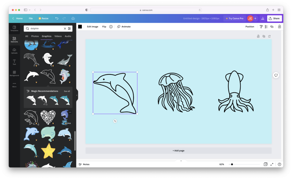
Best of all, you can recolor each icon based on your document’s color scheme since they’re all vector format – just click each icon and pick a new color along the menu at the top.
As you add elements to your canvas, you’ll see a “Magic Recommendations” tab appear to suggest closely related elements in a similar style and save you time in searching.
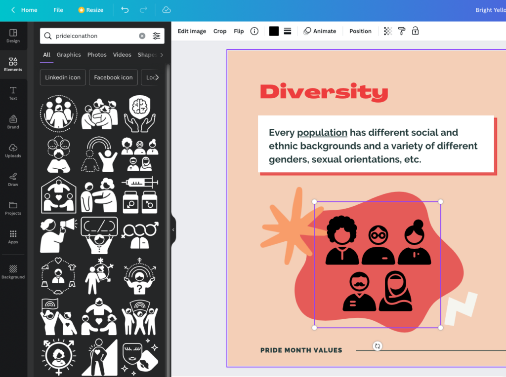
If you want to jump to just Noun Project icons, you can search @nounproject in the Elements search window. Bonus tip: you can also quickly find free, public domain icons from our Pride Iconathon by searching with the term “PrideIconathon.”
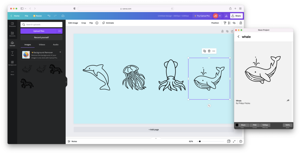
Access Even More Icons with the Mac App
If you want to enjoy our complete library of over 5 million icons in your Canva design, download our Noun Project Mac App. You can access our complete icon library from a small window on your desktop – and quickly search, customize, and drag and drop any icon when you have a Noun Pro account. Drop icons directly into your Canva window, and bear in mind that using an SVG format icon is best so you can instantly recolor it directly inside Canva (PNG icons, as a raster-format graphic, will have to be colored and customized within the Noun Project app window itself).
Add Text
Select “Text” from the left-hand menu, and you can add headings, subheadings, and body text. Note that every text snippet can be resized and recolored from the text menu along the top of your work area.
Canva has a wide variety of text options to choose from, which can be filtered based on type. You can not only look up names of your favorite fonts, but search for terms like “Script” or “Sans Serif.” Feeling overwhelmed? Canva also suggests font popular font pairings that you can simply click from the left-hand menu to use on your canvas.
Tip: it’s recommended that you use no more than 2 different fonts that work well together (possibly 3 if you’re using headings, subheadings, and body text). Using lots of clashing fonts will make your composition look busy and detract from the sense of hierarchy.
Add Images and Photos
If desired, you can also search for images and photos within “Elements” by searching with the “Photos” category selected, or click “Background” along the left-hand menu to find an image that will occupy the full background.
Looking for a more diverse and extensive collection of photos? Search Noun Project Photos for stunning images of any subject or style you want. Upon downloading, you can simply drag and drop them into your Canva window – then click Position > To Back to place it in the background under all other layers.
Just make sure the contrast is adjusted for optimal legibility. If using a photo background, you want to ensure that all other elements – from your icons to your text – stand out with a high degree of contrast so viewers can still easily read them. You can click “Edit Image” on the top menu bar to make basic adjustments such as brightness, contrast, saturation, or even add one of Canva’s filters.
Quick and Easy Tips to Create Better Designs
If you’re modifying a template or designing something from scratch, it’s easy to get lost in the possibilities. Whether you’re a seasoned designer or a newbie, just bear a few of these design basics in mind:
- Hierarchy: make the most important elements either (A) the biggest, or (B) the most high-contrast. Consider what you want the viewer to see first and remember the most, and make sure it stands out.
- Clutter: “Keep it simple” is the long-held maxim of graphic design. Don’t add too many competing elements that make the canvas appear busy. Think about the order in which you want viewers to “take in” your composition, with secondary elements being more muted and subtle, and primary elements being more high-contrast, large, saturated, or generally attention-grabbing.
- Legibility: Pick typefaces that are simple and easy to read. Novel display typefaces might work for a few words on a large scale to make a visual impression, but your body text should always be something more simple and recognizable (like Helvetica) to be quickly scannable and not fatigue the eye.
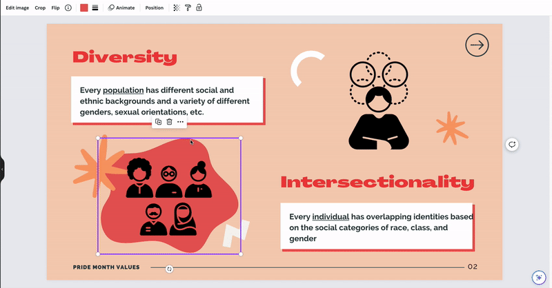
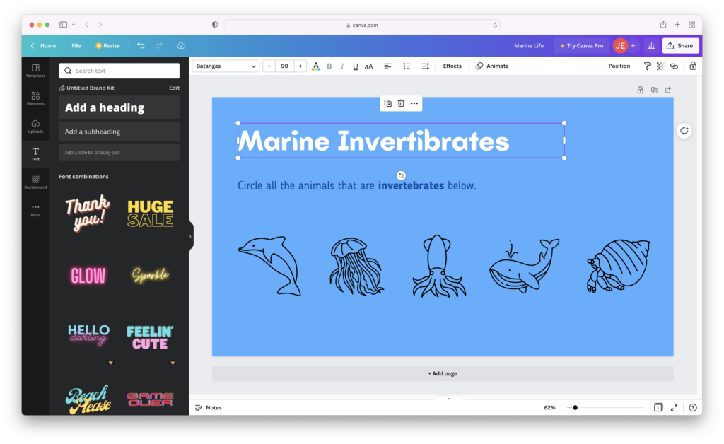
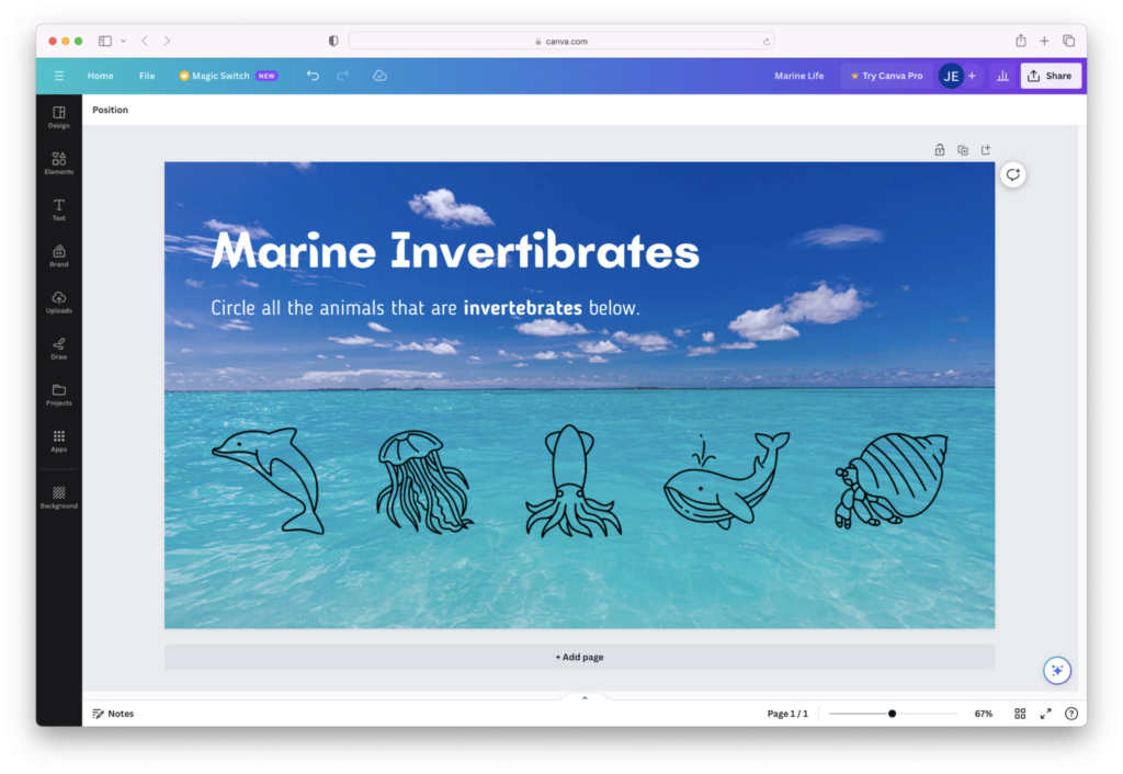
- Consistency and repetition: while you can choose between icons, stickers, gifs, photos, or full-color illustrations, it’s best to use several elements of the same type to make a more harmonious composition. In the marine life example above, using simple black line icons to depict the subject matter helps us mentally “group” these items together and therefore differentiate them more easily. Using too many different styles (like combining octopus photos or sparkly dolphin gifs) will add more mental strain in parsing out different types of visual cues.
New Ways to Get the Most Out of Canva
Canva is debuting new tools, features, and capabilities all the time. Take a look at some of the recent developments that offer more ways to create something unique and eye-catching.
Animation: You can always search Canva’s elements library for moving graphics – like simple GIF’s and stickers that have animated text and other elements.
AI-Powered Tools: Canva now integrates several AI-powered features, generators, and photo editing capabilities, including:
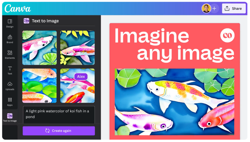
- Text-to-Image: Just write an image prompt and choose an aesthetic style (like painting, 3D, or photo) and Canva will generate a new custom image from your imagination!
- Magic Eraser and Magic Edit: quickly retouch photos by removing or cleaning up subjects, replacing elements with background fill, or select an area to of the image to be filled with a new generative creation
- One-Click Background Remover allows you to instantly select and isolate a subject so you can try out different backgrounds or creatively collage different images together.
Collaboration Features: With Canva Teams, now you can host whiteboard sessions with teammates and collaborate in real time on design projects.
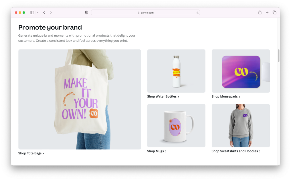
Print Products: Canva has now become an all-in-one shop for printing your designs on physical products like business cards, invitations, t-shrits, tote bags, water bottles and more. Check out their full roster of printed products and have them delivered directly to your door all in one place.
Need more design inspiration and how-to’s?
Check out Canva’s Blog for more insights into designing for education, brand management, social media, print marketing and more.
Follow our blog for more creative inspiration, tutorials and DIY projects.