

No matter what industry you’re in, you’ll likely be tasked with creating PowerPoint presentations to use in meetings, for marketing, or as a standalone piece of sales collateral to hand off to a client. Whatever the context, a PowerPoint presentation allows you to share information in an easily digestible, visual format that informs the reader and brings your story to life. Presenting images alongside your text is a surefire way to make your slides more eye-catching, but it takes some finesse to give your audience information without the overload.
Creating an aesthetically pleasing PowerPoint can be a make-or-break deal, and the photos you use – along with the the right combination of colors, fonts and other graphic elements – can either convey professional credibility and inspiration, or be a jumbled mess that your audience won’t know how to decipher. In this guide, we’ll go over the best practices for using images in PowerPoint (or the slide deck program of your choice).
Tips for Presenting Images
Text, colors, and icons can’t always do the heavy lifting of a presentation on their own — using photos in PowerPoint will make your ideas feel more immediate, human, and relatable. Think about your key messages and your brand identity before adding images to your presentation. What story are you trying to tell? What audience are you trying to speak to?
Visuals are essential to creating an engaging presentation. Audiences will tune out if they see nothing but text.
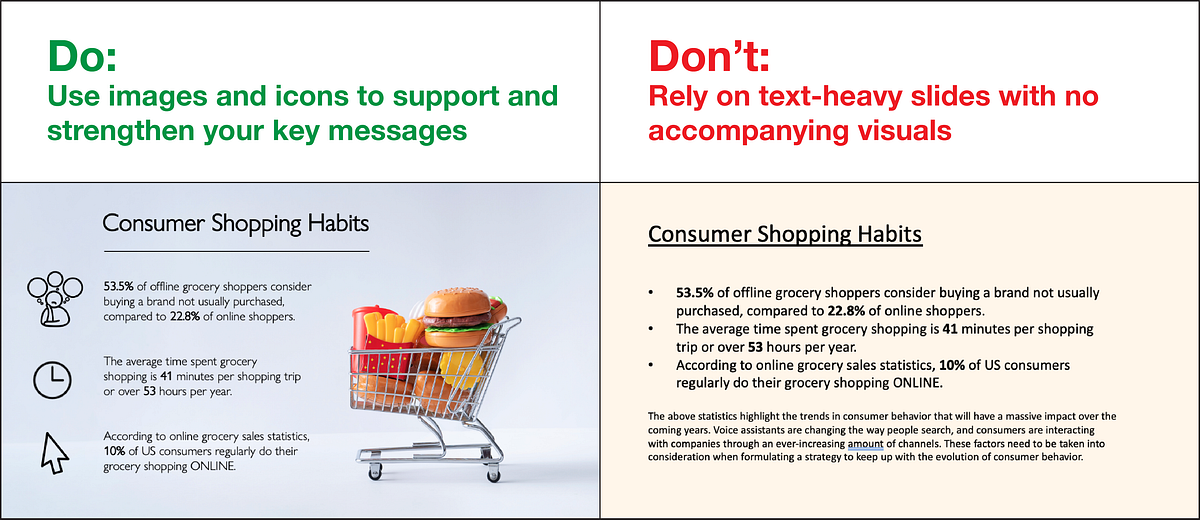
Generally, you should focus on adding photos to your PowerPoint that support and emphasize your key statements, rather than overshadow or distract from them. Selecting more muted background images for presentation slides can also maintain the look, feel, and texture you desire without attracting too much focus.
Here, we’ve compiled a handy guide to the Do’s and Don’ts of PowerPoint presentation design and selecting the right images:
1. Use High Quality Photos
Nothing can tarnish your professional credibility quicker than seeing a blurry, pixelated image in your presentation. This is why adding high-resolution stock photography to your presentation is a must, and drawing from the wealth of professional photos available on a site like Noun Project will lend your slides an immediate air of professionalism.
Go to NounProject.com/photos and search for keywords related to your main idea. You can view specific collections like Diversity in Tech, Empowered Women, Students, and Hiking, and explore additional images by photographer as well.
When you’ve found a stock photo you like, be sure to download it in the resolution you want. Noun Project offers many photos for free in a lower resolution, but depending on how large your final presentation will be, you’ll want the highest resolution that can be expanded to fit your screen without pixelation. Always double check to make sure that the picture still looks crisp at full screen size.
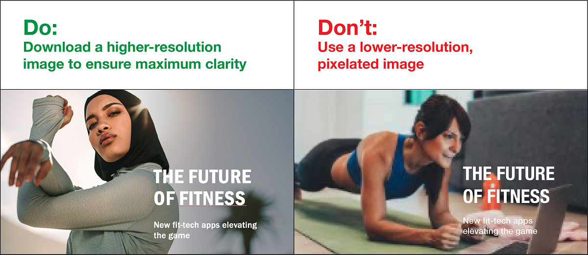
Tip: Standard screen resolutions are 1920 pixels wide by 1080 pixels high (and most default PowerPoint templates have these dimensions). Be sure your photo is at least the same dimension if you’re doing a full screen size to avoid pixelation.
2. Practice Consistency
Chances are, your entire presentation focuses on a single overarching idea and the photos you use should reflect that. In addition to finding the right subjects, pay attention to the other aesthetic qualities of the photos you bring in. Are they in a similar, complementary color scheme? Are they shot in similar environments for a consistent tone (e.g., sleek and corporate, rugged and outdoorsy, urban and gritty, or light and playful)?

Use images in PowerPoint that support and accentuate your theme and overall tone. The images you use throughout should complement each other without repeating or looking too dissimilar.
The most fail-proof way to ensure consistency is to draw from an individual photographer or a particular photo shoot. Stock photographers will often shoot several different angles, poses and variations from a single scene, so you can find just the right shot for each slide and remind your audience that this is all part of one cohesive message.
Noun Project organizes stock photos in collections from individual shoots, so almost any image you click on will have similar ones from the series available. Bear in mind, though, that you don’t want to use too many similar images — the more you can change scenes without shifting the tone, the better.
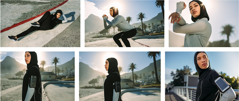
Adding photos to a presentation from the same photographer is the easiest way to keep it visually consistent. If you insert photos from the same shoot, just make sure you add enough variety so it doesn’t become repetitive. Pictured: Fitness photo collection by Jacob Lund.
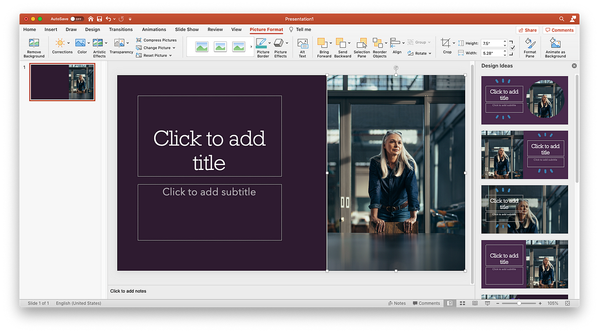
Once you have your desired photos downloaded (and ideally put in the same folder in your hard drive), here’s how to add pictures to PowerPoint:
- Simply click and drag the picture file (as .JPG or .PNG) from your file finder window into the PowerPoint pane. You may see the “Design Ideas” toolbar pop up on the side of your pane, with different options you can try out to arrange visual elements.
- Alternatively, go to Insert > Pictures > Picture from file, and select the photo you want from your finder.
3. Avoid Photo Clutter
The photos you add to your PowerPoint should be presented one at a time, or minimally enough to maintain focus — too many photos can cause clutter and become distracting. You don’t want the photo to be the sole star of the show — you want it to support your statements and add emotional resonance to your messages.

There may, however, be occasions when you want to use multiple images that support a unifying topic: for example, steps in a process or different ways that customers can purchase your product.
If you ever want to add one or more smaller photos, rather than a large background image, here are a few rules of thumb:
- Crop the photos to the same size or shape: Having mixed dimensions makes the overall composition feel unbalanced. Whether you choose a square, rectangle, or circle shape for your photos, making them all the same size and shape will boost the scannability of your page.
- Group and align: Again, scannability is key. When you group the elements of your page together in an even and consistent way, people will visually register the pattern and can digest the content more quickly. For example, you may have three groupings that consist of an image, headline, and descriptive body text. Make sure that these elements are (1) clustered together so they form one unified thought, (2) grouped to match each other so they form a visual “rhythm” across the page with equal text sizes, line weights, and image dimensions, and (3) aligned and justified along the X or Y axis for legibility (in PowerPoint, select multiple objects and go to Arrange > Align to line them up along the same axis).
- If using different sized photos, fit them together into a cohesive shape. A binding element like a grid with solid lines will help the photos appear on the page like neatly fitted puzzle pieces. Again, keep overall alignment in mind — the more your content stays organized in tidy rows and columns, the more scannable it will be.
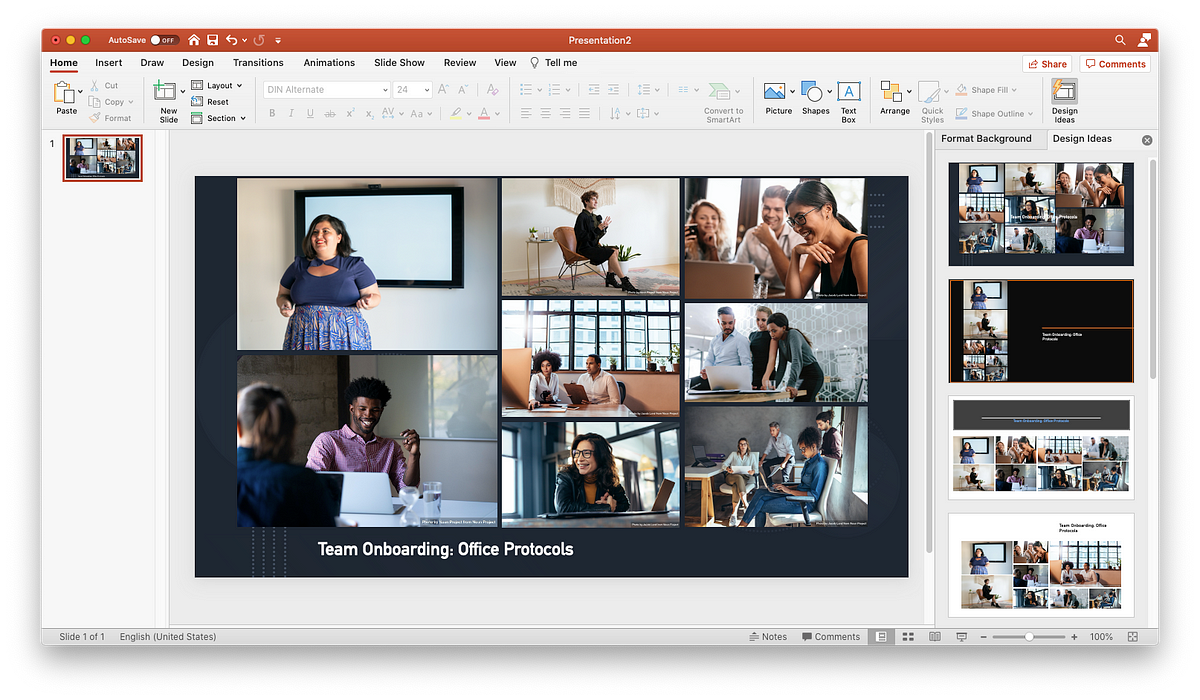
If you must use multiple photos, PowerPoint’s Design Ideas toolbar will give you options to array them in a neatly aligned grid. Focus on creating a tidy overarching shape to avoid the cluttered “collage” effect.
4. Choose Photos Over Clipart
Clipart has been nearly synonymous with PowerPoint and other programs since the ’90s, but unfortunately hasn’t evolved much with the times. While a piece of clipart from the web may encapsulate or accentuate your key themes, keep in mind these aesthetic considerations:
- Professional credibility is lost when your design looks “dated” or “cartoonish,” but gained when your presentation is sleek and modern.
- While aiming for visual consistency, also bear in mind that more muted and subtle visuals — from the photos you choose to the icons that illustrate your key points — help keep the focus on your words and ideas, rather than your visual aids
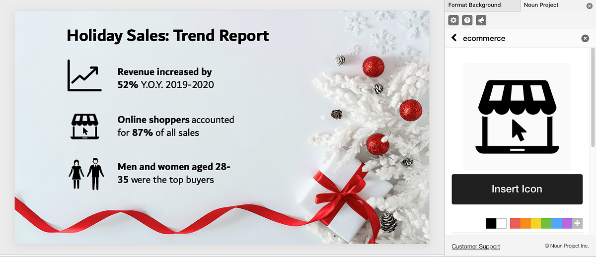
- If you want to add a more sleek, modernized look, browse Noun Project’s collection of over 3 million icons to find a corresponding set to include.

For a more polished and modern look, go for minimalist and visually consistent icons to accentuate key messages, rather than clipart.
Tip: The PowerPoint Add-In for Noun Project lets you search and pull in icons right there in the software without having to leave your workflow. Go to Insert > Add-Ins > Get Add-Ins and search for Noun Project. Once you open the Noun Project Add-In window and log in to your account, choose icons from the same collection to ensure that they’re visually consistent.
Find the Noun Project PowerPoint Add-In on NounProject.com or, from PowerPoint, go to Insert > Add-Ins > Get Add-Ins to search for Noun Project icons.
5. Don’t Use Watermarked Images
Even if it is small, a watermark can be distracting and, once spotted, can negatively impact your credibility. Be sure to use free photos and credit the photographer, or pay for the photos you use in your presentations to avoid the loss of credibility and trust that can occur when you use watermarked images.
Not sure what usage rights you have with an image? Let’s cover the basics of how to cite images in a presentation:
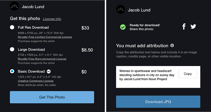
Questions about fees, licenses, and usage rights are common, and citing images in a presentation is the standard expectation for free photos so that the photographer gets credit. Fortunately, Noun Project Photos provides a transparent model for photo usage and licensing — any free photo download is licensed under Creative Commons, which allows you to use the photo for noncommercial purposes, without creating derivatives, as long as you provide attribution to the photographer.
The “Basic Download” option will not only give you a free, CC-licensed image, but tell you exactly what attribution information you should include when you cite it. Once you click “Get This Photo,” you’ll see the image title and photographer name listed in a text box — simply copy the text and include it on your slide to properly cite the image.
Noun Project Photos provides a transparent licensing model in which photos are free to use with attribution under Creative Commons.
Your presentation may have a footer for notes, where such a citation could easily fit. If not, many presentations will have all the attributions listed on a final page. Under Creative Commons, both methods are acceptable.
6. Maintain Diversity in Photos
The truth is incontrovertible: representation matters. Stock photography — like much of the broader media and marketing landscape — has faced a chronic issue with only representing a particular sub-sect of the population, and more and more consumers have started to notice. At Noun Project, we’re dedicated to ensuring that the visual resources we share are inclusive, free from outdated stereotypes, and more accurately reflect the world we live in. Through initiatives like our Diversity in Tech and Empowered Women photo collections, we’re championing more equal and accurate representation in the world of stock photography.
Double-check the photos you’ve added to your presentation and ask yourself: Does this speak to the widest possible audience, or does it leave certain groups out of the picture?

Noun Project offers diverse, inclusive photos, so you can finally leave the stuffy corporate photo shoot in the past. Audiences want to see natural, non-posed, high-quality photos that better resemble day-to-day life.
7. Keep it Simple.
Finally, slides should be readable. The visual elements you choose should bolster the core message of each slide, rather than overshadowing it. Key things to watch out for are:
- Less text, more talk. Unless you’re handing off a comprehensive sales deck, you as the presenter should be doing the talking — not the words on the page. Focus on using short bullet points to extract main ideas and keywords, rather than numerous full sentences.
- Check your text size. Bigger is better (and with less text on the page, it should have more room to breathe). But don’t forget about hierarchy: there should be a clear distinction between headlines and supporting text.
- Check legibility. Are you using simple, legible text for body copy? Does the text appear clearly against the background? Up the contrast or find a more suitable background that doesn’t strain the eye.
Search for “Copy Space” photos to add to your presentation. The best background photos to add are those that have plenty of white space for you to add your own content. While bold, busy photographs might be the most visually striking, bear in mind that your text needs room to breathe. A quick Noun Project search for “Copy Space” will lead you to more minimal photographs that include this built-in space for text.

Search for photos with copy space to give your text legibility. Tip: If you need to set text against a more visually busy background, add a semi-transparent color block. Add a rectangle (Insert > Shapes > Rectangle) underneath your text, give it a black fill, but adjust the transparency until the text becomes clearer while leaving the photo visible.
Explore More Stock Photos for PowerPoint at Noun Project
Noun Project Photos features professionally-selected, inclusive, beautiful and affordable images created by a global community of photographers. We’ve curated our collection to put visual clichés and tired, outdated stereotypes to rest — so you can find stunning images for any project. With worry-free licenses, you’ll support photographers and have peace of mind with clear image usage rights, including model and property releases.