

A great brand is built on consistency and a strong visual identity. When creating a brand and establishing its presence digitally or in print, every element should feel cohesive and unified.
We typically think of a brand’s identity as being built with basic core elements like the logo, typeface, and colors used – but eventually, brands also have to make decisions about every aspect of their presence: the composition of web pages, the photos used, spacing, alignment, and even the size and style of buttons in their user interface.
Tracking and cataloging every one of these design choices (often referred to as design “tokens”) helps create a design system – an organized library of assets and components that you can quickly utilize to take the guesswork out of design. Rather than building something like a new landing page from scratch, the assets and guidelines you lay out in your design system will provide structure to make something new that still looks unmistakably you. Like a brand kit or style guide, this helps guide every decision you make.
In this guide, we’ll walk you through what to include in your design system, and how to start unifying and organizing every visual asset and token in Figma.
Table of Contents:
- Difference Between a Design System and a Brand Style Guide
- How to Build a Design System in Figma
- What to Include
- How to Publish a Component Library
What’s the Difference Between a Design System and a Brand Style Guide?
In short, a brand style guide can be viewed as a smaller subset of a larger design system. It helps capture some of the basic information and most frequently-used assets, including your logo and different logo variations, fonts, colors, photography, and more. It also provides usage rules for deploying them to have clarity and alignment among everyone on your team. This way, if a teammate in marketing needs to create a new presentation deck, they’ll create something that looks distinctly branded and not haphazardly slapped together.
Learn more about brand style guides and creating an easy-to-use, flexible kit using Lingo, in our blog post here.
A design system takes this even further by cataloging not only every asset you’ve ever used, but anything else that can be standardized for reuse, including buttons, UX patterns, web design specs and more. While marketers will benefit from knowing some brand basics like type and color in your style guide, product designers and engineers will need a more robust design system to track these design tokens such as:
- Button styles: What color, size and shape are our buttons across web, mobile and tablet? What colors do we use to indicate button states for each?
- Type styles: What do we use for headings, subheadings, body copy and captions across devices?
- Layouts: What styles, spacings and alignments do we use for pages, menus, components and more?
- UX patterns: what are some of the standardized ways we guide users through an experience like making a purchase or searching and filtering their search results?
The hard-and-fast rule: if you have a design element that will be used and repeated, add it to your design system.
Ultimately, your design system is there to help you scale. As you grow and add more features, functionality, and pages, you’ll need to maintain the same consistency across every facet of your brand. It also ensures full clarity and alignment in cross-functional teams, facilitating smooth handoff to developers and engineers. It can even benefit faster page-loading times as you consolidate things like having too many colors or CSS styles in use.
How to Build a Design System in Figma
Many UX/UI, product and engineering teams turn to Figma to create their design systems, as the platform allows you to turn any design element into a component that you can add to a library for future reuse.
A component is any reusable element, such as a button, that you can reuse throughout a design and that will have different instances or variants – such as a different color for when the button has been clicked. You can begin to organize components as well as colors, type styles, and more, into a library of assets so that you can create with consistency instantly.
Your first step as a UX or product designer, though, should be conducting an audit to capture every asset currently in use across your site or social media. As you track the elements you use, you can also start to ask critical questions about where you can consolidate content and provide greater clarity and ease of use:
- Colors: What colors do we use? Are they on-brand? Is there any inconsistency in the shades and tints we use, and how can we further consolidate to ensure we only use a few colors? (Also note that designing for different platforms – web, iOS, and Android, requires different values in RGB or HEX format).
- Fonts: Which typefaces should be used for headings, subheadings, body copy, and captions – and how can we proportionally scale these sizes for web, tablet, or mobile displays?
- Buttons: Do our buttons have the same size, shape, corder radius and CTA font? Do they consistently convey different button states such as clicked, hover, or inactive?
- Layouts: Are we consistent with designing web or app pages, modals, and dialog boxes that all have the same rules of spacing and alignment?
Start with the building blocks you already have – or if you’re building your brand from scratch, start to think about the following foundational elements:
What Should be Included in a Design System?
Colors
Think about your colors in terms of primary, secondary, and tertiary.
Primary:
- The color(s) of your main logo, which may also be echoed throughout your website’s background and other visual assets.
- The most eye-catching and high-contrast color(s) that demand more attention that others, for things like CTA buttons and modals.
Secondary:
- Colors that complement your main color and form a distinctive color scheme for your brand, but are used less frequently.
- It helps to break down your colors in use with percentages to know which ones are used more or less frequently, and for what purposes. Secondary colors provide an alternate usage for some common assets (say, if you have a blue logo but a corporate partner wants to include it on a blue background), and elements that need to look distinct but secondary in priority.
Tertiary:
- What minor elements like warnings, tooltips, or different button states should have less-distracting but still distinct colors?
- When creating brand illustrations, think of what tertiary colors will provide a harmonious counterbalance to round out the palette and add more dimension and visual interest to your app.
Using a wider spectrum of tints and shades of a color will offer you options for rare circumstances where you need to adjust contrast or other or create a wider array of designs that still feel related to your primary color.
Tip: You can use a quick online generator to Make Tints and Shades from a given HEX Value. This will instantly offer a more harmonious palette.
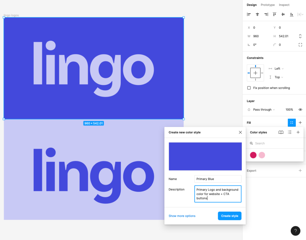
In Lingo’s branding example below, the primary dark blue color is used both for the logo and the entire background of the website – as well as its most prominent CTA buttons.

And of course, don’t forget common color conventions such as using shades of red for errors and warnings, green for success, yellow for highlights or callout text.
How to Add Colors to Your Design System in Figma
Add design assets such as your primary logo by dragging them (in JPG, PNG, or SVG format) into your Figma Window.
- Under the “Fill” section of the Design menu, click the 4 dots to bring up the Color Styles menu
- Click the “+” sign to add a new color style. You can use the Eyedropper tool (i) to click on the color you want to add to your library.
- Add a name and a description of the color, and it’ll be added to your library. Now the next time you click on the 4 dots, you’ll see an option to select your color.
Typography
Choose a brand font to use across your website and apps. While you may be using a display typeface for elements like your logo, you’ll need a simpler, more legible font for everyday use in longer-form writing.
Consider how each text placement also needs to scale for desktop, tablet, and mobile viewing:
- Headings and subheadings (H1-H4)
- Body copy
- Captions
- Links and link states
- Buttons and button states
- Other text placements such as modals and dropdown menus.
Tips:
- It can be helpful to use standard sizes that are multiples of 8 points (8, 16, 24, 32, etc.). Using even numbers in regular increments aids visual consistency and also prevents anomalies like half-point values.
- Think also about spacing between lines: having even increments between headings, subheadings and body copy can aid legibility by making a page more tidy and scannable.
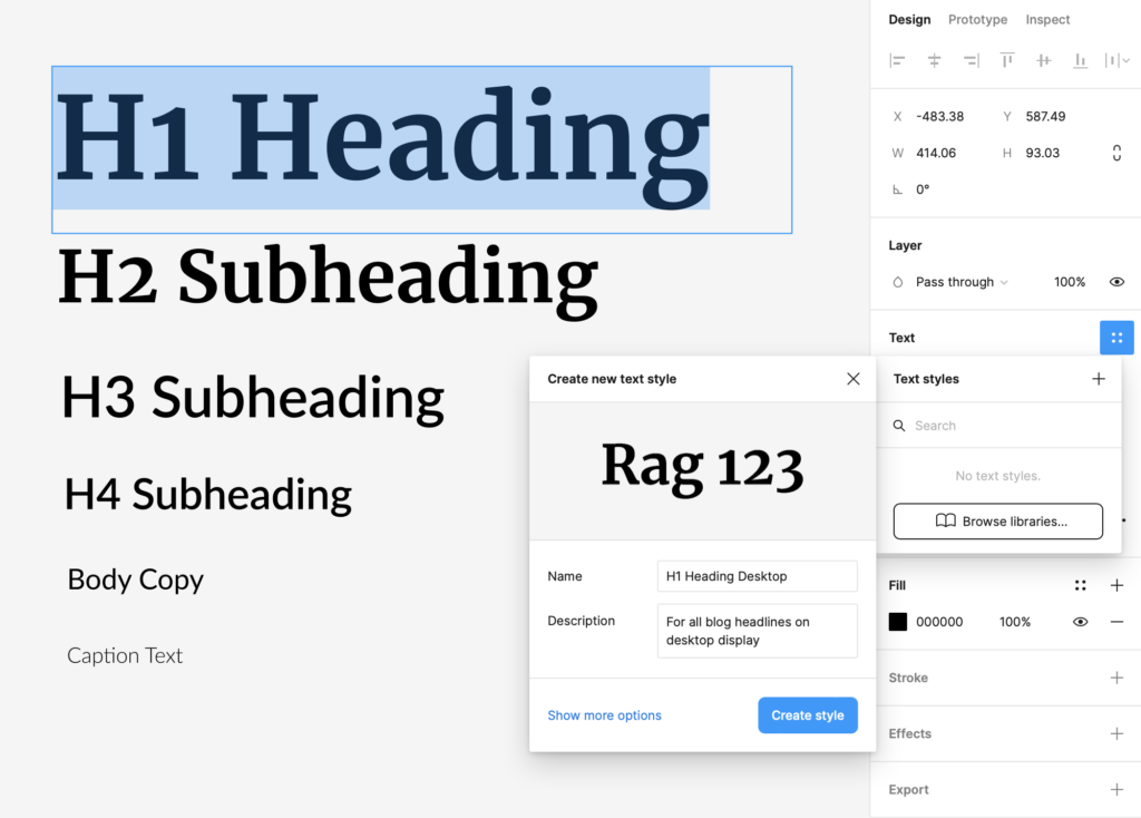
How to Create a New Text Style in Figma
- After you’ve decided the typeface, style, and scales of type that you want for each placement, go to the Text panel of the right-hand design column and click the 4 dots. This will bring up your Text Styles menu.
- Click the “+” button and you’ll be able to create a new style based on the selected text.
- Give it a name and a description for clarity and it’ll be added to your library.
- Later, when you enter the Text Styles panel again, you’ll be able to click on the style you want to convert your selected text to.
Buttons and Active States
When designing a user interface, buttons are the most critical element for guiding users to get what they need. The bolder and more high-contrast the button, the more it’ll attract attention. Again, your specifications should be standardized for replication: the font style and size you use, padding, and corner radius of the button should all remain consistent per device.
Don’t forget to also show button states for each type of button you have: users should get immediate feedback on:
- What’s clickable and highest priority (e.g. a “Check Out” button should be the most visually bold and high contrast)
- What’s inactive or not clickable (typically grayed-out and low-contrast buttons)
- What the user is hovering over (the button should change color, border, drop shadow or another clearly visible effect)
- What has already been clicked. (Tip: read more on button states and other UI fundamentals here).
Notice that on our own Noun Project site, clickable regions change color and the tag buttons at the bottom have a colored stroke upon hover, turning darker when they are clicked.
How to Turn a Button into a Reusable Component
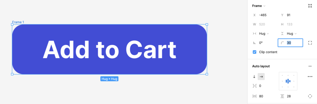
- Create a primary button style: Click and drag a rectangle [R] across your screen and add your CTA text on top [T]. Select both the rectangle and the text and hit Shift-A to add an AutoLayout, which will frame these contents.
(Read our primer on using AutoLayout to quickly add formatting rules like the amount of padding, alignment, orientation and more for common components like buttons.)
- Select the color you want to use for your button, and set a corner radius by dragging in the corner radius dots or adjusting radius within the “Frame” menu shown below. Bear in mind the boldest colors with the highest contrast should be your primary CTA buttons as they command attention.
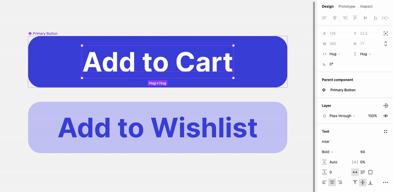
- Make your button a component by right-clicking > Create Component or typing Command-Option-K. The selection box will change color and a four-diamond icon will appear. You can also click “Assets” in the Layers panel to the left of the screen, and the component will appear in your library.
- Now, when you duplicate this component (by selecting copy/paste, alt + clicking and dragging it, or clicking and dragging the component from the “Assets” menu on the left of the screen), any changes you make to the main component will automatically apply to every instance (or duplication) of the component.
In the below example, I’ve made a new instance to serve as a secondary, low-contrast button. I can edit the text and color of this instance without changing my original component. However, when I change the text size of the original component, the text size of the instance changes too.
How to Make Variants of a Component
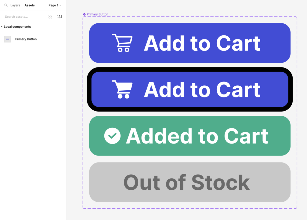
Let’s say I want to make a primary, secondary, and tertiary button with different states for each (default, hover, clicked, and inactive) – meaning 12 different button styles altogether.
Instead of dealing with 12 different components, we can make these button states into variants of a parent component.
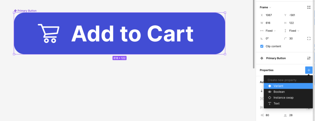
- With your primary (parent) component selected on your canvas, go to the Properties menu and create a new Variant.
- A frame will appear with a “+” sign to add your new variant. This will duplicate the parent component with a copy you can alter.
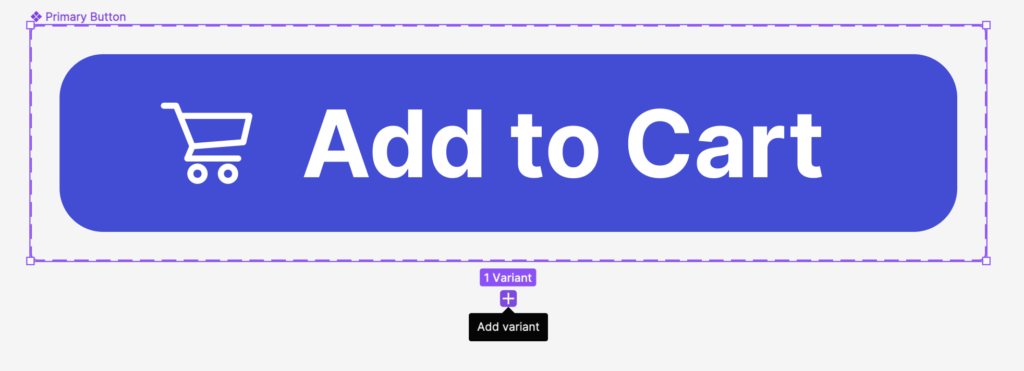
- Add your visual changes. For a “Hover State” version of the button, I’ve added a black stroke and filled in the shopping card icon for quick visual feedback when a cursor is hovering over it. You can rename each property under the “Current Variant” menu on the right.
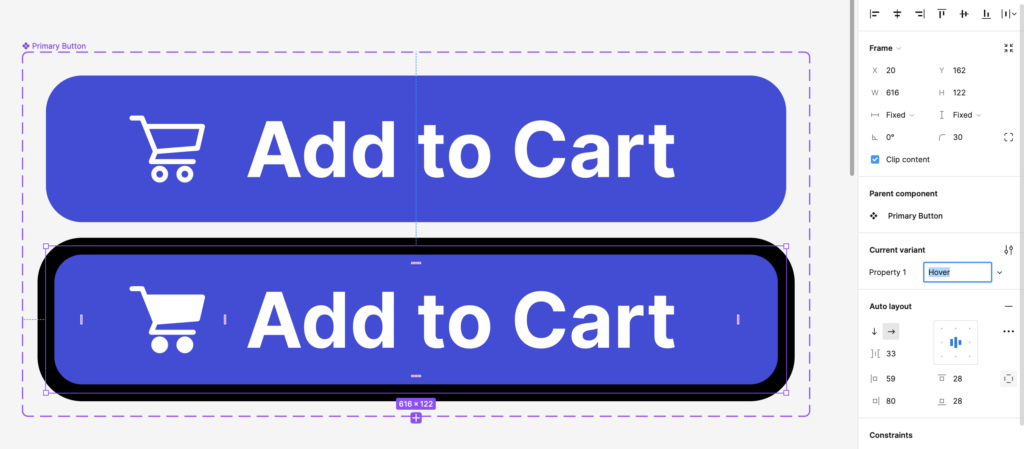
- Click the “+” sign and repeat the process for each button state. Here, I’m visually indicating (1) default, (2) hover, (3) clicked, and (4) inactive with different colors, contrasts, and icons as variants of the same parent component.
- This component is still visible in my “Assets” panel where I can click and drag a copy onto my canvas, and select which variant (or button state) I want to display in the same Properties panel. Creating multiple variants of one parent component will save time and space, so you don’t have to house them all in your design system as separate components.
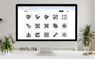
Icons
Icons are a critical part of any user interface design.
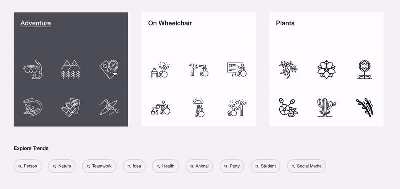
Noun Project has a wealth of UX and UI icons for common navigational needs like home buttons, hamburger menus, media playback buttons, and more.
Be sure to select an icon style that fits with your brand aesthetic, paying attention to things like the icon style (minimalist, hand-drawn, sharp or rounded), and how they match with your existing design elements like typeface.
You may choose to use icons in place of text buttons for user interfaces that need to be condensed – so long as they convey meaning without ambiguity.
Adding Icons to Your Design System
As with the button examples above, create a component for each icon you want to add to your design system. You may similarly want to create variants for each one by changing the fill color, background shape, or effect such as a drop shadow to denote default, hover, clicked or inactive states.
- Download icons from Noun Project in SVG format. Figma allows you to edit these vector shapes and even add your own fills, so use SVG rather than PNG.
- Ensure that they are the same size and visual weight in your Figma window (for example, if certain icons reach to the edges of their frame and others do not, make sure there isn’t a differential in their final size.
- With an icon selected, again, click Create Component (Command-Option-K).
- Create variants under the “Properties” menu on the right. Add visual changes to each new variant, following the process of the button styles and variants above.
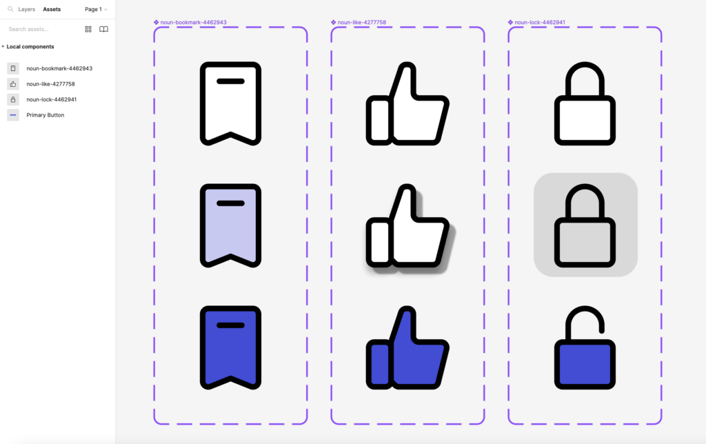
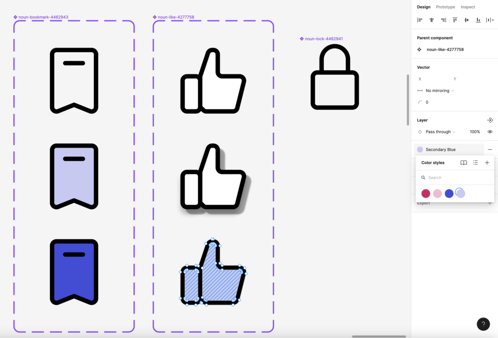
- In the below example, I’ve turned 3 icons into components, then created variants for each one’s default, hover, and clicked states. I’ve made different hover state styles with a fill, drop shadow, and background shape to see which one I prefer.
- To add a fill, you can double-click each SVG icon to enter vector editing mode (or click “Enter” under you see anchor points appear). Click “B” to bring in the fill tool and click within a shape you wish to fill.
- You can fill multiple enclosed regions of a vector shape, then select them each by Shift + Clicking them, and select a new color to apply a fill to multiple regions.
How to Add Styles to Your Design System
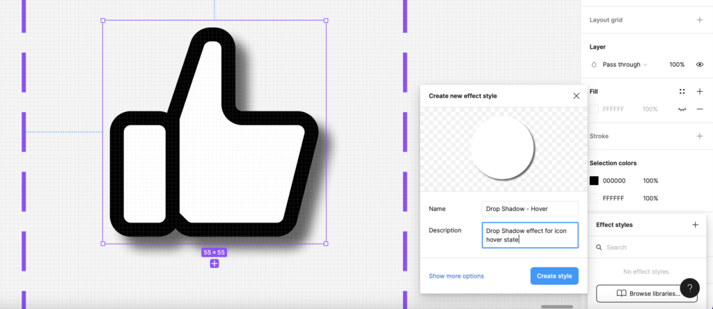
Let’s say I like the drop shadow effect I added to the “Like” button’s hover state above, and would like to standardize it as part of my design system to apply to all buttons.
- Add this effect by selecting your “Like” button variant and going to Effects -> Drop Shadow. Adjust the Blur, X & Y Values, and Opacity (or even color) to your liking.
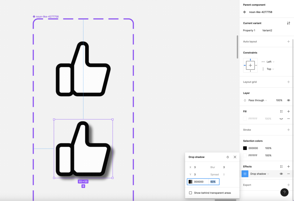
- Again, click on the 4 dots next to “Effects” to bring up your Styles menu. You can then click the “+” to add a new style with a title and description, then click “Create Style.”
- Now, your particular drop shadow parameters can be applied to any other component you wish for consistency by clicking the 4-dot Styles menu again.
How to Publish a Component Library
Every component you’ve made is available locally in the current file under “Assets.”
If you’d like to make components usable across multiple Figma files, you need to upgrade to a Professional plan.
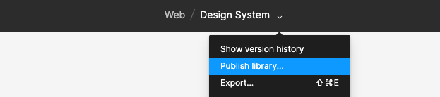
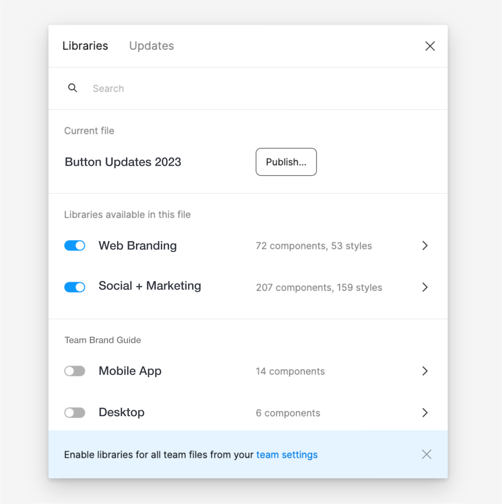
Then, you can click the file name at the top of your window to see a dropdown – then click “Publish Library” and select each component you want to add to your team’s library. You can also click on the Assets tab, click the Library (book) icon, and then click Publish. This publishes the Styles and Components in the library file so they can be used in other files.
You can publish multiple libraries for different needs, for example, a library of different types of web layouts for each page of your website to look distinct yet unified.
Clicking the book icon under “Assets” once again will bring up a list of all published libraries that you can toggle on or off to make locally available.
Tracking every component, style, color, typeface and more by including them in your Figma library is the best way to ensure that every new design you create will adhere to the same brand standards.
Ready to delve further into designing with Figma? Read some of our other Figma tutorials.