

So you’re building a brand: a visual representation of your company, along with the mission and emotion that you want it to convey. Everything you do should ladder up to your distinct, unmistakable brand look and feel. But how can you ensure consistency across every touchpoint so your branding is always memorable, and your messages are never muddled?
Making a brand guide or style guide – sometimes referred to as a brand kit or even brand bible – is how you track every design asset, along with contextual usage notes and guidelines that ensure everyone on your team is aligned and everything looks appropriately branded.
What Should You Include in a Brand Style Guide?
Think about the building blocks of your brand and its visual identity. This typically consists of things like:
- Logo
- Colors
- Typography
- Iconography
- Photography
- Mission statement
- Voice and tone
Naturally, you’ll want to collate your brand assets in a place where you can always find them: different logo versions in various formats, plus boilerplate copy examples, commonly used photos, and more. But writing guidelines about how you use these assets is equally important – for example, making sure that your logo is never stretched, distorted or recolored.
Why Build a Brand Style Guide?
If you’re a graphic designer, developing visual assets for a brand is a large and multi-faceted project to be proud of – but seeing team members improperly use them, or waste valuable time re-designing certain assets from scratch, can make it all for naught.
Give your team some guardrails around how to make sure every new asset you create stays true to the brand for a greater sense of cohesion. Marketers and product managers might want to create new sales collateral like pitch decks, for example, but you want to be sure that everyone on the team is still representing the brand accurately and not “going rogue” with materials that look unprofessional or unrelated. Be both descriptive and proscriptive in how you disseminate your brand assets.
Style guides are just one small part of a larger design system – the complete library of graphics, patterns, and design choices that you make across every touchpoint (including your website or app).
How do You Build a Brand Style Guide?
Historically, many companies would capture this information – particularly rules and guidelines – in a static PDF. But this can create a lot of headaches when it comes to hunting down the assets you actually need and cross-comparing notes about how and where they can be used.
We launched Lingo to address this issue. Lingo is a flexible brand management platform that unites all the assets you need, in whichever formats you need them, with supporting information and documentation to keep your whole team aligned.
The brand kits you can build in Lingo are part document, part asset library, and are built with visual organization in mind – so you don’t have to keep rummaging through opaque folders in storage systems and guessing which file is the right one. Best of all, Lingo includes an automatic file converter so you can take an asset like a vector logo and automatically generate a PNG, JPG, PDF and more from it, at whatever size you want.
Start with a Content Audit and Gather Your Assets
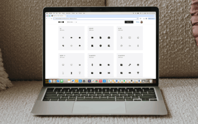
Round up all of the components of your brand: Logos in their various versions (full-color, monochrome, light version vs. dark version), brand colors, typefaces in use, icons and photos used throughout your website, apps, or social media presence. You might already have these assets sitting in folders – but Lingo allows you the clarity of a visual library that lets you view and compare all of your assets in one place.
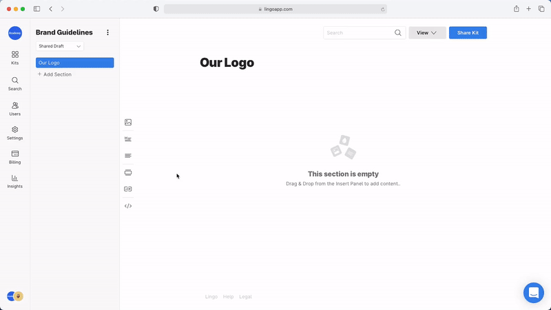
Using Lingo as a brand kit, you can start to organize these assets into sections with headings.
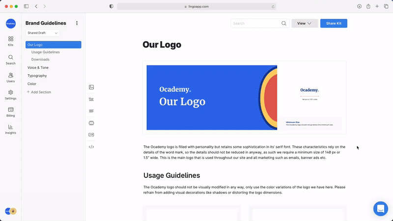
Add new sections with titles and start to add your files. You can include embedded images like header art to begin each section, and create a visual gallery of assets like your logo versions by simply dragging them into your Lingo window to include them. (Hint: upload .SVG versions of your logo and you’ll be able to instantly download them as JPGs, PNGs or PDFs).
You can also add supporting copy to add context and usage rules for every type of asset. Using the left-hand sections menu, you can add sections to clearly organize different types of assets like logos, typefaces and colors.
Making Rules and Style Guidelines
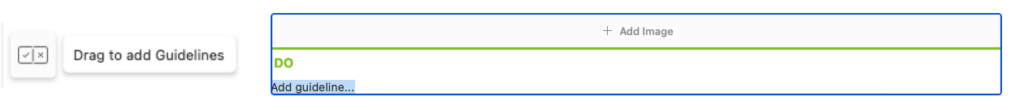
The copy you include in each section will help clarify how every asset is to be used – but don’t forget to include visual examples as well.
Lingo has a quick “Do and Don’t” functionality that you can drag into your kit to begin describing your guidelines with supporting imagery. Look for the “plus and minus” icon on the left-hand menu to add your guidelines.
Think about how you want to set rules around your assets with the following examples:
- Logo styles and colors (Don’t distort or recolor our logo)
- Typography rules (We only use regular or bold, and all type sizes should be multiples of 8)
- Icon rules (only use outline-style icons, never filled)
- Photo rules (use only black and white photos on the website and marketing collateral)
- Contrast, alignment and padding around common assets, or other visual styles like drop shadows or corner radiuses on images.
Below, the Lingo team organized their own brand kit with the most commonly-used logo files as well as their usage rules.


Make Your Assets Useful
Part of the issue with static PDF’s of your brand guide is that the visual assets themselves aren’t directly usable; you have to cross-compare with different files in local folders. Lingo circumvents this by uniting the assets themselves with their guidelines.
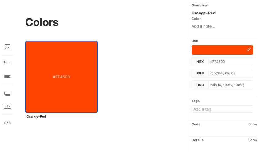
Colors
Lingo makes it easy to track and copy your brand’s colors. Adding a new asset and selecting “Color,” you can copy and paste a HEX value or use the eye-dropper tool to grab a color from anywhere on your screen.
Once you’ve added a color to your library, you can instantly copy its value as a HEX, RGB or HSB code, rename and describe it or give it a tag.
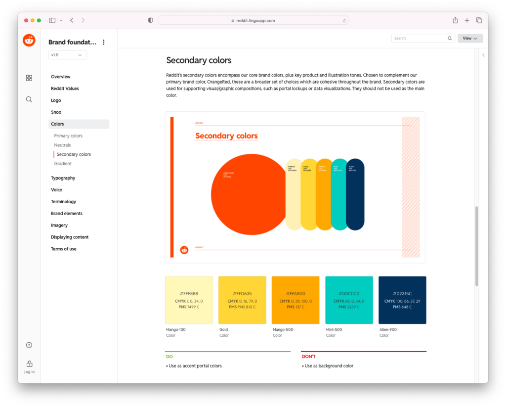
Check out how Reddit provides a visual example of their color library with a description, the colors themselves, and a quick do-and-don’t guide to their usage.
Use Lingo as your visual asset gallery to host everything you need, including vector images, colors, videos, photos and more.
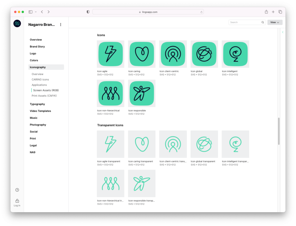
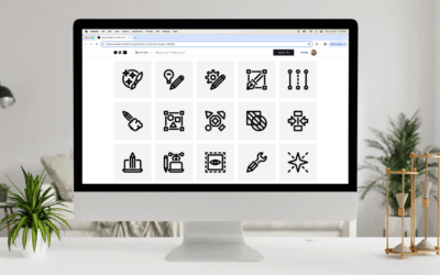
Icons
For brands that have their own signature icon library, keep track of your most commonly used icons by adding them to a kit. You can download SVG icons from Noun Project and even customize them with your brand colors – then keep the assets in Lingo where they can be reused and downloaded in different file formats. (Hint: copy those HEX values right from your color library in Lingo, and you can paste them into Noun Project’s icon editor to have different colors, or background shapes and colors).
Below, brand Nagarro tracks their common icons with 2 different visual styles.
Share Your Brand Guide with Your Team
Of course, a brand guide amounts to nothing without company-wide adoption. Share your Lingo Kit with your colleagues and manage their access and privacy settings to control who makes changes.
A run-through presentation is the best way to walk teammates through the brand guide and be clear about how to use it. As your company continues to grow and evolve, with new assets added every day, creating a clear organizational structure with Lingo will eliminate confusion and keep your work streamlined.
Get Started With Lingo
Want to explore what Lingo has to offer, risk-free? Try a fully-featured, 30-day trial.
Looking for more design tips? Explore our DIY section for more inspiration.