
")
Figma has become the go-to design platform for creative teams, graphic designers, UX and UI designers, and more. With its ease of use and focus on real-time collaboration, Figma allows you to create graphics, vector illustrations, mockups, prototypes, wireframes and user flows, so you can tackle any design project from a simple event flyer to a sophisticated mobile app prototype.
One of Figma’s most popular features – Auto Layout – now has even more functionality allowing you to set rules for how elements are combined, so that you can swiftly put dozens of elements together without having to manually drag and align each one. Combined with component libraries, you can use Auto Layout to build a design system with standardized elements that can be endlessly replicated, or modified with each instance.
Best of all, dragging and dropping vector icons from the Noun Project Mac App right into your Figma window is the quickest way to create a more visually friendly design every UI designer will need.
Here’s what we’ll cover in this newly-expanded tutorial:
Table of Contents:
- Basics of How to Create an Auto Layout: Design a Simple Button
- Change Auto Layout Settings
- Nested Auto Layout
How to Create an Auto Layout in Figma
In this first example, we’ll create a simple button with text and an icon.
Star by opening a new design file in Figma.
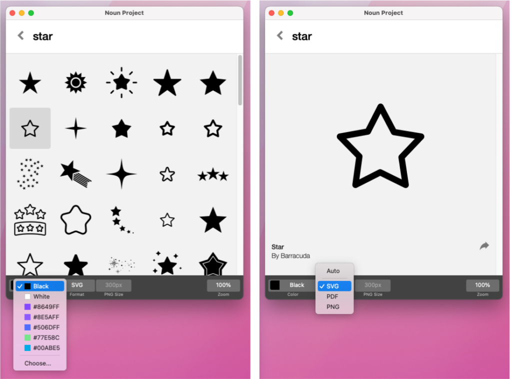
1. Download SVG Icons from Nounproject.com or the Noun Project Mac App
The easiest way to instantly drag and drop millions of vector icons into Figma is with the Noun Project App for Mac. With a NounPro subscription, you can access our complete library of icons from the app window, and even customize them by selecting your own colors and choosing SVG, PNG, or PDF format.
The best thing about working in Figma is that you can select SVG format to drag and drop vector icons directly into your window. Since Figma is a vector-based tool, you can scale icons without losing resolution, and instantly recolor them or even adjust their anchor points.
Search our UI and UX collections to find thousands of icons that are perfect for designing websites, apps, buttons and navigation menus.
It’s always a best practice to download icons from the same collection, or by the same designer, to maintain consistency. In this example, we’ll be using UI Material Icons by Mada Creative.

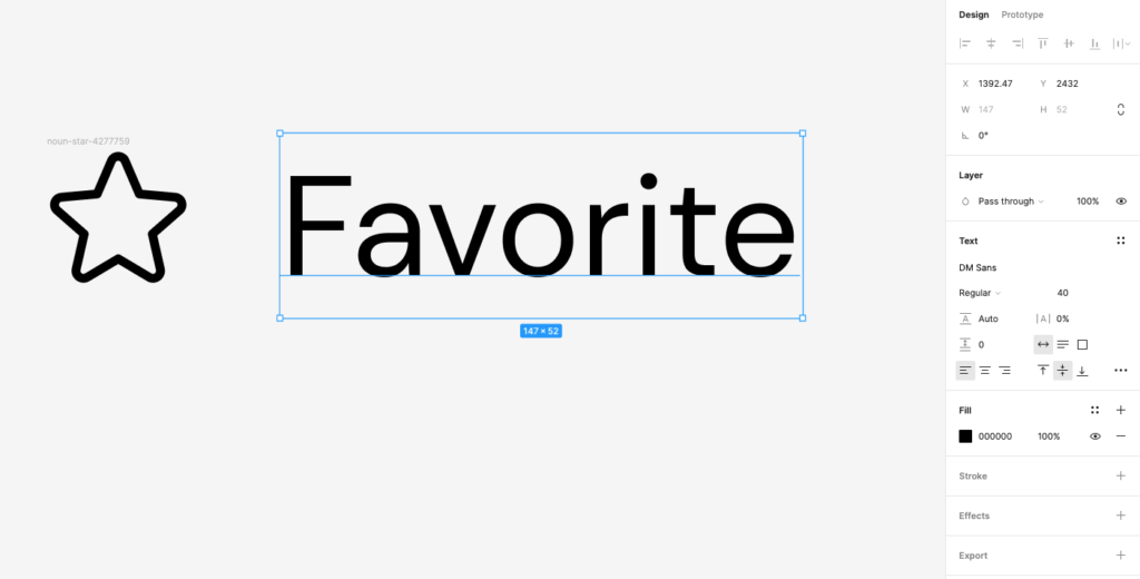
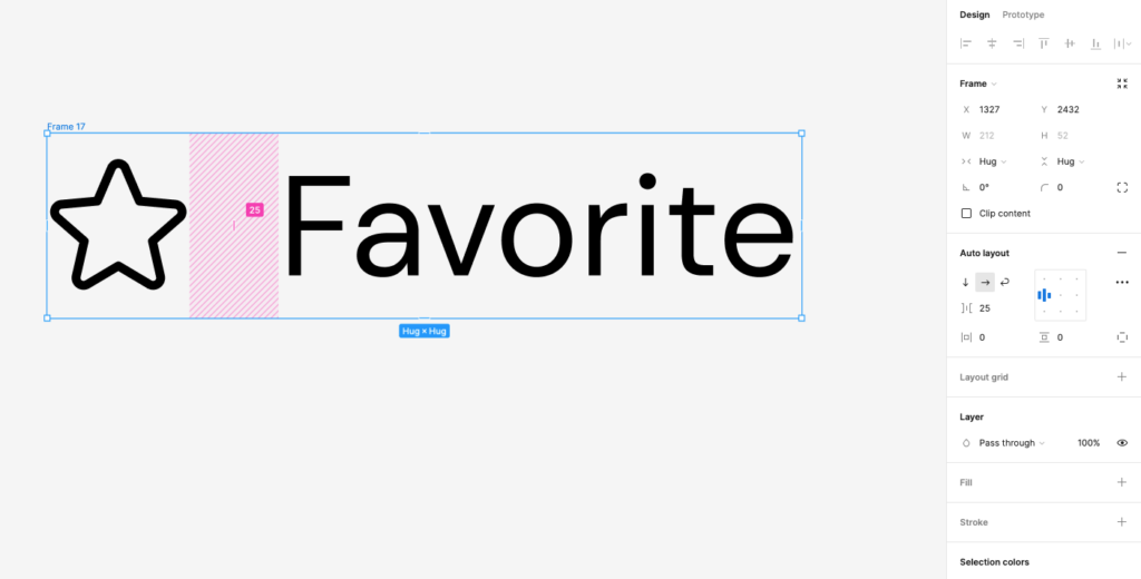
Think about what icons you’ll need and drag and drop them directly into your Figma file. Here, we’ll drag the star icon into the window.
Then, hit “T” or select the Text tool to create text and type your label (“Favorite”).
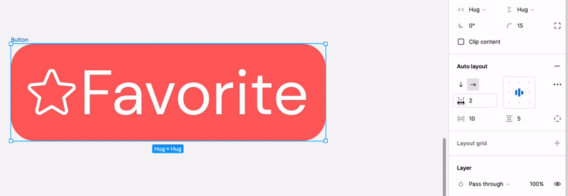
2. Create Your Auto Layout with Multiple Elements Selected
Select both the icon and the text and click Shift-A, or right-click and select “Add Auto Layout.”
You’ll see that Figma has now put these elements in a frame together. The right-hand design panel will now display the Auto Layout settings. Notice the horizontal arrow indicating that the elements have been arranged horizontally (selecting the vertical arrow will stack them one on top of the other).
How to Change Auto Layout Settings to Your Liking
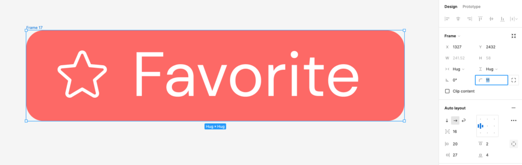
Now, let’s help this Auto Layout frame look more like a “pill”-style button.
- You can click and drag the corners of your Frame’s bounding box to change its dimensions, or input new numerical values under “width” and “height” under the Frame menu at right.
- Set a Fill color under Fill. You can also change the text color, paying attention to contrast so that it remains legible.
- Adjust the corner radius values to make rounded corners, either by clicking the corner dots within the frame itself, or the corner radius under the “Frame” menu.
Now, let’s look at some other appearance settings.
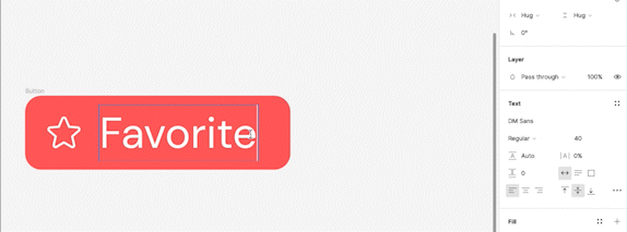
1. Alignment
- In the right-hand Auto Layout menu, our Auto Layout was already set to horizontal so the icon and text fall in a straight line. Clicking the downward arrow changes the orientation to Vertical, which stacks them on top of one another.
- The small grid icon shows us how the elements are aligned. In the horizontal format, we want to center-align our elements so they stay centered when the button is resized and we avoid dead space.
- Clicking the very center of the grid will center contents horizontally and vertically.
2. Padding
You can adjust the padding around each of the elements in your Auto Layout, either individually or all together.
With the Frame settings set to “Hug Contents” both horizontally and vertically, adjusting padding will change the overall size of the button since it’s now “hugging” that padded space.
You can adjust padding and spacing values within the “Auto Layout” menu:
- The spacing value changes space between elements (icon and text)
- Horizontal and vertical padding values change how much padding goes around these elements
- Clicking the square icon will let you adjust individual padding values for more granular tweaks. In the below example, we add a bit more padding just to the right side so that it optically balances the white space created by our star icon.
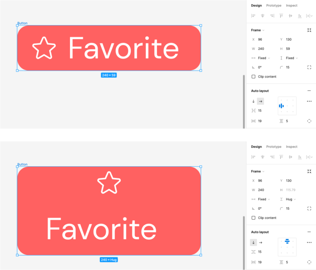
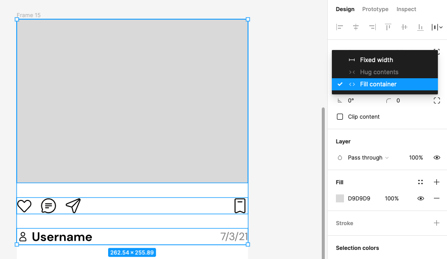
3. “Hug” vs. “Fixed” vs. “Fill Container”
Let’s take another look at how these three Frame settings in Auto Layout will affect your contents.
- Hug Contents: this will make your frame “hug” whatever is inside it – so if you add shorter or longer text, the frame will expand or contract accordingly. Here, we have “Hug” both horizontally and vertically, but with no set width, it’ll just keep extending horizontally.
- Fixed Width: Just like it sounds, you can manually click and drag the length of the button to make it fixed width or fixed height. In the below example, we’ve set a fixed width but kept the height to “Hug contents,” so the button will expand with added text but only vertically.
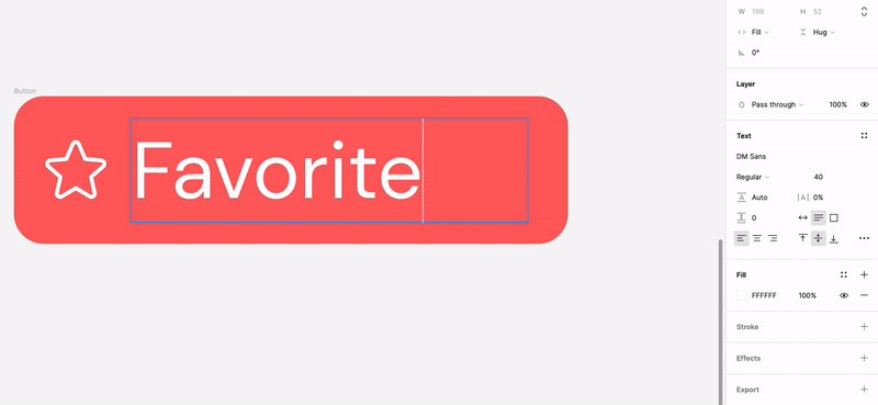
- Fill Container: Note that in the above example, we’ve also clicked into the text box and set it to “Fill Container.” This means it will occupy all available space minus the button’s padding.
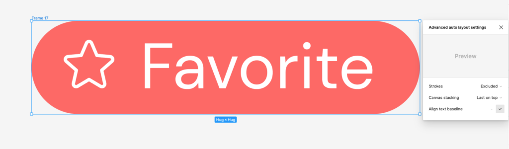
4. Text Baseline Alignment
Also new in Figma is the ability to align your text baseline. Instead of using the text’s bounding box as a reference to align it to the star icon, you can click the “…” within the Auto Layout panel to show Advanced Auto Layout settings. Click the checkbox next to “Align Text Baseline,” and the bottom of the icon will now align to the baseline of the text itself for a better optical alignment.
Also bear in mind that most icons already sit within a frame which may have its own padding. Double-click within the icon to select the vector shape itself, and you can move it outside of a frame (then delete the frame) to better align icons with text and other elements.
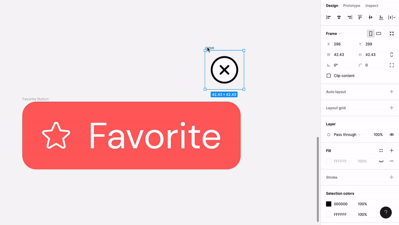
5. Outside the Box: How to Use Absolute Position
You can also utilize Absolute Position, which allows you to pin a certain element in relation to another, overriding other Auto Layout rules.
Let’s say you want to create an “X” that lets a user close out of your button or modal, hanging off the upper-right corner. Dropping that “X” into your button’s existing Auto Layout will just place it in line with other elements.
- With the “X” selected, Click “Absolute Position” under “Frame” instead.
- Drag the “X” to where you want it to visually go on your button.
- “Pin it” into place by adjusting the constraints to “Right” and “Top,” depending on which corner you want to use, as below.
Got a button format you like? Make it a component by right-clicking it and hitting “Create Component,” or typing Shift-Command-K. This will add it to your component library so that you can quickly drag and drop new buttons whenever you need them. You can find your component button under “Assets” in the left-land Layers panel, under “Local Components.”
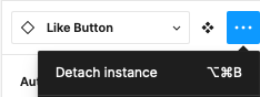
You can modify copies of your components such as typing a new CTA, or to make additional changes, click the ellipses on the right-hand column and hit “Detach Instance.”
Adding Multiple “Nested” Auto Layouts
Now that we’ve conquered simple, single-row Auto Layouts, how can you combine different Auto Layout elements into more complex and sophisticated designs?
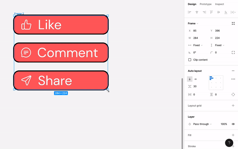
Let’s duplicate our button (Alt/Option – click – drag) and include different CTA’s with new icons as below:
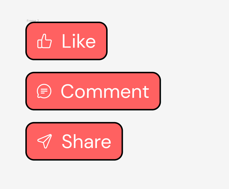
Now, click + drag to select all 3 and place them in a new Auto Layout (Shift-A) together.
They will automatically be placed into a “Parent” Auto Layout frame, vertically stacked, and you can now use the spacing tool – in the Auto Layout Menu or on the canvas itself – to adjust spacing between them.
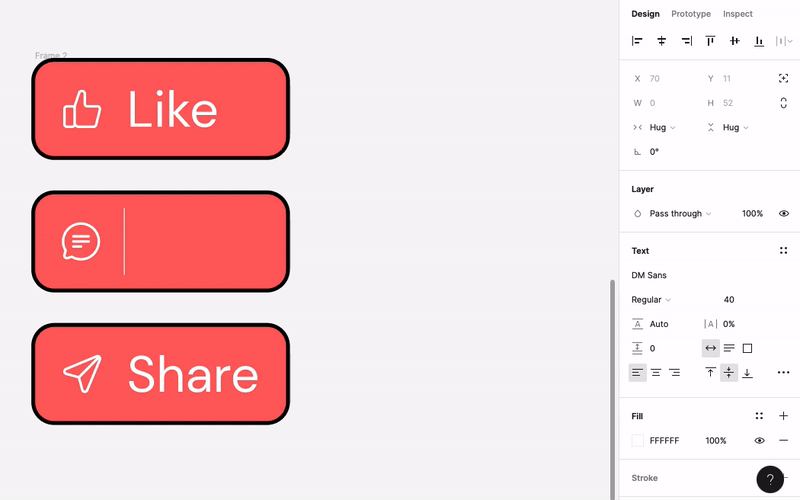
Now that we’ve nested Auto-Layouts to have a “parent” and “children,” let’s look at a few behaviors and interactions between them:
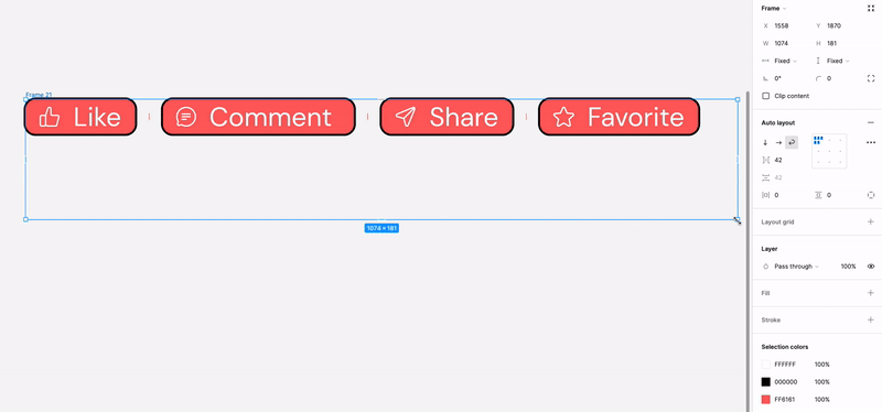
- To make these buttons all the same length for visual consistency, select each of the buttons and set the width of the frame to Fill Container. With the parents frame’s width set to Hug Contents, all buttons will now shrink or grow to the longest one’s size.
- If all three buttons have their frames set to Fill horizontal and Fill vertical, and the parent frame set to Fixed both ways, manipulating the corners of the parent frame will change the size of all buttons – because they’re filling the space horizontally and vertically as it’s changed.
Note that when the parent frame is narrower than our “Comment,” button, it tries to condense across two lines because it is no longer set to “Hug contents” horizontally.
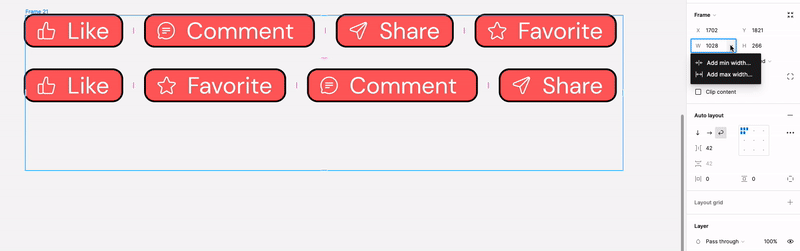
New in Auto Layout: Wrapping and Min/Max Dimensions.
In Figma’s latest 2023 update, you now also have the option of wrapping elements in a parent frame.
Hit the curved arrow “Wrap” button and you’ll see that as you resize the parent frame, elements will jump to the next line to maintain the given spacing. Note that this only works when the child components (each individual button) have a width set to Fixed or Hug Contents (“Fill Container” would contradict the logic of wrapping).
You can also now set minimum and maximum height and width values. This is particularly useful for prototyping, when you’re designing something like a web page in which you don’t want users to shrink or stretch the content too far.
Under the “Width” and “Height” values in the Frame menu, click the dropdown arrow and select “Add Min Width” to set a minimum – this means that, for example, when multiple elements are being wrapped within a frame, the minimum can prevent a more extreme wrapping effect where you’d end up with a single column of buttons. You’ll see a red guide line appear that indicates where you’ve set a minimum or maximum value.
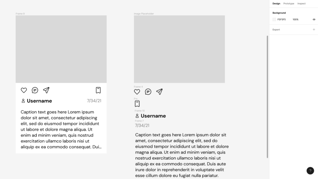
Prototyping: Make a Card Using Auto Layout
In the next example, let’s combine a few more different elements to make an image card – similar to a post you’d see on Instagram.
We’ll start by putting our elements together on the canvas:
- Image placeholder
- Engagement buttons: Like, Comment, Share, and Save
- Username with avatar icon
- Post date
- Post copy
Putting these elements into an Auto Layout can help “standardize” the design while giving us some flexibility – let’s make it so that we can add different sized images and lengths of post copy without disrupting the overall pattern.
We also want to keep certain elements right-aligned vs. left-aligned for more visual breathing room.
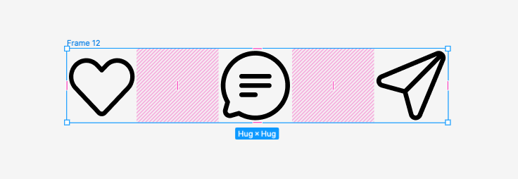
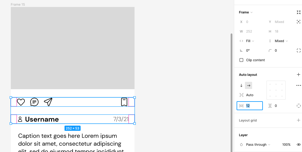
- First, let’s set our engagement buttons in place – we want the 3 interactions on one side, and the “Save” button on the other so they don’t all crowd together.
Select the “Like,” “Comment” and “Share” icons and Add Auto Layout (Shift-A). They should be set to horizontal layout with “Hug Contents” horizontally and vertically. You can then click and drag the spacing sliders to manually adjust spacing between the elements.
- Let’s have the “Save” icon be in the same row but on the right-side of the screen. Place the icon along the same row and add Auto Layout. This time under the “Auto Layout” panel, click “Space Between” and it will automatically space the two elements depending on how wide the parent container is.
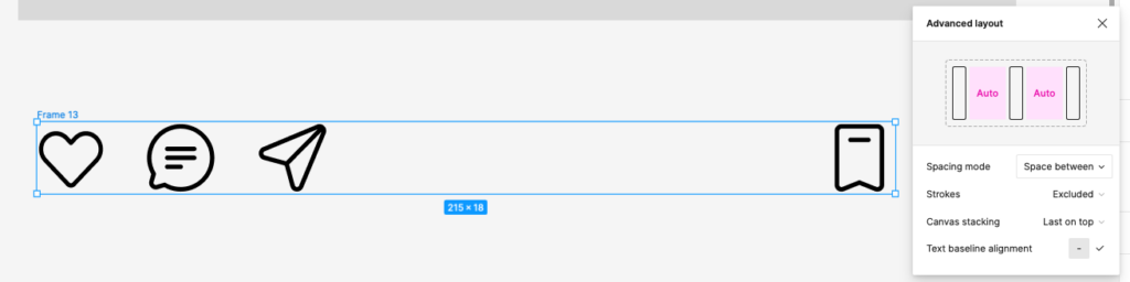
- Do the same approach for your username and avatar: first, place the avatar icon next to the text placeholder and make an Auto Layout like our first button example. Then, create another text box for the date placeholder, and put the two in a horizontal parent Auto Layout with “Space Between” selected again.
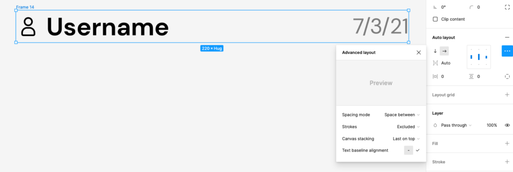
- Be sure your elements are vertically center-aligned in the Auto Layout panel. You can also change “text baseline alignment” if elements like icons are not properly aligning with your text – this will bring the bottom of the icon’s frame into alignment with the text’s baseline.
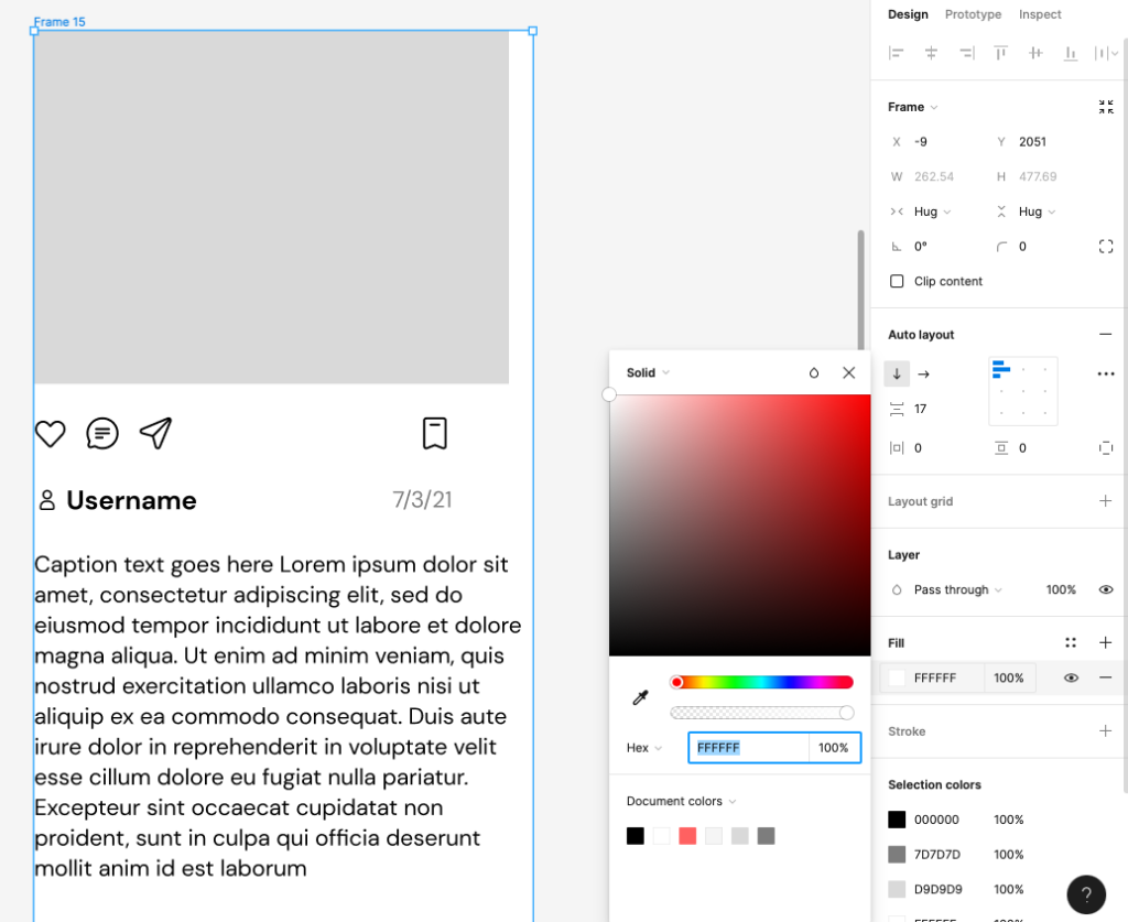
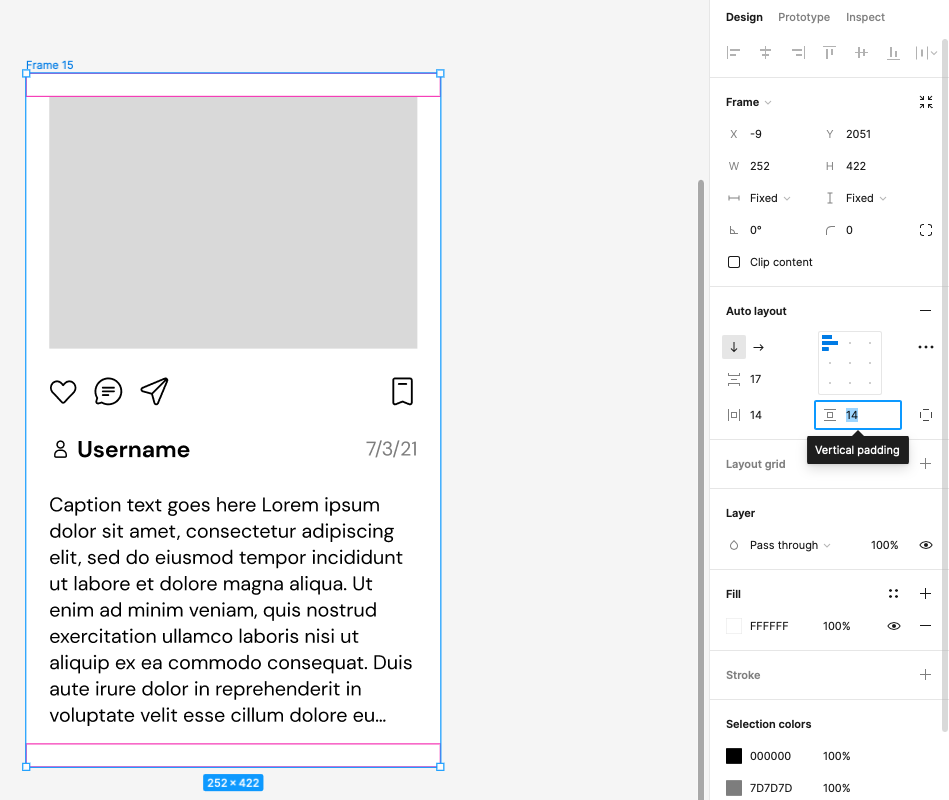
- Now, select all the elements together in a vertical row – image, engagement icons, username and date, and placeholder post text, and hit Shift-A again to make a parent Auto Layout frame that’s vertically aligned.
- Since all our content is now in a Frame, we can set the Frame’s Fill Color to white for better visibility.
Now, let’s tackle spacing:
- Setting each child Auto Layout to “Fill Container” horizontally will help the elements spread across the width of the parent frame. The image will expand and the “Space between” icons and username/date will spread out to left-and-right-justify like a table of contents.
To add better margins, we can adjust padding around these elements.
Adjusting padding values in the parent frame will apply them universally on all sides.
Instead, let’s individually apply padding to our 3 child Auto Layout rows, but keep the image placeholder set to “Fill Container” horizontally and vertically – this way, it’ll stay flush with the edges of the card while the elements below will retain padding.
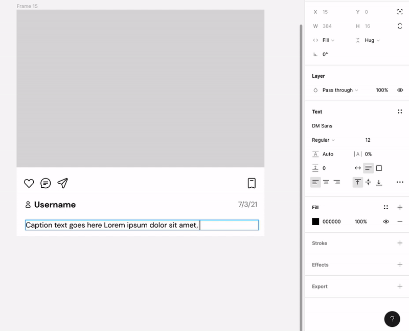
Let’s take another look at our caption text. We want the text to flow depending on how big the parent frame is. Put the text in its own Auto Layout, with the same horizontal padding as the above elements but no vertical padding – this is so we can adjust the vertical spacing from the parent frame for more event results.
Set the text Auto Layout, as well as the image, to Fill vertical x horizontal. Then set the parent frame to Hug Contents. This will help those elements resize to fit the parent frame – perfect for visualizing responsive pages and designs.
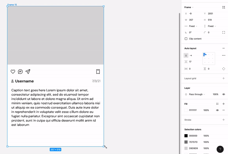
Conversely, we can have the length of our caption dictate how long our parent frame extends.
- Set the image to Fixed Height
- Set the text’s Auto Layout frame to Fill horizontal but Hug vertical. Make sure the text box itself, inside of its frame, is set to Fill horizontal and Hug vertical as well. The parent frame of your social media card should now expand vertically with the length of text.
Take the time to play with Auto Layout and get to know the interactions between elements when you nest different Auto Layouts inside one another. Sizing relationships will very depending on how different layouts are set to Fill, Hug, or Fixed.
For more tips on Auto Layout and other Figma features, follow Figma’s blog or YouTube channel.
For more ideas on how to make your designs pop with Noun Project icons, follow our Creative Inspiration.

Marketing Communications Manager at Noun Project, Designer and Illustrator.