
")
If you’re getting started in UI design and want to create a new app or website, icons are an indispensable part of the user interface. Users need to quickly scan through pages and screens to perform a series of actions, and using icons can lighten the cognitive load by replacing long sequences of text with short, memorable visual cues that rely on established conventions to get users where they need to go. As with most any type of design, scannability is key.
Chances are, any website or app you’ve visited recently uses icons to convey functionality. Even the browser window you’re using to read this article should have small icons that help you navigate back or forward, refresh the page, and more.
If you’re designing your own interface, here are some of our top tips to deploy icons effectively.
1. Use Established Conventions: Don’t Reinvent the Wheel
Great visual design should be new and groundbreaking, right?
Not always. If you’re in the business of UI or UX design, your primary concern is helping a user have their needs met as quickly as possible. Take the guesswork out of the user flow and, as the saying goes, “Don’t Make Me Think.” Having to decipher a new flow or take wild guesses at what various buttons mean is sure to frustrate your user.
Establishing common symbols and their meanings has helped people recognize patterns and become more adept at navigating tools and apps. Icons for “Home,” “Favorite,” “Comment,” “Menu,” “Refresh” or “Settings” buttons have become more or less universal across different interfaces, and that recognizability helps your user get to where they want to go.

2. Use Labels or Tooltips (Especially if Meanings Aren’t Clear)
Despite the above, there can still be some ambiguity among symbols. Does a heart mean “Like” or “Add to Favorites”? Would the user know the difference between a heart and star icon?
The first step would be avoiding ambiguity: if you want to use a heart for your “Like” button, perhaps the bookmark icon would be better for “Save/Add to Favorites” to denote that it’s different.
Does your app even have niche, specialty functions that the most common icons don’t cover? Don’t introduce new symbols without explaining them first.

Always use labels, which are especially helpful in getting a user to acclimate to your interface before navigating through it becomes second nature.
Apps such as Twitter include text labels next to every navigation button, and only collapse these in the condensed view. Users should, by default, have every button’s label spelled out until they are acclimated to the app through repeat usage. Only after practice can users start to more quickly internalize the icons– and even start to navigate through an icon-only UI.

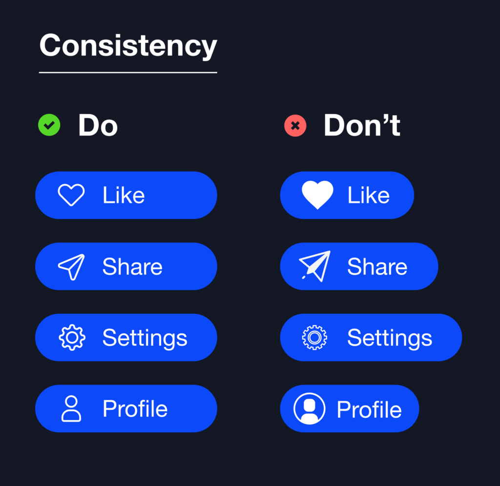
3. Use Consistent Icon Styles
This rule applies to all types of design, beyond UI and UX: find a set of icons that are all in a similar style to look consistent, readable, and brand-appropriate.
Mixing and matching different icon styles is a common mistake that makes your design – and the overall impression of your brand – look cluttered, unfocused, and unprofessional.
Keep your eye on things like:
- Line (stroke) weight
- Filled (glyph) or outlined styles
- Sharp vs. rounded corners
- Minimalist, detailed, or even hand-drawn “sketch” styles
Use Noun Project to search by collection or even by creator, as many icon creators will maintain a consistent style throughout their collections.
Also, be sure to bear in mind other attributes of your brand’s visual identity. Picking an icon set that compliments your main typefaces will help the interface look more cohesive. Does your brand’s visual identity have a playful, handcrafted style? Or is your interface meant to look sleek, polished, and futuristic? Just know that all of these design decisions ladder up to your brand’s credibility and trustworthiness.
Explore icon collections on Noun Project to find just the right one.

Use consistency of scale and alignment.
Once you’ve found a consistent set of icons in the same style, be sure that they’re set to the same scale, as shrinking or enlarging their dimensions will make stroke weights and visual weights appear different.
Another key to scannability is using tidy grid systems and tables to align elements. In the row of buttons below, note that in the visually consistent column to the left:
- All icons are the same style and size
- Icons and text both have consistent padding and alignment; all icons are center-justified while all text is left-justified
- Buttons are set to be the same width, rather than spanning the length of text. (Tip: learn more about using Auto Layout to standardize your elements and set rules to dictate their appearance)
4. Visual Read: Legibility and Contrast
Of course, finding a cool style with lots of design flourishes or a hand-scrawled aesthetic may not serve you if there isn’t a clear read. Every interface needs the right contrast and general legibility to be useful.
Size and Legibility
Be sure to check the icon’s legibility at both small and large sizes, especially if you’re designing for a mobile app in which icons will appear smaller on a screen.
How small can an icon be in a mobile app design? Generally, pushing an icon smaller than 16×16 pixels will be hard for the average user to see – except for basic shapes like arrows. If you’re ever in doubt, test it out! And ask others around you, too – naturally, user texting is the cornerstone of UX design.
Also bear in mind: You may need different icons for web and mobile interfaces.
If you like how a particular icon displays on a website design, you might find that when scaling down the icon for mobile, some of the detail is lost and the read becomes muddled. In that case, don’t always count on using the same icon – many brands will actually adapt and modify a given icon for a smaller scale.


Contrast
Low contrast means low legibility. Using two color values that are too close to one another will make critical details seem to disappear. Contrast is also a fundamental part of making more accessible UI designs.
As with all things in design, you want to keep hierarchy in mind. Two of the biggest tools at your disposal are scale and contrast: you can direct focus across your interface based on how big an icon is, how high its contrast is, or a combination of the two.
While this is often a subjective design choice, minimum contrast requirements are essential for accessibility, and particularly users who may have colorblindness or other visual impairments.
Always test your designs with a free online contrast checking tool when in doubt.

5. Change Icon Appearance to Indicate Button States
Users need immediate visual feedback on things like:
- Which buttons are clickable
- Which have already been clicked
- What they’re hovering their cursor over
- What’s deactivated and not clickable
If you’re making an interface with icon buttons, they’ll need to signify some of these key button states. As with the hierarchy and contrast examples above, you can deploy different methods to give similar icons and buttons more visual distinction:
- Contrast
- Color
- Size
- Fill vs. Outline
- Adding a highlight or outline to a button.
Again, certain conventions have been established when it comes to button states – rather than reinventing the wheel, an easier user experience comes from using the right visual cues to indicate these states, such as the following:
- Inactive buttons are typically “Grayed Out” – or have less contrast than clickable buttons
- Buttons that have been clicked will typically change in appearance, whether with a different color, fill, level of contrast, or highlight.

People are also accustomed to immediately knowing what’s clickable – think of when your cursor turns from an arrow to a finger when you’re hovering over a hyperlink. It helps to similarly give some visual feedback when users hover over their different options – any given button should change appearance in one of several ways.

What’s critical is giving a distinct visual cue at every step of this process: default, hover, and clicked. Each state should rely on a distinct variation – and keep the final state in place so users know a task has been complete.

Tip: Instant icon filling in Figma
Want to turn an icon from an outline shape to a filled shape? Use Figma to change it quickly:
- Open a new Figma file
- Download your desired outline icon from Noun Project in SVG format, or instantly drag-and-drop an SVG icon from the Noun Project Mac App into your Figma Window.

- Clicking on the icon, hit “Enter” until you’re in vector edit mode – you’ll see anchor points appear, allowing you to edit the paths and shapes of your icon.

- Hit “B” to bring up the Paint Bucket tool, and hover it over any enclosed space that needs to be filled. Once it’s been filled, select the desired color within the right-hand design window.
