

Are you new to graphic design, or want a better understanding of how to quickly elevate your designs?
In this series, we’ll be breaking down the fundamental principles of graphic design that help users find and synthesize information more quickly – and add that just-right balance of clarity and visual delight.
One of the most indispensable graphic design principles is hierarchy: the prioritization and visual weight given to the most critical pieces of information and focal points. Without hierarchy, any design can quickly turn into an overwhelming maze of competing bits of information, destined to overwhelm users. By deploying techniques like changing the arrangement, scale, color, and contrast of your most crucial elements, you can avoid any ambiguity as to what the viewer should look at and process first.
Let’s dive into how to use hierarchy effectively in your next design.
Understanding the Graphic Design Principle of Hierarchy: Guiding the Viewer’s Eye
So what is hierarchy in graphic design? Hierarchy can be described as the organization of elements in a design to guide the viewer’s attention and convey the relative importance of each element. Establishing a clear hierarchy is crucial for communicating the intended message and ensuring that viewers absorb information in a logical and meaningful order.
The Importance of Hierarchy in Design
Imagine reading a textbook with no chapters, headings, or subheadings. The lack of hierarchy would make it challenging to follow the narrative or identify key points. Similarly, in graphic design, hierarchy acts as a visual roadmap, guiding the viewer through the content and helping them prioritize information.
In a world inundated with visual stimuli, a well-crafted hierarchy ensures that your audience doesn’t feel overwhelmed. By strategically arranging elements, you dictate where the viewer’s eyes should linger, creating a seamless and enjoyable visual experience.
Hierarchy comes into play every day with things like web design, app interfaces, or even newspapers and books. What you choose to prioritize should be given due consideration, whether you’re building a clear user experience or a scientific infographic. Anything you create will have its own information architecture – an order in which bits of information should be revealed, and connected to one another, for maximum impact.
How to Create Better Hierarchy in Design
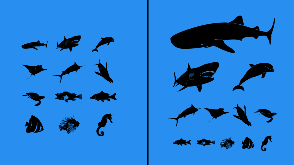
1. Size and Scale: the Best Way to Create Better Hierarchy
The single quickest and most obvious way to add a sense of hierarchy is to make the most important elements the biggest. The bigger the element, the more it demands the viewer’s attention. This applies to both text and other elements like shapes and photos – making your key visual element at least double the size of other surrounding elements will help it stand out more.
If all your elements are around the same size, your eyes will want to dart back and forth across the composition, never quite knowing when to rest. When in doubt, ask someone else to look at your design and tell you what they notice first. Looking at a design with fresh eyes can help you zero in on what the immediate first impression is.
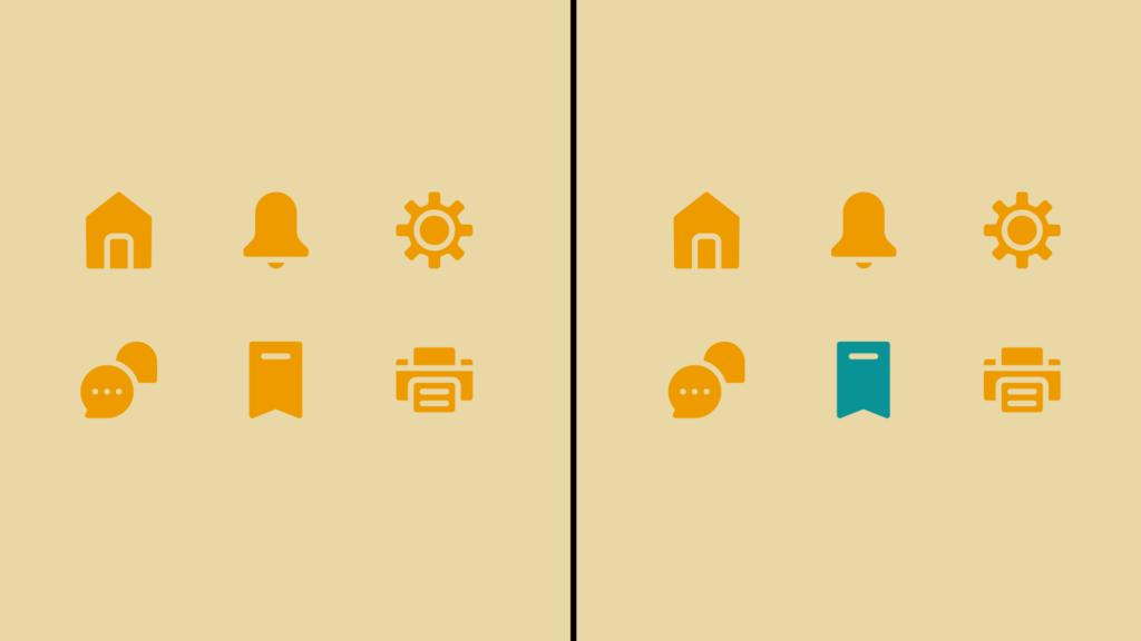
2. Color and Contrast
Direct the viewer’s attention to a single element by making it higher contrast, with a wider range in values of the hues. If you’re drawing colors from a particular palette, you can make most of the elements similar in value or hue to help them blend together – but pick the boldest, perhaps even complementary color for the focal point. The higher the contrast, the more it’ll demand attention.
Also bear in mind that colors can come with their own immediate, visceral reactions – or carry cultural associations. Shades of yellow and red typically signify warnings or evoke high-energy reactions like excitement or anger, while shades of blue or purple may be more calming. Use the emotional language of color to your advantage while creating hierarchy.
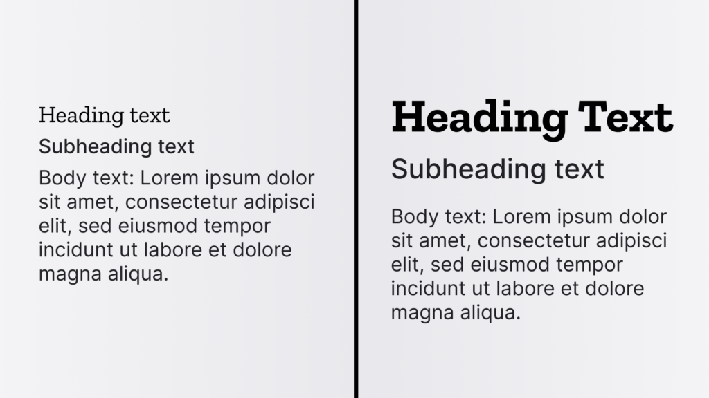
3. Say More with Your Typographic Scale
We most often see hierarchy come into play with typography – from magazines to books to websites. Use distinct font sizes and/or styles for titles, subtitles, and body text.
As a general rule, your headings should be at least double the size of your body text. For example, If you’re publishing a blog article or creative a user interface design using 12 pt. font for the body copy, an eye-catching heading would be 24 pt (and a sub-heading could fall somewhere in between, like 18). For an even bolder statement, go even bigger with your main text!
It’s also a best practice to use a heavier weight for your heading, such as a bold or black weight to more heavily contrast with the regular or medium body copy. Obviously, more stylized embellishments like italics or underlines can help direct attention throughout.
Making an even bigger statement with your primary headline text – such as by using a separate display typeface that contrasts with your regular font – is an even better way to help it stand apart.
4. Spatial Arrangement, Alignment, and Grouping
Rule-breakers always tend to grab our attention. One trick of creating better hierarchy is to establish a set of rules, like groupings or patterns, and then break them. Whichever element falls out of line will become an immediate focal point and create hierarchy.
Creating a composition, the most intuitive rules reign supreme: placing focal elements in the center will always give them the greatest emphasis. Otherwise, use alignments and groupings to establish your own rules as you go.
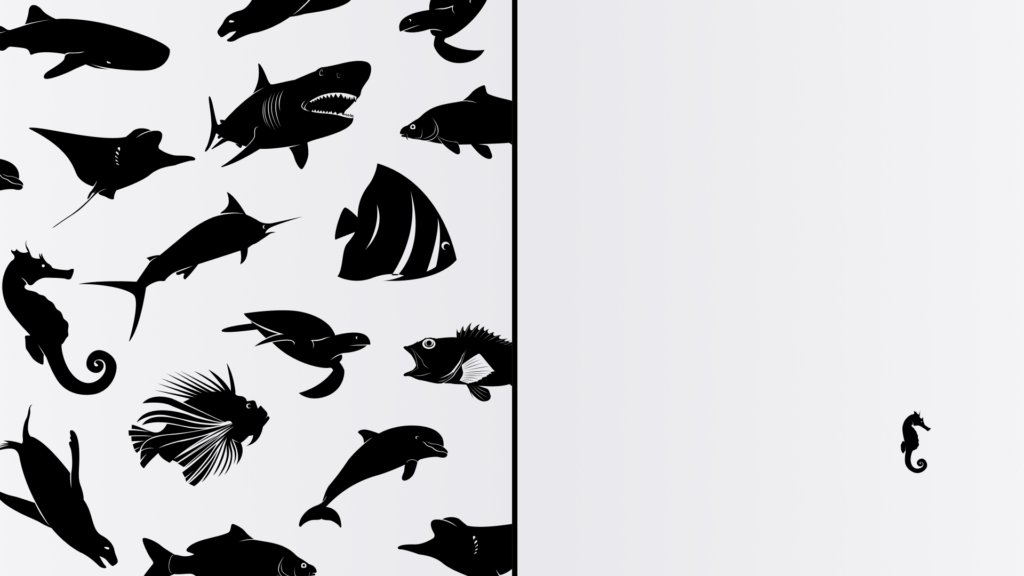
Breaking the Grid: If you have several elements to use on a page, putting them together in a cluster will automatically create a visual grouping, and aligning them on an axis – or an evenly-spaced grid system – will give the design a static, stable feeling. Taking one element and placing it outside of this structure – by re-aligning it, making it bigger, or even just changing its color, contrast, or shape, will give it visual priority.
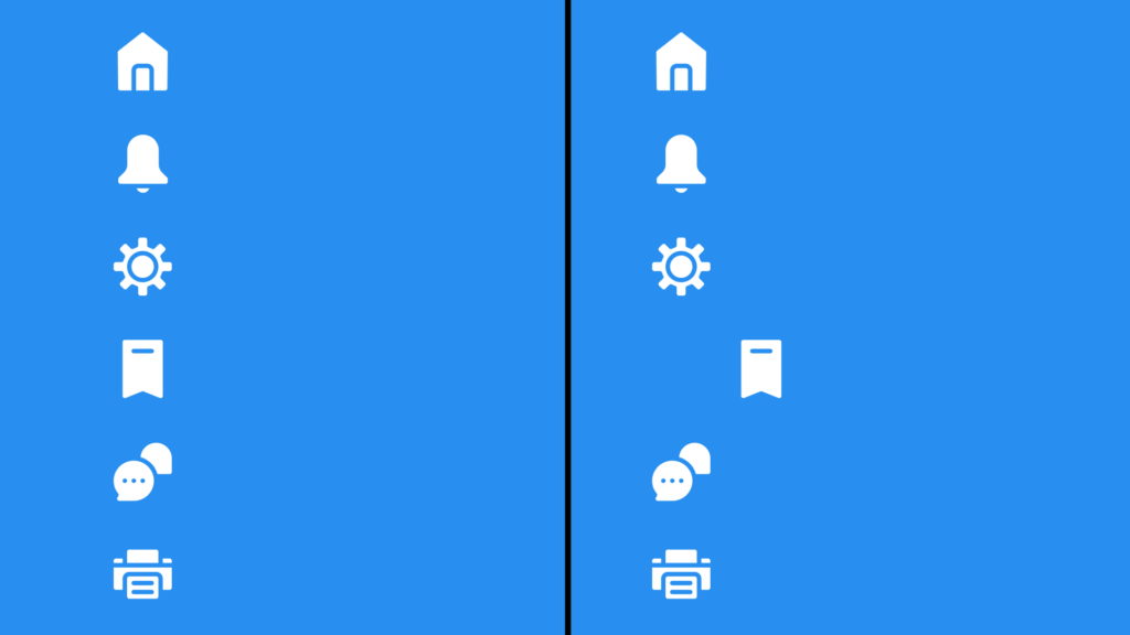
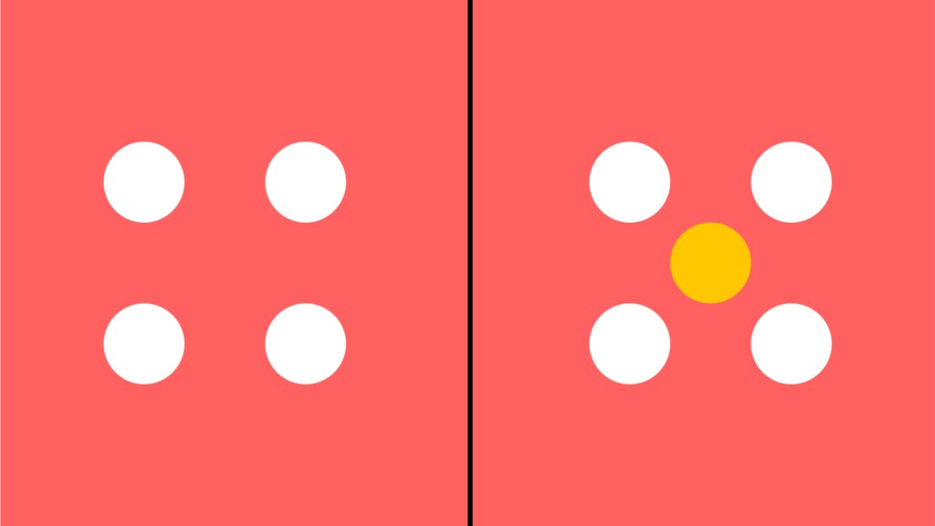
Tip: the “Rule of Odds” is another observed phenomenon in which our attention will be drawn to an odd number of items more so than an even one. Consider looking at a small grid of 4 circles – they all seem to carry equal visual weight and importance. Adding a fifth circle in the center – or anywhere on the page – can break up the “static” and flat nature of the composition and create a focal point amidst the symmetry.
Keep Your White Space: If every square inch of your design has a visual element, it’ll be harder to keep the viewer focused. Leaving enough white space to create visual balance and allow for some “breathing room” will help the viewers see individual elements more clearly, and see where their eyes should eventually settle. Again, if there are so many elements that a design feels “busy,” chances are you’re not focusing on one thing to prioritize. White space will accentuate the most important item.
Learn By Doing
As with so many aspects of graphic design, you’ll get better with practice and plenty of experimentation. Trust your gut about whether something is clear – and when it doubt, ask someone for feedback. Use the principles of size, color, contrast, groupings, alignment, and white space to make your elements come to the forefront or recede into the background.
By mastering graphic design principles like hierarchy, you can not only captivate but also communicate with precision and impact.
Looking for More Graphic Design Tutorials?
Check out our Creative Inspiration blog category for more.

Marketing Communications Manager at Noun Project, Designer and Illustrator.