Choosing the right colors is crucial for any design project. Whether you’re a seasoned graphic designer or a novice, having the right tools to generate and understand color palettes can quickly add eye-catching flair to your work. Here, we’ve rounded up some of the best color palette generating tools and resources available online to help you create harmonious color schemes for your designs.
Top Color Palette Generating Tools
1. Coolors
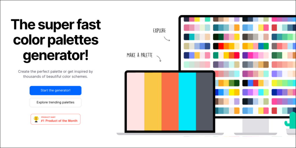
Coolors is a fast and user-friendly color scheme generator. Designers can quickly create and save palettes, export them in various formats, and even explore top trending palettes made by others for inspiration. Key features include the ability to adjust hues, saturation, and brightness, and lock colors to keep your favorite shades while generating new combinations.
Coolors also has an IOS and Android app, as well as plugins for Figma and Adobe, so you can access your favorite saved color palettes for your next design project.
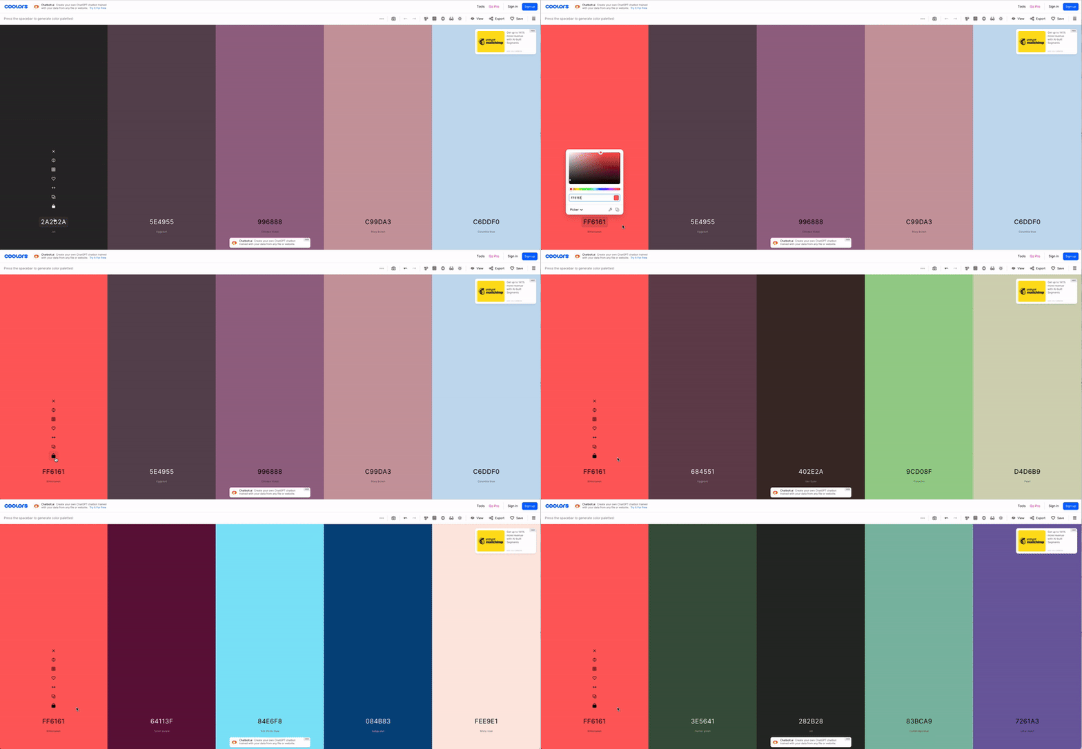
Best way to use it: Instantly generate pleasing palettes based around a primary color. Simply copy the HEX code of a color you want to use, paste it into the generator, hit the “Lock” button to save it, then hit the space bar to explore new 5-color schemes that harmonize perfectly.
2. Adobe Color
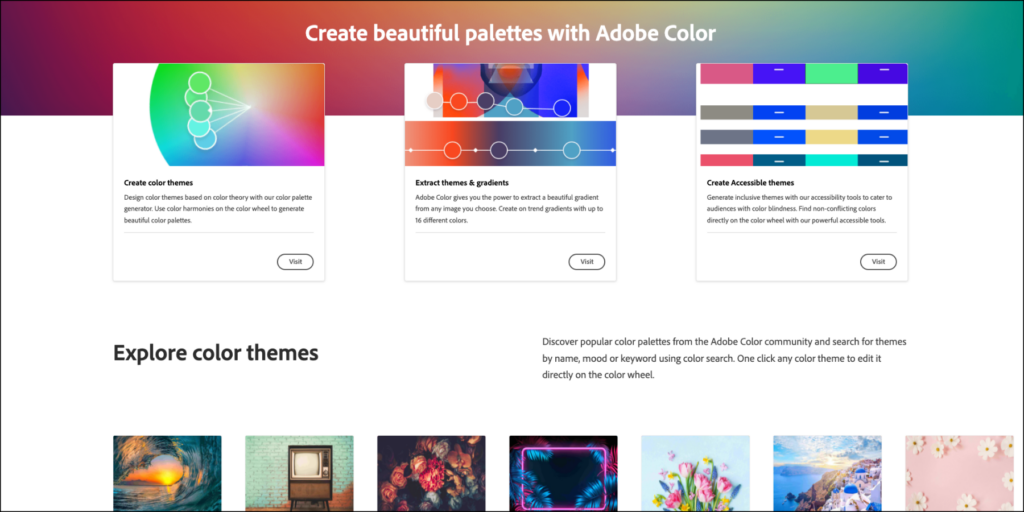
Adobe Color is a comprehensive tool that allows you to create, browse, and save color schemes. It offers different color harmony rules like analogous, monochromatic, triad, and complementary. Integration with Adobe Creative Cloud ensures seamless use with other Adobe products – including the web-based Adobe Express.
Adobe Color’s key features are:
- The ability to generate color schemes instantly based on color theory principles
- Extracting colors from an image file such as a photograph
- Checking color combinations for accessibility, with a contrast ratio optimized for legibility or users with color blindness.
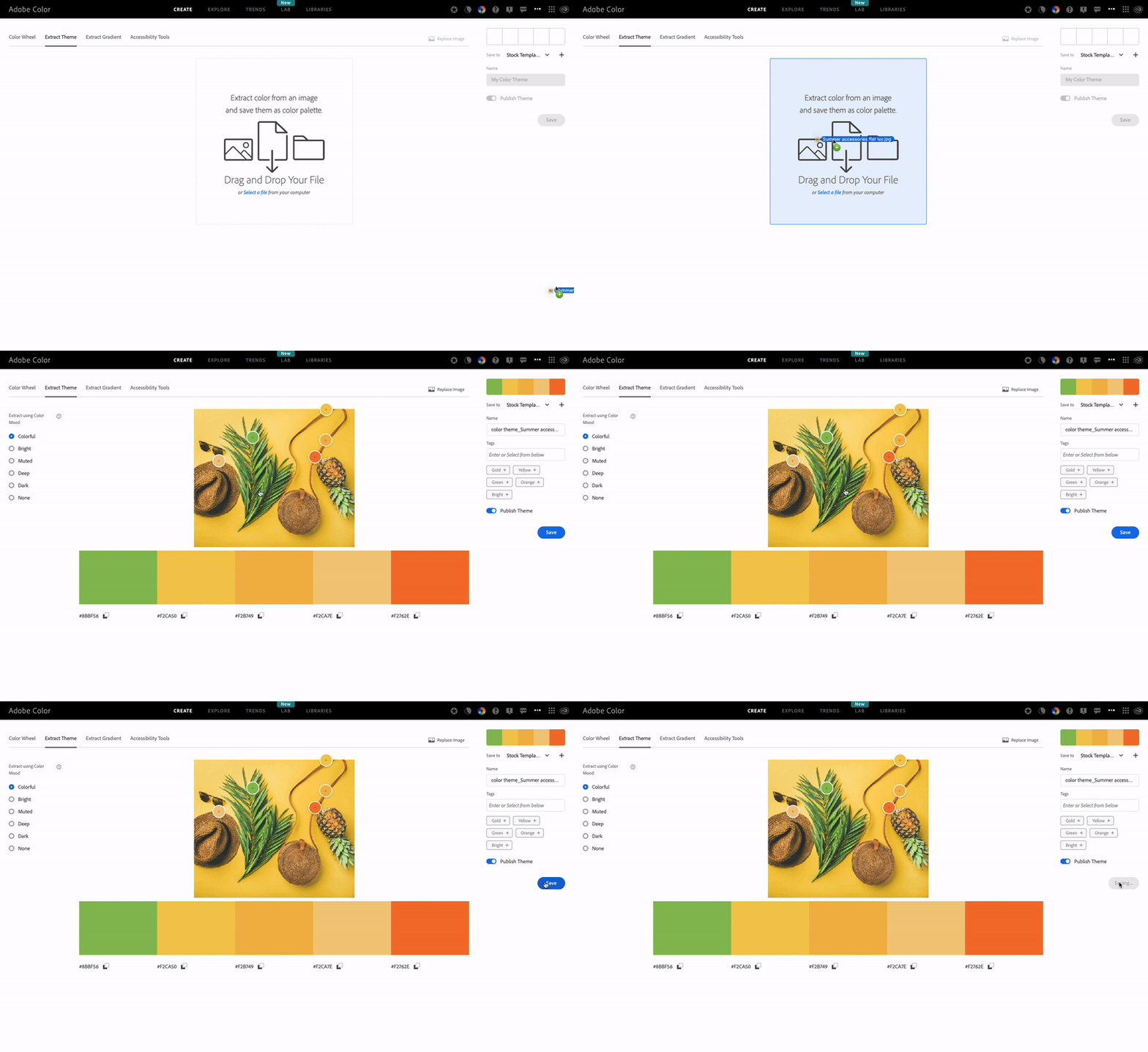
Best way to use it: Drag and drop any photo into the “Extract Theme” tool and Adobe Color will automatically create a pleasing theme from the most prominent colors in the photo. You can add a title and tags and even publish the theme for other users to get inspired by, and save it to use as a palette for any design projects.
3. Paletton

Paletton is designed for more deeply exploring and experimenting with combinations on the color wheel. It offers various color schemes, such as monochromatic, adjacent colors, triad, and tetrad. The tool also includes a handy preview feature to see how colors will look in different contexts, and its “Examples” tab allows you to instantly generate different artworks based on the color scheme you’ve generated.
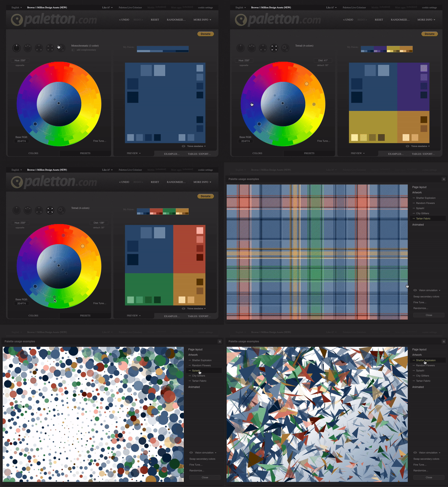
Best way to use it: Explore different color schemes by selecting relationships such as “Monochromatic,” “Triad,” or “Tetrad,” and experimenting with different levels of saturation or shading. Then click “Examples” to get a feel for how these combinations would work in a piece of artwork.
4. Canva Color Palette Generator

Similar to these other popular tools, Canva’s color palette generator lets you select a starting color and explore combinations using rules like triadic, analogous, etc., or to upload a photo and instantly extract a theme. The key differentiator? You can then select “Create a Graphic” to explore hundreds of Canva templates inspired by your chosen colors.

Best Way to Use It: After selecting your color combination, drag the shade wheel around to make your combination lighter or darker. Then choose “Create a Graphic” to explore templates that use those colors. Canva also comes loaded with a curated collection of Noun Project icons that can be instantly inserted into any design (here’s how).
5. Colormind
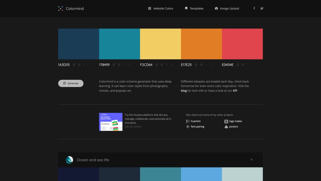
Colormind is a color scheme generator that uses deep learning to create color palettes. The website is constantly pulling from a large dataset of photographs, movies, images from popular culture, and even popular website designs with eye-catching UI elements to curate recommended palettes. It can also behave like these other tools with a five-hue palette built from scratch based on input colors, which can be locked to generate harmonious hues.
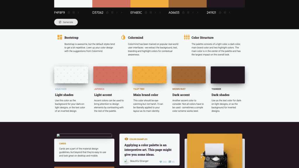
Best way to use it: Colormind’s key differentiator is its UI and web design inspiration. While generating color palettes with machine learning, you can also instantly view examples of how the palettes can translate into a clear, high-contrast, and eye-catching UI designs, with recommendations on how to use each color as a main brand color, background shade, light or dark accent for callout buttons, and more. Another bonus tip: if you have two complementary colors, try placing them at the opposite ends of the palette before clicking the “lock” button, and Colormind will tend to generate nice intermediate values.
6. Color Hunt

Color Hunt started as a personal project built to share trendy color combinations between a group of designer friends. The collection continued to grow with new contributors uploading their favorite combinations from all over the world each and every day, and is now a great resource for color inspiration and celebrating the beauty of design. Anyone can upload their own palette, which is then curated to spotlight some of the most inspiring combinations.
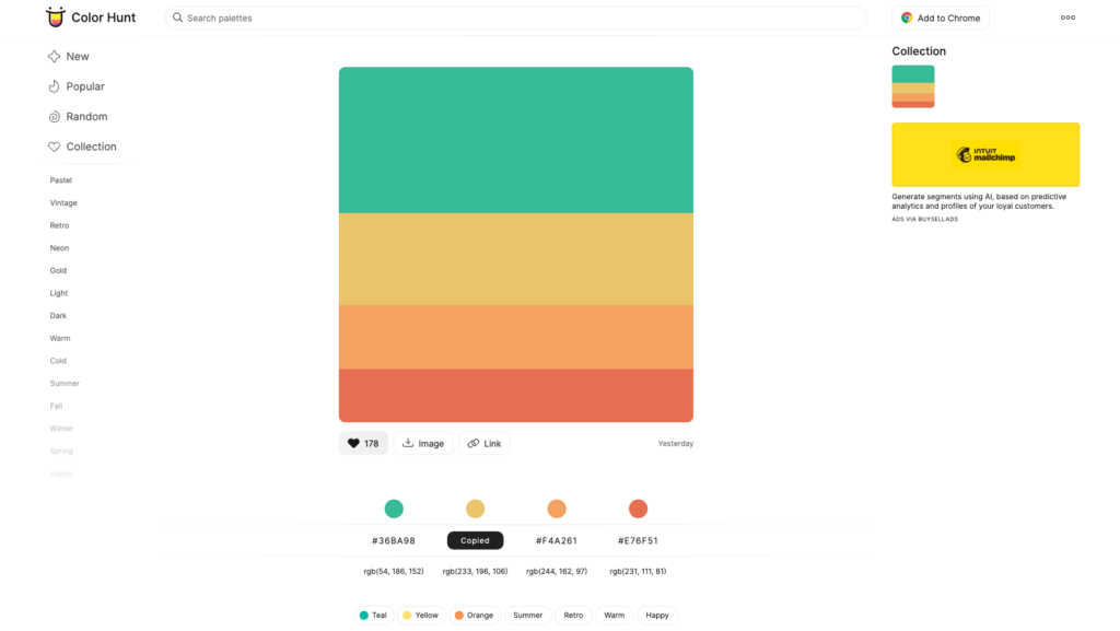
Best way to use it: Explore the most popular categories or search for tags like “nature” or “summer.” Then download your favorite palettes as an image, or click any hue to instantly copy its HEX value.
7. Colorzilla: Browser Extension

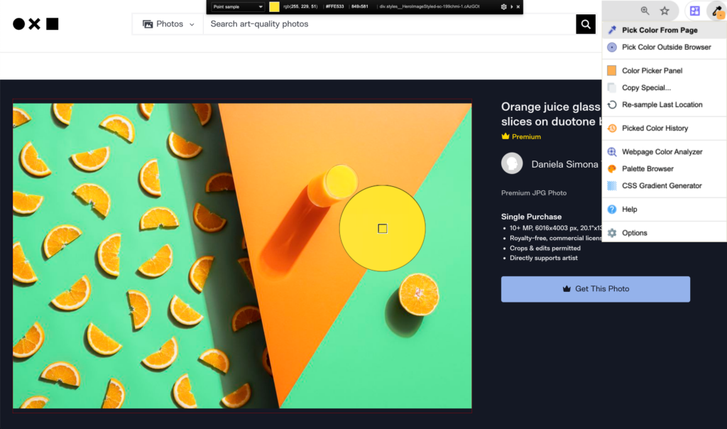
Colorzilla is an extension you can add to Chrome or Firefox, that’s primarily used for its eyedropper functionality. The extension allows you to instantly capture a color within your browser window or beyond, so you can begin to build a custom palette from any source on your screen. After using the eyedropper to capture a color, Colorzilla automatically keeps a history of all selected colors that you can use as a swatch palette.

More Resources for Learning About Color
Ready to dig into color theory and understand the basics of how we perceive and respond to color? Check out some of these resources and books to expand your knowledge.
Interaction of Color by Josef Albers
This book is a classic in the world of color theory. Albers’ lessons and exercises help designers understand how colors interact with one another.
Color Theory for Designers on Smashing Magazine
This series of articles breaks down the fundamentals of color theory, making it accessible and practical for designers.
Color Theory: A Complete Guide for Artists and Designers on Tuts+
Tuts+ provides a comprehensive guide to color theory, covering everything from the color wheel to color harmony and psychology.
Bonus: Make Your Own Palette Based on a Photo in Adobe Illustrator
Want to generate a more robust palette of different colors based on a photograph? While both Photoshop and Illustrator let you use the eyedropper tool (i) to select any point in your canvas to capture a color and add it to your swatches, one handy tool is the Mosaic tool to distill a handful of predominant colors from a photograph containing potentially thousands of hues.
Using the Mosaic Function
- Import a Photo: Drag and drop a photo into Illustrator.
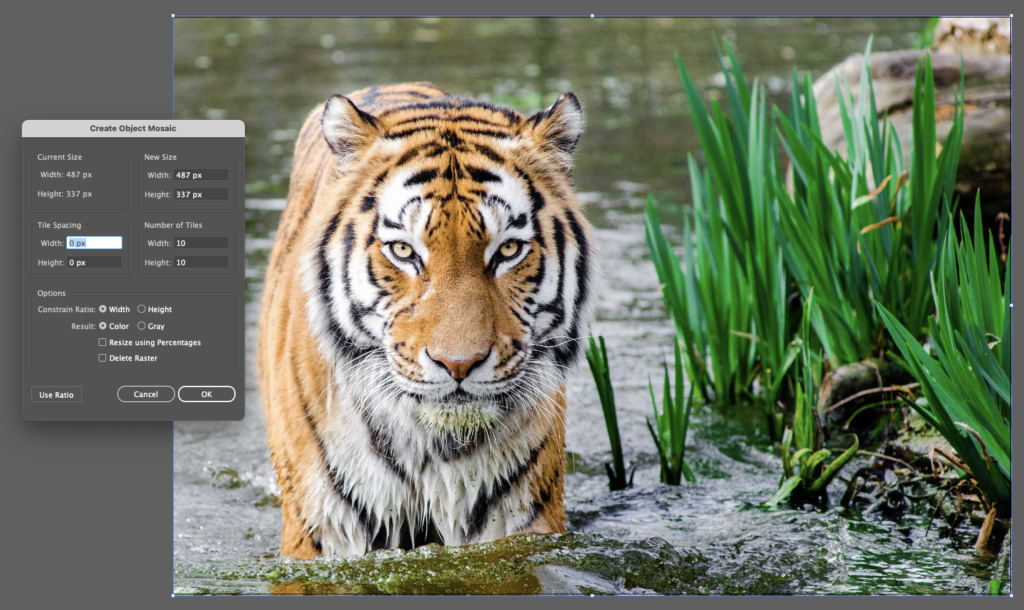
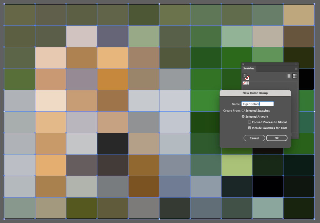
- Create a Mosaic: Go to Object > Create Object Mosaic. Adjust the number of tiles to get a grid that best represents the detail in your photo (here, I’m using a 10 x 10 tile mosaic to give me 100 different color tiles to choose from), and hit “OK” to generate the mosaic.
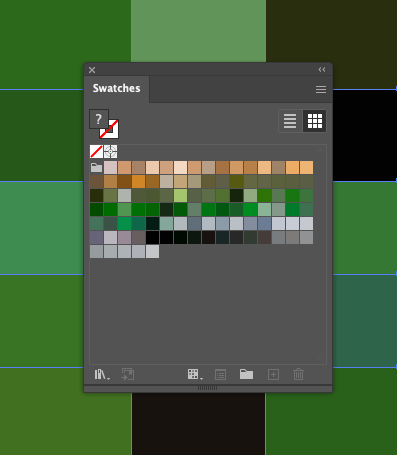
- Extract Colors: Use the Eyedropper tool to sample colors from the mosaic tiles and add them to your swatches. Or, to add the entire collection of colors to your swatches library, open your Swatches window, click the folder icon for “New Color Group,” and make sure “Selected Artwork” is checked. Click “OK” and all of these colors will be added to your Swatches panel.
Understanding the ins and outs of color takes a great amount of practice and deep familiarity with color theory, but these tools and processes can serve as handy hacks to help you make professional looking and harmonious designs without the guesswork.
Check out more guides to using color in your design or photography for an even deeper guide to color theory.


