As photographers, we have many tools at our disposal to make great photographs, including compositional guidelines like the rule of thirds, leading lines, and effective framing. Being intentional with color choices by using color theory is another great way to strengthen the composition in your images. Color theory is a set of principles and guidelines used to create harmonious color combinations that are pleasing to the eye.
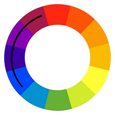
At the heart of color theory is the color wheel, created by Sir Isaac Newton in the 1660’s. The color wheel is a convenient tool to help you visualize the relationship and harmony between colors.

Harmonious color schemes are established combinations based on colors’ positions on the wheel. In this article, we’ll introduce three basic color schemes to use when creating images: complementary, analogous, and monochrome.
Here, we’ll be referencing the RYB color system in which red, yellow, and blue are the primary colors.
1. Complementary Colors
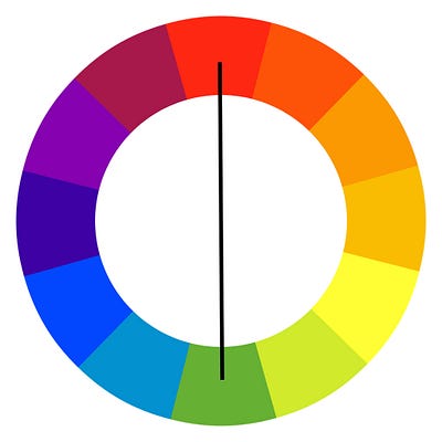
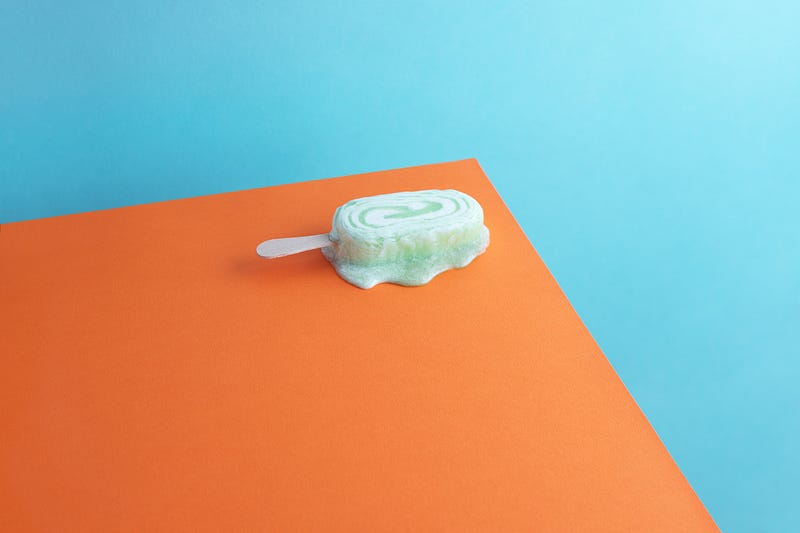
For an easy complementary color palette to create the highest and boldest contrast, choose two colors on opposite sides of the color wheel. Using complementary colors in photos will result in images that pop off the page or screen. Complementary colors in the RYB system are:
- Yellow and Purple
- Red and Green
- Blue and Orange


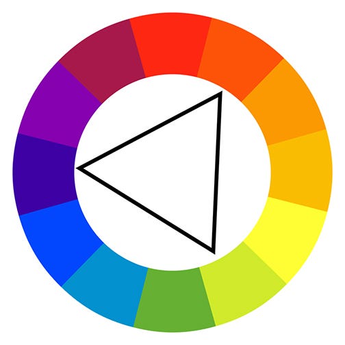
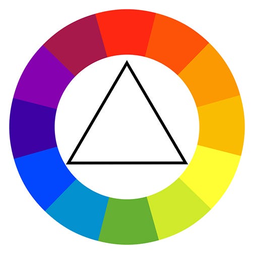
A variation on this approach is to use triadic colors. Triadic colors are three colors with an equal distance between them. This color combo will result in images that are quite vibrant and full of contrast. To successfully use triadic colors in your composition, chose one color to dominate and two colors for accent.
Examples of triadic complementary colors are:
- Red, Yellow, and Blue
- Purple, Green, and Orange


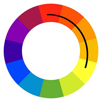
2. Analogous Colors
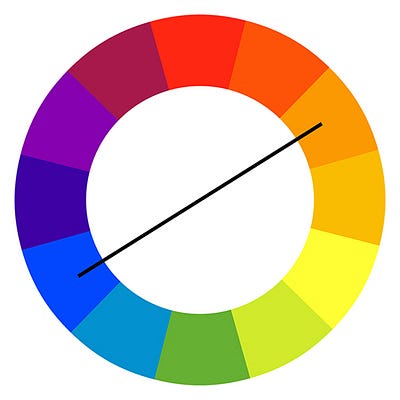
Analogous colors are the colors that appear next to one another on the color wheel. Without the strong contrast of complementary colors, analogous colors can have a more calming effect.
Examples of two-color analogous options are:
- Blue and Purple
- Green and Blue
- Yellow and Green
- Orange and Yellow
- Purple and Red


Analogous color schemes can be also be created using three colors next to or nearby each other on the color wheel. To successfully implement three analogous colors, choose one as the dominant color and the other two for accents. Designers often follow the 60/30/10 rule, meaning that the dominant color takes up 60% of the space, a secondary color takes up 30% and the accent color takes up the remaining10%.
Examples of three-color analogous schemes are:
- Orange, Yellow and Green
- Red, Orange and Yellow
- Blue, Violet and Red-Violet


3. Monochrome Color Scheme
Variations in tones and shade of solely one color create a monochromatic color scheme. Using a monochromatic color scheme results in a calm and serene image. It creates an opportunity for the viewer to focus on composition or texture in the image.


Use these three basic color schemes based on color theory and the color wheel as your guide to take your images to the next level.
Interested in joining our community of photographers and contributing to Noun Project? Submit your work here.
*Original color wheel graphic from Wikimedia Commons: CC Attribution-Share Alike 3.0 ; additional lines & triangles icons from Noun Project