The success of any design or photograph hinges on the use of balance, color, and other foundational elements of composition. When tasked with combining multiple disparate elements like text, photos, and abstract shapes into a single design, the challenge is to bring a sense of harmony and cohesion to the layout. Many designers, artists, and photographers use the rule of thirds in design as a simple way to bring a greater sense of visual balance into the frame, while consciously directing the viewer’s attention to key elements.
What is the Rule of Thirds?
The rule of thirds is a popular method of dividing up a design or photo into thirds by creating a grid that is three columns wide and three rows tall. Designers and photographers will frequently use grid layouts as guidelines for their work; in graphic design, breaking a canvas up into evenly-spaced rows and columns can help with common issues like aligning text, positioning photos, and generally arranging all the elements in a way that helps guide the viewer’s eye to ingest the information more easily (like reading a book). In photography, visualizing a grid overlaying the picture similarly helps direct attention and focus so the viewer doesn’t feel lost.
When the rule of thirds is used in design, the lines meet at four “intersections” at the center of the page, which fall upon the primary focus points of the scene. The human eye naturally lands on these points more readily than other spots in the composition, and the resulting asymmetry (of using the odd number 3, rather than 4 rows and columns) creates just enough tension to bring a dynamic sense of flow to the work.
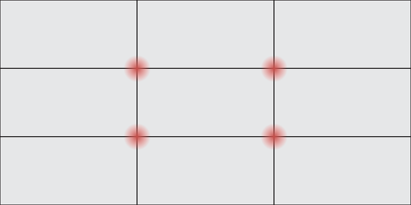
The rule of thirds in graphic design divides a canvas into three even rows and three even columns. The four central intersections where the lines meet are the key “hot spots” where you should aim to place your main subjects, as those are where people’s attention immediately lands.
It should be noted that this “rule” is meant to be treated more as a guideline. When designing, your intuition should always guide you more than any hard-and-fast rule about what works or doesn’t work. But many have found that maintaining at least a mental picture of this 3 x 3 grid is a handy, simple way to ensure that you’re directing focus for the highest visual impact.
How is the Rule of Thirds Used in Design?
It’s important to note that in composition, “asymmetry” and “balance” are not opposing concepts. When you think about a perfectly symmetrical photograph, the sense of balance is clearly strong — but it sacrifices a sense of movement and flow. Symmetry suggests stasis, rigidity, and even confrontation, as the symmetrical figure (or scene) appears to “stare you down” and stand firmly in place. Putting your subject more towards one side or the other invites a sweeping flow of motion, while giving you the chance to experiment by adding elements on the other side of the page that may provide a pleasing counterbalance.
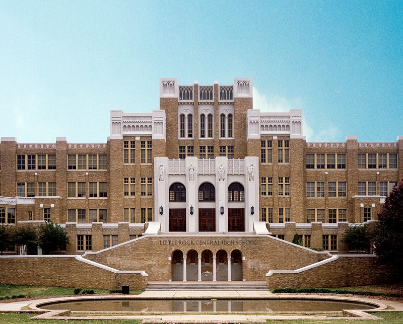
Symmetry is visually pleasing, but sacrifices a sense of movement and fluidity. [Pictured: Little Rock High School Photo by Carol Highsmith].
The rule of thirds helps take the guesswork out of composition, as you can use the central intersections as guideposts for your content. So long as the main element of focus aligns closely with at least one of the 4 central intersections (or guiding lines), viewers will naturally land on the subject without having to visually scan around.
For example, you can deploy the rule of thirds in web design by placing a call-to-action button or other key element in one of these sweet pots, since you know the eye will naturally fall upon the four intersection points. If you want to call out key information in an event flyer, make sure the most important bits fall on (or close to) those intersections.

You can use the rule of thirds in web design by placing the most important parts of a web landing page (title text, buttons, or key subjects in a photograph) at one or more of the central hot spots.
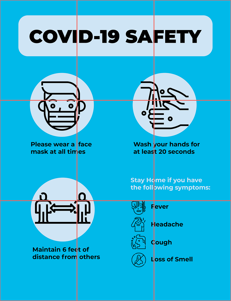
If designing a PSA poster, event flyer, or other piece of collateral, think about conveying the key points of information as close to the central intersections as possible. [Coronavirus icons by Monkik].
Using The Rule of Thirds in Photography
The rule of thirds can help photographers more easily zero in on striking compositions that provide the proper balance between subject and background. Many cameras have a built-in rule of thirds grid that automatically overlays your viewfinder with the three rows and columns (on iPhone, navigate to Settings > Camera > Composition > Grid to turn it on). Even without digital assistance, approaching your subject with a mental picture of how to divide it into three can help compose the frame more compellingly.
Landscapes
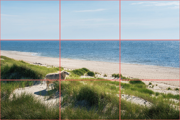
In landscape photography, it’s typically best to ensure that the horizon line falls along the upper or lower dividing line. Whether the ground or the sky (especially in a sunset pic) is the primary focus, giving each either ⅓ or ⅔ of the overall frame is the best way to achieve balance and help the viewer feel grounded rather than lost.
For landscape shots with large amounts of detail, think about where you want people’s eyes to land — and then move through the remainder of the composition.

Bear the rule of thirds in mind while you line up your landscape shot or crop it after it’s been taken. On the left: you may be tempted to put the horizon close to the centerline, but other more prominent elements have be placed off kilter and we lose a sense of balance. On the right: cropping and repositioning the photo so that the subject falls along an intersection point, while the horizon reaches the upper third, packs a stronger visual punch. [Photo: Daniela Simona Temneanu]
Portraits
In portraiture, remember to be wary of the “confrontational” or “static” effect of perfectly centered, head-on shots. Leaving a person’s face just to the side, on the contrary, will help add visual interest while softening the overall effect to bring a more natural, even conversational flow to the scene.
The eyes, of course, are always the primary focus of the shot that the viewer’s gaze will land on immediately. As such, try to align the subject’s eyes along the top horizontal guiding line — or better yet, at an intersection. Notice that while a viewer will always land on the subject’s eyes (typically within milliseconds), a subject that is too far from center may add a discomforting sense of tension to the scene.
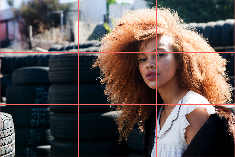
Aligning a portrait subject’s eyes along a guideline (or better yet, right on an intersection point) is a surefire way to attract attention. [Photo by Suzanne Strong].
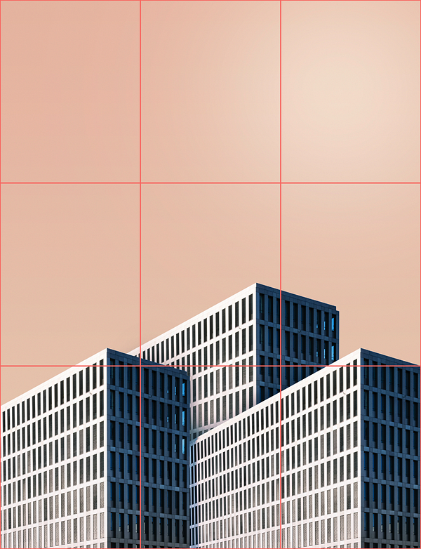
Architecture
If you’re photographing architecture, you can similarly experiment with the difference between a symmetrical head-on shot, or one that aligns a building’s most prominent features along the rule of thirds guiding lines. The latter will help the viewer ultimately feel that they are more immersed in the space, moving physically through it, as opposed to head-on shots that can feel like staring at a TV screen.
Of course, architecture can come in any number of wildly varied forms, and as you move throughout the exterior or interior of a building, you’ll want to be conscious of how you deploy the rule of thirds to capture:
- Symmetry: stately, classical buildings are meant to be impressive monuments — so a symmetrical layout typically calls for a symmetrical, head-on shot. You should nonetheless aim to keep the building’s most prominent features — and horizon lines — within your central rectangle.
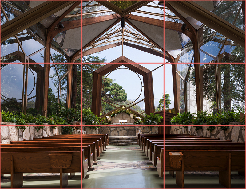
Symmetrical architecture takes much of the guesswork out of composition — but you can maximize a photo’s impact by aligning the horizon or other prominent lines along your grid. [Photo by Carol Highsmith].
- Abstract patterns: even the most wild and whimsical of contemporary architecture will begin to look more comprehensible when we recognize its repeating patterns. Capturing enough of a building’s repeating forms can add a pleasing, balanced structure to a shot, or provide a stable backdrop upon which to center a focal shape in the foreground.
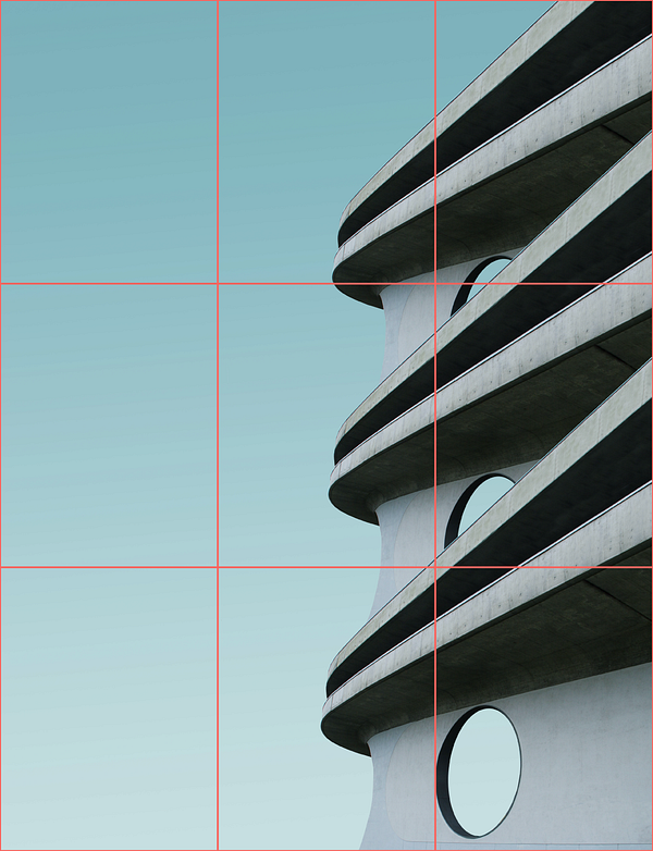
Finding repeating patterns can help us visually make sense of abstraction. The rule of thirds not only provides the focus points where you can align a building’s most prominent features, but can give you a sense of how to balance the negative space of a building while highlighting the contours and silhouettes of a building’s shape harmoniously. [Photos by Simone Hutsch].
- Negative space: a solid, blank background can be your greatest ally in emphasizing the features and even the shape or silhouette of a building in the foreground. Just be sure to achieve balance based on your own intuition — too little negative space makes a photograph feel busy and cramped; too much can make the overall effect of the photo underwhelming and flat.
Action Sequences
Action photography is one of the best possible uses for the rule of thirds as it naturally lends a sense of motion to your composition. Framing a subject along one vertical guideline and leaving negative space along the other is an easy way to convey movement, and emphasize the direction of the subject. Bear in mind that if a subject appears to be moving too closely towards the edge of the frame, it will create a more dramatic sense of imbalance and tension.
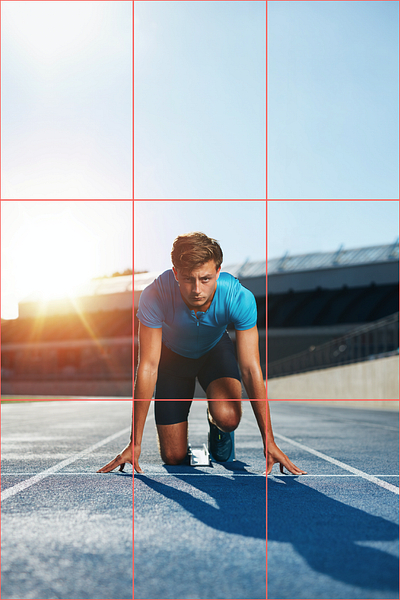
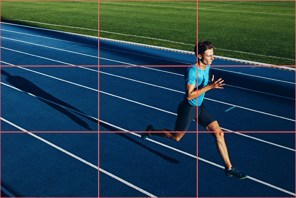
On the left: with the sprinter perfectly centered, we feel a sense of rigidity and strength rather than motion– but keeping the horizon line along the lower third helps balance the composition. On the right: having the sprinter run along the right-side line rather than the center gives us a bit of tension; we see the space he leaves behind as he approaches the edge of the frame [Photos by Jacob Lund].
Start Your Next Design with Noun Project
Noun Project is your one-stop shop to jumpstart your graphic design projects — search through millions of icons and diverse, inclusive stock photos to bring your creative vision to life. Looking for the quickest way to start experimenting with composition, layouts, and finding balance using the rule of thirds? Use the Noun Project Add-On for Adobe to instantly add, color, and arrange icons within Photoshop or Illustrator.
Looking for more graphic design tips? Explore more Creative Inspiration.

Marketing Communications Manager at Noun Project, Designer and Illustrator.