We caught up with designer and developer Aliza Aufrichtig to learn more about her latest creation at Spotify — an open source browser interface that turns SVG files into delightful dots.
Hi Aliza! Tell us a little about yourself — what is your role at Spotify and how did you get to where you are today?
I’m a designer and developer here at Spotify on the Data:Design team. I make data visualizations and apps to help people at Spotify make sense of music data.

My journey here has involved a number of different types of roles — from travel writer in France to English teacher in San Francisco to product manager at a company that makes educational rap songs, to interactive journalist at the Guardian and this hybrid data/design/development role at Spotify. The path may appear meandering or surprising to an outsider. I studied comparative literature at university, but now spend my days writing JavaScript. But to me, thus far, my career has been a natural progression of exploring a problem I find endlessly fascinating: how do you communicate complicated information in a way that seems easy? (In a way, icons are a visual branch of this same problem!) These days, I’m focused on how data visualization can be a crucial tool for communicating certain types of information — specifically, understanding how millions of people listen to music.
You recently developed a tool called Coördinator — can you tell us what it is?
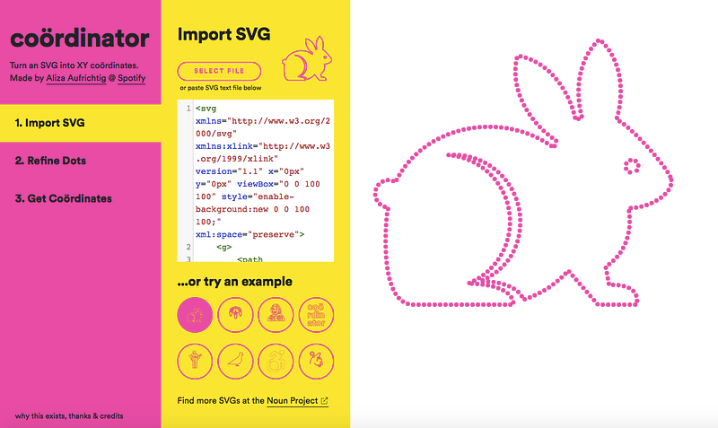
Coördinator is an open source browser interface to help you turn an SVG into XY coordinates. In other words, you can upload any SVG file (like the icons on Noun Project) and the program will turn it into dots, and allow you to export the XY coordinates of those dots as a CSV or JSON file. You could then use those coordinates to provide positions for animated particles in a data visualization, or for anything you’d like, really.
Why did you create it and how does it work?
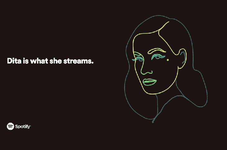
As I wrote in an introductory blog post for Coördinator, Dita Von Teese agreed to talk with Spotify about her listening history at the 2017 Cannes Lions Festival, and she gave permission to Spotify to analyze her listening data ahead of time. I worked with a team of Spotify researchers–the excellent Clay Gibson, Ian Anderson, Alice Wang and Yang Sui–to tell a story with the “Dita Data,” and I was responsible for creating a visualization as a backdrop to a live interview with Von Teese.
Over several years, Von Teese had listened to 7,532 streams on Spotify. The idea was that a single dot would represent each stream, and 7,532 dots would fly around throughout the presentation and congeal into groupings by listening time, genre, album, release year, and many other data attributes. The theme of the presentation was, “You are what you stream,” so I really wanted the streams to ultimately resolve into Von Teese’s face. For her tracks to literally be her.
I had a vision of Dita Von Teese’s beautiful face composed of 7,532 dots, and needed a way to conjure this reverie into actuality. And this is where Coördinator was born. You can view the whole presentation here; the Coördinator-driven parts are at the beginning and end.
So the dream of Dita as dots became reality, just in time for the Spotify Cannes Lions panel. And my manager, Edward Lee, kindly encouraged me to build out this Coördinator pet project of mine as a tool for others to use, too.
As for how it works, the core of Coördinator is built on two simple, powerful SVG methods: SVGGeometryElement.getTotalLength() and SVGGeometryElement.getPointAtLength(). The first method gets the length of a path within an SVG. Then, you can divide the length into the number of points you want, and use the second method to get the XY coordinates of the points at those length positions. And the web app itself is built with Svelte, a JS framework that I highly recommend. For more on how Coördinator is built and how it works, check out the intro blog post.
We applaud making data visualization delightful — is it important for data to be whimsical and fun?
I don’t think that all data visualizations need whimsy. I think clarity of communications is most important, and that a lot of fancy pants data visualizations would actually just be better as bar charts or line charts or a paragraph of text. But obviously, I think there are cases where something interactive or animated or whimsical is the best way to clearly communicate the meaning of data, and when that is the case, you want to have as many creative options as possible. And just like any storytelling, an engaging, whimsical, fun approach might be the best route to engaging people in the idea — even a serious idea.
Outside of datavis, I’d say this is one of my core personal beliefs, but it translates to a lot of the work I’ve done: You don’t have to behave seriously to take something seriously. I believe that there are some situations where the best way to engage with some real, serious problems is with humor or lightness. I think it’s led me to work at a company that created hip-hop educational materials, and was a big part of my work at the Guardian (where we tracked Republican support for Donald Trump with a bizarro solar system rotating around Trump’s head, or highlighted real lapses in women’s health education by creating a user-generated wall of 20,000 vulva drawings.) And having fun visualizing data is certainly a great perk of my role at Spotify, where music-related data certainly lends itself to some whimsy.
“You don’t have to behave seriously to take something seriously.”
Why did you decide to make Coördinator open source and how can people contribute to the project?
I open-sourced the tool because I wanted to make a contribution to the open source community that I’ve benefited from enormously.
I’m a self-taught programmer — but maybe self-taught isn’t the right expression, because this process was only possible due to the wealth of available open source resources, helpful tutorials and documentation that many programmers have taken the time to carefully write. Maybe it would be better to say that I was taught by a broad, largely welcoming community via their writing. Though not just writing, I also spent 3 months at a programming retreat called Recurse Center which was a beautiful instantiation of people helping other people grow as programmers, and I’ve learned a lot from coworkers and friends who are very involved in the open source community.
I’m hugely reliant on open source projects, with D3 & Svelte being libraries I use on the daily, and dozens of others at times. And the world of datavis is filled with lots of fun, quirkily-named, single-purpose tools which are supremely helpful to the community: things like Swoopy Drag for label placement, or Flubber for shape interpolation.
All of which is to say, I thought it was possible that this skinny tool with a funny name might be quite useful for a small group of people, and I wanted to share it. Many programmers at Spotify are involved in open source work, and they were extremely helpful and supportive in the release of this software. And I definitely welcome contributions! Just raise an issue or make a pull request.
How do you see people using Coördinator in the future?
In its most useful incarnation, I would be tickled if I saw it being used in data-driven stories, where images created from dots are interspersed with data-driven particle locations. I made a simple example of how that could work.
But, utilitarianism isn’t the only aim: if I knew I was helping someone, somewhere make something weird on the internet, I’d sleep easy.
What tips do you have for people who want to start creating their own animations with Coördinator? How can they use what they create?
When I made the Dita Von Teese animation project, Peter Beshai’s post about smooth animation of points provided a smart pattern to handle particle animations. I adopted this pattern for the Dita project, and I created an example project with Coördinator dots based on Peter’s post that someone could use as a template to get started. So if you don’t have a lot of experience with how to handle particle animation, I’d start there: use Coördinator to make your own dots, and plug them into that template.
We noticed you used several Noun Project icons as examples people can experiment with — how did you discover Noun Project?
I first learned about Noun Project in 2015 when I was working at Flocabulary, an edtech company, as the director of product. We were redesigning our pricing page and we were looking for a good teacher icon for the “teacher plan.” A designer at the company brought the Noun Project to my attention. I remember this so specifically because the options for teacher icons made quite an impression on me — namely that they were mostly icons of people pointing at chalkboards, and this was precisely the sort of outmoded teaching method our product was looking to avoid. I actually wrote an article about this teacher icon problem in response to this issue (with icons from the Noun Project embedded in it). The Accessible Icon project had brought my attention to the subtle power of icons, and generally led me to think more critically about the subtle ways that iconic representation can truly encapsulate an idea when done well, or reinforce stereotypes when not. So it’s awesome to have a resource like Noun Project, where there are so many icons in one place to compare and consider.
What makes Noun Project icons good for a project like this?
The Noun Project is a great resource to complement Coördinator because it has so many icons! And they are all available as SVG files, so you have a lot of options for what you turn into dots. Also, while I was developing Coördinator, it was really helpful for me to have a trove of SVGs from lots of different creators, because it helped me build the program to effectively handle varying quirks of different files.
What are some of your favorite Noun Project icons?
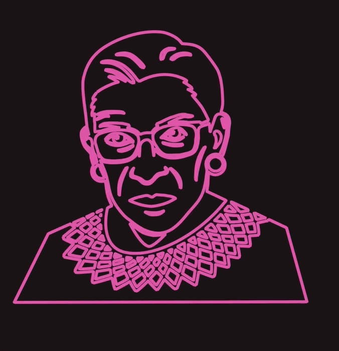
I think Lorie Shaull’s work is fantastic, especially Faces of Feminism and Women of the Senate. I don’t remember when or how, but at some point while building Coördinator, I stumbled upon her Sonia Sotomayor icon, and made it one of the default examples. I also used her awesome RBG icons to make this GIF for a presentation I gave about Coördinator at Spotify.
Thanks for sharing with us Aliza! You can learn more about Coördinator by reading Aliza’s introductory blog post at Spotify Labs. Want to try creating your own visualizations using Coördinator? Check out the tool and some of the helpful examples provided here, and if you’d like to chat dots with Aliza you can reach her here.