Tell us a little about yourself — what’s your role at Wired and how did you get to where you are today?
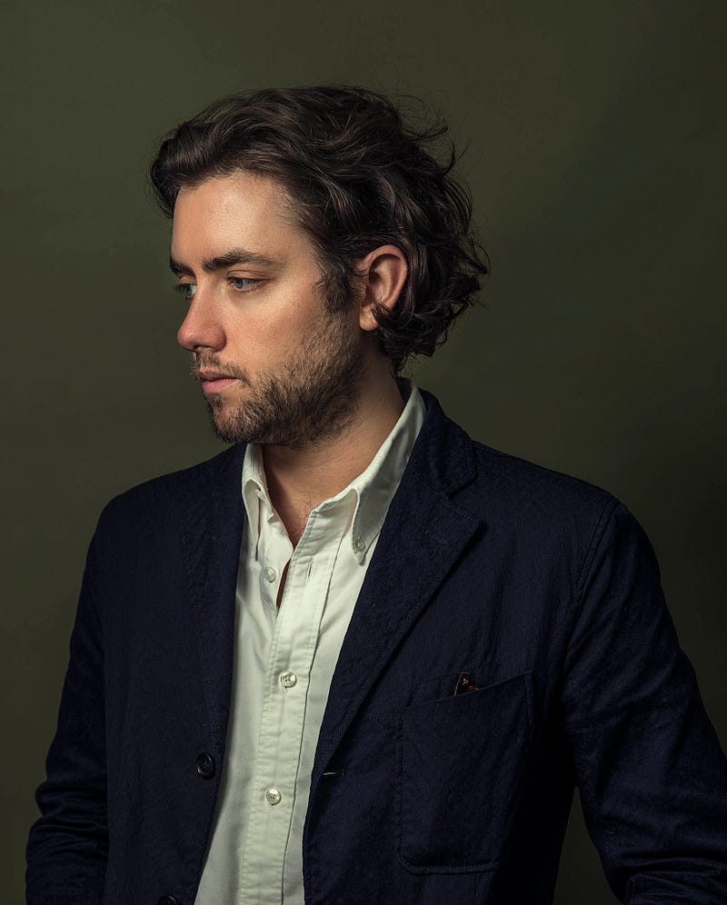
I’ve been a career print designer since graduating from Maryland Institute College of Art (MICA) in 2010. In all of my time at school, I never once thought about entering the world of publication design. Of course, I had favorite magazines that I would follow religiously because of their great design and photography, but it never quite dawned on me that I could be a part of that in any way. I think it’s because at the time I was very focused on branding and wanted to work for small studios that focused on crafting logos and typefaces as part of identity suites for different brands. It was only when I was close to graduating that I discovered the great Society of Publication Designers (SPD) annuals and started to learn about the key players in the world of publication design. It dawned on me that designing for magazines is a lot like being a brand designer, but with much more focus on other aspects of the brand as well. Not only are you responsible for maintaining the magazine’s identity, but you’re able to work closely, on a daily basis, with your clients (the editors) to further push the voice of the magazine on a holistic level.
Before I graduated from MICA, I was still applying to small studios like Triboro and Mucca. Then I learned of an opening at GQ Magazine. At the time, I knew close to nothing about the inner workings of the magazine. The one thing I did know, however, was that one of the greatest magazine designers ever, Fred Woodward, was Design Director. I like to call him the Milton Glaser of magazines. Simply iconic. Also, I was (still am) really into fashion, so I felt connected to the brand. I got the job and spent 5 incredible years reshaping what I thought I knew about design.
Next to GQ, I’d always wanted to work for Bloomberg and was hired as Art Director of their Pursuits platform, while also working on the iconic Businessweek. After a couple of years there, the West Coast called to me and I went back to Condé Nast to work for Wired, another company I’d always admired.
Here at Wired, I’m an Art Director in charge of stories throughout each monthly issue, as well as for web and social media. Aside from the physical magazine, I’ve worked on videos, webpages and daily illustrations.
How do you art direct imagery to go with each article? What does that process look like?
Regardless of platform, the process usually starts with a story that we’re trying to tell. I start by talking with the editor or writer of the story to gain their point of view and I share mine. I then start to think about voice; what tone is most appropriate for the story? Is it funny, serious, sad? This is the point at which I start to craft the basic outline of what it’s going to look like. Sometimes the photo department has already commissioned photography for the story, in which case I will work with them on pacing. If it’s a feature story, I choose a photograph, or multiple photographs, for an opener and then create a design system for the turn pages in which I can disperse the rest of the photography in a way that strikes the right balance between all of the other elements on the page. When there is no photography, I go through a long roster of illustrators I keep on hand. As an amateur illustrator myself, I really enjoy commissioning artwork and working with artists, not only to get the best for the magazine, but to also learn from their process.
You recently helped develop a design system to create art for Wired’s Ideas platform. Why did you create it and how does it work?
We needed to come up with a system to create art for multiple stories per week with a shared aesthetic. We needed to be able to make images fast, sometimes with a same day turnaround, and we needed to keep them economical. In order to do that, we decided to pair icons with photography. We created a system using our own icon illustrations, Noun Project’s vast archive and a beautiful icon suite by Luzi Type that could easily be picked up intuitively by anyone on the team. Paired with black and white photographs and a limited color overlay, the system allows us to tackle extremely abstract concepts with clean, graphic visuals.
How has your design process and style changed over the course of your career?
I can’t say that, technically, the way I design has changed much in the past 8 years that I’ve been designing for print. I still use the same program tricks and sketch process I’ve always used. What has changed is the way I think about design. When I first started out, I wanted to put my mark on everything. By that, I mean I wanted everything to be hyper designed, with crazy typography, regardless of the tone of the story. But over time, I learned that designing for print should be a delicate balance between the story and the art. What can you do to help the story convey its message without always making design the star of the show? Sometimes that means taking a back seat and letting other elements shine.
When and why did you start designing icons?
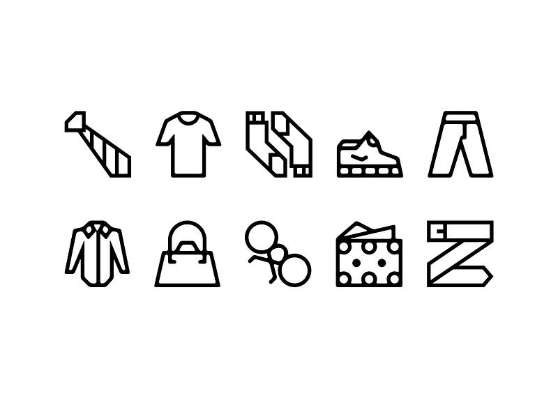
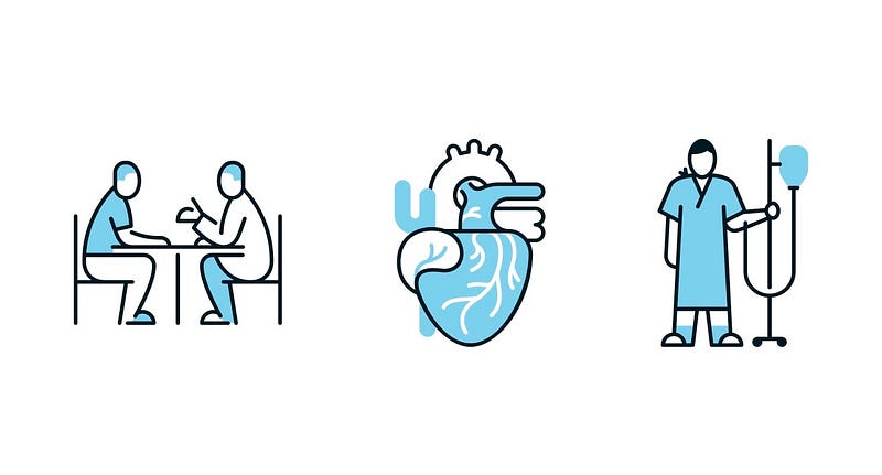
I never really considered attempting icons until it became a necessity at GQ. Spot illustrations and smaller one/two color icons were always something we would commission an illustrator to do. On one of the first issues I worked on, we needed a few icons for a page in the Manual section fast, so I volunteered to try it out myself. Having had no illustration experience, I was a little worried that it would take too long for me to figure out the right proportions for human figures, the right line weights for the 60×60 size I was working in, and so on. Once I got started, I realized that if I treated each icon like a design element rather than an illustration, it made it more comfortable for me to wrap my head around. I also became more comfortable with my own shortcomings, having never illustrated before. My limitations became my parameters. A lot of what I make starts out symmetrical, which makes it easier for me to envision the final design. And, of course, symmetry is a very good thing for an icon to have.
How do you decide what icons to create?
When I make icons, it’s almost always for a project, or a byproduct of a project that never came to fruition. If I’m designing a print package on basketball, for instance, I’ll map out ahead of time where I need to place icons, what size they need to be at and then sketch about 3–5 options for each one. Once I’ve chosen one, I go ahead and start from scratch creating a vectorized version.
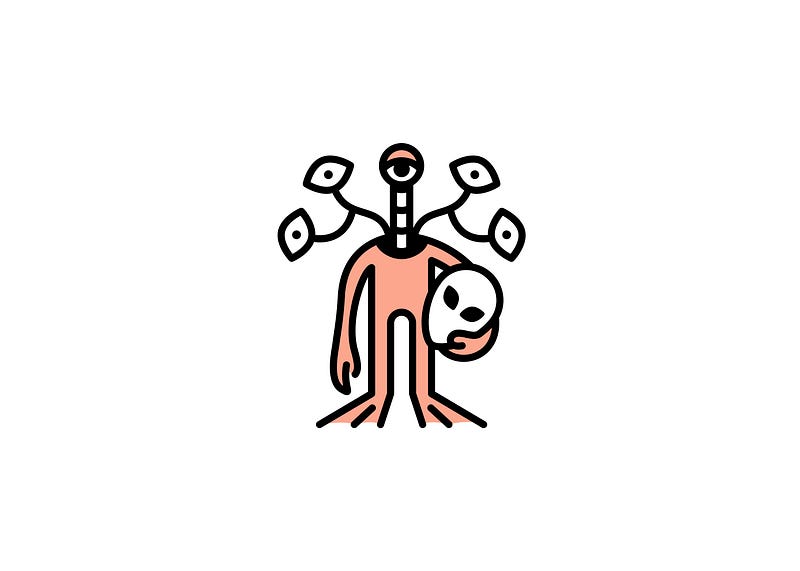
I’ve done this enough times for places I’ve worked at that other magazines have asked me to do it for them as well. Recently, I’ve designed icons for New York Magazine and Consumer Reports. The more random the topic, the more creatively I respond to it. The last thing I did for New York Magazine was a suite about alien conspiracies.
Moving forward, I’d really like to start designing icons for myself. I would like to carve the time out to practice. I’m thinking about doing a series of famous movie couples; Mia and Vincent dancing from Pulp Fiction, Mathilda and Léon from The Professional.
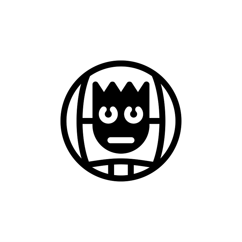
You’re a bit famous at Noun Project HQ for this icon: Wilson. Why did you create it and what’s the story behind the Tom Hanks collection?
That’s really funny. I love those, very much. I’m pretty sure they were for a project from around 2013 that may or may not have run, but I decided to finish them and upload to the site. I picked three Tom Hanks roles iconic to me: Splash, Saving Private Ryan and Cast Away. The Wilson icon was actually very hard to make, and I went through many revisions that had a rougher paint-texture for the face until I realized that I didn’t need to be so on the nose. Sometimes it takes 4–5 rounds of simplifying before I have an icon where it needs to be. This series is also a little thicker in line weight than I usually work, but I think that adds a juvenile quality to them, which makes sense. I should keep going with that series… BIG, Apollo 13, Sully…
Where do you find inspiration and how do you get through creative blocks?
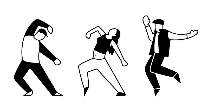
I’m really not a social media person, but I use Instagram religiously right now. It’s a gold mine for seeing what other people are doing in real time, allowing me to keep up with and connect to creators that I admire. It’s also how I find a lot of the illustrators I work with. But, when it comes to icon inspiration, my absolute go-to is always Gerd Arntz. I have this fantastic book of his work that I received as a gift some time ago called Gerd Arntz: Graphic Designer. It’s probably one of my most prized possessions and how I taught myself to draw basic human forms and other isotypes. I think his way of looking at the world was just so perfect; he was able to portray the most complex subjects through the simplest means possible. Pouring through his work inspires me and also challenges me to find a way to make a solution truly unique and my own.
What are some of your favorite design blogs/ podcasts/ resources and why?
I have a few go-tos that I regularly check. For print design, I enjoy Coverjunkie. It’s an up-to-date collection of print covers from around the world; a passion project by Jaap Biemans, who is also an Art Director at De Volkskraant. It’s for print, by print.
I also listen to The Stack from time to time. It’s a podcast by Monocle about the current state of print and allows me to hear about magazines I might not know about, straight from the people that make them.
For typography and design, I love Fonts In Use, Typewolf, It’s Nice That and a small blog called Dark Side of Typography, that my friend clued me into. I try to keep the list of things I look at small, otherwise the world becomes just so overwhelming. And then, of course, for icons, I always take a peek at Noun Project.
What advice would you give designers who are just starting out?
When I was first starting out, I was naïve to think that I knew what path my career would take. It was pretty clear to me what I wanted to do and where I wanted to work, but being open to something foreign to me uncorked a world of possibilities that I didn’t know existed. I would say this; especially now, when design is playing a more important role in broader areas than ever before, leave some room for unexpected opportunities. You never know where they might lead.
Thanks for sharing with us Ben! To see more of Ben’s work, check out his Noun Project creator profile and follow him on Instagram.

