

Jon Setzen has created rock posters for Mogwai, Sufjan Stevens and more, developed websites for artists like Alicia Keys, and designed brand identities for companies including Reaction Commerce and ACLU SoCal’s Resisterhood. We caught up with Jon to learn more about his creative process, how he uses iconography in his work, and some tips for finding balance as a creative in today’s fast-paced, hyper-digital world.
Hi Jon! Tell us a little about yourself — when did you first become interested in design and how did you get to where you are today?
I’m a Designer living in Los Angeles with my wife and two sons. I spend my days working as Senior Global Creative Director at Bluebeam in Pasadena. I’ve been here for three years and, prior to that, I was the Creative and UX Director at Media Temple. Prior to going in-house, I worked in advertising and ran my own studio for about a decade in Brooklyn, NY.
I got interested in design at a young age. I was very into music growing up and made zines throughout Junior High. Years later I found myself as a Music Director at KWVA at the University of Oregon where I got into making posters and, most importantly, learning HTML. In 1995 I made my first website that didn’t have any graphics and I loved it. I was obsessed with writing (really bad) code and publishing the kind of stuff I wrote in zines: music, soccer, travel, food, etc.
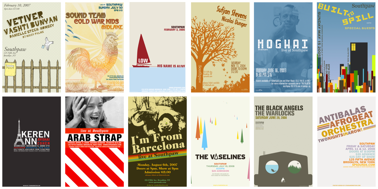
Many years later I was making posters for bands and venues in NYC, which I loved doing. I think I made around 350 posters. The posters were my favorite thing, but they didn’t pay very well, so I did agency and brand work to pay the bills.
Now, I work in-house and it’s great. I have health insurance for my family and I feel creatively fulfilled in my work. I still do some freelance branding and design work on the side for small local companies, as well as the likes of UCLA (I’ve been making type-only posters for their Art School since 2011) and the ACLU. I feel incredibly lucky to be able to do this kind of work and there isn’t a day that goes by that I take it for granted.

What have been some of the most memorable projects you’ve worked on?
There are a handful of projects that come to mind. At the very top of the pile is the work I did with Alicia Keys back when she was making her second album, “The Diary of Alicia Keys.” I was working for J Records/Sony/RCA and was asked to document one of her recording sessions. She was about 21 or 22 at the time and I was absolutely blown away by her talent and just the way she carried herself. Her confidence, kindness and her humble nature was so impressive. The first session went well and I stayed throughout the recording of the album. I shot photos, video, made a website called “In The Studio with Alicia Keys” and helped run some AMA’s (or, as we called them back then, “online chats”). My favorite memory from that project was being in the room while she called Aretha Franklin on speaker phone. I’m a big Aretha Franklin fan and that was a serious moment. Alicia said “Hi Queen, it’s Alicia Keys.” That was magic.
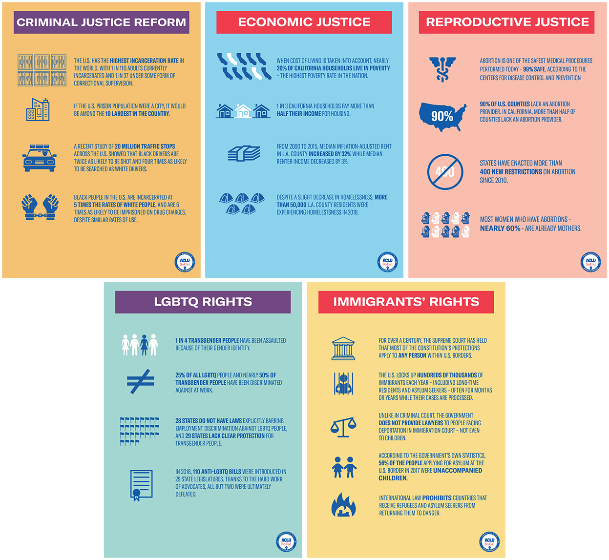
Some other memorable projects include relaunching the Media Temple brand after the Go Daddy acquisition and, lately, work I’ve been doing for the ACLU. I am thrilled I get to work for them. I volunteer my time, because I feel powerless right now with what is happening in this country. I feel that the ACLU is doing all it can to try and protect people and I feel honored I get to do work for them. I do anything for them really: email newsletters, ads, branding, whatever. I’m happy to spend some evening and weekend hours helping them because I just want to pitch in and contribute to the cause.
Over the last few years you’ve defined the look and feel of brands like Reaction Commerce, ACLU SoCal’s Resisterhood and more. What is your creative process like when you’re designing new logos and branding?
I definitely gravitate towards symbols and simplicity when it comes to branding. Like many designers, I look back to look forward. In a somewhat unexpected way, I have found that a lot of imagery I saw as a young kid growing up in Toronto was probably way more influential than I thought. My family immigrated to Canada is 1977 and when I look through the Canadian logos from the 70s and 80s I see so many shapes, symbols, and marks that meant a lot to me. From the Canadian National Railway logo to The Toronto Zoo logo to the Loblaws logo, these were everywhere when I was a kid. Between those and some UK music-based work (Peter Saville in particular) and old Blue Note Jazz covers, I have always enjoyed simple, bold, and memorable shapes and photography. I love the way Bob Gill approached the work he created. If I am ever stuck, I look through his books.

My process begins with words and writing. I like to write pages and pages of word associations with brands and then just jump into sketches. Sometimes, the ideas are right there. For example, Hive, I really had one idea that I tried in about a dozen different ways. Hive’s founder is Bumble Ward, so between the name Hive (which Bumble came up with) and her first name, it was always going to be a, well, bee of some sorts. I found some nice historical bee illustrations and we printed the cards on this beautiful, rich, and bright yellow paper.
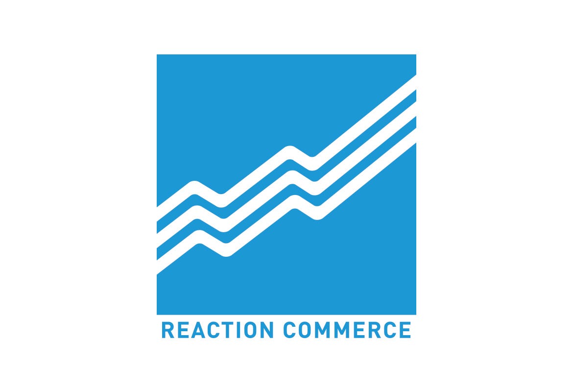
Reaction Commerce was one of the toughest branding projects. I think I sketched about 300 logos and probably created 50 digital varieties. There were a lot of prismatic humming birds (inspired by Reaction’s speed), but eventually these simple wave lines stood out. They were inspired by Reaction’s predictive analytics. The Secret Coffee mark was really fun. I made this logo for Tyler Wells, who founded Handsome Coffee. This was his next, under the radar, coffee business. He chose the name “Secret,” so I wanted to hide the name of the company in something that looked like one of those old sliding puzzle games. He saw it and said, “yeah, that’s it.” I love when that happens, when there’s just instant alignment.
It actually happens a lot more than you would think. I am not an amazing logo designer, but I am good at listening which is 90% of the battle. I am not precious about design, especially on the client services side of things. I want the client to be happy with the work, so I don’t believe that dog and pony show about showing a good, a great, and a weird to try and push the client down a path. I only show the work I feel great about. When I present work, I describe what I heard they wanted and how I approached it. It’s great when they can visualize the solution before I ever show anything. I can see their excitement and anticipation and then I know I’ve done it right, before they ever see anything. It’s my favorite part of the actual design process.
Visual communication is so important, particularly in our fast paced, hyper-digital world. How does iconography play a role in your work?
I have always loved Noun Project’s mission to create a universal visual language. You can see an icon and it can be the equivalent of a word, a paragraph, a memory and more. Arlo Jacob was my own thing and I knew exactly what I wanted. I wanted to name the candle after my Grandfather, who used to blend pipe tobacco, but there’s no real association with the candle’s name “Courlander” (his last name). So, I asked Eleonora Marton (wonderful UK-based illustrator) to basically draw me a version of Magritte’s pipe — arguably the most well-known pipe symbol in the world. It instantly communicated what the candle as all about.

We use icons a lot here at Bluebeam. When we redesigned our site a couple of years ago we wanted to visually depict our customers. However, we wanted to stand out in the industry (where so much of the imagery is stock art), so we introduced some illustrations. The talented guys at DKNG created some characters for us and then from there we created simple icons to represent them.

For example, the architect was represented by a pair of black rimmed glasses. It was validating in our testing of the site, showing it to the CEO, and internally that just about everyone knew that glasses icon meant “architect.” We used the small icons to help guide our audience into downloading the right version of our product.
We have since created a massive internal library of icons to be used in all of our local markets, created by Elias Stein. Our company is growing like mad and it’s important that when someone uses a “scissor lift” icon it means “scissor lift” (in whatever language they speak) and not “construction” or “production” or something else. So, we’ve made this library available to people internally and it gives me a lot of pride to see the icons pop up in presentations and used correctly.

What’s the secret to balancing full-time work with creative side projects?
I’m in a good place now where I have a full-time job that allows me to have a life. This was not the case when running my own studio or working in client services. It took me a long time to be able to say “no” to work, but again this is a privileged position. I have worked on some stuff that I would never ever put in my portfolio, solely because the kind of work you put in your portfolio is generally what you get hired to do. I remember working on CD covers for collections of soap opera songs. It wouldn’t go in my portfolio, but it definitely helped pay my electricity bill for a few months. So, nowadays, I am picky about outside work. I try and work on things that matter to me, like the ACLU work or collaborating with friends on their businesses. I want to be working on things that make a difference and not just putting out another version of something else we probably don’t need in the world. I particularly have enjoyed doing some branding and identity systems for bars, coffee shops, and restaurants.
“I want to be working on things that make a difference and not just putting out another version of something else we probably don’t need in the world.”
As a senior creative leader at a large organization, how do you approach collaboration, managing your team and mentorship?
I am grateful to have a boss who trusts me. Our entire department benefits from the leadership example she sets. She trusts me to do the work I was hired to do. She gives me the freedom to think, create, and fail. I’ve been micromanaged in the past and it’s so nice to be where I am now. I also, in return, trust my team to do their work and to stay out of their way. I’ve worked for people and Creative Directors before who put their names on awards, took credit, and talked over me. I don’t want to be that guy. I get to come to work every day and work with an incredibly talented, smart, funny, and creative group of people. They’re all way better at their jobs than I would be, so I try and give them the same freedom and space I have been given. Our team has grown from 7 to 18 over the past three years. We’re careful about who we hire and I always look for people who don’t have egos, who are ok with being wrong, and who are thoughtful. I’d like to work with them all for a long time.
We’ve grown rapidly and we continue to optimize foundational best practices that enable us to scale for future and global growth. It’s important that everyone see the big picture and everyone feels like they’re being heard, they’re participating, and they matter. I have enjoyed watching people on the team grow into new roles, become more confident, and find their career paths. It’s very important to me as a manager that I am not only giving people a place they feel valued and successful today, but they’re setup to succeed wherever they go next. I have weekly 1–1’s with my direct reports and bi-weekly or monthly with skip-level reports. I am confident I can tell you what all 19 people on my team are happy with, struggling with, and what their ideal next step in their career is. I am more proud of this than any design project or accolade I’ve received. I think it’s critically important that the team and all the individuals understand their importance.
How do you stay inspired?
This is a tough question. After attending some recent conferences, there feels like a lot of schtick out there, a lot of style over substance right now, so much designing for a particular look rather than a more thoughtful scenario. “Designers designing for designers” as they say. Seeing Paula Scher speak recently was such an inspiring juxtaposition to all of this. I appreciate her experience, brilliance and perspective, especially as I get older and start feeling more and more obsolete in this industry. I’m interested in hearing stories about scalability and foundational change within creative organizations, so I am looking out for those stories and lessons.
With all that said, I am inspired by cleverness in design work — that old school mix of solid art and copy, people exploring different materials, as well as companies prioritizing experience and taking a stand to do right by people and the world around us. I like what people like Tom Gauld, Jean Jullien, Morag Myerscough, Kelli Anderson, Olimpia Zagnoli, Isabel + Helen, and Stefano Colferai are creating. I think Man Vs Machine, Character, and Work & Co. are doing some of the best motion, branding, and interactive work out there.
For the end to end experience, the joy that LAFC is bringing to my family’s life lately is incredible. They’ve nailed the end to end experience, from edgy, Raygun-esque promotional design, to a beautiful experience, enjoyable soccer, and an inclusive, accessible group of players and fans. It’s really special. I think Nike’s socially-focused campaigns have lately been really important and inspiring. It’s a wake-up call for brands who won’t take a stand. Also, Patagonia and their nonstop commitment to the environment.
Finally, I am inspired by my family. My wife has the most unique and wonderful creative eye. I wish I saw things the way she does, but I am getting better. My kids make, build, draw, and create crazy things all the time. I enjoy seeing the world through their eyes.
What are some of your favorite design blogs, podcasts, etc. and why?
There’s so much good stuff out there. So much so, that I actually started posting a monthly list of good reads, videos, ephemera, etc. on my site.
Some of the design blogs I look at frequently are:

I visit The Guardian Daily and I also eagerly await Nick Cave’s “Red Hand Files” newsletter. If you haven’t read it, you should read this letter to a 10-year-old fan. I read a lot of soccer sites, but my current favorite is Black Arrow FC which is, as they put it, a “lifestyle brand specifically focused on the intersection of soccer and black culture.” Their approach is so different and refreshing and they kill it on Instagram. Their coverage of things like the Soweto Derby and Panama experiencing their first world cup is so much better than anyone else’s. I loved his visit to LAFC’s Banc of California Stadium. I hope they’re incredibly successful.
On the podcast side of things, I like “How I Built This” mainly for the ways people have been able to scale and grow their ideas. The Alice Waters episode is really worth listening. I enjoyed hearing about the empathetic approach she took to understanding what all roles, contributing to her restaurant’s success, felt like. I haven’t read it in several years, but I try and have everyone on my teams read Designing for Emotion by Aarron Walter. It says so much about how I like my teams to think and work.
And finally, what advice would you give to new designers who are just starting out?
I would say, find your thing and find your people. It feels great to find something you love to do and, more importantly, find people you enjoy working with and being inspired by. Don’t worry about working at a place that’s huge and well-known. You can make a major impact for yourself and an organization at thousands of different places.
Find a manager who cares about where you want to go next. Find a manager who has 1–1’s with you. It took me until I was 37 to meet a manager who took the time out to meet every week for a 1–1 and chat about my day-to-day, my life, and my career. Thank you Sara Hicks for being that person. It’s not only made me a better designer, but a better manager, and maybe a better person? Sara was, and is, a great mentor. It’s so important to find those people. Professionally, I am lucky to have found her and Tsilli Pines and Tina Roth Eisenberg. These are people I can always ask for a gut check on career-related things. I see so many people “coaching” now. I think it’s good, but also worrying a bit to me. I would urge new designers to really make sure the coaches and mentors they choose have had the experiences (life and work) that would inspire them and drive them in the right direction.
This industry is big, but it’s also tiny. You’ll constantly cross paths with former co-workers and bosses. Be a professional and be kind. Be on time and work really hard. Treat people well and with respect. Be bold, take chances, speak up, advocate for the user, but just don’t be a jerk. Work with others rather than against them. It sounds basic, but it’s remarkable how few people actually do this.
“Be a professional and be kind. Be on time and work really hard. Treat people well and with respect. Be bold, take chances, speak up, advocate for the user, but just don’t be a jerk. Work with others rather than against them.”
Oh, and of course, attend CreativeMornings. It’s a welcoming, inclusive, and inspiring community.
Thanks for sharing with us Jon! For more from Jon, visit his website JonSetzen.com or catch him on Twitter and Instagram @jonsetzen.

