Adrien Coquet is a Graphic Designer from France who has been freelancing for seven years. He enjoys the freedom that freelancing gives him as he’s been able to explore creative projects ranging from typography to music production, though he primarily focuses on icon design. Here, we’ll get a glimpse at Adrien’s process to design simple, consistent icons in Adobe Illustrator.
Hi Adrien! Tell us a little about yourself — how did you get to where you are today?

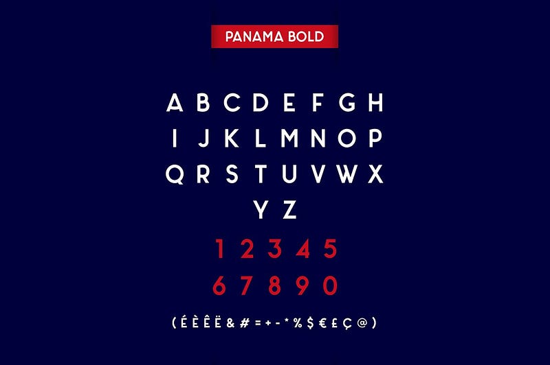
After getting a science degree in college, I started studying pharmacy before realizing that it was creativity that fed me. I spent my free time discovering Photoshop, Illustrator and FL Studio music production software. I think that music production and design have very similar processes, as they’re both full of small pieces put together that ultimately achieve a certain result. I finally chose to attend a design school, but as it was quite expensive, I found a work-study program to be able to work while learning. I did this for two years by working for an e-commerce website, then just after graduation I started freelancing. I worked for different clients, notably for an agency that markets games on Facebook. In my free time I designed typography that I offered for free on the web, and I was surprised and touched by the positive feedback I got. My typeface Panama was the font of a national television show for a year.

I realized that I loved creating content for people and seeing how they could use it. One day I came across the Noun Project and thought to myself, why not try making icons?
Of all the art and design forms that can express ideas or emotions, what drew you to icon design in particular?
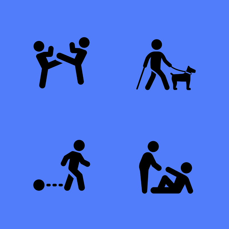
I like the simplicity of the message that an icon can bring — it can replace an entire long sentence. I also like the fact that some people may not speak the same language, but they can both instantly understand the meaning of an icon. When I first read the Noun Project motto “building a global visual language that unites us,” it immediately spoke to me and I knew I had to take part in it.
How do you decide what icons to create and what subjects interest you the most?
I find inspiration everywhere and in everything around me; I tell myself that anything can become an icon. I always write my ideas on my phone when I’m outside, because that inspiration can be fleeting — you have to catch it in the moment. I really like to create designs about people, emotions or concepts; things that are often difficult to materialize. What’s sometimes surprising is that when I make happy icons, it affects my mood, and vice versa. I always wonder how people are going to use my icons and I like the idea that they’ll be useful in different ways.
What tools do you use to create your icons? What software functions and tricks are the most helpful?
I started to learn early on by myself using Adobe Illustrator. I think this software is fabulous — there are so many possibilities, and I’m still learning new tricks even today. My icon design process relies heavily on the shape builder and the pathfinder to make my shapes. I don’t use grids, but I do use ruler guides.
Walk us through your process of how to design an icon.
I’ll make an outline sketch in Illustrator, then refine and adjust it step by step. I always duplicate my icon several times, then compare the changes with the previous version. I keep both a plain and a stroke version of my icon to be able to see my progress, then come back and readjust it.
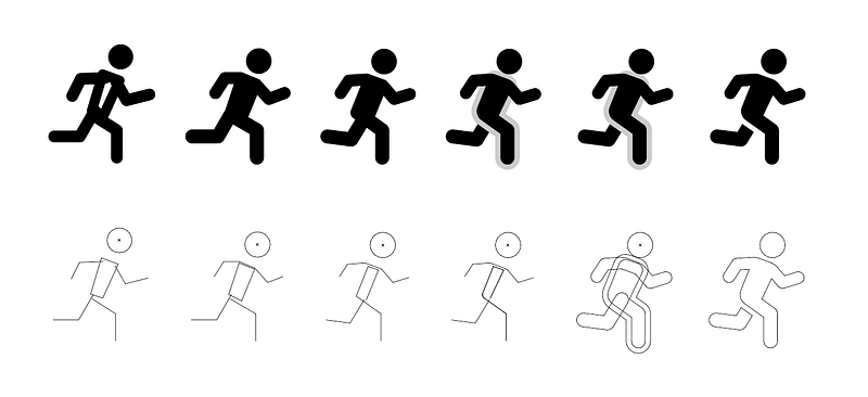
Here’s how I design an icon like the running man figure:
(1) Start by using the Pen tool (P) to create basic lines and shapes. It’ll connect anchor points in a line, so hit P again to start a new line, or click the original anchor point to close the loop and make it a shape.
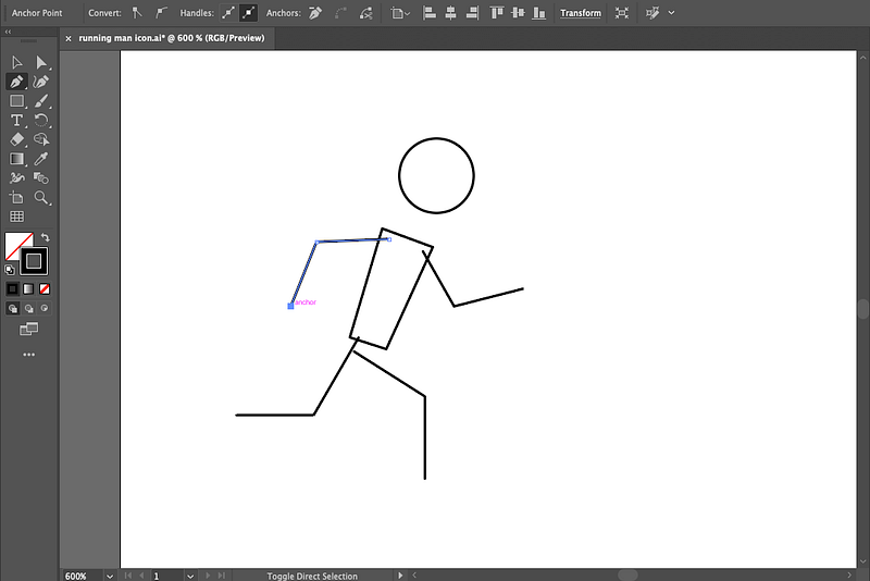
(2) Then with a line or shape selected, add a larger stroke with rounded tips and rounded corners (click the “Stroke” button in your toolbar to see these options). The larger stroke helps me see what the icon is ultimately going to look like.
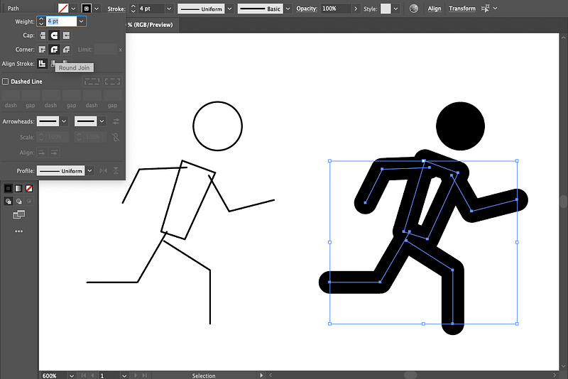
(3) I’ll also add a Fill in the same color for regions like the torso that need to be solid.
(4) Then, just continue adjusting each anchor point with the direct selection tool until the limbs are positioned more naturally.
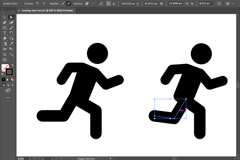
(5) Once each of these parts is in place, go to Object > Path > Outline Stroke to turn the stroke into a compound path.
(6) Then, decide what parts to unite into a single shape and go to Shape Builder. Here, I want the front leg to stand out from the rest of the figure to be more visually clear. I select the torso and front leg, then select Shape Builder (Shift + M) and click and drag to unite the objects.
(7) Then I add a stroke to this new shape (in gray) and select “Align to Outside” in the stroke window, so I can see what part I want to cut out, leaving a gap between the front and back legs.
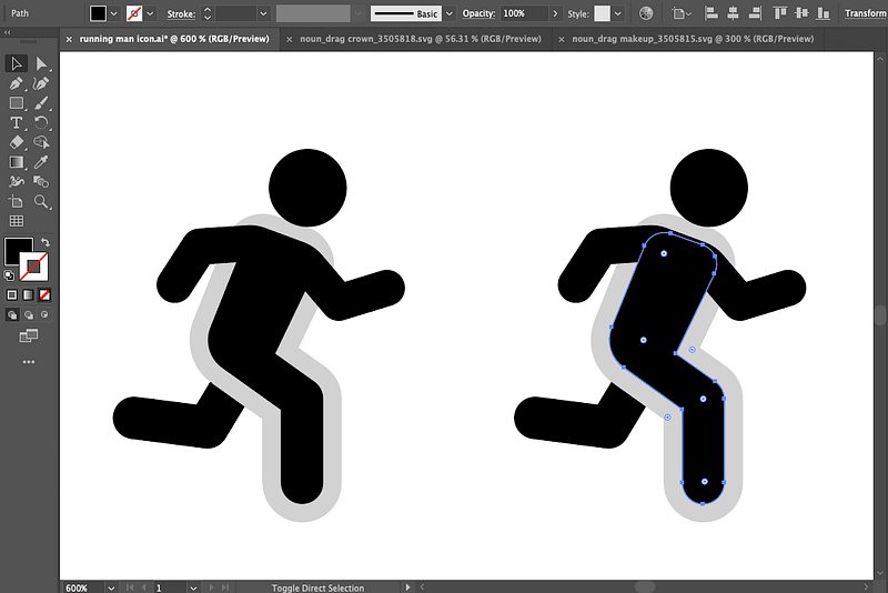
(8) Then I click Object > Path > Outline Stroke again so that the stroke becomes its own path.
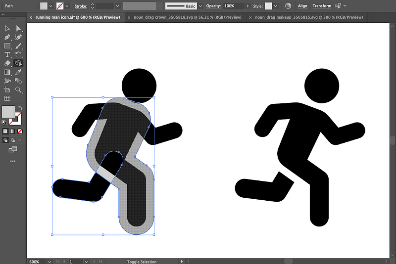
(9) To “subtract” this gray shape so that it leaves a gap between the front and back legs, select the back leg and gray shape and go to Shape Builder (Shift + M) again, but this time hold down Alt (or Option on Mac) to subtract — then you can subtract just the gray, leaving a gap. Voila!
Here are some other handy tips and tricks I frequently use in Illustrator:
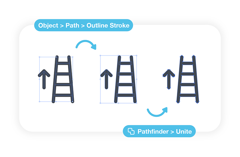
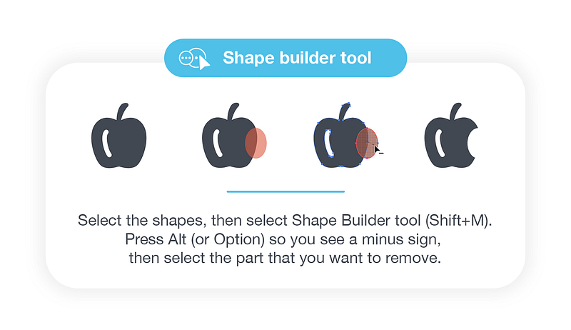
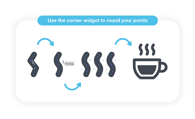
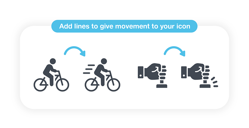
What would you say are the most common mistakes people make when designing icons?
An inconsistency in the stroke styles or widths, having too many anchor points where they’re not needed, an imbalance in the overall icon or including too much detail. I would say these are the things that make an icon unsuccessful.
What are a few things every designer should do to create a more polished, professional icon collection?
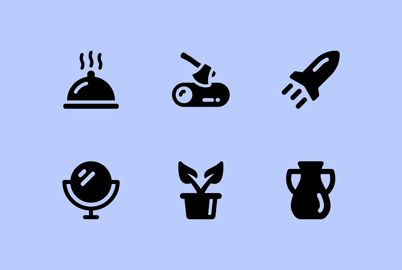
Have a distinct style and keep some consistency– make sure that within the same dimensions, your icons have similar stroke weights, fills, and similar corners and miter limits (the degree of sharpness or roundedness where your lines come together). If you’re making a collection, put all your icons next to each other and look at the set as a whole. I like to keep a certain freedom in my icons, but I also want to keep homogeneity.
Are there any particular designers you like to follow today, or other resources you turn to for inspiration?
I like to surf on Behance, which has a lot of great designers.
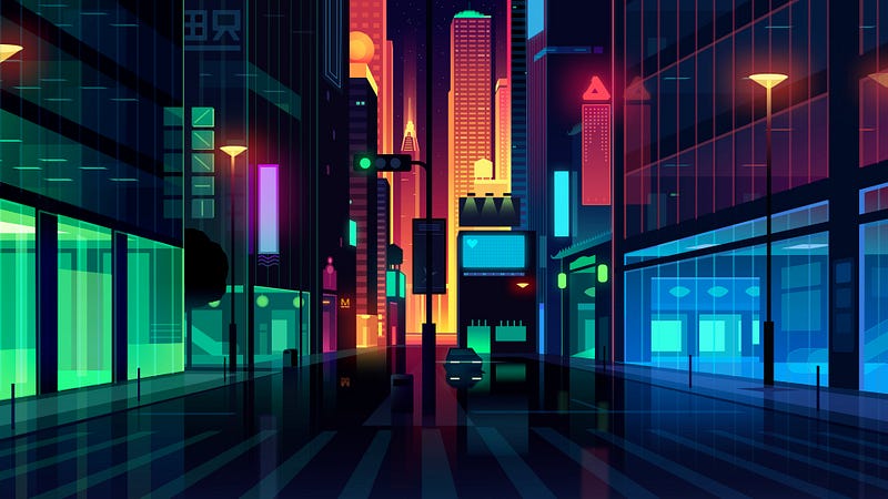
This is less related to icons, but I’m a huge fan of the work of Romain Trystram, and particularly his work “City Lights” where he uses bright neon colors with darker shades.
I also really like the work of Alberoner with his colorful faces with captivating emotions.
What’s up next for you?
I will continue to create and try to improve my skills day by day. I still have a lot of ideas in mind to explore! I am grateful to the Noun Project and everyone who supports me and sends me kind messages about my work; it keeps me going!


