

Tim Boelaars is an illustrator, art director and graphic artist living in Amsterdam. He specializes in icon, identity, logo, and packaging design, as well as illustration and art direction.
His work is recognized for its bright colors, singular line-work and geometric compositions.
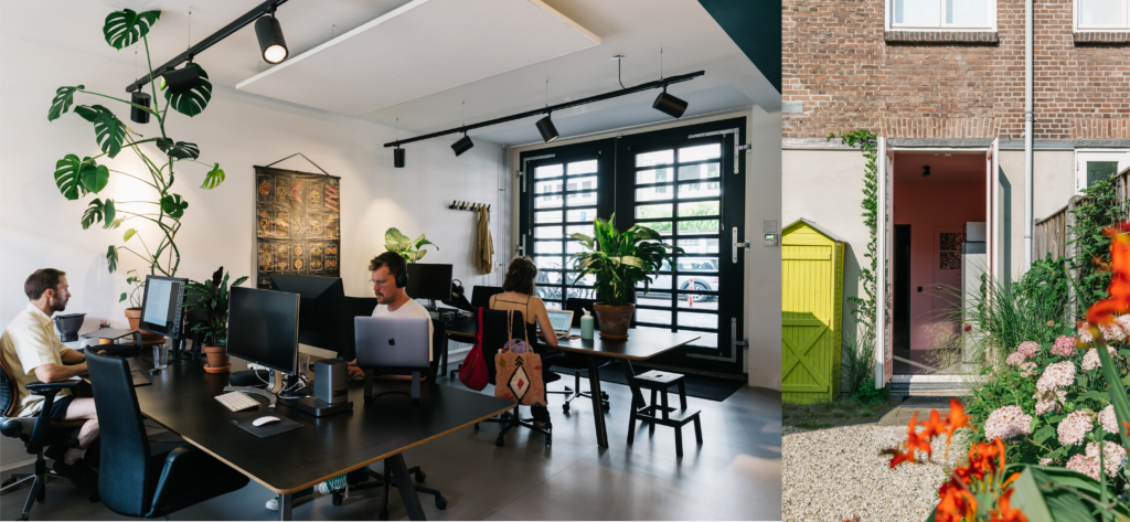
In his free time Tim draws inspiration from gardening, hiking, mixing electronic music, making fresh pasta and birdwatching. He was named a Young Gun by the Art Director’s Club in 2012. Tim is also the founder of Plant22, a co-working space for eight creative professionals, located in Amsterdam.
We spoke with Tim about how he got started as a designer and illustrator, and his top tips for making visually pleasing, clean geometric designs.
Hi Tim! Tell us a little about yourself—how did you get to where you are today?
I grew up very close to Amsterdam in The Netherlands. When I was younger I was always drawing and my grandfather was a key figure in teaching me. He was a painter in his free time and would spend time teaching me more about painting and drawing. It was all very basic, as I was just a child, but I always think this has been the anchor in my pursuit to become an illustrator. It has always kept me interested in drawing and illustration. During my studies I got familiar with Adobe and my interest for digital illustration and graphic design grew. I enjoyed working on constrained grids and building simple graphics on a computer. There was a period where I was only drawing icons and it felt too specific at times. Over the years I’ve tried to diversify more and work on larger illustrations as well. The combination of small icons, logos and larger pieces keeps it interesting for myself.
How did you develop your personal taste and your individual style/aesthetic? What is your favorite subject matter to design or illustrate around?
As a teenager I was interested in graffiti. I was attracted to old school graffiti styles, where there was a strong combination of line work and bright colors. I feel this has influenced my taste and preference for illustration a lot, and can still be recognized in my work.
I really enjoy more organic subjects lately. As my love for gardening has grown the past years, so did my interest in drawing more plants, flowers and fruits. Nature is definitely the best source of inspiration for me at the moment.
What are some of your top tips for making a more minimalist-style design successful, and how do you get started?
- I use Procreate, Adobe Photoshop and Illustrator to make my designs. For sketching and drawing out ideas, I’ll start in Procreate. To make refine my sketches in vector, I’ll use Adobe Illustrator and for adding certain effects or textures, I’ll use Photoshop. Illustrator is the standard for making vector graphics like icons. It gives a lot of control over shapes, lines, and curves. Vector software is essential to export .SVG icons that can be uploaded to Noun Project.
Try the Noun Project Add-On for Adobe
- When starting a new piece, it’s always helpful to try many options by starting with an initial draft and making slight iterations to it. I’ll copy and paste the initial draft several times and adjust and move onto the next option. It helps to see different versions next to each other to iterate, refine and eventually pick out the best option. I also tend to zoom in and out quite a lot while I’m working. It helps me to see what works best on smaller sizes, as I think it’s important to keep legibility in mind when designing icons.

- When designing an icon set I tend to start out by setting up a grid in Illustrator and copy this grid throughout the canvas to make sure all icons in the set are designed on the same grid.
Grids are a great way to help define a set of rules for yourself when you’re building an icon set. Think ahead if you’re going for a filled style or just outlines. I like both of those styles, but sometimes they don’t always work well on a dark or light background. It’s good to take the icon size, line weight and distribution of weight into account. To make a coherent icon family, it helps to design the set on one canvas. That way it’s easier to see how icons work next to each other and if they have the same level of detail and style overall.
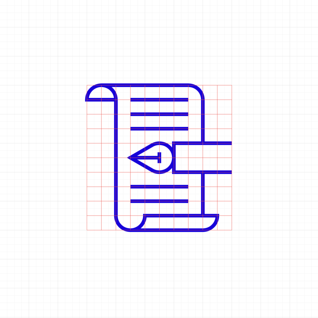
In the example below, you can see how the strokes/lines are aligned to the grid. It helps to keep the visual spacing consistent. This way, I don’t end up with visual “dark spots” where the lines are too close together. Lastly, it’s important to keep the stroke weight the same for all of your icons.

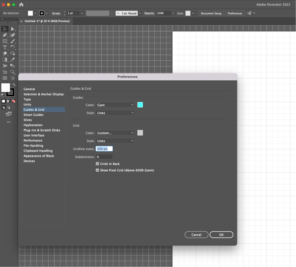
Tip: How to set up grids in Illustrator.
- When starting a new document, make it a square since those are easiest to use in grid systems (such as 1200 x 1200).
- Go to Preferences > Guides and Grid. Under “Grid,” establish the divisions, which will appear evenly across your artboard as long as they’re evenly divisible in your dimensions (for example, setting a gridline every 100 pixels in your 1200 pixel canvas will make 12 even divisions).
- Set the subdivisions for additional detail, again, making them easily divisible (like 4 subdivisions between 100 pixel gridlines).
- Under “View,” click “Show Grid.” It’s also helpful to click “Snap To Grid” so every element you draw falls evenly upon the grid’s intersections.
- Make sure “Snap to Pixel” and “Snap to Point” are turned off. It still sometimes happens to me that my anchor points or lines are not snapping correctly and it takes me a few minutes to figure out that one of those is accidentally turned on. So just be sure to always check if snapping to the grid isn’t working properly.
- Furthermore, if you want to design several icons within a single artboard, you can use the Rectangular Grid Tool to place smaller guiding grids across the canvas.
- Double-click the Rectangular Grid Tool to bring up its settings
- Ensure that the horizontal and vertical dividers are 1 less than the span of grid you want to cover. For example, to draw a grid across a 16×16 area, set the dividers to 15×15 as shown below.
- Under the layers panel, Lock this grid (listed as a “Group”) so you can draw over it easily.

Grid systems are helpful not just for drawing straight lines, but for controlling your curves and ellipses. In the example below, I’ve made a circle two gridlines across used for both the edges of the sheet and the head of the pen. Establishing visual measures like this and repeating them is another great way to add a polished, “pixel-perfect” aesthetic to make your icons appear clean and tidy.
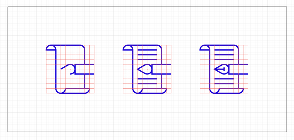
Grids, and snapping to a grid, are not only helpful to draw straight lines with, but this practice also makes drawing geometric curves and ellipses much easier. In the example below you can see how the head of the pen tool is created by using half of an ellipse and snapping one end to the grid to create the point. Establishing visual measures like this and repeating these throughout a set is a great way to make your icons appear clean and coherent.
When designing an icon set, try to establish a rule that can be repeated. You can then test an idea and see how it translates to other icons in your collection. For example, the TV icon below has a ‘break’ along the bottom with diagonally slanted end points. I’ve repeated this break and diagonal effect for the music notes. But for the other icons, I decided not to add this as it didn’t seem to improve the set as a whole. Creating a rule doesn’t always mean that all the icons in the set should follow this rule. Every decision like this will change the overall balance and visual weight of the composition, so you can test out which version works best without disrupting the overall legibility.

What’s been your favorite project to work on?
I recently made an illustration for a beer can for House of Cans, a small shop in London that teams up artists, illustrators and designers with breweries and other drinks producers to create limited run collaborations. I really enjoyed that.

Where do you go for creative inspiration?
In my free time, I really enjoy gardening. My office space has a garden and I have a big balcony with lots of pots and plants. I really enjoy growing plants from seed, doing garden upkeep and filling the space with as many plants as I can find.
During COVID, my interest and love for gardening grew deeper and I really enjoy it. It takes my mind off any stress and creates a calm space for new ideas. I believe that on a deeper level, hobbies and peaceful moments like this help make room for creative work.
