Alignment is about more than just arranging elements on a page; it’s the art of creating a visually harmonious and organized layout that helps you communicate more effectively. It’s one of the key ingredients to transform chaotic compositions into clear, engaging designs. Coupled with guides and grid systems, the standards and rules you set for your composition will take the guesswork out of design and help you quickly create clean, crisp iterations on an idea to get your point across faster.
The Power of Alignment
Alignment is the foundation that ties a design together, guiding the viewer’s eye and establishing a sense of order. Whether you’re designing a website, a brochure, or a poster, proper alignment ensures that each element has a clear relationship with the others, enhancing readability and overall aesthetic appeal, even helping to make a design look more professional.
Types of Alignment
In short, alignment is the act of ensuring all your elements fall uniformly flush against a line, visible or implied. We most think of alignment in action when we look at bodies of text, and encounter the four primary types of alignment: left, right, center, and justified. Each type serves a distinct purpose.
Left alignment is of course the most common, providing a clean, easy-to-read layout for text-heavy designs. Since most readers grow accustomed to left-to-right reading (save for those of right-to-left written languages like Hebrew or Arabic), left-aligning bodies of text is the best way for readers to swiftly make their way through the literature.

Right alignment is often used for creating emphasis or for elements that need a unique visual flow. If aligning text to the right creates a “ragged edge” of line starts on the left, readers will find themselves slowing down to better absorb the information.

Center alignment creates a formal, symmetrical look, ideal for invitations and posters. But with the potential visual inconsistency of having both edges look “ragged” with different lengths of text, it’s best to reserve center alignments for titles or smaller lines of text.

Justified alignment – which stretches the text to fit the full width of the container – can offer a tidy, block-like appearance that is most often useful for newspapers, textbooks, or any context in which a larger amount of different information has to be organized in a visually neat format.

In both written text and graphic design, we also frequently think in top, bottom, or center alignments that create a smooth, stabilizing line of motion across a composition.

Combining different elements with a certain type of alignment helps establish visual “rules” that ground the composition – while breaking out of the alignment can compromise the overall sense of cohesion and make your design less digestible. Think of a common bar chart – it only makes immediate visual sense because each bar lines up along a common baseline, so the viewer can quickly see their relative sizes.

Grid Systems: The Backbone of Alignment
To achieve precise alignment, designers often rely on grid systems. A grid system is a framework of horizontal and vertical lines that helps organize content, ensuring consistency and even spacing across a design. Grids can range from simple single-column layouts to complex multi-column structures, depending on the design requirements. They act as a roadmap, guiding the placement of elements and maintaining balance and proportion.
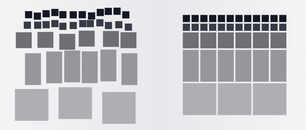
Grid systems are useful on both the micro level of designing a single element such as an icon, and the macro level of combining multiple elements, like icons, photos, and bodies of text, into a single layout.
Tip: Want to learn how to establish grid systems for icon design? Read our guide.
Implementing Grid Systems
When starting with a grid system, consider the content and the medium. For print design or any kind of editorial layout like a magazine or newspaper page, a common choice is the 12-column grid, offering flexibility for various layouts.
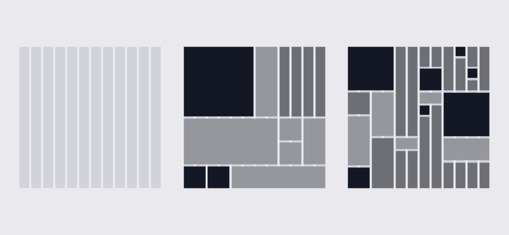
For web design, responsive grids that adapt to different screen sizes are essential. Begin by sketching a rough layout and then overlaying the grid to refine the placement of elements. Similar to the above examples, begin by creating a grid layout with several uniform columns that are evenly divisible – for example, starting with 8 columns that turn into 4 at the breakpoint for a tablet, and just 1-2 columns for mobile view (see more visual examples from the UX Design Institute).
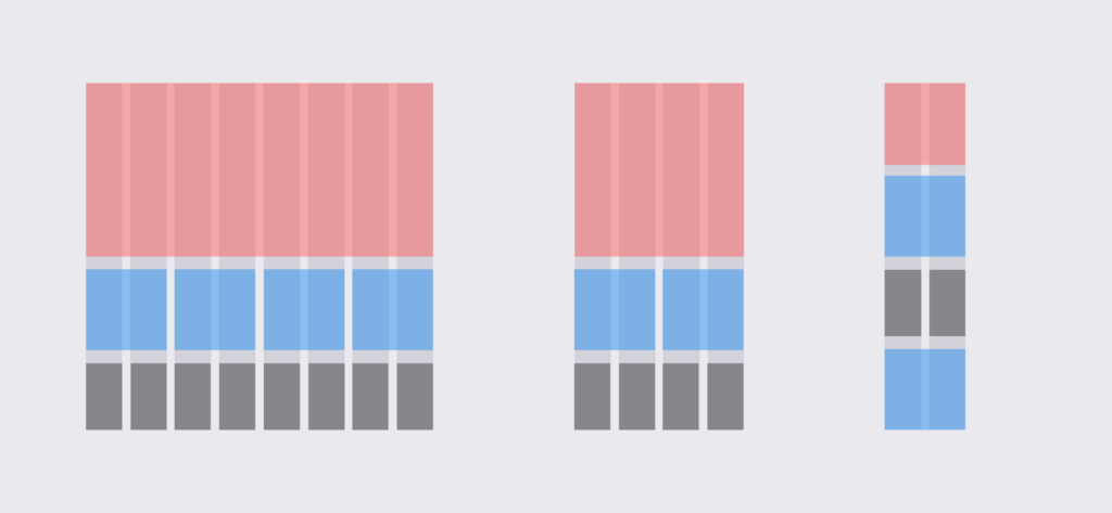
As you begin to use grid systems as the basis of alignment, keep the following tips in mind.
Tips for Effective Alignment and Grid Systems
- Consistent Margins and Padding: Ensure that margins (the distance between two columns or rows) and padding (the border space around elements or columns and rows) are consistent throughout the design. This not only aligns elements but also creates a sense of uniformity and order.
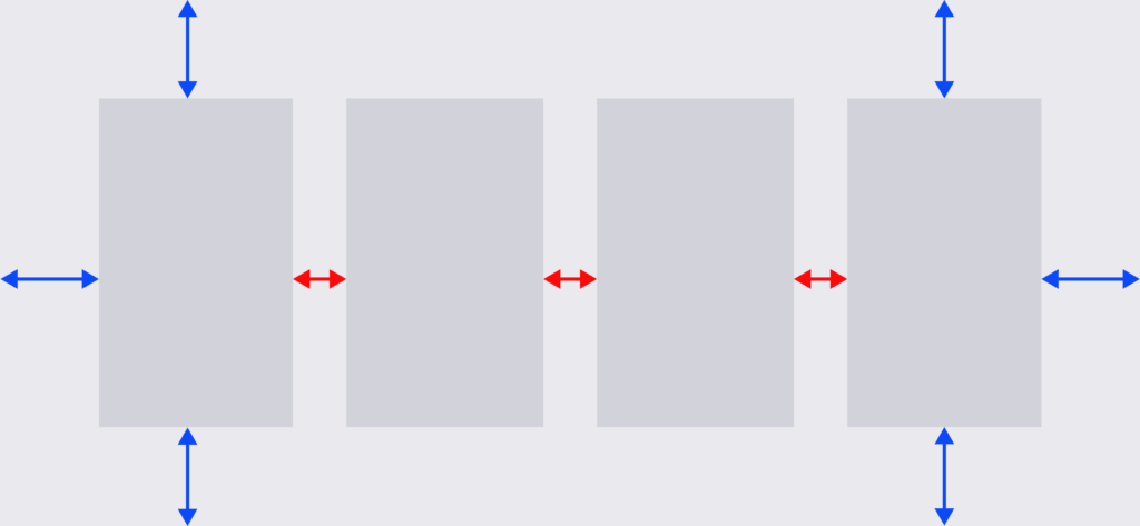
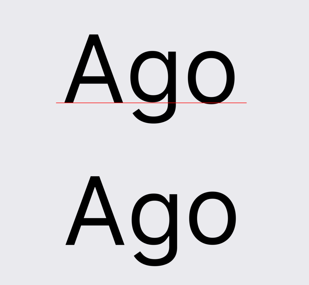
- Use Baseline Grids for Text: Aligning text to a baseline grid ensures that lines of text are evenly spaced, improving readability and visual consistency. If you’re designing a title or perhaps creating your own custom text, your typography will only look evenly balanced when it falls on the baseline grid – the (ultimately invisible) bottom line upon which the bottom of all letters fall. Bear in mind that this often becomes an optical adjustment, since letterforms with flat bottoms will evenly hit the line, but letters with descenders will fall below the line and rounded letters, like “o,” may dip slightly beneath. The mind perceives an optical center-point that may not exactly adhere to the established baseline. With any kind of alignment you bring in to your design, your overall perception is just as important as the technical details of what you’re designing.
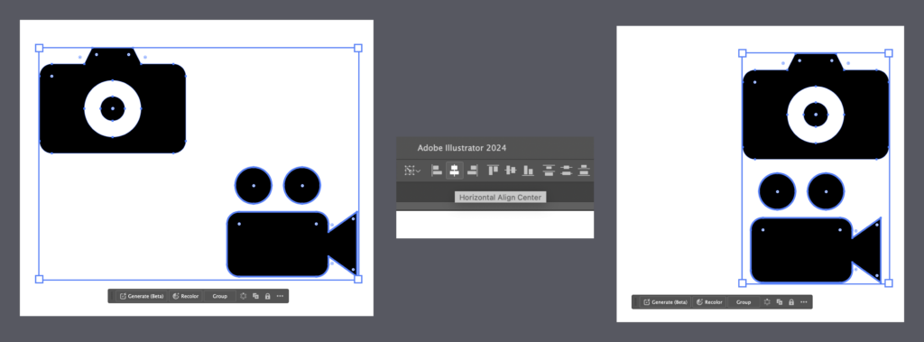
- Align to Key Objects: Choose key objects or anchor points within your design and align other elements to these. This creates a visual hierarchy and guides the viewer’s eye effectively. Typically, if you select two elements on your canvas and hit an “Align” button (whether that’s center, right, left, top, or bottom), it will “average” the distance between them and merge them together. In programs like Adobe Illustrator, the “Align to Key Object” command will let you select the main object you would like to remain in place while the other object is aligned to it. Simply select both objects (with a shift-click) and give one additional click to the one you’d like to make your key object.
Mastering alignment is a process that requires both technical precision with artistic intuition. By understanding the principles of alignment, utilizing grid systems, and applying effective tips and techniques, you can elevate your design compositions instantly.
Looking for more creative how-to’s? Follow our DIY articles for more.


