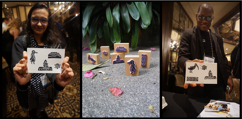
Zack’s unique icons begin as rubber stamps and feature the rich details of world cultures.
Zack McCune is an American filmmaker and graphic designer. His work has been featured by AeroMexico, the National Parks Service, the BBC, France 3, and the International Ocean Film Festival. In his professional life, Zack works in creative marketing as Director of Brand at the Wikimedia Foundation. We caught up with Zack to learn more about his creative process and how he creates custom icon stamps, travel journals, and more.
Hi Zack! Tell us a little about yourself — how did you get to where you are today?
I grew up in the computer lab of a public school near Boston, Massachusetts. My mom was both a computer teacher and an art teacher. My interests formed at the heart of these disciplines, although I knew I was bad at the art — I just liked doing it too much to quit.
I studied Modern Culture & Media at Brown University and the curriculum focused on semiotics. Suddenly, everything in the world was a “symbol” to be defined or redefined. I took art classes at the Rhode Island School of Design and just got rocked by the pace of the assignments and the talent of my classmates. Between the semiotics and design classes, I crafted my own messy, humanist style. It’s grounded in making curiosities. One time I recorded the sounds of all the door knockers of a street for an interactive website. Another time I printed posters advertising a (fake) upcoming lecture from Joe Biden that hundreds of students got prepared for. A true highlight was receiving a grant to make a documentary about ancient Irish sports — though I had never been to Ireland.
After college, my love of working on creative, cultural stuff led to working in advertising. My own art-making stopped almost entirely until I moved to San Francisco and rediscovered the energy to make things again. Plus, I started working for the greatest website in history and was surrounded by inspiration.
What does your current role at the Wikimedia Foundation encompass?
I am incredibly honored to work at the Wikimedia Foundation as Director of Brand. The Wikimedia Foundation is the non-profit that operates Wikipedia. My job is to increase awareness and love for free knowledge worldwide. I lead the Foundation’s Brand Studio team in doing this global work and we have incredible creative leaders in Johannesburg, Cairo, London, New York, and San Francisco.
You’ve created hand-carved stamps and stickers from icons, including as part of a travel journal. What was the original inspiration behind this project?
Icons offer an alternative to written language that invites curiosity and interpretation — one part art, one part statement. On Noun Project I delight in the specificity of the icon sets and how succinctly yet powerfully the icons can represent an idea. Noun Project is a world library of symbolic thoughts.
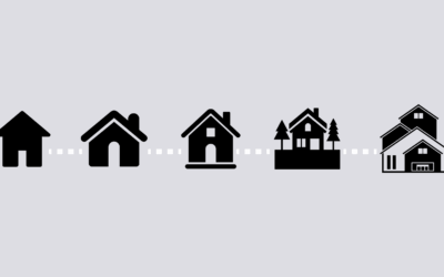
For some of my personal hobbies (soccer, surfing, and hiking), I have tried to make “fill-in-the-blank” templates that summarize the activity without words. To illustrate concepts like “trails hiked” or “animals seen” I scoured Noun Project and found fitting icons. Then I manufactured these into stamps and printed them out in small journals. I use the journals to keep track of my activities, and give them to friends around the world for their own use. My goal is really to leave space open for the activity and let the journal owner add the words. I’ve been thrilled to see the journals get used in Austria, France, South Africa, and Mexico, so I know they work across languages. My great thanks to icon makers on Noun Project for helping make these creative experiments work!
https://player.vimeo.com/video/287484765?app_id=122963
You’ve also designed your own collections of icons, stamps, and stickers depicting everything from world landmarks to the Mayan Popul Vuh. What drives you to explore a particular subject, story, or culture?
When I started making my own icons for Noun Project I wanted to fill in gaps for topics that did not have icons yet. So many illustrators and designers are working to make the world more visible on Noun Project, and I wanted to help with that.
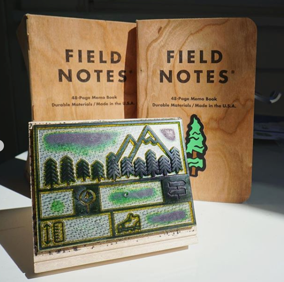
I also wanted to get off of my computer, so I decided that every icon I made would be hand-carved in rubber. My icons are stamps first. There is a real, physical version of each one. These physical stamps make great postcards and I like bringing them to Wikipedia events around the world so people can make their own art objects.
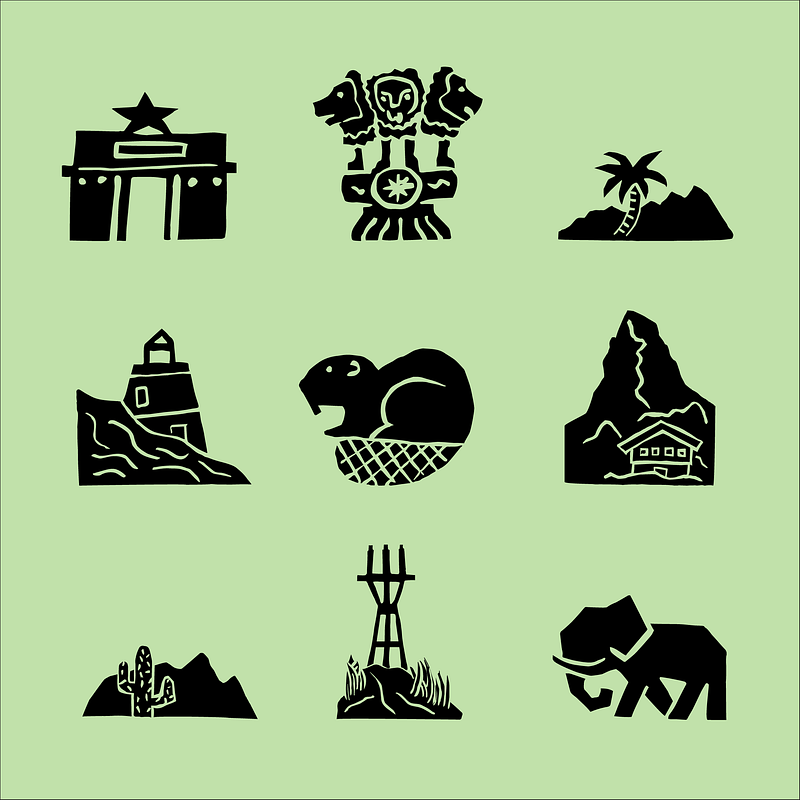
Stamps are actually a terrific way to learn about branding and how versatile simple icons are in telling stories or inspiring feelings of trust, action, purpose, etc. If I make 7 icons to describe Cape Town, South Africa, people can recombine these into millions of totally new permutations that are all their own and yet still related. Icons allow people to explore the tension between originality and consistency, which is part of the balance between making brands both dynamic and recognizable.
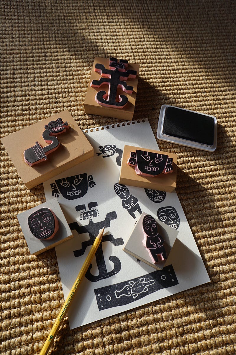
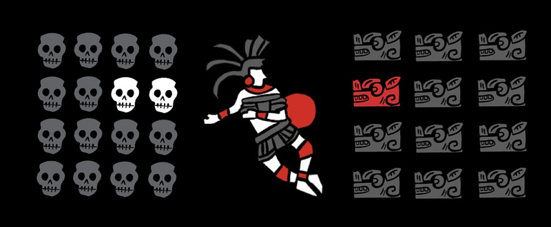
Last year, I decided to explore telling stories using icons. Again, I wanted to help fill gaps, so I found that the ancient Mayan creation myth, the Popol Vuh, did not have icons on Noun Project. This is a thrilling story (it’s got sports, it’s got romance, it’s got haunted houses) that everyone should know, as it’s a part of world history that was systematically suppressed. Plus, Mayan language is symbol-based, so it’s a really fitting thing to explore with icons.
Overall, I made nearly 50 icons that outline the arc of the story, and organized them into an abridged version of the Popol Vuh. The San Francisco Public Library hosted me for a public reading in October. I am hoping to do more readings again. More importantly, I wanted to share the key icons with the Noun Project community so people all over the internet can use them, get inspired by Mayan culture, and learn more about Mayan art today. I was particularly inspired by artist Frida Larios in exploring Mayan iconography.
Why do you think it’s important to share and preserve the world’s visual language and what drove you to use Noun Project?
Icons are just incredible tools for expression. They offer an alternative to written language that invites curiosity and interpretation — one part art, one part communication. On Noun Project I delight in the specificity of the icon sets and how succinctly yet powerfully the icons can represent an idea. Noun Project is a world library of symbolic thoughts. The more creators that are contributing, the better. We can examine how differently people see things.
How would you describe your personal aesthetic and has it evolved over time?
I call my aesthetic “nightclub at the museum.” There is a lot less distance between a rave flyer and a Mayan stone relief than people think, and my aesthetic tries to close that gap. Human symbols have always been crafted for people to both learn something and feel something.
My aesthetic has evolved through a cultivated sense of curiosity and a beginner’s mind. I try to celebrate that first feeling you get when you see something odd/surprising/enchanting and use it in visual work to pull a person into mythology or biology.
What would be your dream creative project to work on?
I really love to do collaborations with cultural organizations. I like working from archive materials or museum pieces that people ignore. I believe up-cycling creative work from the past is a reminder that humans are fundamentally interesting and creative.
To be more specific, I would love to make a Leporello with Nobrow press in London. Or the pictograms for an edition of the Olympic Games. Slightly different tasks, but still fundamentally about humans and the symbol systems we use.
Where do you find inspiration and what are some of your favorite design resources?
I find inspiration in parks, museums, bookstores, overheard conversations in coffee shops, street stickers, plus a HEFTY dose of Instagram.
My favorites range from the Letterform Archive, to the art and design blog This is Colossal, to Alexander Girard prints and Vimeo staff picks, bookstores like Magma Shop in London, and museums like Zeitz MOCAA in South Africa (and I could go on!).
How do you get through creative blocks?
When I hit a block, I try to joke my way out of it. I like running “bad idea brainstorms” — answering the question, “what is the worst way to solve this challenge?” Just a way you know is bad. Then you can enjoy a snarky chuckle at that terrible idea and you may be surprised to find there is a pretty ok idea hanging out right next to the bad idea. Might even be the same idea.
What advice would you give a designer or fellow creative just starting out?
Repeat ideas and build series. This allows a creative person to improve on their articulation of a core idea and gives many chances for audiences to engage and understand the work. Too many times, talented creatives express an idea one time in one way and feel disappointed with how it turned out or how people missed the idea.
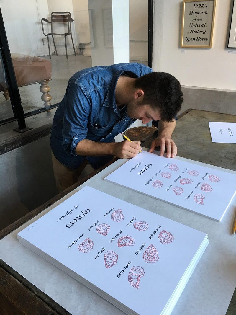
I find that nine is the magic number. That’s 3 sets of 3, so it’s exponential on the “original” magic number. At nine repetitions of oyster shells, Mayan glyphs, conifer trees, or whatever, the form of the element comes into clarity.
Bruno Munari used to remind people who said they “could not draw” that they all learned how to draw letters in order to “write.” I think the same thing is warranted for graphic design.
Repeat your ideas. They will get better. And people will see what you see.