Refer to these technical guidelines when creating icons to submit to Noun Project.
Anyone can create and submit icons to be considered as additions to Noun Project’s vast collection. Each icon found on Noun Project has made it through our rigorous content moderation process, ensuring that every icon adheres to strict quality standards. In addition to considerations like subject matter, design quality, and accuracy of accompanying tags, we have strict technical requirements for the icons that make it through our curation system.
Following these technical guidelines will help you create clean files that look their best, optimize how your icon functions, and makes the file easier to use.
Here are a few easy steps you can take to prep your icon for success:
Artboard
Create a 100px by 100px artboard in Adobe Illustrator to use for your icon design.
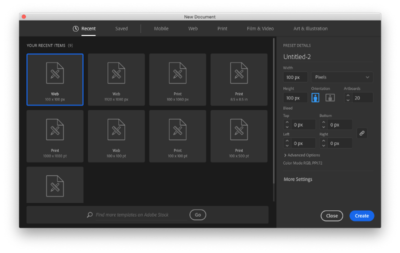
Create your artboard. 100px by 100px is best.
Color
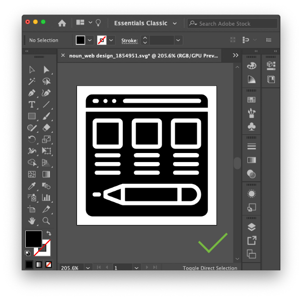
It’s important to make sure the color of your icon is true black. For some design software, the default black is not a true black. To make sure your icon is true black, use hex value #000000.
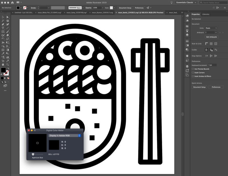
To check the color of your icon, use a digital color meter and make sure all RGB values equal 0.
Check for Strokes
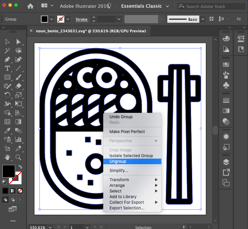
There should be no strokes in the final icon design. Strokes may be used during the design process, but should be converted to compound paths once completed.
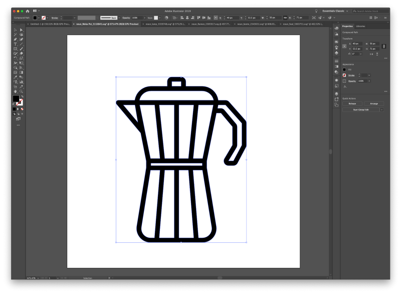
Merge Shapes
Be sure to merge all shapes using the Unite tool, sometimes called “Add to Shape Area.”
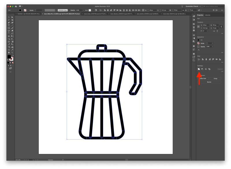
Doing so should remove faint lines that appear in your design.
Center Your Icon
Always center your icon using the vertical and horizontal centering tools.
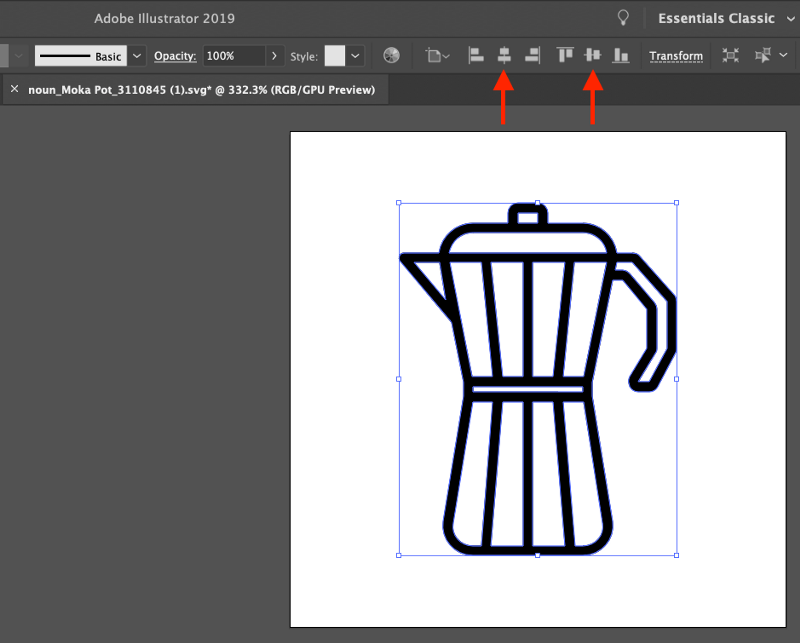
Give your icon a 2–5px buffer. Having a buffer prevents your icon from falling off the edges of the artboard. It also makes it easier for Noun Project moderators to view the entire icon, which speeds up processing.
Adding a buffer is key to ensure your icon does not bleed off of the edges of your artboard.
Grouping
Once you have completed your icon design, be sure to ungroup any shapes in your icon and use compound paths. Compound paths behave more predictably than strokes for the end-user. Resizing becomes more consistent and intuitive when using compound paths.
Remove Hidden Artifacts and Scraps
Remove any hidden artifacts that may appear on or off the artboard. Anything left in the working icon file when you save it will be included in the download of the icon.
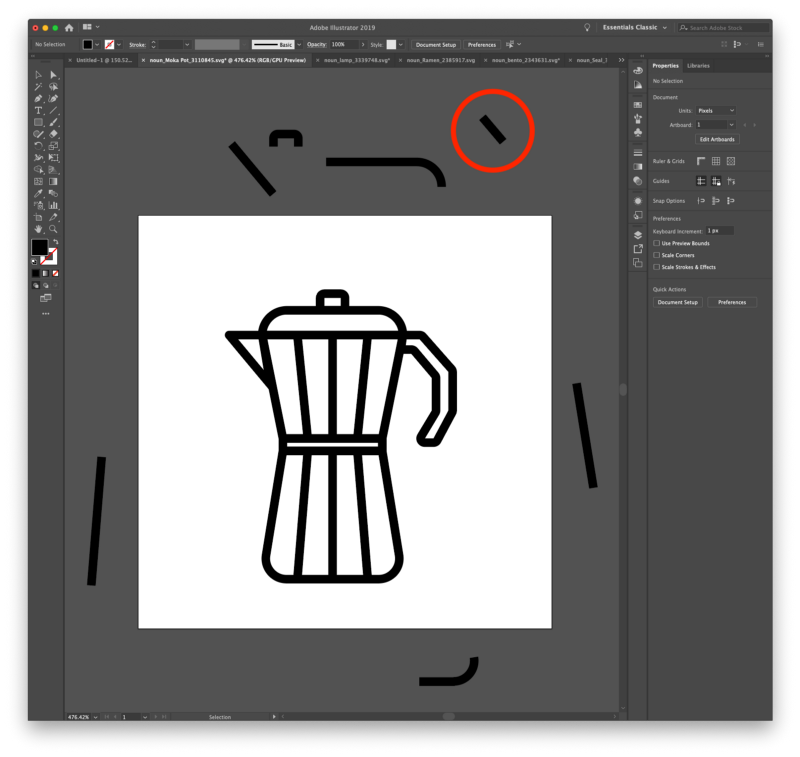
All unused design scraps, like the circled one above, will show up in the final file.
If there are any scraps of unused SVG elements, those will actually appear in the downloaded icon file. If you include a collection of icons off of the artboard, those will be included in downloads as well.
SVG
Finally, make sure your icon is saved in SVG format before you upload to Noun Project for consideration.
That’s it!
Properly formatting your icons by following these technical guidelines helps clean up your files, makes your icons look their best, and helps them function more intuitively for the end-user.