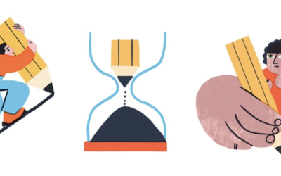
We see thousands of icons every day. These visual shortcuts instantly tell us where to click, what to expect, or what something means. The best ones are so intuitive that we barely notice them anymore—and that’s not by accident; it’s great icon design at work.
Some designers strip everything down to basic shapes, while others add shadows and textures to make things pop. What works best to quickly communicate ideas with icons: taking a minimalist approach or including details? The sweet spot, it turns out, lies somewhere in between. Understanding your context is the key to choosing between minimal and detailed design when creating icons.
The Case for Minimalism
Minimal icons work because they reduce cognitive load. When you see a simple magnifying glass, you instantly think “search.” There’s no mental processing required – the connection is immediate and universal. This immediacy is crucial in user interface design, where every moment of hesitation creates friction.
Minimal designs also scale better. A simple icon remains recognizable whether it’s displayed at 16 pixels or 160 pixels. In a detailed icon design, you’ll often end up with an icon that becomes muddy and difficult to interpret when scaled down.
The Case for Details
Sometimes, details aren’t just decorative – they’re functional. Take Google’s search bar animation. The way it expands and the microphone icon pulses aren’t purely minimal; these subtle movements and transitions help guide users’ attention and indicate interactive elements. These small details help users understand how elements relate to each other and what they can do with them.
Details can also infuse personality and energy into icon design. For example, the Cleaning Services icon set below demonstrates how thoughtful details can create whimsy and playfulness while maintaining clear communication.

Cleaning Services icon set from Noun Project user, IconPai
Finding Balance: A Practical Approach
The key to effective icon design lies in finding the right balance between simplicity and detail. Here’s how to approach it:
1. Start with purpose
Before adding or removing any element, ask: “Does this help users understand the icon’s function?” If not, it’s probably unnecessary.
2. Consider context
An icon in a navigation bar needs to be simpler than one used as a standalone app icon. The environment dictates the level of detail needed.
3. Apply the 5-Second Rule
If someone can’t understand your icon within 5 seconds, it’s too complex. But if they forget what it looks like 5 seconds later, it might be too simple. The best icons stick in memory while remaining instantly recognizable.
4. Test at multiple sizes
If details disappear or become distracting at common usage sizes, they’re not serving their purpose.
5. Maintain consistency
Whether you lean toward minimalism or detail, apply your approach consistently across your icon set. Mixed styles create cognitive dissonance.

Animal Kingdom Icon Set by Jino
How to Make The Right Choice
Choose Minimalism When:
- Speed of recognition is crucial
- The concept is simple and widely understood
- Mobile optimization is a priority
- The interface needs to be instantly intuitive


Home icon by SEFEICN // Message icon by SEFEICN // Speaker icon by SEFEICN
Opt for Detail When:
- Educational content needs visual support
- Brand storytelling requires emotional depth
- Complex processes need explanation
- The audience expects rich, immersive experiences


Musicans icon by Luis Prado // Food Delivery icon by kliwir art // Software Engineer by Iconathon
The Future of Icon Design
As display technology improves and design tools evolve, we’ll likely see new ways to balance simplicity and detail. Dynamic icons that adapt their detail level based on context or size are already emerging. But the fundamental challenge remains: how to communicate clearly while maintaining visual interest.
The answer isn’t in choosing between minimalism and detail – it’s in understanding when each serves your users best. Sometimes the clearest communication comes from a simple shape. Other times, it’s those small details that make an icon not just functional, but memorable.
Remember: the goal isn’t to find a universal balance between minimalism and detail; it’s to find the right balance for your specific context, users, and purpose. That’s what separates good icon design from great icon design.
We’re excited to see how you contribute to the world’s visual language!


