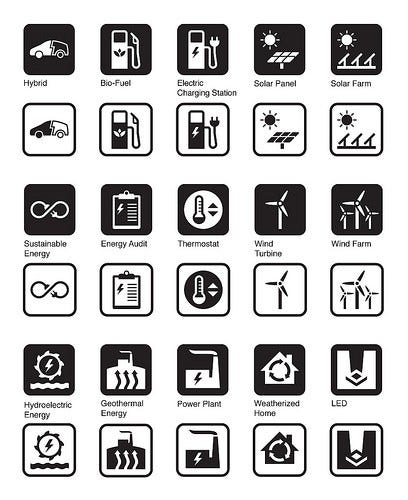
Energy Efficiency and LED Light Icon Collection
Although the idea of Energy Efficiency has been around for many years, only recently has it received the kind of exposure and focus that requires it to have its own visual language to represent concepts like wind and solar farms, electric charging stations and sustainable energy.
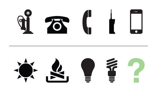
When Cree, Inc. reached out to us to partner on an Iconathon, they were troubled that the old incandescent light bulb and the twisty CFL bulb were still the only symbols used to represent lighting. What’s amazing is that the incandescent light bulb has been around for 132 years and yet whenever we need to symbolically represent “new” ideas, we still use the old bulb as the go-to symbol.
Think of all the innovative strides that have been made in the past 132 years. Take, for example, the telephone. If you go through the list of symbols for telephone on our site, you can see a beautiful progression from the candlestick telephone, to the behemoth first portable phones, to slender and compact iPhones. Although there may not be as many drastic progressions for the light bulb, one of the symbols we wanted to design was a new symbol for LED light — the most energy-efficient lighting to date (about 85% more efficient than incandescent bulbs and mercury-free, unlike CFL’s). How amazing would it be if this new symbol became the “it” symbol for new ideas, progressive thinking, and of course — light, just like the original incandescent light bulb has been for over 100 years?!
Think about how many other symbols we’re lacking that could represent recent developments in Energy Efficiency. Can you visualize a symbol for solar farms, weatherized homes, or wind turbines? These technologies are so new, there just aren’t any easily-recognized symbols for them yet. And we want to change that.
The Iconathon
The event began with a presentation about Symbol Design & User Comprehension by Edward Boatman, Co-Founder & Creative Director at Noun Project. Paul Pickard, former head of research and development for Cree lighting, spoke about the important role energy-saving technologies play in conserving energy. Paul and his team actually designed and commercialized the first commercially viable LED downlight.
The Iconathon process really allowed a diverse group of people to discuss the merits of a variety of designs. Through the critiques, many strong concepts emerged. It was remarkable to see sketches from the Iconathon take on a life of their own as beautiful digital symbols.
LED Symbol Design Process
One of the core themes that emerged from the group critique was that LED is a radically different light source from any of its predecessors, and because of this we all felt it was appropriate and necessary to break free from any past “light bulb” design precedents. LED needed to have its own distinct and identifiable mark.
As a group we decided the two essential elements that needed to be present in the final design were the semiconductor microchip that produces the light, and of course light itself. During the group critique we observed that many of the sketches used a square to represent the chip. The final design uses this concept but displays the square as a three-dimensional diamond shape, thus creating the illusion of depth and volume. Representing the second element, light, turned out to be the greater challenge. When limited to black and white with no gradients, designers only have a few options to graphically represent light. Most of the sketches created at the Iconathon used lines emanating from the microchip to communicate a light source. However, after the event there was a realization that so many other icons used this same “emanating line” technique to represent a variety of concepts (i.e. sound), that we came to the conclusion that there should be a more unique and memorable way to illustrate light.
The solution we arrived upon was to use negative space to represent a powerful focused beam of light rising up from the microchip. We felt this created a much more dynamic, memorable, and bold design that still contains the same original elements agreed upon by the participants of the Iconathon.
Finally, we view these symbols not just as purely utilitarian, but also representative of where we are as a society, and what we want our future to look like. Creating symbols for these powerful ideas helps disseminate them by providing people with the visual tools to make their voices heard across contemporary communication platforms. We can’t wait to see how you use them and we hope you enjoy these symbols as much as we do.


Thanks to the help from our Durham Iconathon participants, we’re thrilled to release 15 of these new symbols into the public domain. The symbols below can be found for download in our Iconathon Suite.