
Hi Erika! Tell us a little about yourself, what got you interested in design?
Visceral satisfaction! Admiring clear or clever images, refreshingly crisp lines, or expressively smooth curves was always a source of pleasure for me. When I was a kid I collected clothes tags, pamphlets, business cards, stickers, and Asian stationery to admire these elements. Whenever I was at a park, in a grocery store or reading a book, posters, packaging and symbols demanded my attention and I was happy to give it. The wide spectrum of styles within graphic design continued to keep me interested and I never outgrew it.
As I got older, I got more into music and started going to shows. Music exposed me to print and digital design through fliers, tour posters, record sleeves and stickers. Concert merch taught me a lot about typefaces, well executed alignments, unconventional spatial arrangements, and striking color contrasts. A lot of my friends were design oriented as well, so I was surrounded by a good mix of references.
Icons were part and parcel of that interest. I respected the visual clarity and immediacy icons provided, plus they are everywhere. Icons are simple but bold, visually concise, and semantically efficient. They’re the perfect marriage of creativity and pragmatism.
What brought you to Noun Project?
Noun Project’s logo. Before I was hired, I was a substitute teacher going to a different charter school every day, and summer vacation was coming up. During my job search I noticed a company with a circle, x, and square for a logo signifying person, place, and thing. The simple clarity of it stood out.
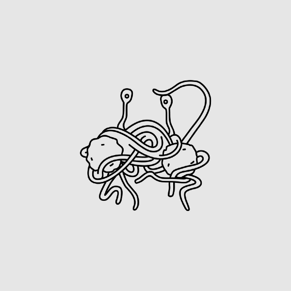
I went to the site and tried gaming Noun Project search and was surprised that they had a flying spaghetti monster icon. The range of subject matter and style on the site was impressive. There was a lot of purely functional material, but the whimsey and expressiveness of Noun Project Creators was a major draw.


Going further back, I graduated college with a degree in English Literature. I studied English to critically interpret language and ambiguous meaning. Words are symbolic signifiers with culturally shifting meaning just like icons are. Ultimately, reading is interpreting symbols, so considering shifting meanings between symbolic images and their identifying terms was a natural progression for me.
As content manager at Noun Project, your team oversees all of the icons that are submitted for consideration. How does the curation process work?
Our goal is to serve our community as objectively and efficiently as possible, while upholding high standards of quality. We spend our time focusing on quality control, user satisfaction, and internally improving tools and processes for scalability.
First, we check icons for technical and aesthetic quality. In order to remove as much subjectivity from the process as possible, we focus on quantifiable qualities like line weight, spacing, centering, alignment, checking that lines are connected and curves are smooth. We also do not allow icons with color, letters, numbers, or icons that are contained in a shape.
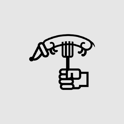
Here are a few examples of issues that would prevent an icon from being accepted:


Then, we check to make sure icons are titled and tagged correctly. Title and tag terms must be relevant, accurate, spelled correctly, in English, and be free of questionable connotations.
Finally, we assess the legality, usefulness, and appropriateness of the icon if applicable.
What are some of the ethical considerations that go into the curation team’s work?
For the most part, we get material icons or icons that represent concepts and objects. Aside from potential plagiarism, there’s not much more to consider for those than visual clarity and accuracy. However, we also get icons depicting everything from politicians to drugs, nudity, sexuality, and suicide. For those, we have to carefully consider the appropriateness of the depiction based on subject and context, connotations and the implications of how they may be used or interpreted in contemporary culture.
We review icons using the following framework:
- What would happen if everyone submitted icons like this?
- Is this icon exploitative or could it be used in an exploitative way?
- Is this icon maximizing happiness for the greatest number of people?
- As a moderator, would I be happy with my decision to accept/deny this icon?
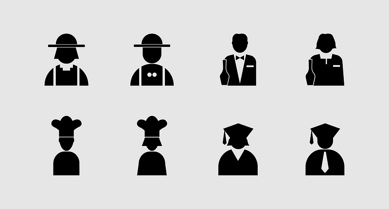
An example would be how gender is depicted and contextualized with tags. There are micro and macro ways that this can be problematic. On a micro level, gender is sometimes depicted with misleading prescribed gender roles. Many medical collections tend to depict doctors as male and nurses as female. Most pilot icons are depicted as male and teachers are often depicted as female. Some depictions may be unequal by showing two male female icons of the same style, but the male one with no facial features, and a stylistically comparable female icon with conventional beauty standard features, thus implying gendered expectations about masculinity and femininity. At times, unequal status or hierarchy are implied by gender depictions in professions. For example, a female teacher may be titled “teacher,” while a comparable male depiction may be titled “professor.” We also see icons of two genders where one is titled “Avatar” and the other “Female/Male Avatar,” which brings irrelevant or unequal focus to gender. On a macro level, there is a disproportionately higher number of male icons than female icons. An unintended result of allowing gendered clarifiers to tags for objects, like “men’s/women’s coat” or “man/woman’s bag,” is skewed results when searching for “man” or “woman.” For example, a search for “woman” may pull up women’s wear, make up, and purses more than displaying actual women.
Cultural sensitivity is also important to us. We try our best to uphold ethical standards of quality when it comes to ethnicity and culture by making sure depictions are not offensive caricature, are comparatively equal, with appropriate titles and tags to accompany the depiction. There are not clear rules for discerning this, but we try to keep up with evolving issues surrounding race and ethnicity.
Icons have high visibility in our globalized and online environments because communication is becoming increasingly visual. It’s worth deeply considering what images are used, especially symbols like icons, because they present themselves as neutral. Due to their wide proliferation and accepted depictions, I believe icons have the power to influence peoples’ expectations, identity, and beliefs. We have a diverse moderation team, which helps cast a wide net for catching potential icon issues. Also, ethical consideration remains a core priority in our collective process. Keeping our team aligned with our goals and standards allows us to maintain a set of values that we want to uphold for our community.
What types of icons would you like to see more of on Noun Project?
I want to see more diverse icons for gender. More specifically, those without assumed or prescribed gender roles. There are doctors, pilots, CEO’s, scientists, athletes, engineers, and politicians who are women, and the same goes for teachers, nurses, caretakers, secretaries, and librarians who are men.
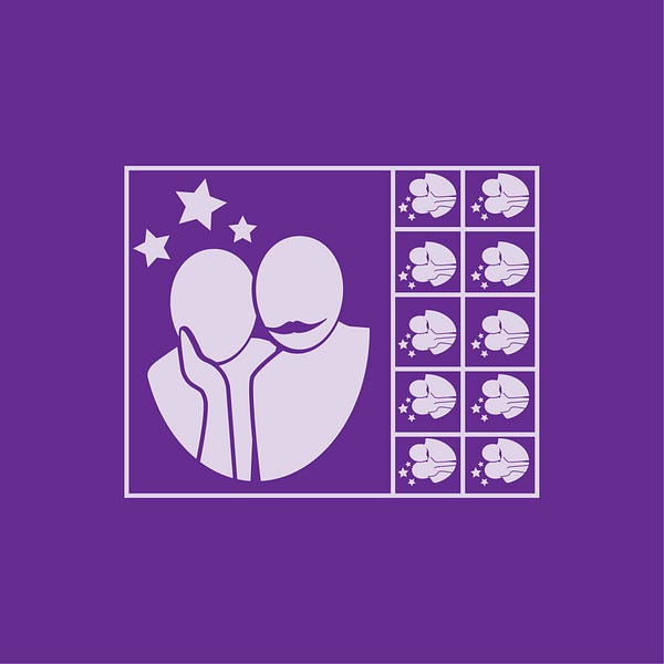
Here is a great example of gender equality:
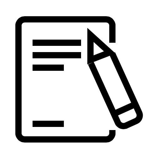
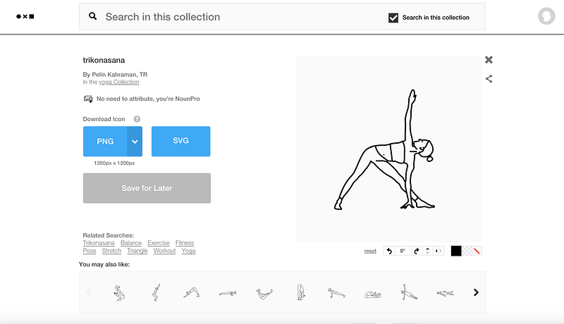
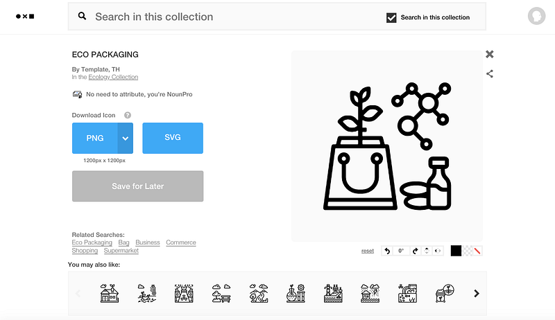
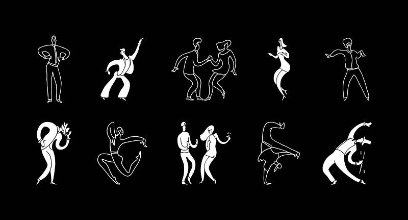
Also, the unsung hero of icons are their tags. Part of what makes icons more valuable is how easy they are to find and that’s only possible when tags are relevant, accurate, and precise. The following icons are great on their own, but they get so much added value in being accurate, precise, searchable, and sometimes educational via relevant tags:
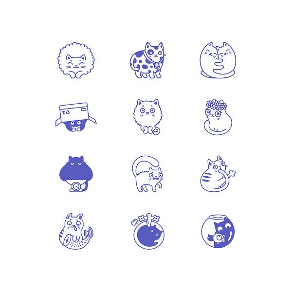
I also want to see more personal/intimate icons, both in subject and style. For example:
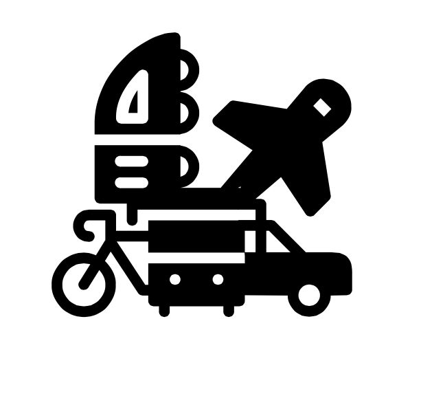
Finally, I want to see the things that don’t exist yet! Things that should come to fruition are probably rooted in the deeply personal, or from a place of passion or curiosity.