Michael A. Salter is an obsessive observer, an artist, a designer, visual culturist, illustrator, doodler, sculptor, fabricator, an image-maker and a Professor of Art/New Media at the University of Oregon. He culls through the avalanche of mass media and corporate branding to find poignant, absurd, and baffling pieces which become part of his work. His creations span all types of media including installation, drawing, kinetic sculpture, logotypes, animation, web art, styrofoam robots, graphics, and signage.
We caught up with Michael to learn more about his background, his perspective on visual culture, and how icon and logo design have become a core focus of his practice.
Hi Michael! Tell us a little about yourself — how did you get to where you are today?
I wanted to be a cartoonist when I was a little kid in the ‘70s. I loved Snoopy and Mad Magazine and I was medicated with pop culture’s branding phenomenon, which blossomed during that time and was injected into my soul via Saturday morning TV cartoons and commercials. When I was 7 years old I was painting my own logos on my sneakers, and to this day I am transfixed by visual culture and its beating heart — branding. In college, I began to straddle the art and design practices and have ever since. Perhaps a generational curse, I’ve lived my life with a lust for things because I was indoctrinated by capitalism to want stuff and sneakers and cars and Jiffy Pop and Kool Aid and Burger King and video games. This fascination with goods transformed into an obsession with visual culture at-large on a global scale.
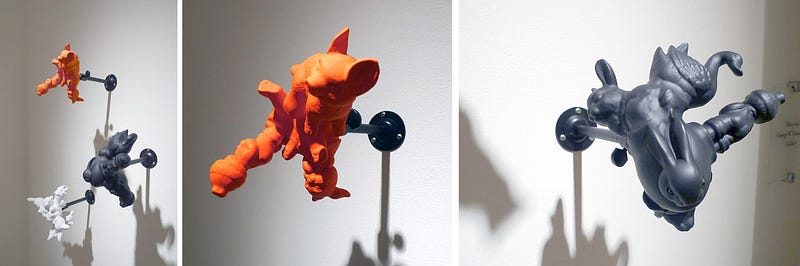
After grad school, I found the fine art world to be weird and difficult to wrangle. This led me to two places: I had a successful design company catering to board-sport-related industries and I found a home in the underground/alternative/DIY art world. My artistic practice fused art and design. I began using design tools, ideas, and languages to critique commerce and capitalism in an art context. Of course, now the lines are all brilliantly blurry between art and design and looking for the divisions is only distracting, but I did learn a few ideas early in my creative practice that seem to have stuck solidly in my identity. I like to embrace a wide-open and broad understanding of media and material. I think it can be seen in my exhibitions when I show an installation that might consist of a giant site-specific sculpture, a free 3D paper model takeaway, edition books, drawings, etc., all in the same installation.
What is the primary focus — or perhaps the artist’s statement behind the artwork you produce? What topics interest you the most in your art practice?
The core of what motivates me has been the same list of questions for a very long time: What does the world look like? Why does it look that way? How is my perception manipulated? How does what I see make me think? Who is responsible for visual culture? What is my role in visual culture? Does the way things look matter? What influence do others have on the way I think?
To answer these questions I obsess over looking at the world, and then I think about what I see, and the work I make is an attempt to sort out answers to all those questions.
What are your favorite mediums to work in, and what’s been one of your favorite pieces you’ve produced?
I do not have a favorite medium, but I do have a favorite way to work. I am committed and devoted to drawing as being the beginning of everything. For me, drawing is the quickest and purest form of visual thinking. I also love a broad and diverse range of media, dimension, scope and delivery. I think of an entire show, or installation as one piece. It is a complex arrangement of relationships of things and ideas that can only be experienced in person. My favorite ‘pieces’ are full solo exhibitions. To spend all my creative currency in one space for a designated time is the most rewarding experience.
How would you describe your personal aesthetic and how has it evolved over time?
My aesthetic could be described as “minimalist-with-county-fair-theme-park-haunted-house-painted signage” or perhaps “formalist sci-fi nerd Bauhausian Magritte mayhem”. My work might be recognized as having an aesthetic, but I’d rather not be bound by that, and hopefully I am open and not afraid to push my own aesthetic boundaries and familiarities.
How did you discover Noun Project and why did you decide to make icon design one of your creative outlets?
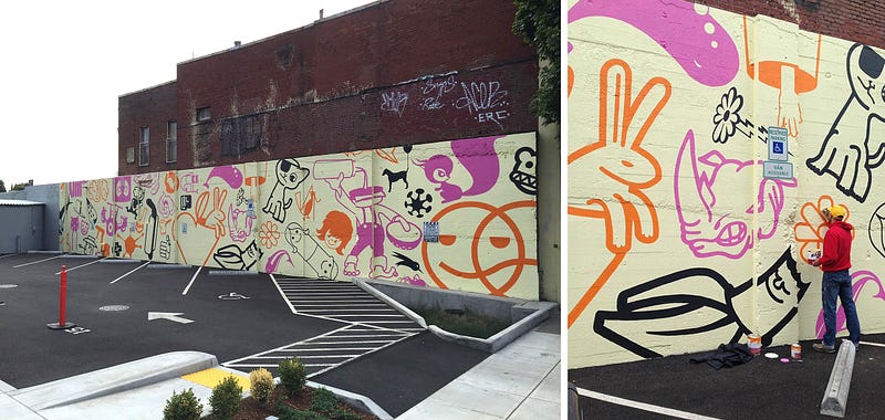
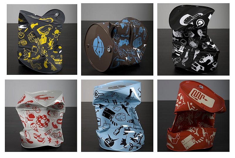
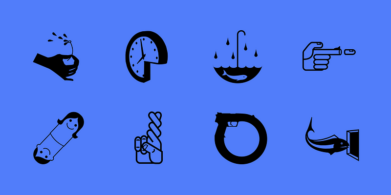
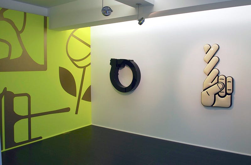
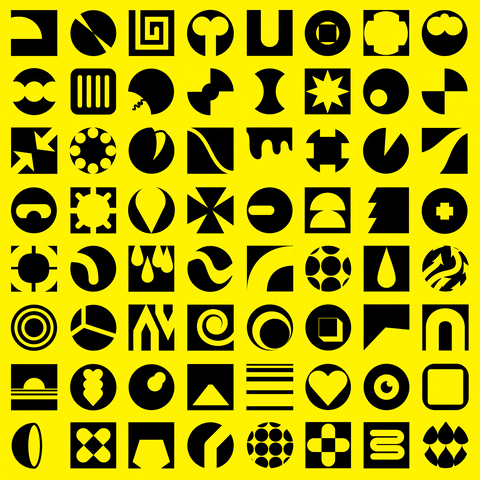
I am grateful for the opportunities I had. The Noun Project is one of those opportunities. I am attracted to the Noun Project occupying that space between art and design, my favorite space. For over 20 years I have developed a series of icons inspired by my love and hate for commerce (numbering near 1,000 at this point) and my fascination with the reductive visual language and its authority. I sometimes think of my icons as logos with no specific audience, or budget, or timeline. I like to draw a visual conundrum that instigates viewers and defies logic. I make visual poetics, silly narratives, grotesque, or perverted, logo-like graphic ideas. Of course this is just some of my work, but it is a series I have devoted many years to developing. I am, and always have been, obsessed with the reductive visual language of logos, icons, and pictograms. It’s like my language of origin where I am most comfortable.
Break it down for those of us who don’t know: What’s the story with NFT’s? What excites you about this new realm of producing and selling art, and why did you decide to be involved?
NFT’s are just a way to certify authenticity of a digital creation. This allows the work to be bought, sold and valued accordingly. Since drawing digitally is so integral to my creative output it was a no-brainer I should try to get involved in the NFT market. I’ve been drawing on a computer since the Mac Classic in 1990, and nearly all my work has been influenced by the digital drawing tool. I happened to be doing a 100 GIF self-imposed pandemic project about the time NFT’s entered my radar, and I just figured why not. To date, I’ve not sold any NFT’s, but I still love playing the game, and I have a bunch of GIFs on GIPHY I am super proud of having produced.
You’ve also been teaching as a professor of art at the University of Oregon — what’s one of your top pieces of advice for students setting out on their own artistic journeys?
I am honest with students about the challenges of the pursuit of careers in creative fields. It is a brutally competitive pool of creators out there. I think my students would vouch for my expectations and standards. I teach the principles I hope they take out into the real world. I insist our work be smart. I insist we think critically and deeply about the ideas and narratives that we make visual. I insist we allow ourselves to take risks and be vulnerable and honest.
What’s one dream project you’d love to work on in the future?
I have a new show/installation in my head every week. A dream project would be the opportunity to realize one of the installations in a space. This is all I ever want. To make an experience that allows an audience to get in my head, and either confirm, or deny, my sanity. Lately I’ve been imagining two giant skulls facing each other, each made from found styrofoam packing pieces. A sort of death contemplates death concept, in proximity to a massive archive-like grid of all black-on-black drawings.
Do you have any favorite design resources — books, blogs, podcasts, or fellow artists — you love to follow?
Reading — The Politics of Design: A (Not So) Global Design Manual for Visual Communication, by Ruben Pater.
Watching — The Choe Show on FX, about world-renowned artist David Choe.
And I’m always inspired by some of my favorite Instagram accounts, including @1milliondiamonds, @femmetype, @dailypersuasions, @matildedigmann, and more.
What’s up next for you?
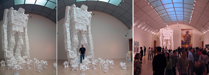
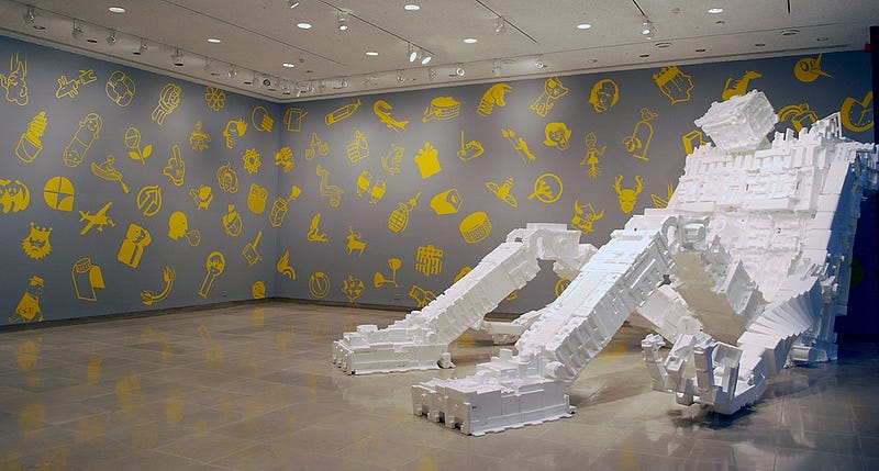
A new Styrobot is about to be built, you can see previous Styrobots on my website. I’ll be making more GIF’s because I’m smitten with ridiculously short looping nutty animations and the plasticity of that language — check out my GIPHY.com page to see those. And drawing constantly, always searching for answers, clarity, and peace in a world gone mad….