Luis Prado is an Argentine-born graphic designer and illustrator whose work has been featured in several publications and received numerous design awards. He creates visually engaging icons that communicate a range of ideas, from concepts like washing your hands and voting to popular expressions like “elephant in the room.” We spoke with Luis about his creative background, his unique approach to icon design, and where he finds inspiration.
Hi Luis! Tell us a little about yourself — how did you get to where you are today?

I’ve liked drawing since I was a little kid. Now that I’m older, I can see how being true to my dreams has helped me achieve some things and hopefully will continue to direct my learning and creating.
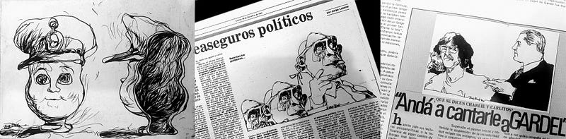
I’m originally from Tucumán, a northern city in Argentina. While in college, I did editorial illustrations and political cartoons for the city newspaper when Argentina was going through troubled times. My degree is in architecture and I think that training has helped me to look at things more carefully and to make sure that that all elements in a design come together coherently. I had work in Argentina before immigrating to the USA, but at some point I realized that communicating ideas and emotions visually was much more meaningful to me than designing buildings. I changed gears and focused on finding work in advertising and graphic design.
It hasn’t been easy, but I managed. I did some freelance work in San Francisco — even got a drawing of mine published in the Chronicle once. Truthfully though, in my first years as an immigrant the artwork wasn’t enough to pay the bills, so I found restaurant work as a dishwasher and barback. When I first moved to Washington State, I was delivering pizza to make ends meet — in a borrowed car.
Eventually, I got a steady job as a graphic designer with the communications team at the Washington State Department of Natural Resources (DNR). Within my job at DNR and with freelance work, I’ve had artistic and other creative opportunities that have been amazing. The people I work with are great.
Of all the art and design forms that can express ideas or emotions, what drew you to icon design in particular?
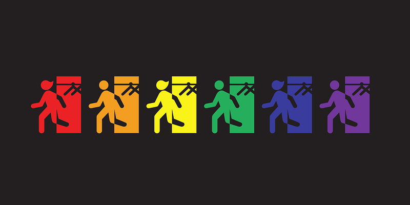
I have always been intrigued by shapes and, as a logo designer, I’m always looking for the synthesis, depicting concepts minimally. Icons, like logos, can tell a story. They must speak for themselves without words and to me, living in an English-speaking country, that’s very important. I am very grateful to Noun Project for giving me, and many designers from all over the world, this great opportunity to contribute to world’s visual language.
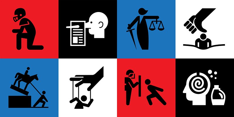
The icons I submit to Noun Project follow the style of the icons produced by the American Institute of Graphic Arts (AIGA) in collaboration with Rajie Cook and Don Shanosky of Cook and Shanosky Associates. The visual communication world owes a lot to this team. In 1974, they were commissioned by the United States Department of Transportation (DOT) to produce a comprehensive set of pictograms. Since that style is so well known and recognized in highways, recreation facilities, and public buildings, I thought it would be best to continue with the style and expand that wonderful collection.

Between the practical, the topical, and the whimsical, how do you decide what icons you want to create? What subjects interest you the most?
I find inspiration everywhere. I keep a list of icons on my phone that I would like to make. They could be anything — shapes, concepts, or ideas that I haven’t seen before are what interest me the most, and if I can add some whimsy and fun to them, all the better (see the “Cheating” icon). The challenge is to fit those ideas and tell a story inside a 100×100-pixel area. Symbols that can help communicate about safety, health care, or that relate to the things I care about are the ones I’m most motivated to spend time on. But I like the nonsensical silly joke also.
Recently, you’ve shared many icons that focus on trending and often political themes — protests, statue removal, even Colin Kaepernick kneeling. What issues are you the most passionate about and why do you create icons depicting these ideas?
I cannot be silent with issues that matter to me like climate change, racial injustice, women’s rights, immigrants’ rights, gun violence, nuclear disarmament, minimum wage, and political issues. I remember a moment in Tucumán when things started to become clear to me. I was 23 years old and a particular editorial illustration of mine was rejected by the newspaper I had created it for. It was of the current military dictator represented as an empty-headed doll. The editor knew better than I did then. Publishing the illustration was risky.
I will soon re-issue an updated graphic novel I published ten years ago called “Julioh, a Visual Trip,” an off-the-wall visual story about a young man from Argentina who dreams of working in advertising. This book also touches on progressive themes and environmental causes. Stay tuned for its release.
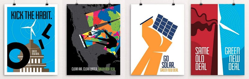
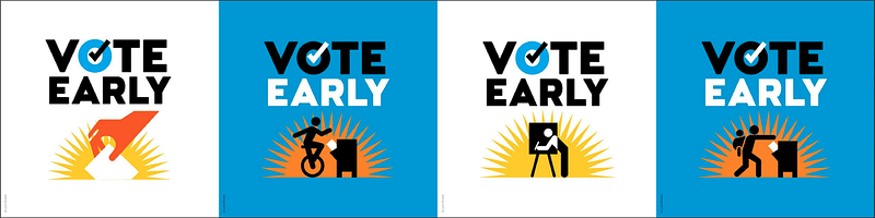
I often contribute to The Creative Action Network, a community of artists that advocates making art with purpose. This network helped me expand my design work by allowing me to contribute posters for their good-causes campaigns. With each new campaign, I get a new challenge. They recently published “Posters For A Green New Deal: 50 Removable Posters To Inspire Change,” a wonderful large-format book that includes three of my posters.
How do you think graphic design and visual communication can help shape culture?
Visual communication transcends language. Art, including visual design, can speak in ways that spoken words can’t and can move us to action. My hope is that my designs move people to make this a more equal, peaceful, better world.
What’s one of your most memorable examples of a designer, work of art, or campaign that changed the way you think?
Probably Seymour Chwast’s “End Bad Breath” poster, protesting the bombing of Hanoi in Vietnam. He was able to say so much with a single image.
Are there any particular designers or other resources you turn to for inspiration?

I like the work of Christoph Niemann, very creative. I could name a few others that see the ridiculousness of our existence, like Quino, Gary Larson, Ann Telnaes, Hermenegildo Sábat, David Sipress, Christopher Weyant, and all the The New Yorker cartoonists. Then you have great designers like Chip Kidd, Paula Scher, Massimo Vignelli, Mads Berg, The New York Times, with a great team of staff designers and illustration freelancers.
I like these publications and blogs: Communication Arts (CA), Print, Graphis, Eye, Lürzer’s Archive. Blogs: itsnicethat.com, eyeondesign.aiga.org, Muse by Clio, and all magazines in general.
What advice do you have for designers who want to start creating icons?
Distill the icon concept to the bare essentials. Make sure it’s clear, clean, understood. Make it fun. Be bold. Leo Combes, a cherished architect professor in Argentina, said to me while reviewing one of my architectural designs: “Things are, or they are not. No middle of the road. If you design something, do it well with all you’ve got.” This stayed with me and try to apply it to all my designs.
Make your icons inclusive. If you made an icon with a shape that looks like a man, make one with the shape of a woman as well. Include the LGBTQ community. Include all races and ethnicities.
Perhaps my most important advice, and something I’ve had to learn through mistakes, is to review your work. Let’s say you’ve got an idea for an icon. You work on it and after a while you think it’s done, ready to upload. It’s not finished yet. Ask your family or friends to see it. Observe their reactions. Do they understand what it means? Make corrections. Then sleep on it. The next day, when you see it with fresh eyes, you’ll be surprised at how that icon that you thought was perfect, is flawed. Now you see the problem. Now you fix it.