John Caserta is a professor of Graphic Design at The Rhode Island School of Design in Providence, USA. He founded The Design Office, a work and project space for designers in 2007 and his icon set, Modern Pictograms, was first released in January of 2012.
We spoke with John to learn more about his background, creative process, and some of the most rewarding projects he’s worked on throughout his career.
Hi John! Tell us a little about yourself — when did you first become interested in design and how did you get to where you are today?

Although I teach in an art school, I discovered design not through the arts, but through computing, the humanities, and journalism. My father was a professor of Italian literature and film at Duke University and my mother worked in the Duke library organizing their collection. In addition to the influences my parents provided, I gravitated toward typewriters and simple machines. My aunt, who was from Austin, was a computer programmer (she wrote in Pascal) and sent me a manual 35mm camera and an Apple IIc in the mid 1980s. I learned Basic programming in middle school and would make patterns, newspapers for our street, and other fun things. Thereafter, each time I bought a new Macintosh or peripheral, I would draw an icon for it. With a program called ResEdit, I could look at the computer asset by asset. I learned about typefaces by opening up the files and looking at how they were drawn.

While at The University of North Carolina Chapel Hill, I worked on and redesigned various publications, including the college daily. I wanted to make sense of information, to organize it. This led me into explanatory graphics and data visualization for large media companies; first in print, then online, then some of both. I made lots of symbols, lots of charts, lots of diagrams, and lots of websites.


I moved to San Francisco at the tail end of Web 1.0 and worked for Quokka Sports on data visualizations for NBC Olympics and the NCAA. After they went bust a year later, I found myself gravitating toward learning environments: public lectures and night photography classes at CCA, welding classes at the Crucible, and the shelves at William Stout Bookstore. There was much more I wanted to learn, so I applied to the Yale MFA program in Graphic Design. Returning to school opened up my thinking, my approach to design, and my community.
I never imagined teaching while in graduate school, but the opportunity arose at RISD in 2006. I’ve been on the full-time faculty in the Graphic Design Department since 2012.
What have been some of the most rewarding projects you’ve worked on throughout your career?
I feel most rewarded when I use design to strengthen community. I believe democracy needs all of our attention, and so I have been teaching and working in civic engagement — not simply on elections, but on building connections between unlike-minded people.
Three years ago, I organized a block party on our neighborhood street. With the streets car-free, people were able to bring their interests outside for others to experience. One resident had a bike shop and brought a selection of electric bikes for folks to ride. Another installed interactive sculptures. Kids set up lemonade stands and made chalk drawings. We shared plenty of good will and good food. Most of our elected officials came, too.


Much of my recent work has been made at RISD in the classroom with students or when I was Department Head. I asked the sophomores to design flags for four unused public poles outside our building. A group of seniors in my Web & Democracy class developed a website to communicate the proposals.

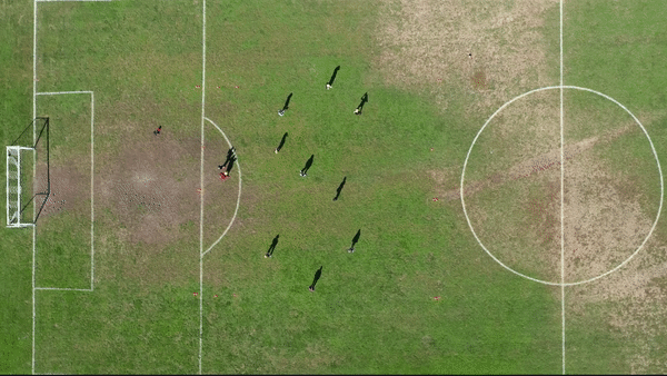
This past fall, my Type 1 students and I used a drone to record ourselves making letters with a soccer ball at a local high school. We designed the space, had a plan, but also improvised on the field. The student responses to the footage took things to the next level.

It’s also worth noting that Modern Pictograms has been incredibly rewarding. I’ve drawn so many sketches alongside my children at home (sketchbooks, chalk, out of flour!). We collect source material first, then hone in on what makes the form distinct. I’ve been able to collaborate with others at The Design Office on the website, printed materials, laser cut icons and more. I’ve felt fortunate (and invigorated) to have been brought into Noun Project initiatives including the Lottie animations with Airbnb, collaborative collections and more.
You founded The Design Office, a unique co-working space in Providence that invites deeper collaboration among designers of all backgrounds. What do you believe is the importance of community-building in this way and how has the past year of the COVID-19 pandemic affected it?
Work can be highly productive when done remotely. But productivity is only part of what work is about. Ezio Manzini describes in his book Politics of the Everyday the value of interacting with strangers and the benefits of lightness in forming community.
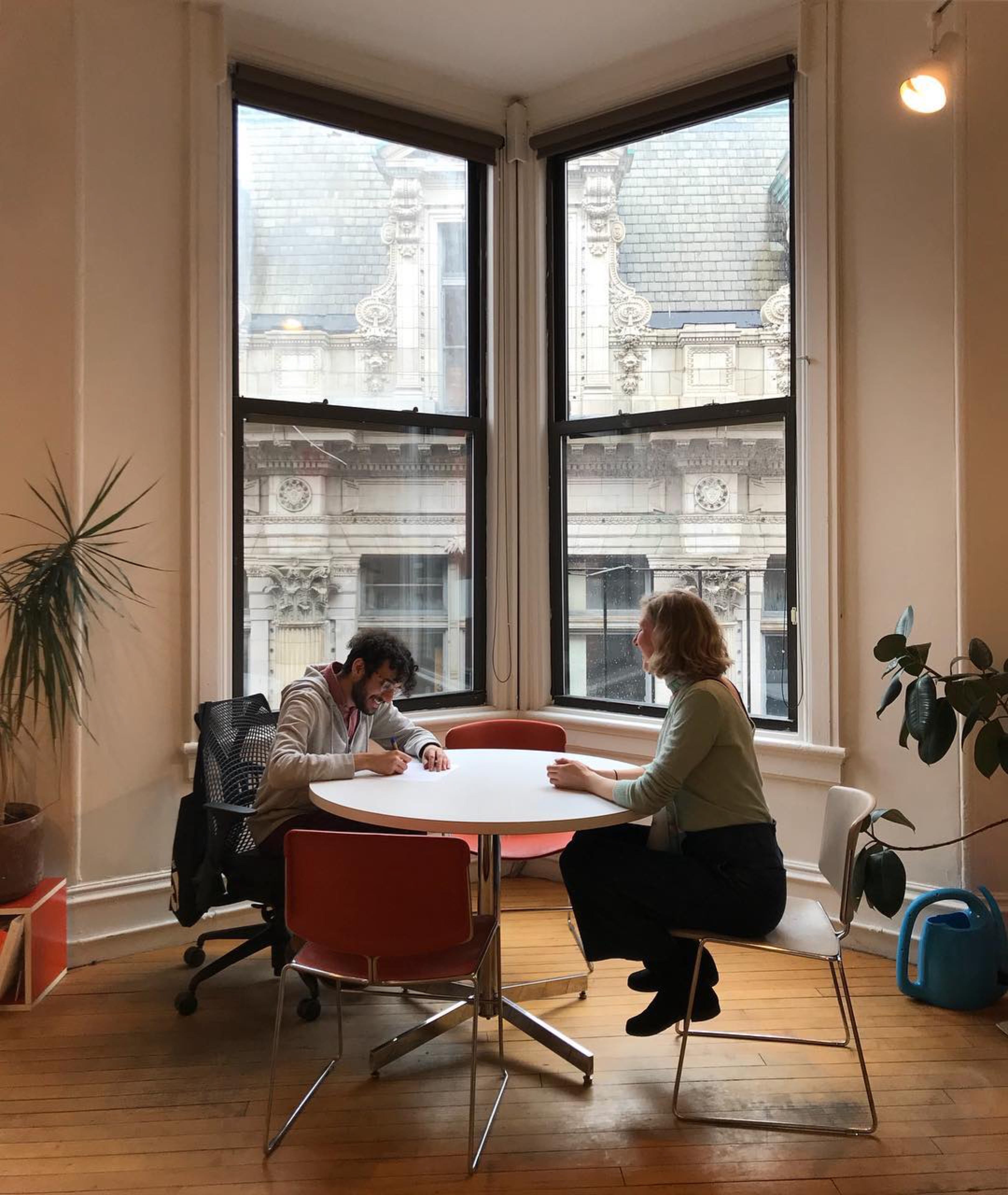

The Office mixed full-time resident members with part-time members with fellows with guests (events, visitors). There was a balance between newness and depth. We used the space as a learning environment for kids, adults and each other. Sharing space was core to the mission and its success. Covid gutted the energy, causing many to shift attention and re-evaluate their work and lives. With remote work, there is time to garden (in the front of the house!) and connect with neighbors and friends. If there is a benefit to remote work, it’s that work will be de-emphasized in importance relative to health, family, friends and civic life.
From all your years of teaching design, what are the most important things you want students to know year after year?
Careers are long. You won’t make your best in school. School projects are not meant to be exactly like professional projects. Try things. You are not in competition with your classmates. There are a lot of ways to make work. Gutenberg didn’t have the Creative Cloud. Weird is good. Stop trying to make work like them. Interesting work wasn’t made to mimic others, it was made in response to the failures of that work. The world is square and RISD is one of the few places you can do work you love. With persistence, faith and luck, others will notice what you do and support it.
The field of design is constantly evolving — and often graphic designers are expected to “wear many hats” from print design to motion design, web, UX design and more. How do you prepare students for the rapidly changing field?

RISD GD takes a fairly generalist approach to undergraduate education. We want students to have access to a variety of tools, influences, potential careers and humans. Three years in a highly immersive studio environment is a good amount of time to learn a lot of things and to decide where to start one’s career. The major shift in the past five years is that the screen has become the dominant substrate for our work. Offset printing was the default output when I started teaching in the mid 2000s. The screen allows for motion, 3D rendering, systems and interaction. We made a major shift in 2014 to bring these qualities (and the screen) into the sophomore year. Our program went from an interlaced gif to a progressive jpg. Instead of learning one thing then the next, they are making projects right away, but the projects they take on after a year or two are more open, relying on students to identify and develop their own interests.
Tell us more about your Modern Pictograms project and how you originally discovered Noun Project.

I discovered Noun Project when it was raising money on Kickstarter in 2010. I could hear Henry Dreyfuss and Otto Neurath screaming from beyond with excitement. What a great idea and so well executed! In 2011, I released a WordPress theme for artists called Flatfile. As part of it, I drew a few icons and bundled them as a font in the theme. This was so users could change the icons’ link color within the theme settings. While making the theme, I found only one icon font out there, and so was motivated to add to the set. Modern Pictograms was released in January 2012 with 78 icons. I quickly added most of the icons to the Noun Project. Version 2 came out a year later as a paid font with a custom website.
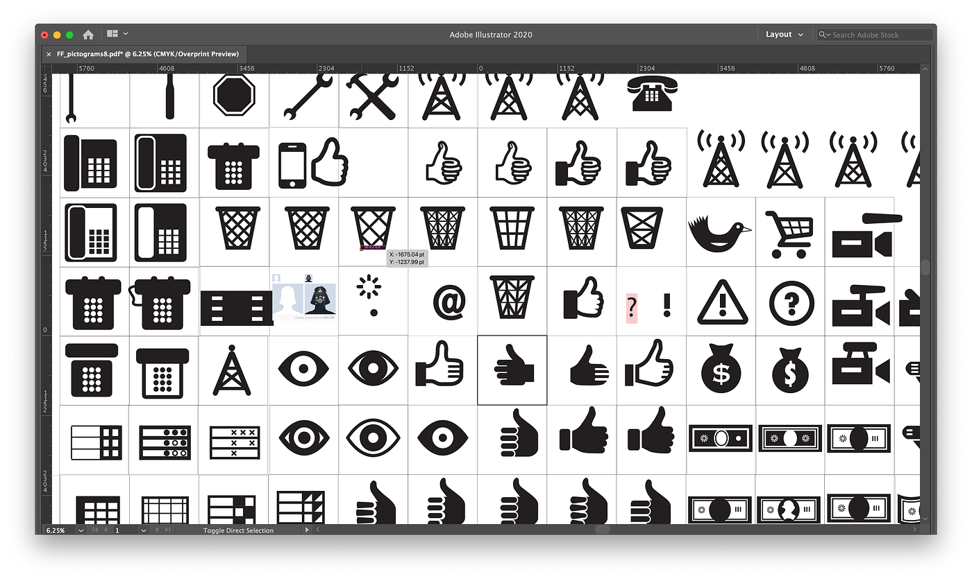
Layered SVGs, color, animation and other developments in the icon space have kept the project alive and interesting for me; but it also makes adding to the set more cumbersome than if it were only a monochrome font. Bringing the pictograms into real life (via printing, lasercutting, signage, etc) has been gratifying, as well as using the project in the classroom. For example, in my Web Programming workshop, I passed out eight different Risograph prints of a candy cane and asked students to apply those colors to a monochrome SVG of the candy cane.

Where do you think the biggest shift is currently happening within the field of design?
The pandemic has certainly upped the volume on digital design. More software, more animation, more screens. The other noticeable change in the past year is with race and social equity. There is greater consciousness around the systems that surround design: who is making it, how much they are paid, and who it is for. Work from BIPOC designers is more visible and impactful now. Many aspects that were taken for granted are getting a closer look with equity in mind. Who represents a group? How does a group represent itself? How can quiet voices be amplified? What systems need changing to right wrongs? These are valuable and important conversations for us all to be having.
Where do you find inspiration?
Because my work is systems-oriented (teaching is a system, a school is a system, my co-working space was a system, a website is a system, etc.), I get a lot of inspiration from how nature operates — trees in particular. The natural world is a slow-moving adaptive machine that makes use of cycles, repetition, idiosyncrasies, beauty, diversity, cooperation and death, even. Nature is always moving, and it has virtually no straight lines. Natural forms get better over time and adapt to their surroundings. While I am closing up The Design Office in these months, I’m mindful of what seeds I can cast into the air, where the branches grown have led to, and more.

Most of my design inspiration stems from are.na, a platform of references and readings populated by designers, educators and artists. It’s an incredible database of human-generated associations, allowing for a ton of creativity in how images, links, readings and more are organized. It’s so well conceived and executed that I oscillate between love and jealousy when I use it. I don’t use Instagram or Twitter much anymore. Damn the algorithms.
What has been your most challenging project?
Teaching this past year has challenged my organizational mind. It’s like a sequel to Lars von Trier’s Five Obstructions film, where von Trier asked his mentor to remake one of his old films using five different constraints. “I want you to teach someone fine typography, but they are on the other side of the world, and they don’t have a printer.” In the fall, I had five of 14 students offsite: one in LA, one in New Jersey, two in China and one in Korea. I was pre-recording lectures, doing Loom critiques; printing their work, arranging for group and individual sessions online at odd hours, meeting a section in person, mailing things to students. All in the name of typography. Phew. It reminds me a bit when I worked on the Sydney Olympics in San Francisco. We flipped our schedules to be on Sydney time. But that was only for 2 weeks!

What’s up next for you?
After the closure of The Design Office, I have to shift how I work and what I work on. I’m taking it a step at a time and open to ideas 🙂