Icons are everywhere. They are used to indicate restrooms, emergency exits and for wayfinding. When traveling, icons help us navigate places with unfamiliar languages. They show up in in our homes when we open products accompanied by instruction manuals, and every day we wear clothes with care instruction icons on the tags. We frequently see them on our computers, tablets, and mobile devices where icons are used to supplement articles and infographics, on brand websites and in applications. They also exist in the form of emojis.
All this to say that icons are prevalent to the point of being unavoidable.


Icons take up a lot of space in our lives, and space can be political. Space is a limited social resource and what occupies it is typically seen as legitimate, valuable, and influential. A lot of issues involving class, social status, sexual orientation, and gender play out in space based on how they’re represented. In physical space, signs that direct people, important messages, emergency communications, and art are given space because they are deemed useful or valuable.
Space also includes the digital world, which unlike physical space, is theoretically limitless. The digital realm is governed by an audience’s access and attention, and value is determined by the reach and visibility of competing content. Quality representation and visibility in these spaces — especially public or highly visible space — implies legitimacy and value, which translates to influence.

The Scully Effect
Take the Scully Effect, for example. The Scully Effect was a study conducted by the Geena Davis Institute on Gender in Media about the popular TV show, X-Files, which focused on how the character Dana Scully sparked interest in science, technology engineering and mathematics (STEM) among women. FBI agent Dana Scully was a prominent lead character on the X-Files and one of the first multidimensional female characters working in a STEM field depicted on television.
Research showed that women who were medium to heavy watchers of the X-files held more positive views of, and an active interest in, STEM fields than non or light watchers, and that interest was correlated with the actions and attitudes of women who went on to major in or work in STEM fields. Scully is the poster child for how highly visible aspirational women represented in space — in this case a fictional popular television show — can positively influence and expand a girl or woman’s world.
While little research has been done about depictions of gender in iconography, a lot of the trends we see with stock imagery and photographs correlate with icon trends. If you search the web for images of “boss,” “entrepreneur” or “leader” the majority of results are images of men. Similarly, if you search for terms like “caregiver,” “child care,” or professions like “nurse,” the majority of results are images of women.
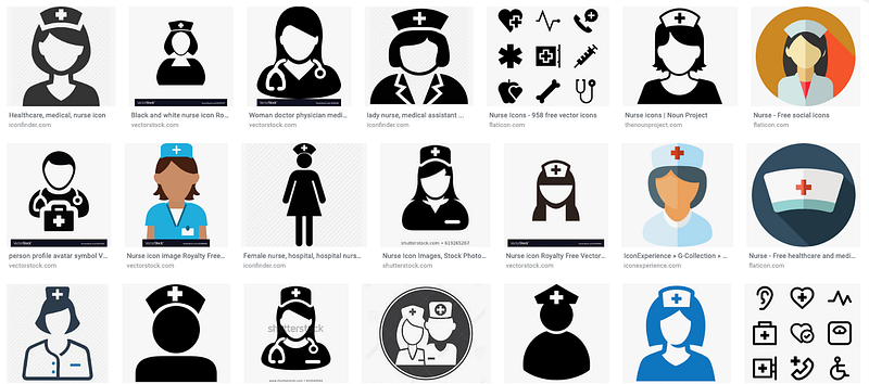
Search results for “nurse” on Google
A recent Pew Research Center study assessed gender representation in online image searches for job roles. The study found that men are overrepresented in image search results across the majority of jobs they examined, while images of women in professional roles appeared further down the page in search results. The heavily skewed ratio of men to women makes it seem like men dominate or monopolize certain positions, which may skew public perception. Only seeing men in certain roles lends an artificial and inflated legitimacy to men for those roles. In addition, the decreased and deprioritized visibility of women in search results can cast doubts of women’s competence and legitimacy, and can contribute to a real world exclusion of women from certain roles or spaces.
A lot of existing representations of women are more prescribed than real, showcasing a shallow caricature of “female” or perpetuating outdated stereotypes. Even those that exist may be placed where they will not have much visibility or impact. In this sense, women are often downplayed and in some cases, invisible. The impact of the existence, quality, ratio, and placement of gendered imagery can be powerful, particularly when thinking about cultural phenomena like the Scully Effect.
Designing for Gender in Iconography
Since icons have high visibility in our society, we need to learn from the gender biases of other visual mediums and create more equal and accurate depictions. Here are some considerations to keep in mind when designing new icons:
1. Make equal depictions, in quantity and quality.
- Make male and female equivalents. For example, a mother holding a child should be supplemented with a father holding a child. If there is a male astronaut, create a female astronaut.
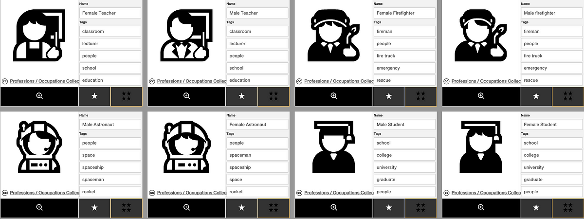
This would be a great example of comparable depictions. Note how the style, position, line weights, size, etc. are proportionate and comparably equal.
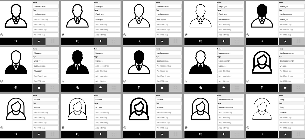
- Pay attention when women are missing in sets of icons. Question when a set is male dominated, and consider the implications of visibility or lack thereof. Does the absence suggest exclusion? Are men only interacting with men, and women only with women? Are gendered groups mutually exclusive and, if so, why? If there are multiple figures, who is placed in the front? If they are actively interacting, consider who is in the superior or subordinate role.
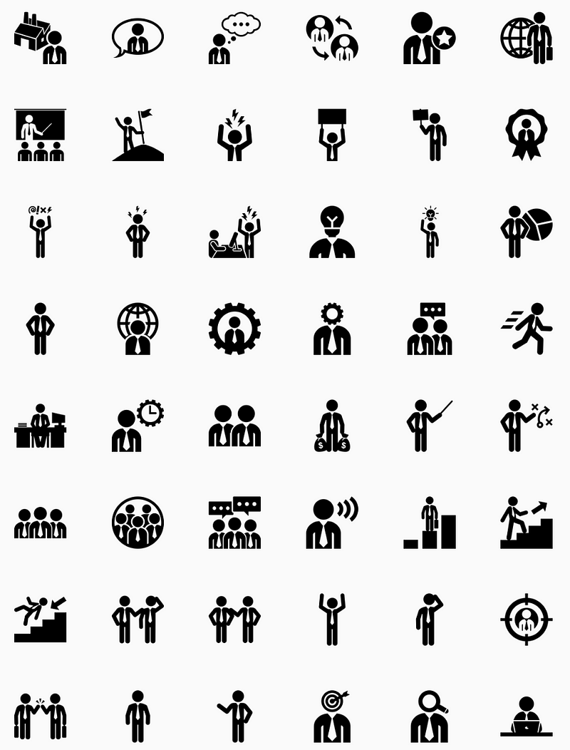
The absence of women in this set seems to presume women are not a part of the business world.
- If you are depicting both genders for one role, like making an “athlete” icon, make their facial features, size, level of detail, stylization, props, body language, and outfits and accessories proportionate to each other. If one of them has more detail, what does that difference imply about the value or status of each? Is one of them made to look larger than the other? Discrepancies between subtle attributes like this may introduce unnecessary semantic noise or imply unintended hierarchies.
Note how the difference in size of gender icons adds unintended visual meaning to this icon.
The depictions shows men wearing neckties and looking more professional, while women are shown without details that signify “professional.”
- Ask if male and female icons are assigned with roles that are clearly above or below each other when compared. If so, make the submissions more balanced. Examine who makes up the “experts,” “managers,” “CEO’s,” “doctors,” “parents,” “teachers,” “pilots,” “students,” and “engineers.” Who are all the “employees,” “customer service,” “front desk,” “nurses,” “patients,” and “steward/stewardesses?” If they’re heavily weighted towards one gender, strive for balance.
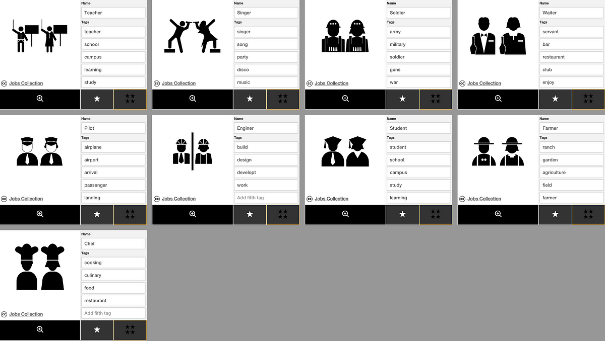
While some of the details for each pair are different, note how they’re comparable in size, placement, pose, and quality.
2. Make appropriate depictions.
- Don’t objectify women. If you’re creating a female doctor icon, giving her pouty lips, bouffant hair, or cleavage doesn’t add any relevant detail. Instead, it undermines the icon’s legitimacy to represent “doctor,” and co-opts the role to make her a sex object in all contexts.
- Carefully examine whether any attributes or details suggest prescribed gender roles or inappropriate femininity. There’s nothing wrong with showing a woman wearing a skirt, but not every woman identifies as conventionally female, whether that’s expressed in her hobbies, clothes and accessories, or aspirations. Be aware of how your depiction may reify existing prejudices, and make representations of a more modern girl or woman to fit a growing need.
- Be a gender bender. Gender roles are passé and a lot more crossover happens in real life. Gender lines tend to be more permeable for females, so making icons of males wearing a dress, heels, or nail polish? Great idea. Men changing diapers and cooking? Much needed. Women in pantsuits or boxing at a gym? Would love to see them.
3. Title and tag depictions appropriately and proportionately.
- This may seem obvious, but titling icons of women with “chick,” “bitch,” “wench,” “baby,” “babe” is inappropriate and unacceptable. Even tags like “girl,” “girlfriend,” “companion,” “mother,” “beautiful/pretty/cute” can be demeaning when applied too loosely. Omit slang and carefully apply female specific roles and adjectives when appropriate.
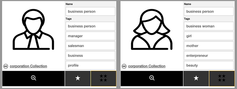
Note the discrepancies in these tags. While “girl,” “mother,” and “beauty” aren’t objectively wrong, they seem irrelevant to the intended representation in the context of a corporation collection, and when comparing to male counterpart.
- Quite often, talented designers create appropriate, proportionately comparable depictions of men and women, then title or tag them with pairs like “teacher” for male depictions, then “female/woman/girl teacher.” Comparatively highlighting gender implies legitimacy when gender clarifiers are omitted, while assigning gender clarifiers signals an outlier or anomaly status. So, if there are opposite sex icons of the same thing, their titles should either both include or exclude gendered clarifiers, i.e. both titled “writer,” or “male writer” and “female writer.”
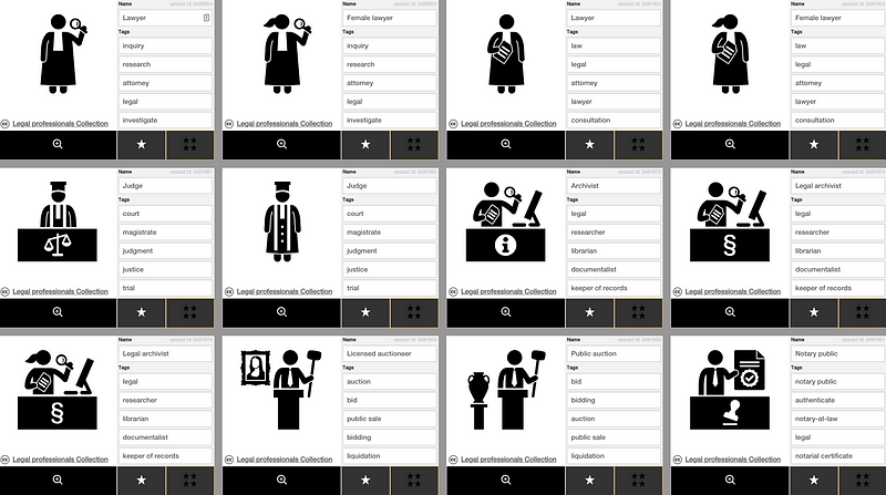
The male and female lawyer icons inconsistently highlight gender. These could be improved by the pair being titled “Lawyer,” or “Male Lawyer,” and “Female Lawyer.”
- Avoid tagging inanimate objects with gender tags. For example, do not tag a suit icon with “man,” and do not tag an icon of high heels with “woman.” Doing so skews search results in a way where looking up “woman” brings up makeup and dresses, which can be unflattering and prescriptive.
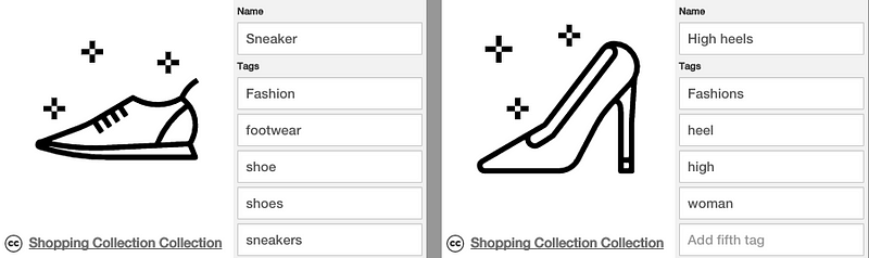
Note how “woman” is tagged for heels. Doing so brings up irrelevant results when searching “woman” while assigning prescriptive gender roles.
- Extend the rules of proportionate titles and apply them to tags. If there are comparable depictions, make the tags the same with the only applicable difference being gender.
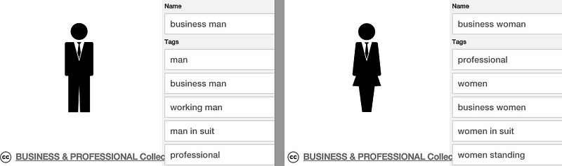
The man icon is described as “working man” while the woman is “women standing.” While most of these tags are equal and comparable, that discrepancy perpetuates active and passive gender roles. This could be improved by making identical tags.
Women and girls should live in a world where they occupy proportionate space, and have visual representations that assume the same respect and value as their male counterparts. Visually representing women affirms their existence as half the population, offsets the idea that a woman’s place is exclusively in a private or domestic sphere or support role, and gives children a framework where girls have equal opportunity. We need to represent women to have aspirational female role models, and to instill healthy expectations of equality in the general public psyche. Giving girls and women space and visibility sets the stage for respect and equality for their gender orientation and potential. Creating that space levels the playing field for humanity.
We are actively working on initiatives designed to support the creation of more equal and accurate representations in visual language. If there’s something you’d like to see get better representation, tell us in the comments, tweet us @nounproject or send us a note at iconathon@thenounproject.com.