
Whether you’re a budding UX/UI designer or just an avid icon user who wants to add a bit more pizzazz to otherwise flat designs, this is our guide to making neumorphic-style drop shadow effects using the design platform Figma. A bit of dimension can go a long way in conveying new information about your design, including what’s important and what is or isn’t a clickable button.
Why Using Icons is Critical in UX and UI Design
Designing websites, apps, and even wayfinding signage necessitates breaking down concepts or instructions using instantly recognizable icons and pictograms. Rather than requiring people to stop and read, icons allow people to instantly grasp a piece of information — which is critical for website navigation, translating concepts between languages, and more.
Today’s users expect to successfully navigate through common everyday experiences like mobile apps through recognizable symbols like menus, home buttons, “back,” “save,” and “like” buttons.

But in order to make a design stand out from the rest, many designers have opted to ditch the strictly “flat and minimal” style to bring back a bit of eye-popping dimension and evoke more of the tactile qualities often missing from flat design. Hence, neumorphic design was born.
What is Neumorphic Design?
Neumorphic design emerged as a popular trend in response to the previous “skeumorphic” style in which designers tried to realistically replicate recognizable objects for things like app icons and interfaces. Skeumorphism relied on rendering things like televisions, radios, or other objects as you would see them in real life with a higher level of detail. When you think about the evolution of app icons — from the early YouTube or Instagram icons, representing a TV and camera, respectively — to today’s more muted and minimalist versions, you’re witnessing the difference between skeumorphic and neumorphic (AKA neo-skeumorphic) design.
As mobile screens continued to proliferate, icon design became both a necessity and an art form all of its own. Rendering “true to life” objects in an under-100-pixel square often made them harder to decipher, so designers focused on conveying as much as they good in as few (digital) brushstrokes as possible. Not only did minimalist icons take over common website navigation, but app icons came to resemble more abstract logos.

Neumorphic design bridges the gap between the strictly flat and minimal icon form, and the true-to-life skeumorphic form. It provides just enough dimension — through things like cleverly designed drop shadows and gradients — that an interface can appear sleek and minimal, but with a dimensional surface that looks “touchable” through visual indentations and buttons.
Regardless of your stance on UX and UI design trends, neumorphic design captures a sleek and sophisticated look that invites interaction through tactile and dimensional appearances.
How to Create “Neumorphic” UI Design Effects in Figma
Figma is a web-based design platform that teams use to collaborate on designs and prototype apps. It has become a favorite among UX and UI designers for its ease of use, simplicity of tools, and opportunities for live collaboration.
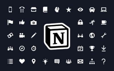
Best of all, you can easily drag and drop both .PNG and .SVG icons straight from the Noun Project Mac App into Figma. Being a Noun Pro subscriber allows you to access our complete library of over 3 million icons, customize, and drag and drop them into your favorite apps without having to worry about attribution.
Let’s Get Started
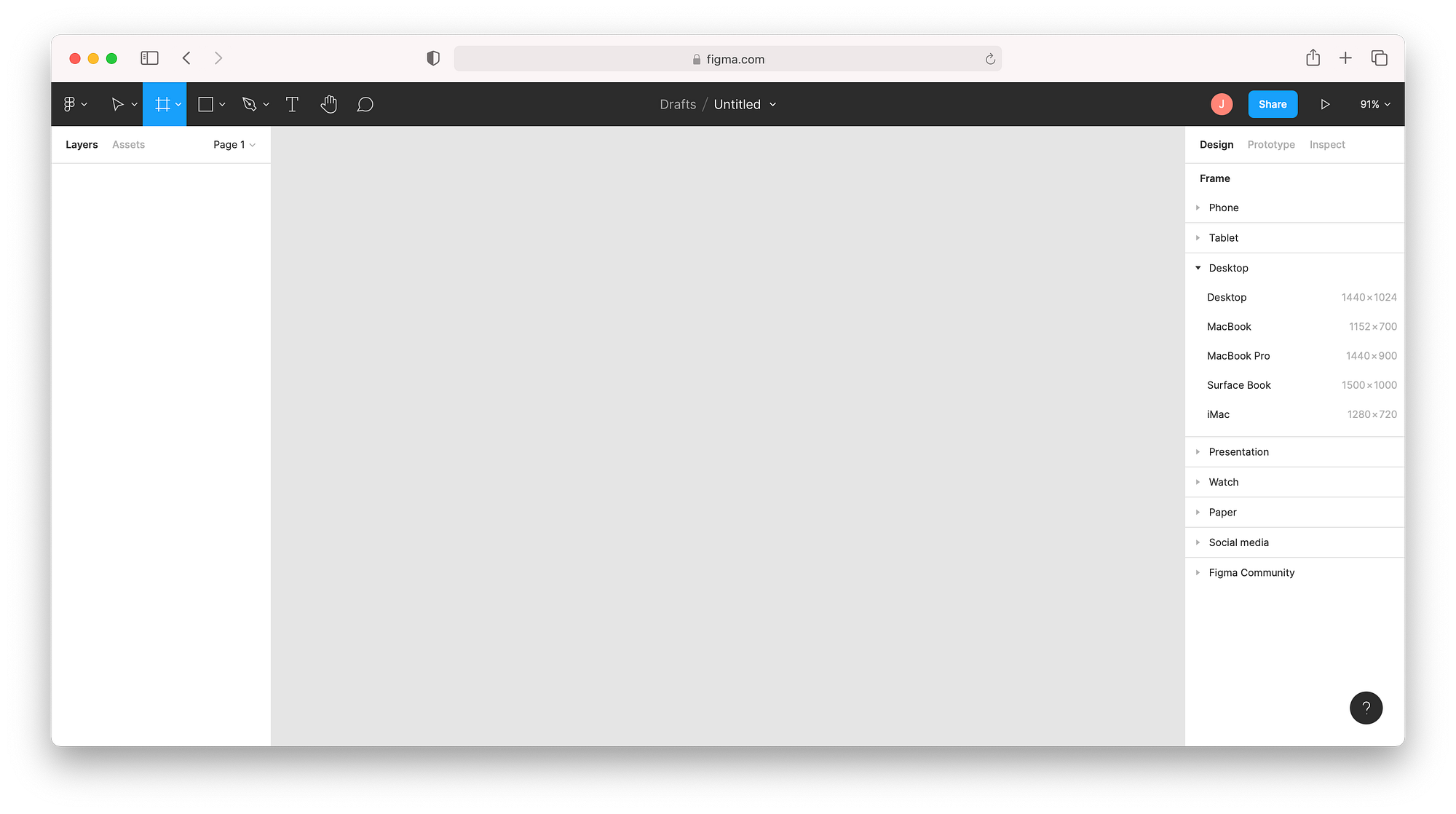
1. From the Figma homepage, go to New File > Design File at the upper right.
2. Create a new Frame to serve as your project canvas. Hit “F” or the hash symbol at the top left in the menu bar, and either click and drag your cursor or select one of the templates that appears in the right-hand column.
Here, I’ll be using the regular Desktop dimensions, 1440 x 1024.
3. Pick a base color for your frame. With the frame selected, look at the right-hand column under “Fill” and click the small square color thumbnail. Choose a color from the selection window or input a HEX code directly. I’ll be using a neutral-yet-warm beige color.

4. Create a rectangle. Click the box-shaped icon at the top, or type “R” and click and drag. Hold shift to make it a perfect square.

To have a smooth, seamless neumorphic interface, we want our buttons to be the same color as the background. With the rectangle selected, go again to “Fill” and the color picker window, and hit the eye dropper icon to click your frame and make it the same color.

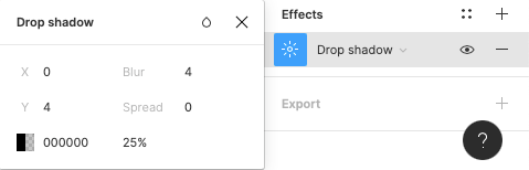
5. Now, the key to making a sleek Neumorphic design is adding softer drop shadows. In the same right-hand panel with your rectangle selected, click Effects or the plus sign next to it to add an effect. A drop shadow is the first effect added by default. Here, the “sunshine” thumbnail icon takes us to an Effect Settings window where we can adjust our parameters.
Drop shadows typically appear as a sharp contour that can make an object like our rectangle appear as if it’s levitating off a surface.
This is where you want to leave room to experiment with the effect settings until it’s to your liking.
6. Adjust the drop shadow to make it bigger. In the Effect Settings window, the X and Y fields tell us how far off the drop shadow is placed on each axis. Click X or Y and either click-and-drag your cursor side to side, use your up-and-down keyboard arrows, or input a particular integer to adjust each value. To bring my drop shadow further out, I’ve set the X and Y both to 20.
To cast the shadow on the opposite side, simply make the values negative. Too high a number, and it’ll appear to float away off the page. Too low, and it appears as a mere border around the rectangle.

7. Make the shadow softer and more natural. By default, it will have a black color with opacity. In the color picker beneath X and Y, once again use your eye dropper to select the same color as the rectangle — but pick a slightly darker value. Keeping it in the same hue will help it look like a more seamless part of the material surface.
8. Adjust the blur so that it looks more like a “mound” than a levitating plane. Typically, setting the blur value to twice the X and Y value gives it enough breathing room.

9. Add a new drop shadow to highlight the opposite site. Back in the right-hand panel, hit the “+” next to Effects one more time to add another drop shadow. This time, put in the opposite coordinates (negative X and Y values) to make a drop shadow on the other side. Adjust your blur the same way, but use the color picker to pick a lighter or pure white value. This will complete the visual dimensionality of our rectangle.

10. Make it a component for easy replication. With the rectangle selected, right-click it and select “Make Component” or click the quadruple-diamond at the center of the top menu. When an object is a component, you can replicate it multiple times — and any edits you make to the original will be applied to any instance you have of it. You can find components later under the “Assets” view at the top-left.

11. Try different shapes and variations. Perhaps you want rounded rectangle or circular shaped buttons. Click on the rectangle (and if it’s a component, make sure you click the original rectangle shape from the Layers menu) and you’ll see dots appear at the four corners to adjust your radius. Click and drag them inwards, or input a radius value on the right-hand column where you see the arc icon.

12. To show dimensional button states, make “innies and outies.” One critical aspect of UI design is conveying what buttons can be pressed, and which (if any) already have been pressed. Now that we have a 3D “pop-out” button, let’s make a depressed button.
Duplicate your shape, but under effects, switch each Drop Shadow to an Inner Shadow. Given the parameters of your existing shadow, it will stay visually consistent put convey an indentation.

13. Drop in Noun Project icons to make these usefully labelled buttons. To make these buttons a cohesive part of your UI design, let’s bring in descriptive icons. Whether you need typical navigation buttons that users expect (home, download, like, save, menu) or a custom navigation cue, you can find it in Noun Project’s collection.
Open up the Noun Project Mac App and enjoy 100 free starter icons, or upgrade to Noun Pro and log in to unlock over 3 million icons, endless customization and unlimited royalty-free downloads.
The best part of the Mac App is you can simply drag and drop any icon you search for, in whatever color, background shape and color, or format (SVG or PNG) you need. Because Figma works with vectors, you can click, drag, and resize any SVG icon to any scale you want.

14. Make your button states clear. A common practice in UI design is to clearly signify what buttons are pressed or unpressed. In addition to the dimension you’ve achieved with your shadows, be aware that contrast is the primary attention-grabber. Maintain higher contrast by using bold icons on the “press me” buttons, and a lower contrast like the grayed-out ones above to signify a button has already been pressed.
Explore the Possibilities.
The sky is the limit for exploring different visual effects, even with Figma’s simple built-in drop shadows.
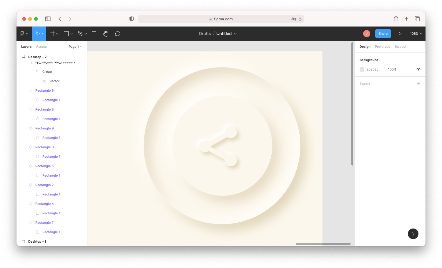
You can apply the same neumorphic shadow effects to the icons themselves — just be sure the vector, rather than its frame, is selected (double-click the icon again and be sure the vector is selected in the Layers panel).
In the below example, I’ve applied a similar drop-shadow scheme to my “Share” icon, but decreased those X, Y, and blur values since it’s on a smaller scale. I then copied and pasted the base circle, scaled it up, and placed this second circle underneath the first. Adding both an inner and an outer drop shadow on this circle creates a fascinating and layered effect.

Don’t Let “Cool” Get in the Way of “Useful.”
If usability is your chief concern for a new design, keep legibility and accessibility in mind. Just because your app now serves up a streamlined aesthetic doesn’t mean that it’s particularly user-friendly. Plus, in the realm of web and app development, accessibility isn’t just a nice-to-have — it’s the law.
You can find plenty of usability and accessibility guides online, and even test out your design’s accessibility through these Figma plugins.

Marketing Communications Manager at Noun Project, Designer and Illustrator.