Jake ‘JP’ Hytken is the Diversity, Equity, Inclusion (DEI) & Employee Resource Group (ERG) Engagement Manager for Snap Inc, where he supports 28 different international Employee Resource Groups around the world and has helped launch the first collection of Bitmojis depicting wheelchair users. He actively encourages people to lean into their “other” categories and support underrepresented groups to get ahead of antiquated systemic thinking. Before his current position, Jake worked on DEI initiatives at Lyft and Airbnb, but he takes the greatest pride in focusing on small startups that prioritize DEI at their inception. Jake, a gay and Jewish cis-male (he/him), has also been using a wheelchair since he was 13 years old. Growing up as “other” has shaped his identity profoundly, and Jake finds power in speaking up to break down prevailing systems.
Hi Jake! Tell us a little about yourself—how did you get to where you are today?
Growing up I wanted to be an actor, but my parents sat me down and said I had to cancel those dreams, because I “needed to get a corporate job to have good medical insurance.” I realized more often than not a person’s position in society is determined by how we create spaces for them, which is based on the stories we tell about them. So my career shifted to Diversity, Equity, and Inclusion because I wanted to fix the systems that limit people because of how they look or where they were born. Through this journey I have put a media focus on people with disabilities because the more we show them as real people, the more opportunities we’ll create for them.
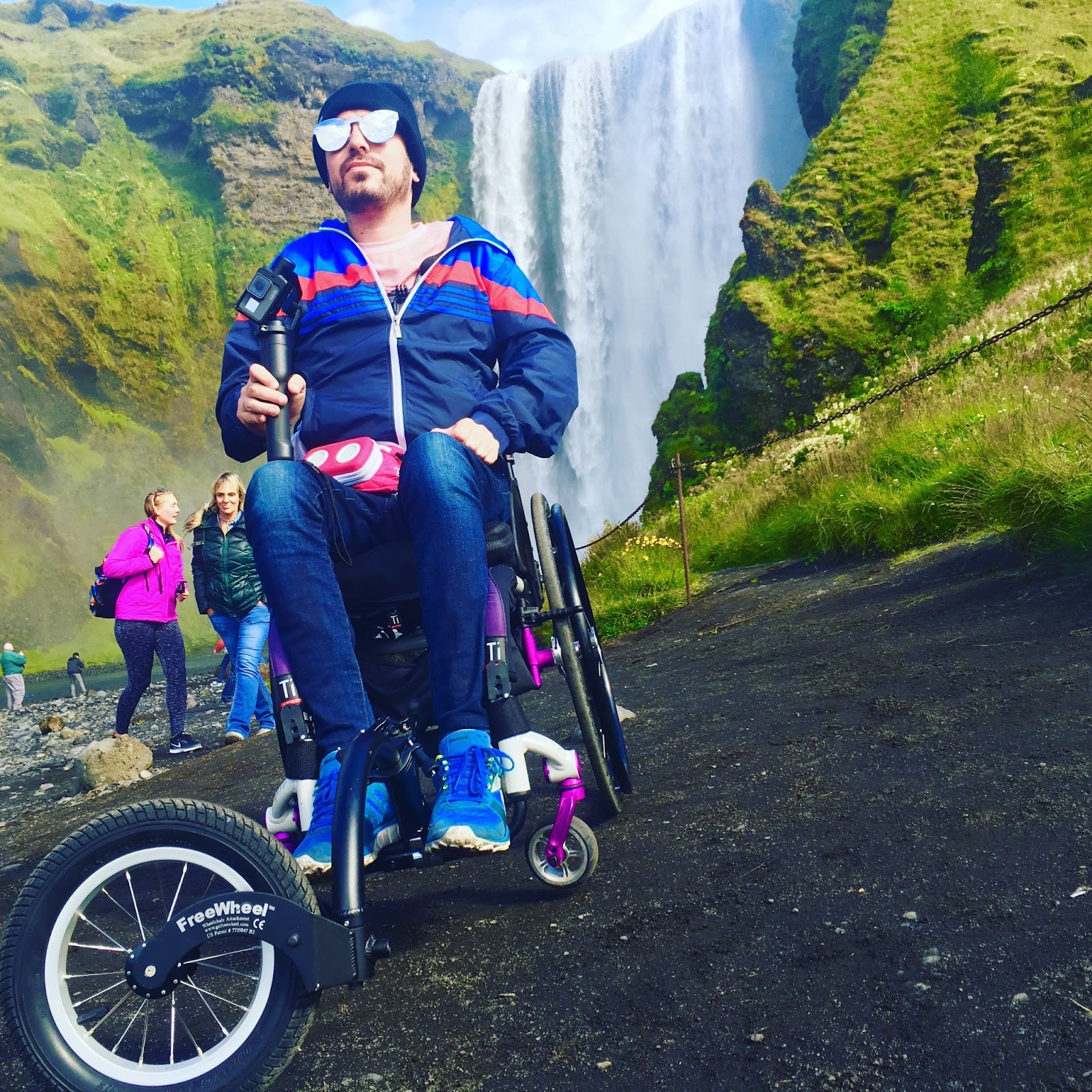
I feel that I first truly found my voice on a series of trips, where I, alone with my wheelchair and a single bag, backpacked across Europe and Chile – even on the trails of Patagonia – relying on being loud to navigate inaccessible streets and perceived stereotypes abroad.
Throughout your career, what is the biggest shift you’ve seen in the realm of Diversity, Equity, and Inclusion initiatives in the professional sphere?
The biggest shift has been seeing the new generations of Millennials and Gen Z who demand that DEI goals are not just a business case, but also is a necessary way to operate. For the first time in decades, we are reexamining these systems in hopes we can make it pay off for as many of us as possible.
Broadly speaking, at least one third of our waking lives is spent at work. During the post-war Baby Boom years, work was seen as a path to freedom – and that freedom was measured in consumption: bigger houses, fancier clothes, cars, vacations, etc. But we’ve reached a tipping point where we realize that this doesn’t apply, because work does not set us all free equally because of our identities.
Young people are saying, if I am expected to give this much of myself to my organization, then I want to come as I am. The professional sensibilities of yesteryear tell people there is only one way to be a “good worker,” but we continue to disregard the many different identities in today’s workforce. We know that even if you “dress the part” you still may not get ahead– so people are asking why they have to conform if the rules have historically not paid off for them. It seems many Millennial and Gen Z people who’ve seen the shortcomings of their grandparents’ and parents’ opportunities feel the same way, and are demanding changes in the professional sphere too.
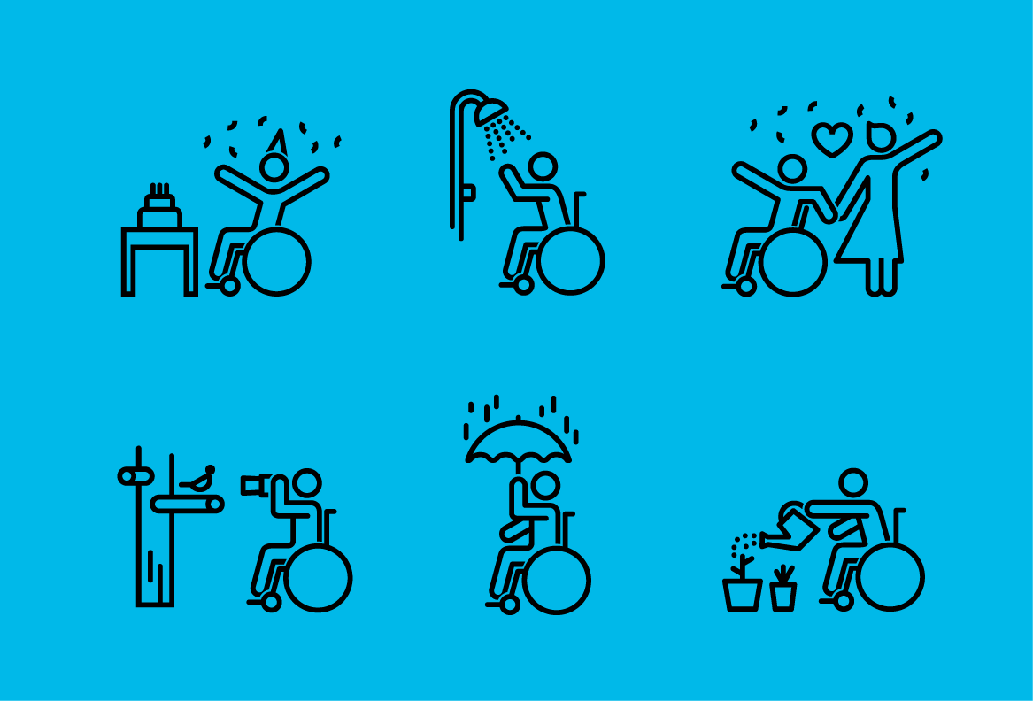
You were recently part of an initiative at Snap to introduce Bitmoji’s first-ever wheelchair-using avatars in a variety of scenes and poses. How did this project take shape?
In my profession, I’m successful not by dictating how people should think, but rather by providing my colleagues the tools and resources they require to help them think critically on marginalized identity topics that are foreign to them. With this mindset and in my role at Snap, I was fortunate to be asked to join this initiative to provoke philosophical questions and explain the experience of wheelchair users. I’m also fortunate to have found such incredible partners on the Bitmoji team who encouraged me to shake things up. My feedback was incorporated into the product and balanced with artistic choices. Together, we brought the wheelchair Bitmoji stickers to life! That is true allyship through partnership, and exactly what I hope other companies can gain from this – that just because you can do something on your own, doesn’t mean that you should. That also applies to me within the boundaries of my role. Sure, I can personally bring the real life experience of being a wheelchair user, but as a Diversity Manager it is not my responsibility to “own” the space – rather, I bring in external disability experts and help weave in their feedback while being conscious of their authentic expertise.
As a representative of the Snap brand and with a role on our DEI team , it’s imperative that I constantly check my own bias. It’s an elephant-on-a-tightrope skill to traverse in the DEI space, meaning it’s a balancing act to have an underrepresented identity and choosing to be a teacher as my profession, which many underrepresented groups understandably don’t want to take on. So I introduced the team to a bit of disability history, including the motto “Nothing about us, without us.” I helped Snap and Bitmoji prioritize which Bitmojis we should work on with our partners. It’s better to deliver 100 Bitmojis that represent wheelchair users in a meaningful way, than give 1,000 that are inaccurate and offensive just to say that we’ve delivered the largest library of wheelchair Bitmojis.


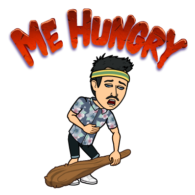
To better understand this, let’s discuss how mobility can come across differently in the context of a Bitmoji scene. For example, one Bitmoji depicts a neanderthal saying “me hungry” – this could have a different connotation when it’s a disabled person. If we created it without the neanderthal’s club (because a wheelchair user would hold it differently) and just used the words “Me Hungry,” it could be perceived as a depiction of a disabled person not being an intellectual, or looking starved and emaciated due to their disability. Every time we replicate an able-bodied image, we have to break our decisions down to this kind of science in order to tell the same story and create an equitable representation that avoids perpetuating false stereotypes.

Again, I did not do this alone, and the process required an incredible team of partners to recreate art that conveyed this when introducing wheelchairs as another layer. We needed an entire design team and project managers to comb through our library of Bitmojis and manually recreate each one, scene-by-scene, basically from scratch.
Looking at the Noun Project’s icon library, you’ll find a person chasing after a plane – that, for example, would change if they’re disabled.
How would you convey a wheelchair user chasing after a plane? Does this convey something different? Perhaps they are falling behind because of their disability?
In reality, some people might have assistants escorting them through the airport and personally, I wouldn’t wheel after a plane – I’d have 4 shirtless men carrying me in a sedan chair like Cleopatra. I applaud the Noun Project for reaching out to me for this narrative because it shows they are willing to do the same steps that we did over here at my organization.
We all have to be comfortable with discomfort, and as allies, to be okay with not getting it right on our first try. In the icon world some simply won’t work – and that’s okay; that’s what diversity is all about. Just knowing that some people are different and we have to keep talking about the process to bring justice to many different groups of people.
What were the biggest challenges in rolling out the wheelchair Bitmoji set?
It is technical. In addition to the engineers and designers who built this, I had to frequently look at revisions and provide input. I brought perspective on which representations felt authentic, or advised on where we blur the line between creative freedom and magical realism. For example, if a Bitmoji had wings they would still be seen in their wheelchair, but I would need to assess where these wings sit on the person. It took frequent checks and edits to convey the right meaning or feeling.
I understand that many people want change immediately, but this process takes reverse engineering. You wouldn’t just want to throw an existing icon of someone onto a wheelchair symbol if they look misaligned, right? I would work with the team to say what feels natural and they would edit in those changes.
This process is just like my life in New York City. I want to be able to enter every physical institution, but many buildings are well over 120 years old. I understand that we have to talk about how to make the entrance accessible, do the construction, make some mistakes and learn from them, and repeat the process and improve every time. What I don’t want is a makeshift entryway into the building where I have to leave my friends to go through the exit in the gift shop. So yes, we have systems in place that we are learning to improve, and we’re making an effort to do it right, but we won’t figure it all out right now.
What has been the general public reaction to this update?
Incredible! We have had great success with adoption metrics and the feedback has been wonderful. I really believe that the majority of disabled people are not this scary regulatory risk, but rather people who just want to see allies working to recognize and improve our lived experience at all times. It’s really unfortunate that old-generation companies see us as anything other than team players, but that’s a stereotype that came with an overcorrection of nothing ever being worked on before.
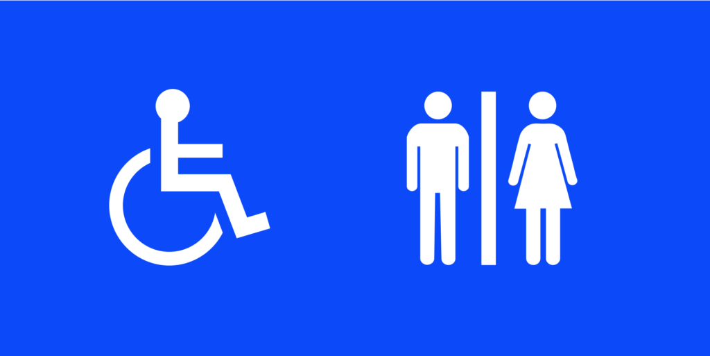
What do people most often get wrong about disability representation? From the classic “handicap” symbol from 1969 to new approaches that people are trying today, what works and what doesn’t work? Why?
We are not just a single symbol! We are eclectic and have agency. We’re someone’s friend, partner, colleague, etc. Disability agency is not in a silo and we need to see them for who they are. We’re kind, intelligent, beautiful and yes some of us are sassy, rude, creative, and sexy (and we represent all ages, abilities, genders and ethnicities). We are all the things just like any other group of people.
How should people seek to improve disability representation? Knowing that icons and symbols are “the short stories of design,” what are some ways people can create more authentic, accurate and respectful depictions – without extraneous detail but without being reductive?
Personally, I dislike the majority of wheelchair icons because more often than not, the people designing them are clearly not wheelchair users. The types of wheelchairs most commonly depicted are the ones you’d find at a hospital – that, and so many icons focus on negative experiences. Here’s some tea: able-bodied people have negative life experiences too, but I’m not creating symbols of partners fighting with each other and then just titling the icon “Couple with a rocky relationship.”
It’s not just how designers convey it – it’s that they convey it without consulting someone. As designers focusing on experiences other than your own, you should see it as your professional obligation – and a necessary method of design activism – to collaborate with the people living the authentic experiences you aim to represent.
Designers should also be mindful of socioeconomic differences within the disabled community. Not everyone has equal access to healthcare, and equal access to different types of medical equipment. Some abled people might infer that a person appears to be more disabled than another, due to how the available medical equipment affects their self-presentation. Perhaps their insurance only allows bulky electric medical equipment over newer and sleeker technology.
Finally, when you look at the classic “Handicap” symbol, none of the icons are actually a person – they’re just a symbol. Even the restroom symbol has a greater level of detail than these to depict male vs. female (which also is not an accurate representation of gender); the wheelchair is a single monolith – nondescript. It just proves that designers are stripping away agency from millions of people without regard to their feelings or feedback.
What’s the biggest message you want people to know about designing for disability – whether that’s in the symbols we use or the infrastructure we build?
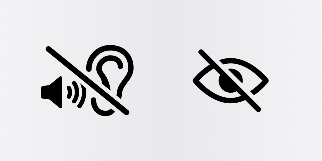
One of the common threads in disability representation is showing a slash through something to show it doesn’t work: Eye with slash = blind. Ear with slash = deaf. Society is obsessed with defining a person by what they lack. People design what they perceive, not what they want to see in the world. I’d encourage people to be a bit more aspirational and stop focusing on the negative, because there are a lot of icons that paint disabled people in a negative light.
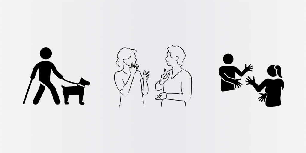
A better way to think about all of this is to depict how disabled people actually engage in the world instead of how they don’t. Show that a person is blind by having them walk with a cane or a seeing-eye dog. Show more deaf people using sign language. Think about the conversations they are having or where they are going when you design – we have goals and things to do like anyone else.
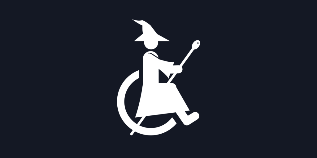
Give us agency, and get weird doing it! Perhaps even adapt icons to common things: is there an icon of a wheelchair-user witch riding a broomstick? (Actually, there is)
It’s helpful to remember that what we call “disability” is a situationally-dependent thing. I’m not disabled because I’m in a wheelchair; I’m disabled because there are stairs in front of me. I’m not deaf because I can’t hear you communicating to me; I’m deaf because hearing people don’t learn how to sign to me, or don’t bother finding another way to chat!
Part of being disabled is constantly having to navigate ways to blend in with the abled community to accommodate their discomfort, but ironically because of our disabilities, we have a harder time adapting. Designers have an obligation to understand the community they’re talking about. If you make a choice to represent an experience, you’re not doing your job if you’re not consulting with the person you hope to represent. If you don’t feel so inclined to ask yourself if your art will equate to authentic representation, then you’re just not doing your job well. Just because you’re doing it doesn’t really mean you’re doing it in an equitable way.
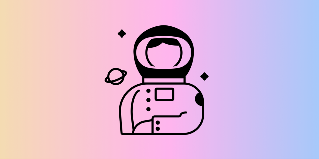
I want to leave readers with some better ways to make icons. Take an example from the Redefining Women icon collection – the woman astronaut gives a stronger sense of identity to this female and her scientific mind. When you’re thinking about diversity or designing a new set of wheelchair-centered icons, can you show that there’s opportunity for these people beyond just getting through a door and getting up the flight of stairs we know is their obstacle? It says “the entire identity of disabled people is their obstacles – not their agency.”
If it’s a thousand versions of one person in a wheelchair, then you’re not accurately representing people.
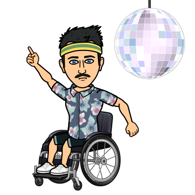
Show me line dancing at the disco! Show me cooking in the kitchen! You make too many assumptions about what my life is like. Show me, and we, the people.
Looking for more tips on designing more equitable and inclusive icons? Read our guide to Depicting Race in Iconography, or consult our Handbook for Creators.

Marketing Communications Manager at Noun Project, Designer and Illustrator.