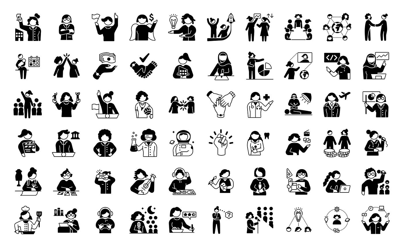
Elisabetta Calabritto is an illustrator, graphic designer and icon designer who has worked with clients including Fast Company, Raconteur Media, and Autodesk. Noun Project recently worked with Elisabetta to design the Redefining Women icon collection, 60+ icons that represent women in design, tech and leadership positions. We caught up with Elisabetta to learn more about her career path, creative process, and more.
Hi Elisabetta! Tell us a little about yourself. How did you get to where you are today?
I’m originally from a small town in Northeastern Italy, in a region close to Austria, Slovenia and Croatia. I am very lucky to have grown up with a variety of historic, visual and cultural influences around me (and let’s not forget about the food!). I was a curious child, always asking “Why?”, and became interested science, which is a passion of mine. I discovered that I have a very good visual memory and I entered the world of graphic design to try to help explain difficult concepts to people like me, who love complexity but sometimes don’t fully understand them, using infographics. Later in my career, I added illustration and icon design to my skillset. It has been a slow development really, kind of like growing a bonsai. Then, after working in Milan I had the opportunity to move from Italy to the United Kingdom.

I personally think that most of the time great opportunities come from meeting the right people, who believe in you and your skills. Before throwing myself into the freelance world I was fortunate to work for companies that gave me the opportunity to learn. Currently, I am very happy to be represented by LoveBlood Creative, a small but fierce illustration agency. They believed in me and gave me the chance to be part their artist pool.
Tell us about the type of work that you do. When did you start designing icons?
The work I typically do includes illustration, graphic design, infographics and icon design. I love when a project needs all of these types of design and I can create them from scratch.
I started designing icons a couple of years ago. I started with small, illustrated icons — I wasn’t in a good place and designing small icons somehow helped me to cope with what I was going through. Designing icons make me happy, whether it’s, food, animals, or a sink it all makes me happy and it’s sort of a safe place for me.

What is your creative process and what is your approach when designing for clients?
It very much depends on the project. I usually work in stages where I collaborate with the client to understand the project brief and make sure we are on the same page. I work in small steps to assure quality. Sketches are the main thing and I think defining a concept in the early stages of a project is fundamental. I am quite methodical and I love organization (almost too much sometimes!).

You recently partnered with Noun Project to design the Redefining Women icon collection. Can you tell us about one of your favorite icons from the collection?

One of my favorite icons is definitely “Success.” I think it’s a positive representation of what women should do — unite for success- instead of competing and pushing each other away. It’s difficult enough to be recognized as it is, we don’t need to crush others to be successful — I think it’s the wrong way to go and it only brings misery. This concept applies to everyone, really.
How would you like to see these icons used?
I would love to see these icons used in schools — I think the first place people need to make equality a priority is at school. Children need positive representations and they need to get used to them, without prejudice of any sort. And secondly, I would love to see them used in everyday life, in any type of situation that allows us get to used to them and get rid of any layered prejudice we might have from our past, because even if we are the most progressive person in the room, we are still prejudiced. Education is the key.
What have been some of your favorite and most memorable projects so far?
Obviously, the Redefining Women collection was very enjoyable and fun. I am very proud how it turned out and how much good it can do.
Another project is a personal project — I’ve redesigned the houses where I’ve lived during my past years in London, I’ve experimented 3D style, using strong colors and outlines. I have a sort of an obsession with designing objects. It has been a walk down memory lane to design these houses, with a lot of interesting moments and people, small spaces, and way too many flatmates in some cases!


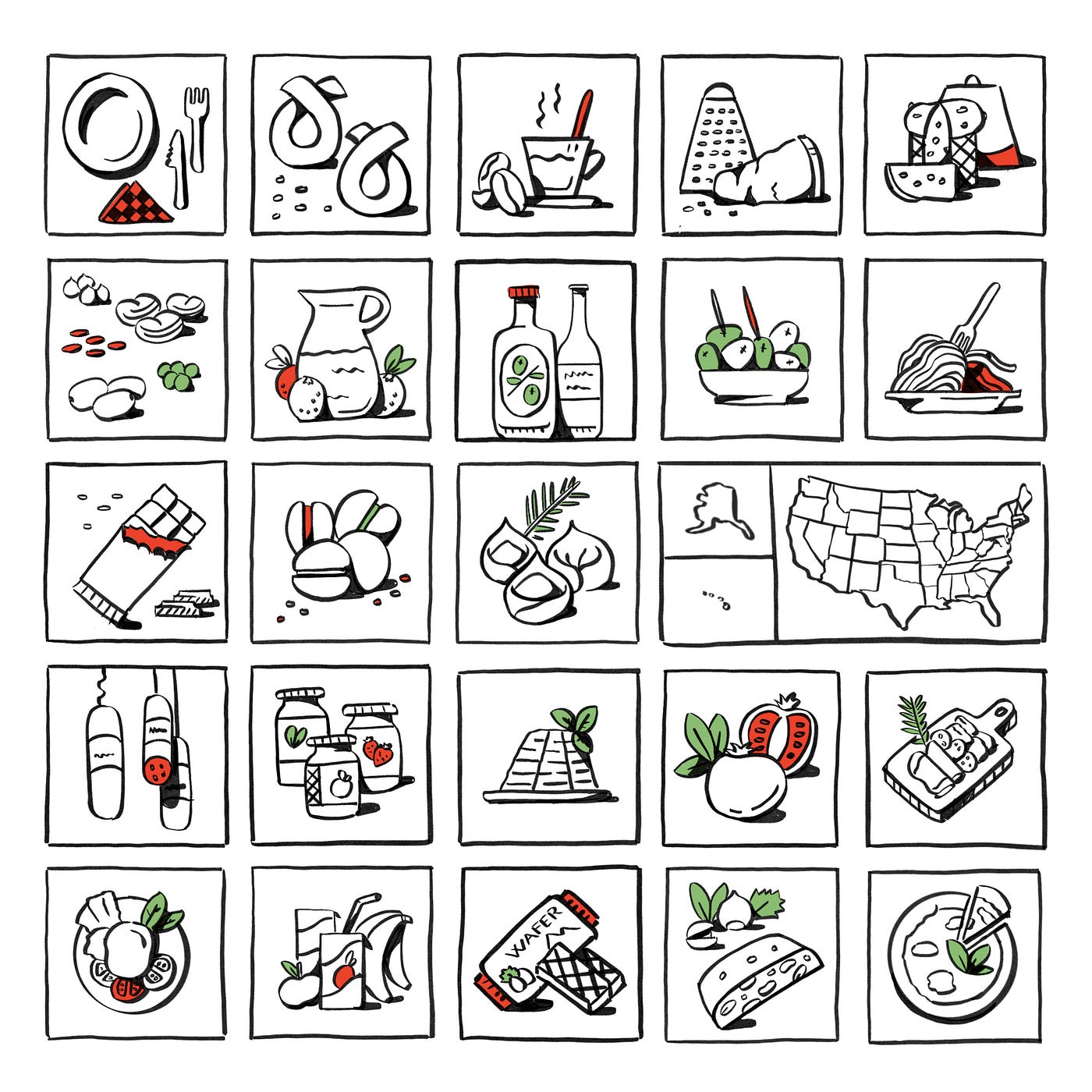
One of my all time favorite projects was about food. I had the opportunity to design the cover illustration for the USA Special Issue 2019, published by Italianfood.net, which is an Italian platform dedicate to Italian food. I was completely out of my comfort zone as my style is not “organic” but rather geometric, so I first sketched the icons and it turned out that I had so much fun to draw so little and cute food icons, despite the difficulty to think about this food when lunch time was approaching!
Do you think that icons have the power to influence public opinion and positively influence the world?
I believe that icons play an important part in shaping society. Look around and you’ll see how many icons we use to do things, to help inform us and make us think.
Take bathroom icons for example. These icons define a space where we are vulnerable, so it’s a very delicate matter. Those icons are on the front of a door and are the first social signal that tell to us where we should go. For a long time designers have been trying to find alternatives in order to represent rightfully in one shot female and male, or a unisex bathroom. And this is so powerful, because even an everyday symbol such a bathroom icon can have layers of meaning and cultural heritage, and also categorize our identity as a person.
Then, the second part of the “icon’s job,” is to try to make a positive impact. It takes time and persistence, and it goes hand by hand with society and politics. It will be always an everyone effort.
Thank you for sharing with us Elisabetta! To see more of Elisabetta’s work visit elisabettacalabritto.com and check out more of her icon collections, available on Noun Project.
Want more content like this? Subscribe to our monthly newsletter, the Noun Gazette. 🎉

VP, Brand Marketing & Communications at Noun Project