
Ready to try your own hand at icon design?
While Noun Project has over 5 million curated icons in a variety of subjects, at some point you may be tasked with creating your own icon set – or want to contribute a new set of never-before-seen icons depicting a unique subject.
In this tutorial, we’ll explore the art and science of creating stunning icons from sketch to final vector.
Table of Contents
Ideation and Sketching
Before jumping right into a digital design program, it’s often best to start with some freeform ideation using good old fashioned pencil and paper. The art of icon design is all about distilling a subject down to its most essential parts without superfluous detail to communicate an idea quickly and efficiently. Think about what you’re setting out to communicate with your design, whether you’re putting your own stylistic spin on commonly-used icons, or perhaps creating a new icon for a unique and perhaps niche subject.
Your subject matter may lead to several different approaches to brainstorming ideas:
- Literal: Depicting unambiguous, real-life objects like laptops and donuts.
- Conceptual: Tackling abstract concepts like “Gerrymandering” or “Cyber fraud.”
- Recognizable References: You may opt to focus on established conventions that people are accustomed to – like navigating an app using a “gear” icon to mean settings, or “hamburger menu” for main menu navigation.
You’ll also want to bear in mind what type of style you want for your final icons:
- Outlined, filled, or semi-solid
- Minimalist or illustrative
- Sleek and geometric or loose and hand-drawn
- Sharp or rounded
Aesthetic considerations like this will help guide every choice and you’ll want to select everything, right down to your stroke weight, based on how much detail the final icon will need to convey.
Once you have a few sketches laid out, it’s time to vectorize your top picks on the computer.
Creating a Vector from Your Icon: Choosing the Right Software
It’s crucial to select the right vector editing software. There are various options available, both free and paid, such as Adobe Illustrator, CorelDRAW, and Inkscape. Many designers also turn to Figma as a free alternative, which offers a streamlined approach with the most essential vector-editing capabilities, and additional tools available as plugins.
Your choice of software will depend on your preferences and budget. No matter your platform of choice, you can set yourself up for great icon design with these techniques. In this tutorial, I’ll be using Figma to show you how to create digital icon designs.
How to Use Grid Systems for Icon or Logo Design
Every icon design begins with a well-structured canvas or art board. Using guidelines and grid systems is the most surefire way to keep your designs stylistically concise – and they’re also critical when designing a cohesive set of icons to maintain the same visual appearance. The idea behind icon grids is not only to give you the ability to “snap” your anchor points to pixels for cleaner and more consistent shapes, but to set boundaries and corner radius rules so that multiple icons in a set follow the same visual standards. This way, you can even hand off future icon creation to a colleague and they’ll know how to constrain and build their designs to match yours.
Let’s look at how you can set up a grid system to set boundaries around spacing and alignment.
Setting Up an Icon Grid
Icons are designed to be used a small resolution, so let’s start small.
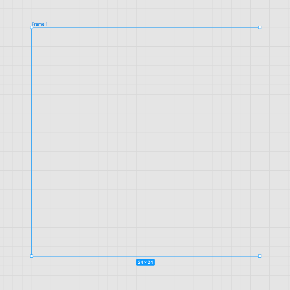
A. Create a Square 24×24 Pixel Grid
- In the program you’re using, ensure that the pixel grid is visible in your settings.
- 24 is a great number to start with since it can be evenly subdivided multiple times, so create a grid that is 24 px high by 24 px wide inside your art board.
In this example I used Figma and clicked “F” to click-and-drag out a frame. I also made sure its height and width were set to 24.
B. Make Sure you “Snap to Grid”
- Selecting “Snap to Grid” in your settings means that every move you make on the art board will be “snapped” to the nearest grid intersection, rather than freely floating. This will not only aid the design process and give you tidier geometry, but it will help avoid issues with pixelation further down the line so you don’t end up with blurry lines that fall between pixels.
C. Add Guidelines and Subdivisions
- Add guidelines horizontally and vertically across the center, so you can always clearly find the center of the grid.
- You may want to further divide this grid into quadrants to give better visual cues about the optical balance.
In Figma, you can add Layout grids to your selected frame on the right-hand design menu. You can use the + button to add multiple layout grids at different divisions – such as 12 pixels or 6 pixels – to evenly segment your canvas).
- It also helps to give your grid padding (or margins) to constrain your icon towards the center and not have it bleed all the way to the edges. In the above example, I’ve added an extra rectangle (transparent fill with stroke) to serve as our “live area” and give our icon grid a 2 pixel gutter. While elements like a circle may dip outside this boundary, they won’t be flush with the edges or extend beyond them.
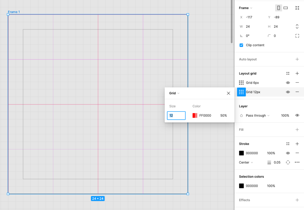
D. Add Key Shapes
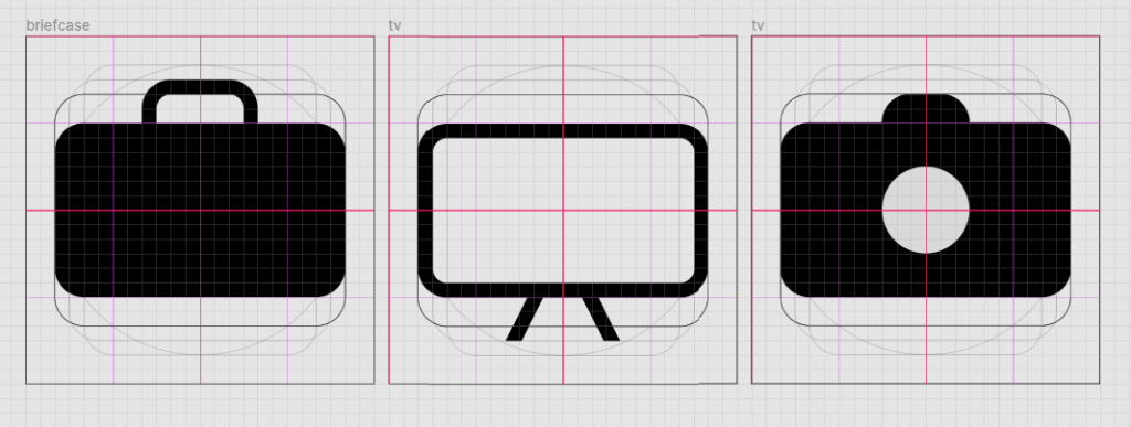
- Key shapes are essential for demarcating how you’re going to constrain each icon, given their core shape – whether it’s a circle, square, rectangle or triangle. You may also want to create multiple icons that have a similar rounded corner radius. For example, let’s say you have multiple rectangular icons you want to create, such as a briefcase, TV, and camera. Giving them the same aspect ratio as well as corner radius will provide more visual consistency across the set.
- Lay out your parameters for how you want your key shapes to appear by including them as guides on the canvas.
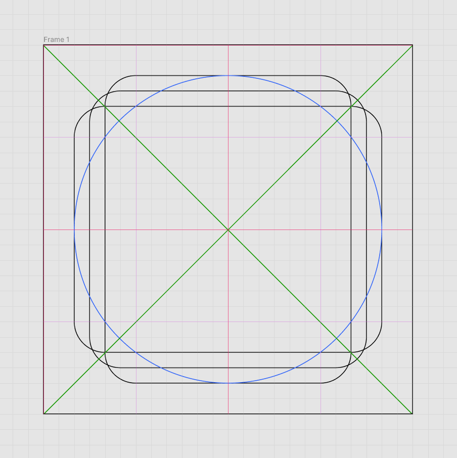
- In the below example, I’ve made a circle that falls within the “live area” of padding.
- Then, I created several rectangles at different aspect ratios, plus or minus 1 pixel on each side. I set the corner radius of each one to 2. This will be our guiding standard for how we design icons from each type of shape.
- This way, you can easily use a core shape (such as a rectangle with rounded corners) to swiftly create multiple similar icons in a more visually consistent, cohesive manner.
- You may also want to add a diagonal guide, otherwise known as an orthogonal. This comes in handy particularly for “Prohibited” signs or any shape that may take a triangular or asymmetrical form.
- You may also want to color each of these guides differently for better visual clarity.
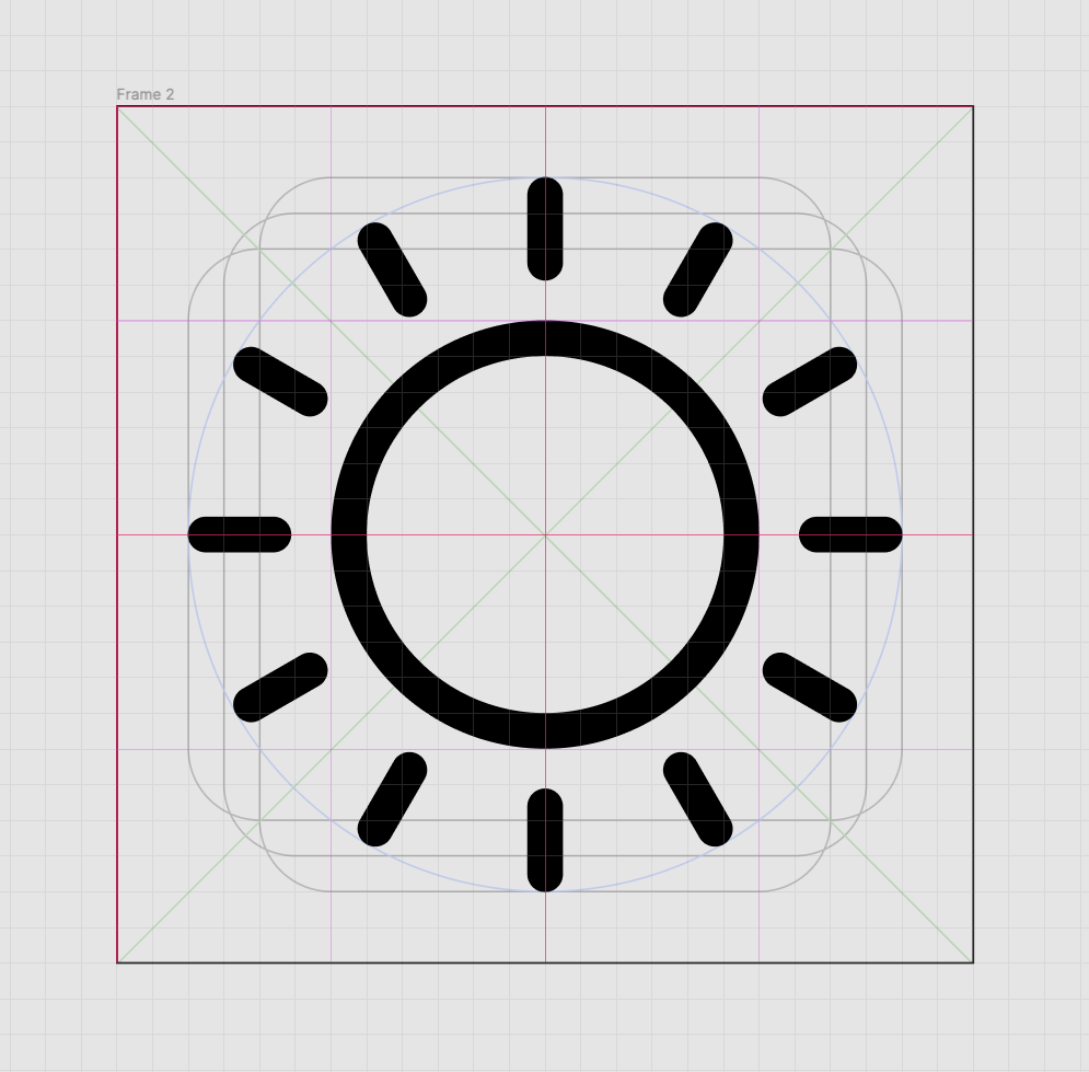
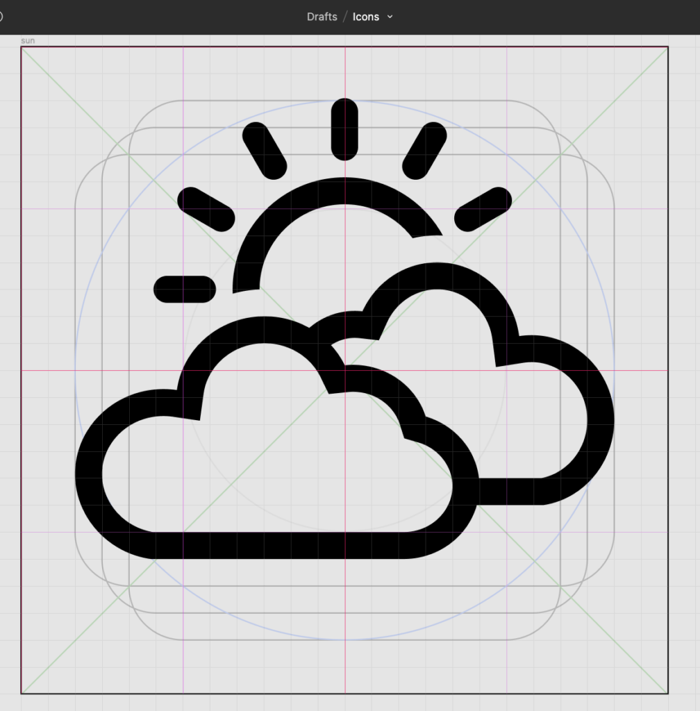
In the below example, I’ve made a “sun” icon by creating a circle within the innermost square guide, and ensured that each of the “rays” fall within the live area. When examining your final set of icons, most adjustments should be made optically. For example, having some rays touch just outside the live area may be acceptable as long as it doesn’t appear like a larger icon, or throw off the balance of the overall composition.
Creating Your Icon
Now it’s time to create your actual vector shapes. Be sure to lock any guide layers that may interfere with your design process. Here are the different ways you can start designing:
Start from a Shape
- You can always use your guiding shapes as the basis for an icon, or add a new circle, square, or line. Once you start with a shape, you can click any of its anchor points to rearrange them manually.
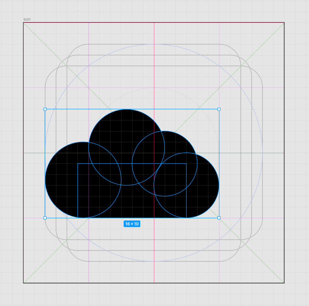
- In this example, I’m adding clouds to make a weather app icon, combining multiple circles with a rectangle to add flatness on the bottom.
Draw Your Vector with the Pen Tool
- If you want more manual control over making shapes, select your Pen tool and click across the canvas to create anchor points. With “Snap to Pixel” still enabled, your anchor points should appear at even increments for a tidier geometry. Clicking back to your original anchor point will create an enclosed shape.
- Choose a stroke weight that you’ll want to stick with. Generally, you want to maintain the same stroke weight throughout every element of an icon – as well as all icons in a set. This helps the set look more cohesive, and therefore more professional. You can experiment with different stroke weights as you design to see how they affect the overall balance of white space.
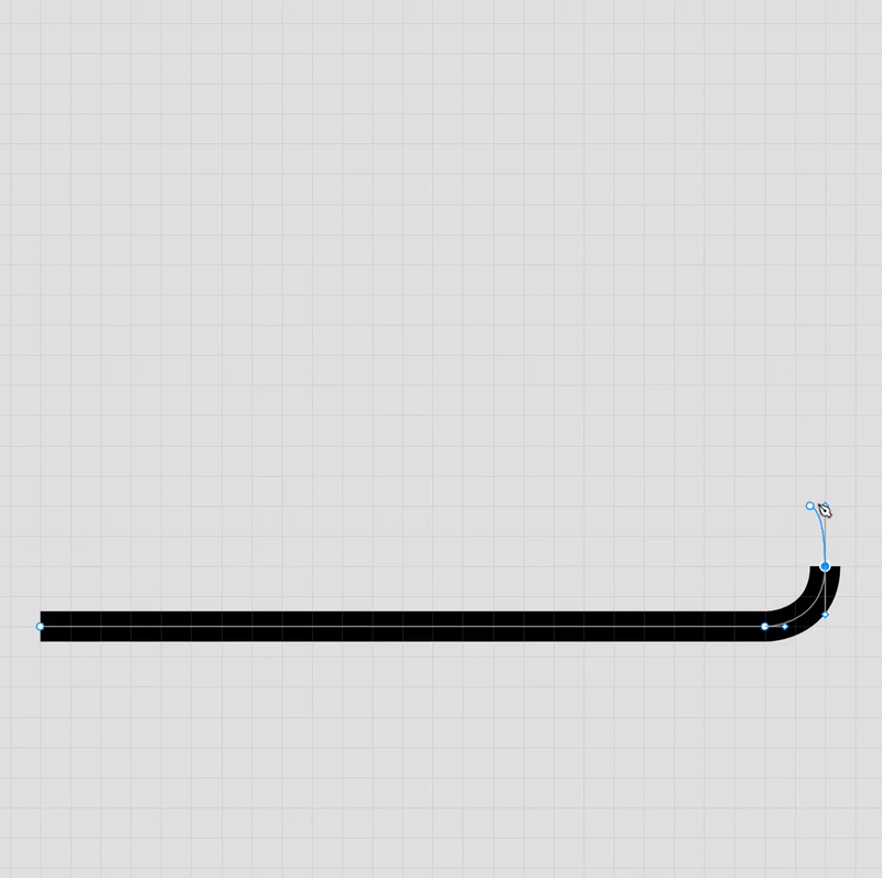
Use the Handles to Adjust the Curvature of the Lines.
- Single-clicking across your canvas will create straight lines using the pen tool.
- As you draw, you can hold your cursor to make each anchor point a curve – or go back afterwards and Option- (or Alt-) click an anchor point. You should see a handle appear to help you adjust your curve. You can control both handles at once to change the direction of the curve, or again Option- (or Alt-) click one of the handles to move it individually.
- Double-clicking the anchor point will convert it back to a regular anchor point with straight lines.
Adjust the Stroke
- In your Stroke menu, you’ll see options to adjust the “Joins” or mitre limit. This controls how rounded or sharp the corners create by your anchor points are – so consider a more rounded join for an overall softer and more friendly icon effect.
- You can also adjust the endpoints of your stroke, so that terminals are square or rounded (or perhaps have another shape like an arrow).
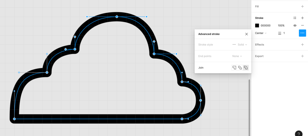
Outline Stroke
- It’s typically a good idea to leave your paths with strokes until you get all the elements of the icon just how you want them. But you can then have greater control over the vector shapes by clicking “Outline Stroke” – this means that instead of a single path with a stroke centered, inside, or outside the anchor points, it’ll create a fully enclosed shape as below.
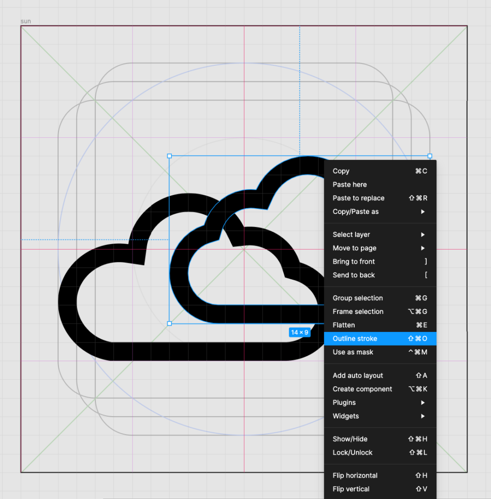
Combine Shapes with Boolean Operations:
- To create complex shapes or cut out parts of your icon, use boolean operations. These are quick actions that affect how two or more overlapping shapes will interact.
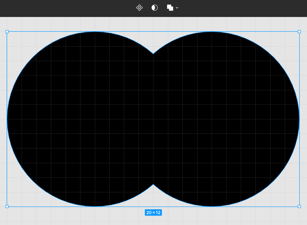
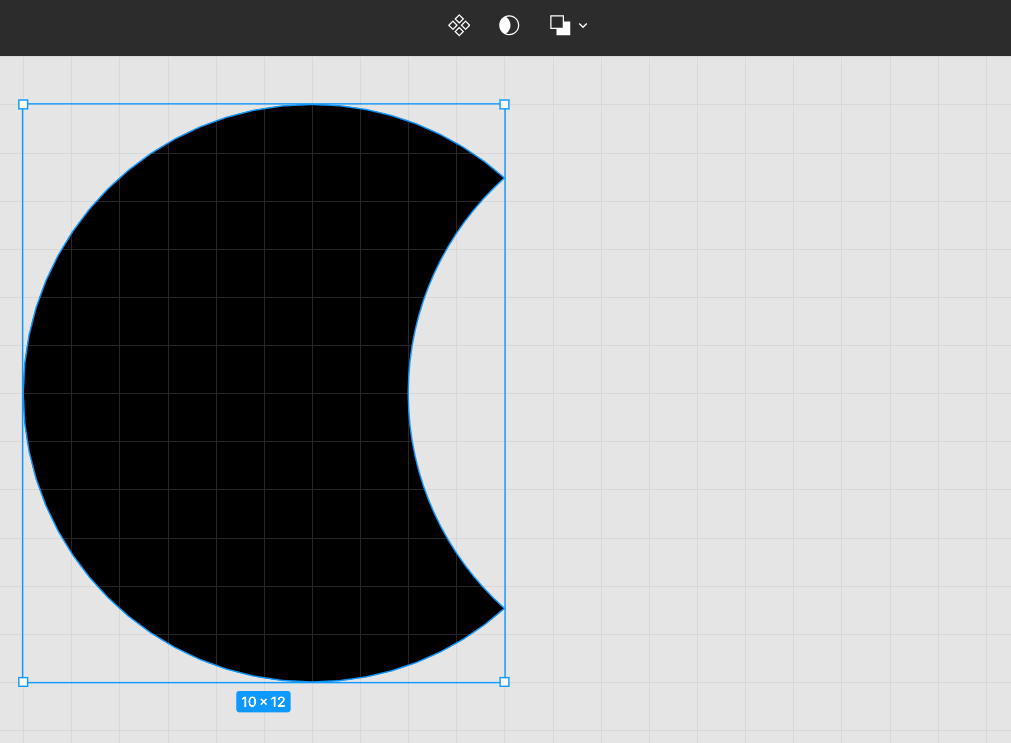
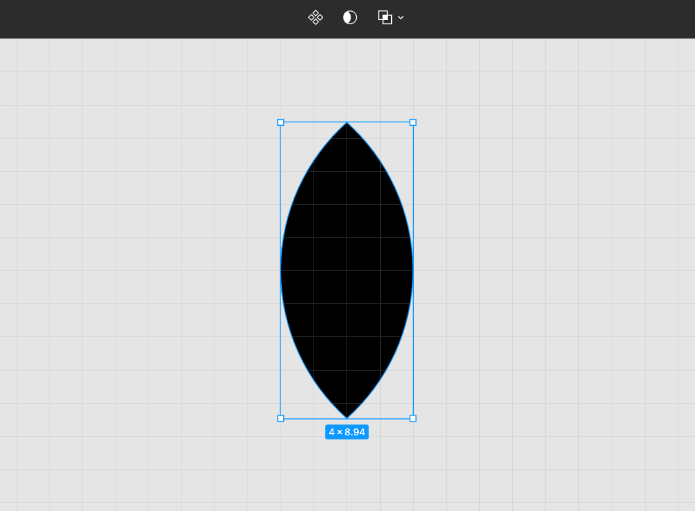
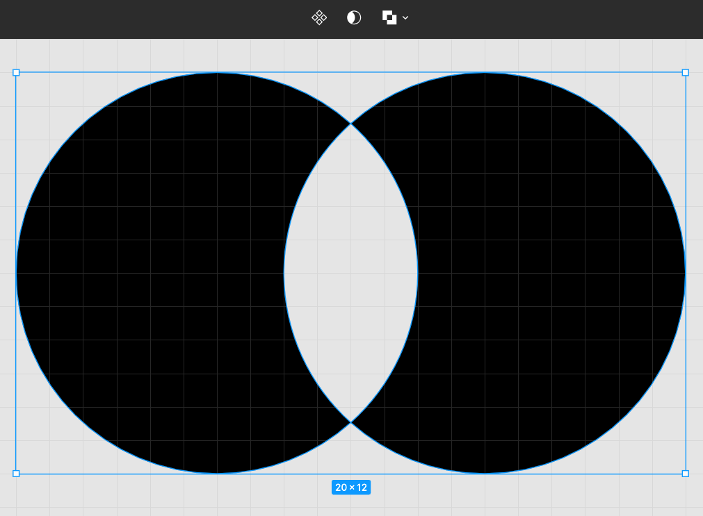
- Boolean operations only work with 2 or more shapes selected. Take a look at how each one operates, using two overlapping ellipses here:
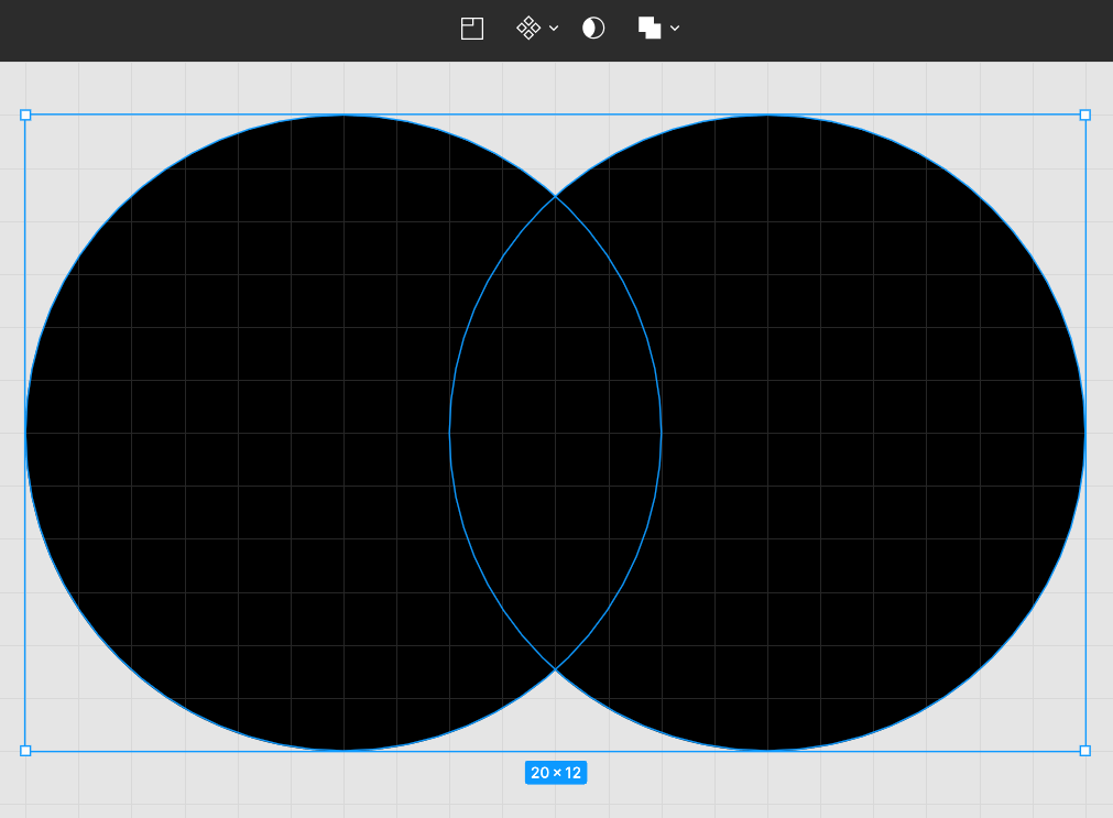
Union:
- The simplest of operations, Union will simply combine all selected shapes into one. Resulting anchor points will only be found along the outermost perimeter of the combined shape, as all anchor points within a point of intersection will have disappeared.
Subtract:
- As its name implies, subtract will take the top-most shape (on the layers panel) and subtract it from the lower shape selected. However much of the top shape intersects with the bottom will leave a resulting outline.
Intersect:
- Intersect will remove all content except for the area of overlap between shapes. Note that for 3 or more shapes, all shapes must overlap in some area for the intersect function to have a result.
Exclude:
- Exclude does the opposite of intersect: it will remove only the area of overlap between shapes. Similarly, for 3 or more shapes it will only exclude the area in which all 3 overlap.
Combine Stroke, Outline, and Boolean Functions for More Shape Building Capabilities
Frequently, you will want to use multiple, overlapping elements in an icon design, but you’ll need to leave each element adequate space. This is especially challenging with outline icons, where you want shapes to appear opaque even against a transparent background.
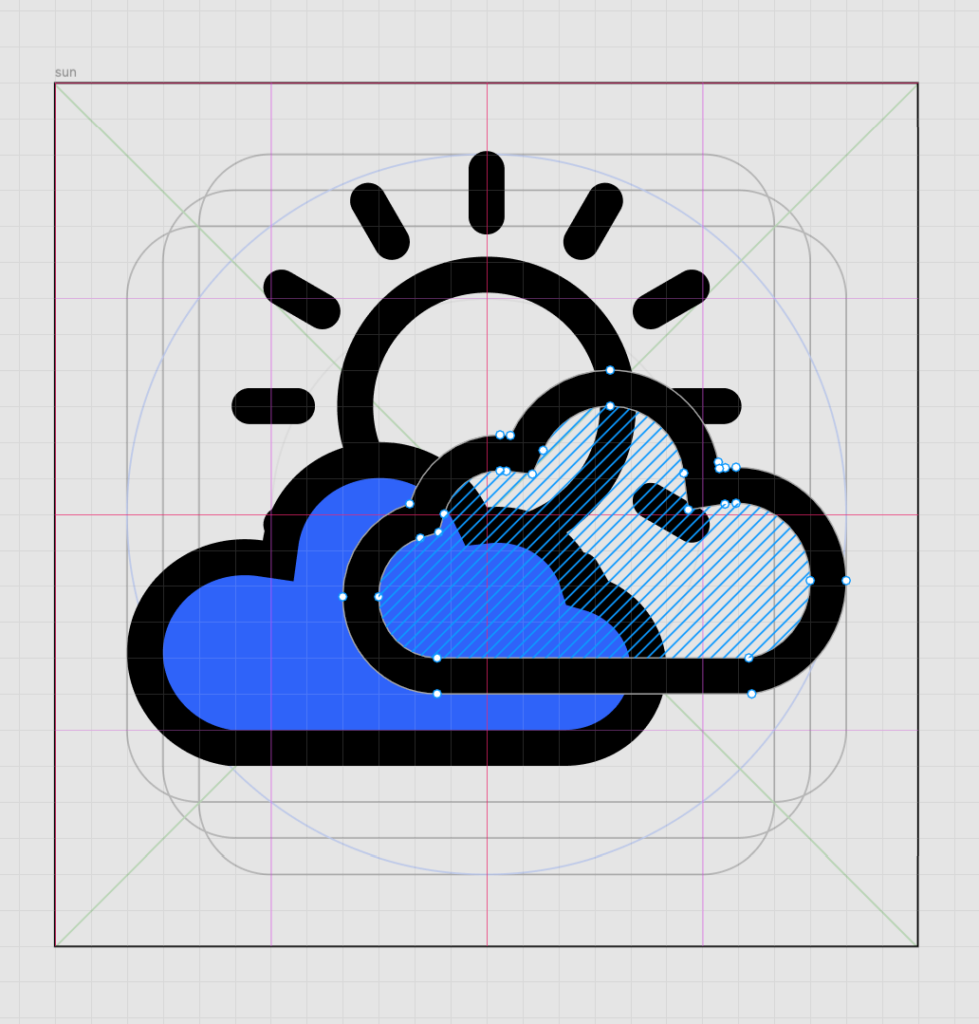
In this example I’m creating a weather app icon with 2 clouds and a sun. The sun shouldn’t be visible behind the clouds, so I’ll need to fill the insides of the clouds.
In Figma, double-click your icon and select “B” to fill it with a color, as I’ve done with the left cloud below.
Let’s say I also want to leave white space around the clouds so that the cloud outline and sun outline don’t touch. Once I’ve outlined my original stroke of the cloud outline, it’ll become an enclosed vector shape – and I can add a new stroke set to “Outside” to show me where this padding should go.
With the new red stroke, I again click “Outline stroke” to make it a shape.
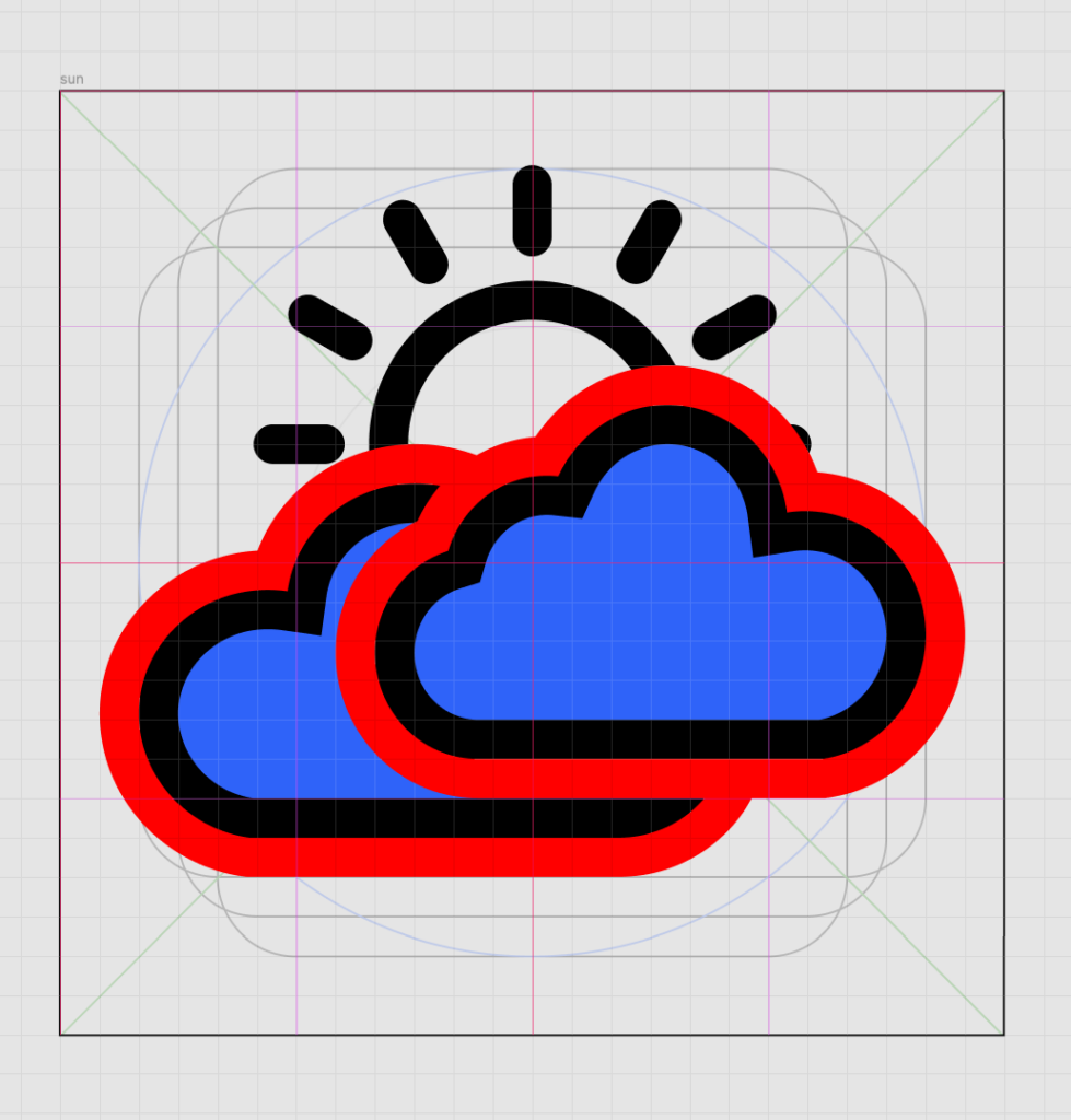
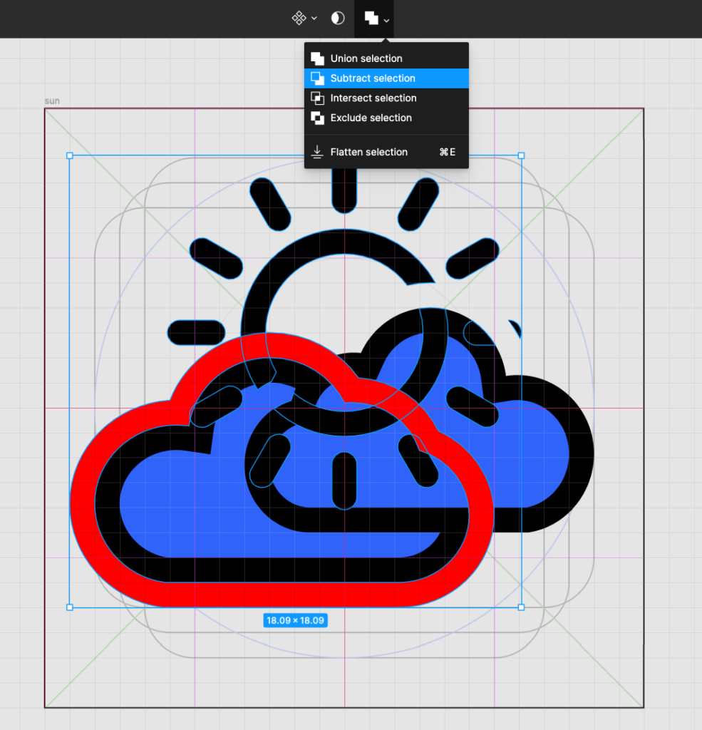
I can then use the “Subtract” operation with the red outline placed just over the sun, and it will give me a clean border of white space. From here, I can manually delete all spare overlapping anchor points (alternately, you can copy the top shape such as the cloud and paste it in place – then subtract the copied cloud shape from the sun shape).
Be sure that you have not only outlined your strokes, but flattened your vector shapes for them to behave as a cohesive unit – especially for shapes with disconnected elements like the sun and its rays.
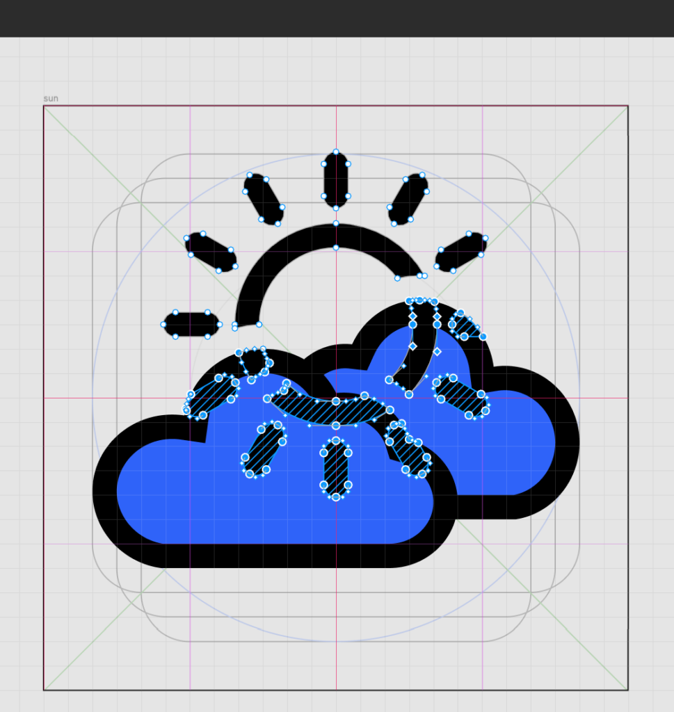
The resulting icon has an even border of white space that is visually tidier than trying to manually separate the cloud shapes from the sun shapes.
Finalize & Export
One you’re happy with your icon design, there are a few final steps you’ll need to complete before you export your file.
Flatten and Clean Up:
- Clean up any stray or unnecessary anchor points. Some programs like Adobe Illustrator give you this option using the “Clean Up” tool.
- Ensure all vector shapes are combined into a single layer if your icon is made of multiple elements by clicking “Flatten” again.
Export Your Icon:
- Select the icon shape you want to export.
- In Illustrator, select “Export” from the topmost “File” menu, or in Figma find “Export” in the right-hand design menu. For many icon purposes – including uploading your own creations to the Noun Project site, you’ll need an SVG file. These vector files have the benefit of remaining editable and infinitely scalable in any vector editing program.
- Examine the final SVG exports, paying attention to detail including line and shape consistency, tidiness, and legibility at small scales. Re-edit and export again as needed.
In Conclusion:
Icon design is an art form where creativity and precision meet, and with practice, your skills will flourish – so take plenty of time to get into your flow and hone your craft!
When designing icons, always be sure to:
- Start with rough sketches before diving in to software – and remember simplicity is key!
- Give yourself guidelines and boundaries by using a grid with key shapes and padding.
- Give yourself time and patience to master the pen tool and various shape-building or boolean group functions!
- Double-check your work for cleanliness, cohesion, and consistency before you export.
Noun Project Co-Founder Edward Boatman has a Skillshare course all about creating pictograms with purpose, which will be helpful if you’re looking to delve deeper into the icon design process.
Looking for more graphic design content? Browse more blog tutorials.

Marketing Communications Manager at Noun Project, Designer and Illustrator.